
Almost every ecommerce site you visit asks for your email address within about fifteen seconds of arrival. Almost all of them ask the same way: ten percent off, one field, one button. The mechanic is so standard that most visitors have stopped reading it.
So we went looking for the ones doing something else. Sixteen pop-ups, captured from live sites, annotated and lined up next to each other. What follows is what we found, ordered by a single question: how long does the brand wait before it shows you a number?
A note on what this is. Every observation below comes from the screenshot next to it. We have no access to these brands' opt-in rates, list growth or revenue per subscriber, so nothing here should be read as evidence that one approach converts better than another. What we can tell you is what each brand chose to do, and what that choice implies about the audience they think they are talking to.
Four of the sixteen do not offer money off at all. That is a deliberate margin decision, and it only works if the brand has something else worth trading for an email address.
WHOOP has the clearest version. The pop-up leads with a data visualisation from the product itself, and the promise is insight and updates rather than a price cut. For a subscription hardware business, a discount on the first order would set an expectation the pricing model cannot sustain.

The one thing we would question is the placement. Five lines of consent text sit between the email field and the button the visitor needs to reach. Whatever that text is doing legally, it is doing it in the exact spot where attention is most valuable.
Oura takes the same position and words it differently. The headline sells a daily practice rather than a device, and the offer is product reveals, health tips and special offers. The button says Subscribe, not Get My Discount, which is a small consistency that matters. Consent text sits below the button rather than above it, out of the path between deciding and acting.

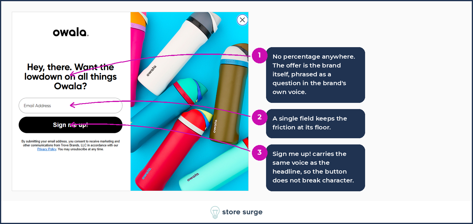
Owala does something more unusual. There is no percentage anywhere and no benefit list either. The offer is essentially the brand's own voice, phrased as a question. It is the shortest pop-up in the set and the one most dependent on the visitor already liking the brand.
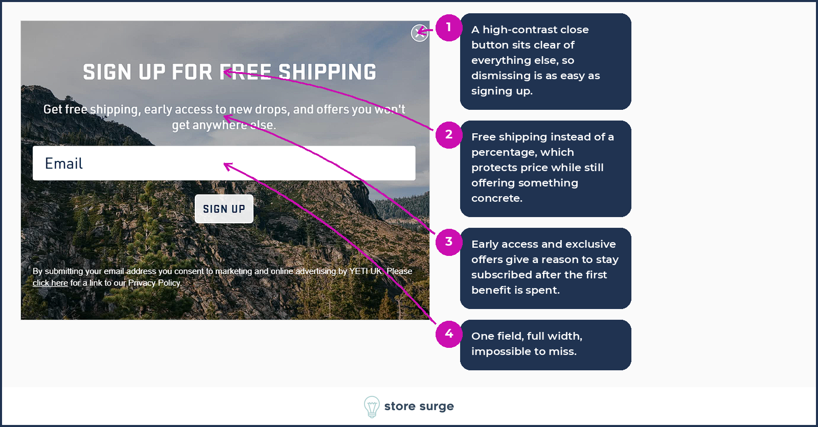
Yeti splits the difference. Free shipping is a concrete benefit that protects the price, and early access to drops gives the list a reason to stay useful after the first benefit is spent. The close button is high-contrast and clear of everything else, so dismissing is as easy as signing up.
Hears replaces the offer with an action. Try your luck, scratch to see what you win, reward undisclosed. Clicking a scratch panel is a smaller commitment than judging whether ten percent is worth an email address, and it converts a decision into a moment of curiosity.

The risk sits on the other side of the scratch. A visitor who plays and wins less than they hoped has started the relationship with a small disappointment, and that is a harder thing to measure than an opt-in rate. Whether the mechanic is worth it depends on how generous the reward pool actually is, which is not something a screenshot can tell you.
Three brands ask something before they reveal what is on offer. The visitor answers without knowing what they are answering for.
Fishwife promises a mystery discount, then asks whether you have tried them before. Two answers, and they sort new customers from returning ones before a single email address is captured. There is no email field on this screen at all.

Eight Sleep asks a better question than most. What is your main sleep challenge, with four answers that are all symptoms rather than product categories. Every answer is a segment that both the welcome flow and the ad account can act on. A visible Skip keeps the exit free for anyone who will not answer.

Wild runs the longest sequence in the set. Step one leads with a mystery offer and segments on what you came to buy. Step two reveals ten percent and asks for a phone number rather than an email. Step three delivers the code on screen, so the reward never depends on an inbox arriving. Three screens is more friction than most brands would accept, and each step earns it by giving something back.
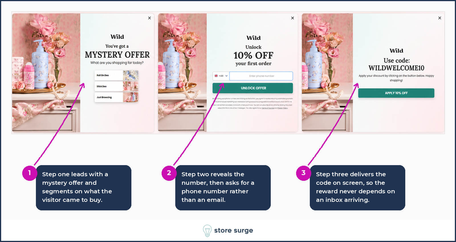
The segmentation question is the part worth stealing. An answer captured at this moment costs the visitor nothing and gives the email programme something to work with from the first send, rather than waiting for behaviour to accumulate.
Four brands do the reverse. The offer is stated up front, and the question comes after the visitor already knows what is in it for them.
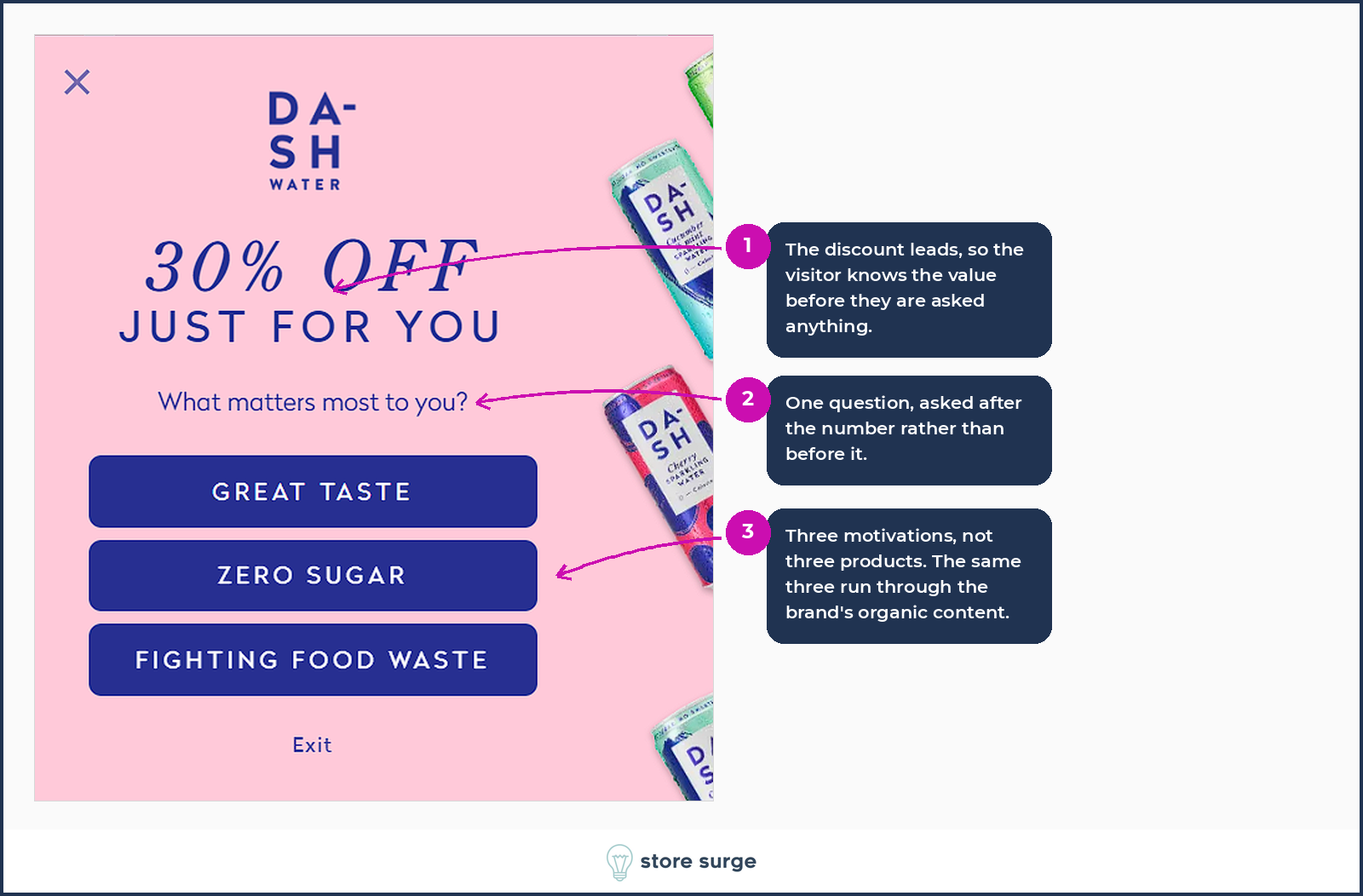
DASH leads with thirty percent, then asks what matters most to you. The three answers are motivations rather than products: great taste, zero sugar, fighting food waste. Those same three themes run through the brand's organic content, which suggests the segmentation is feeding something wider than the welcome email.
Caraway has the most interesting offer in the whole set. Fifty dollars off your second purchase, not your first. The incentive is aimed squarely at the repeat rather than the acquisition, which for a cookware brand with a natural expansion path from one pan to a set is a sensible thing to buy. The question is framed as the condition of claiming the offer, and a Not Sure Yet option keeps undecided visitors in the list instead of forcing a false answer.

YoungLA is not running an evergreen welcome offer at all. Twenty percent sitewide, tied to a live sale, with three checkboxes to segment the list. The consent block sits above the fields rather than below them, which takes the eye before the ask does.

Vuori puts product preferences above the email field, so the segment is captured before the address. The third option, I Want It All, spares undecided visitors from a false choice, which is the same instinct behind Caraway's Not Sure Yet.

Momentous is the only brand in the set that prices two different pieces of data in the same sentence. Fifteen percent for an email, twenty percent if you add a phone number. Only the email is required to continue, so the larger offer stays optional rather than gating entry.

The second step repeats the reward in the button label, keeping the payoff visible at the moment of the ask. The consent text runs to seven lines and sits directly above the field it governs, which is the same placement problem WHOOP has.
The last three do what almost everyone does, and the interesting part is what they add on top.
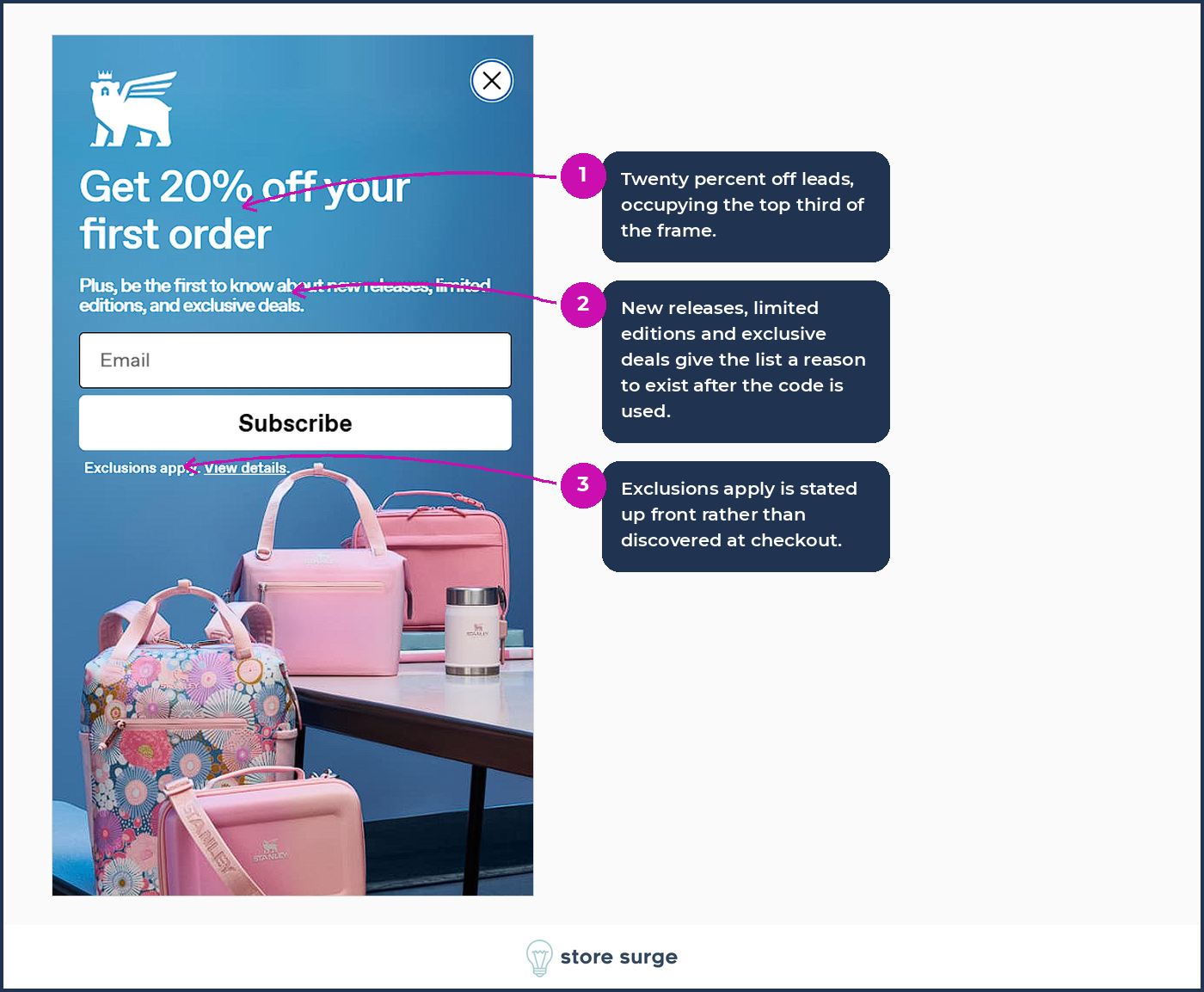
Stanley leads with twenty percent, then promises new releases, limited editions and exclusive deals. That second sentence is what gives the list a reason to exist once the code has been spent. Exclusions apply is stated up front rather than discovered at checkout.
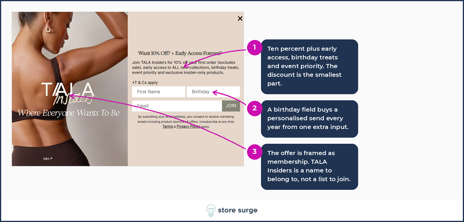
TALA frames the whole thing as membership. TALA Insiders is a name to belong to rather than a list to join, and the ten percent is the smallest item on a list that includes early access, birthday treats and event priority. Three fields is more than most brands ask for, and the birthday field buys a personalised send every year from one extra input.
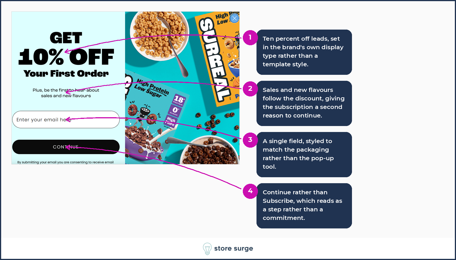
Surreal is the closest thing here to the standard pattern, and it still adds a second reason. Ten percent, plus first word on sales and new flavours. The form is styled to match the packaging rather than the pop-up tool, and the button says Continue rather than Subscribe, which reads as a step rather than a commitment.
Three things stand out across the sixteen.
The first is that a question costs less than you would think. Six of these brands ask something before or alongside the email capture, and none of the questions require effort beyond a single tap. If your welcome flow currently sends the same three emails to everyone, one question in the pop-up changes that immediately.
The second is that the discount is rarely the whole offer. Almost every brand that leads with a number attaches something ongoing to it, whether that is early access, new releases or exclusive products. The number gets the opt-in. The second promise is what stops the unsubscribe after the code is used.
The third is placement of consent text. Two of the sixteen put several lines of dense legal copy between the field and the button. It is worth checking whether yours does the same, and whether it needs to.
None of this replaces testing on your own traffic. A pop-up that works for a sleep hardware brand with a long consideration cycle will not necessarily work for a cereal brand people buy on impulse, and the only way to know which of these patterns fits your audience is to run them. If the pop-up is the first thing your conversion work touches, it is also one of the cheapest things to change.
If you would like a second pair of eyes on how your own site captures and converts first-time visitors, get in touch.
