
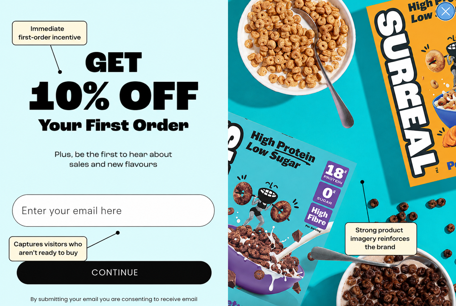
Surreal has taken on one of the most established categories in food and found a compelling way to stand out. Its high-protein, zero-sugar cereals promise the flavours people remember from childhood, repackaged for health-conscious adults. That positioning has helped Surreal become one of the UK’s fastest-growing cereal brands, recording 456% year-on-year growth and securing listings with major retailers including Sainsbury’s, Waitrose and Co-op. (Grocery Trader)
However, strong branding is only part of the story. Surreal’s website is carefully constructed to turn interest into purchases, subscriptions and repeat customers.
That process begins with its email pop-up. Visitors are immediately offered 10% off their first order in exchange for an email address. It is a simple, low-friction value exchange supported by colourful, product-led imagery. Even if someone isn’t ready to purchase during their first visit, Surreal can continue the conversation through email marketing, recover otherwise-lost traffic and bring potential customers back when they are ready to buy.
Next, we’ll look at how the homepage builds on that initial interaction through clear positioning, nutritional proof and an unusually strong collection of trust signals.
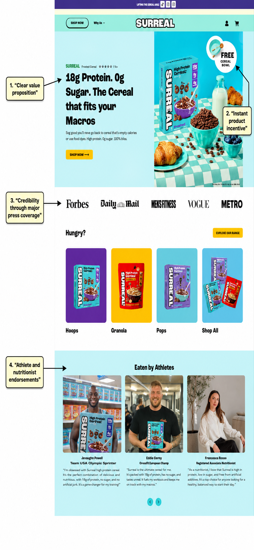
Surreal’s homepage immediately answers the most important customer question: why should I choose this cereal? The headline communicates the core proposition in seconds: 18g of protein, zero sugar and a product designed to fit the customer’s macros. Rather than leading with vague lifestyle messaging, Surreal puts its strongest nutritional benefits front and centre.
The free cereal bowl adds an immediate purchase incentive, while prominent coverage from Forbes, Vogue, Men’s Fitness and other publications gives a relatively young brand instant credibility. Visitors can then browse the main product categories without having to navigate through multiple menus, creating a straightforward route from interest to shopping.
Further down, Surreal strengthens its claims with endorsements from athletes and a registered nutritionist. This is particularly effective because the proof comes from people whose expertise or lifestyles align with the product’s positioning. Together, these elements establish what makes Surreal different, make the brand feel trustworthy and give health-conscious shoppers several reasons to continue towards a purchase.
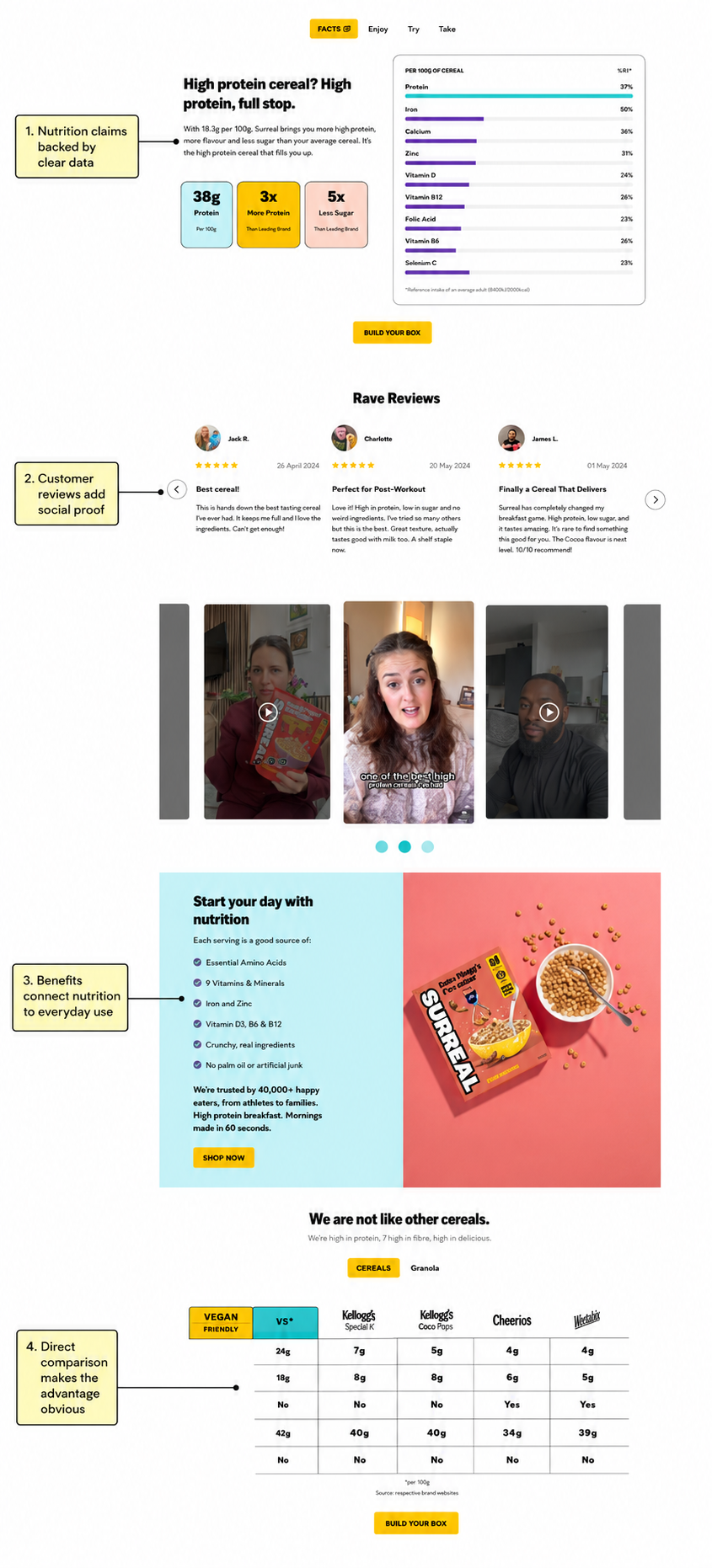
Once Surreal has established its core proposition, the homepage provides the evidence needed to make those claims believable. Detailed nutritional data supports its high-protein, low-sugar positioning, while the bold comparison cards make the most important differences easy to understand at a glance.
Surreal then shifts from product claims to customer proof. Written reviews and video testimonials show real people enjoying the cereal, helping to address concerns around taste, an especially important consideration for healthier alternatives. This mixture of polished reviews and more authentic user-generated content gives the brand both credibility and relatability.
The “Start your day with nutrition” section translates ingredients and nutrients into everyday benefits. Rather than expecting shoppers to interpret the nutritional information themselves, Surreal connects it to a familiar use case: a quick, high-protein breakfast that also provides vitamins and minerals.
Finally, the direct comparison table makes Surreal’s advantage over familiar cereal brands immediately visible. By placing protein, sugar and other attributes side by side, the page reduces the effort required to compare alternatives and positions Surreal as the obvious choice for health-conscious shoppers. Repeated “Build Your Box” calls to action then give customers a clear next step once the evidence has made its case.
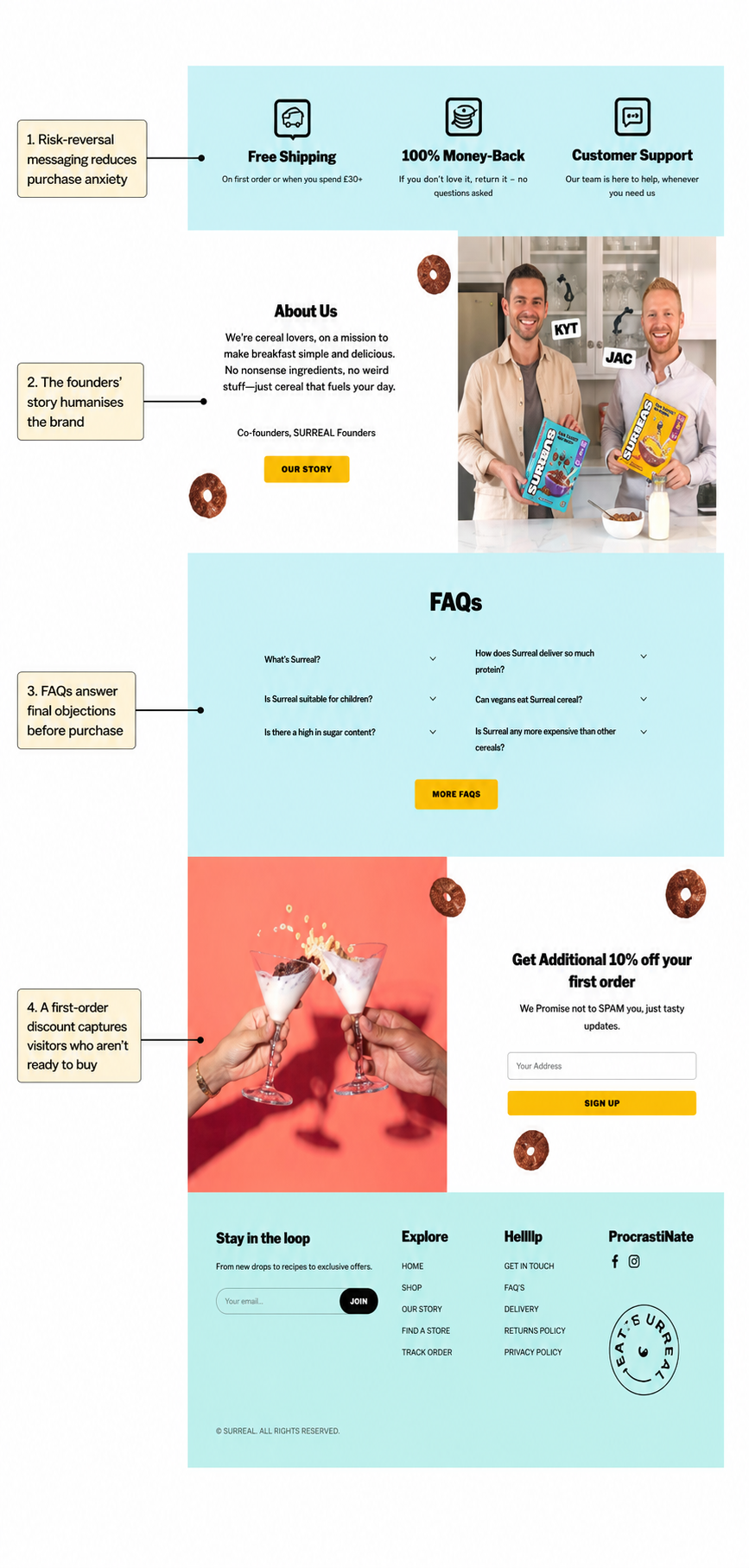
Towards the bottom of the homepage, Surreal focuses on removing the final barriers to purchase. Free shipping, a 100% money-back guarantee and accessible customer support reduce the perceived risk of trying an unfamiliar cereal brand, particularly for customers considering a larger multipack or subscription.
The founders’ section then adds a human face to the business. Featuring Kyt and Jac alongside a short, informal explanation of Surreal’s mission makes the company feel more personal and reinforces the playful tone seen throughout the website.
For visitors who still need convincing, the FAQ section addresses practical questions about sugar, protein, suitability for children, vegan options and pricing. Answering these objections before checkout reduces uncertainty without forcing customers to leave the page or contact support.
Finally, Surreal gives visitors who aren’t ready to purchase another route into the funnel. The additional 10% first-order discount encourages email sign-ups, allowing the brand to follow up with product education, offers and abandoned-browse campaigns. It is a strong final conversion opportunity that ensures undecided traffic does not simply disappear.
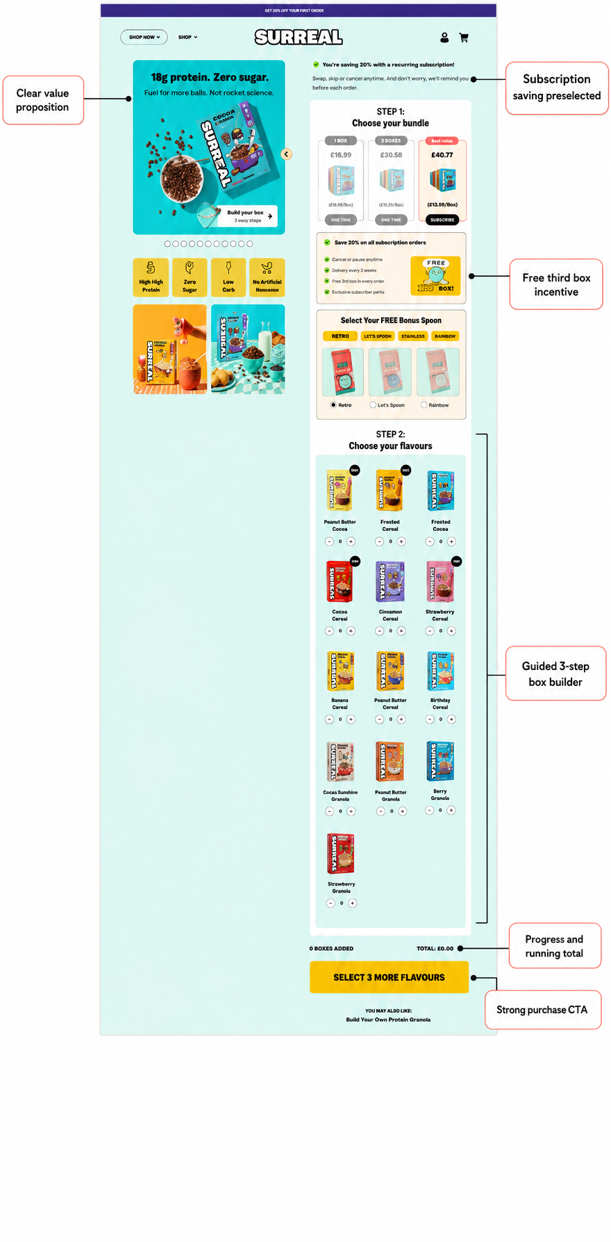
Surreal’s product page transforms a potentially complicated purchase into a simple, guided three-step process. Customers first choose the size of their bundle, select a free spoon and then build their box from the available flavours. This interactive approach gives shoppers control over their order without overwhelming them with too many decisions at once.
The subscription option is preselected, making the 20% saving the default choice while still clearly explaining that customers can swap, skip or cancel at any time. This helps make recurring delivery feel flexible and low-risk rather than a long-term commitment. The free third box and bonus spoon add further value, encouraging customers to choose the larger subscription bundle.
As flavours are selected, the page displays the number of boxes added and maintains a running total. The CTA also changes to tell customers exactly what they need to do next, creating a sense of progress and reducing uncertainty during the box-building process.
Alongside the builder, bold product imagery and the “18g protein, zero sugar” message keep Surreal’s core value proposition visible. The result is a product page that does more than list flavours: it actively guides customers towards a higher-value, recurring purchase while making the experience feel personalised and straightforward.
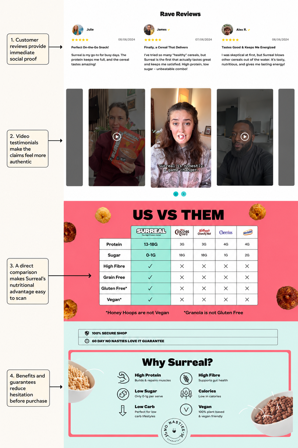
After guiding customers through the box-building process, Surreal uses the remainder of the product page to reinforce why the product is worth trying. Written reviews provide immediate social proof, while video testimonials add a more authentic layer by showing real customers discussing the cereal in their own words. This is particularly valuable for overcoming doubts about whether a high-protein, zero-sugar cereal will actually taste good.
The “Us vs Them” table then compares Surreal directly with familiar supermarket cereals. By placing protein, sugar, fibre and dietary credentials side by side, it makes the nutritional advantage easy to understand without requiring customers to study individual labels.
Finally, the “Why Surreal?” section translates these comparisons into clear customer benefits, including high protein, low sugar, high fibre and fewer calories. Secure checkout messaging and the 60-day “No Nasties” guarantee further reduce the perceived risk of ordering.
Together, these elements address the two biggest concerns likely to prevent a purchase, taste and nutritional value, while giving customers additional reassurance before they commit.
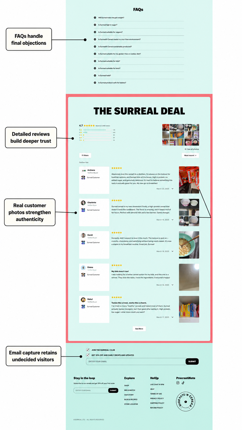
The final section of Surreal’s product page is designed to resolve any remaining uncertainty. Its FAQ area covers practical concerns including weight gain, protein content, vegan suitability, allergens and whether the cereal is appropriate for children. Placing these answers directly on the product page helps prevent unanswered questions from becoming reasons to abandon a purchase.
Surreal then reinforces its claims with a substantial collection of verified customer reviews. The visible rating breakdown gives shoppers an immediate sense of overall satisfaction, while detailed comments provide more specific reassurance around taste, texture and how the cereal fits into customers’ everyday routines.
Customer photographs add another layer of authenticity. Rather than relying entirely on polished brand imagery, Surreal shows the product in real kitchens, bowls and cupboards, making the reviews feel more credible and helping potential buyers picture the cereal as part of their own breakfast routine.
Finally, the email capture provides an alternative conversion for visitors who remain undecided. The promise of 10% off and early access gives them a reason to stay connected, allowing Surreal to continue nurturing them through email rather than losing the visit entirely.
Surreal’s website succeeds because every section has a clear purpose: attract attention, explain the difference, prove the claims and remove the risk of purchasing. From its playful branding and email capture to its guided box builder, subscription incentives and extensive social proof, the customer journey is designed to turn curiosity into higher-value, recurring orders. For ecommerce brands, the key lesson is simple: strong creative may win the first click, but clear positioning, credible proof and a well-structured buying experience are what ultimately convert it into revenue.
