
In 2021, Fishwife did about $750,000 in revenue. By 2023 that was roughly $6 million, a 180% jump in a single year inside a tinned fish category that grew about 1% over the same stretch.
Becca Millstein and Caroline Goldfarb didn't invent tinned fish. Spain and Portugal have been canning sardines since before either of their grandparents were born. What they built was a brand that made a genuinely unfashionable category worth photographing: illustrated, vintage-poster tins, a name borrowed from the sharp-tongued fishmongers who used to sell it, and enough taste-making from food editors to land the brand across the New York Times, Vogue, Vanity Fair, and half a dozen other outlets most CPG founders would kill for.
None of that explains the whole number, though. A recognisable tin gets someone to stop scrolling. It doesn't get them through checkout. We pulled apart seven sections of Fishwife's site, the popup, three homepage sections, two product page sections, and the bundle builder, to see what's actually doing the conversion work underneath the packaging design. Here's the breakdown.
.png)
Most ecommerce popups open with the same trade: give us your email, take 10% off. Fishwife's opens with a question instead. "You've earned a mystery discount. Have you tried Fishwife yet?" sits above two buttons, "Yes, and I'm obsessed" and "Not yet, but I'm curious", with no discount code or email field in sight yet.
The framing does more than it looks like it should. A visitor answers a question before they see a number, which means the popup is sorting before it's capturing. An existing customer and a first-time visitor deserve different messaging on the next screen, and most popups never bother asking which one they're talking to. It's the same instinct behind good email marketing: a list is only as valuable as how precisely you can segment it, and that starts before the first send, not after.
Butternut Box builds an entire funnel on that principle, using a quiz to qualify a visitor before it asks for any commitment. Worth reading alongside this one if you're weighing up how much you can ask of someone before they buy.
.png)
Fishwife's homepage doesn't open with a brand statement. It opens with "Mussels are Back in Stock!! After 6 months they are FINALLY back," over a hero image of tins stacked into bread, tomatoes, and basil rather than the studio pack shot most CPG homepages default to.
Six months of stockouts turned into a headline is an unusual choice, most brands would rather not advertise that they ran out. But it converts a supply problem into urgency copy no fabricated countdown timer could match, and the product photography doubling as a recipe scene means the hero image is selling a meal, not just packaging.
YoungLA engineers the same effect on purpose rather than by accident, running drops and restocks as a deliberate scarcity engine. Fishwife got there by genuinely running out, which is cheaper but considerably harder to schedule.

Further down, "Pick your protein!" runs Fishwife against chicken, red meat, and fresh seafood across six rows: ready to eat, shelf stable, omega-3s, recyclable packaging, cook time, and sourcing. Fishwife wins five of the six outright.
The choice of competitor is the interesting part. Comparing a tin of mussels to a rotisserie chicken only works if the table is arguing for tinned fish as a category, not for Fishwife over any other tinned fish brand on the shelf. And the row most shoppers will actually act on isn't a health claim at all, it's "Cook + Clean Time: None, it's ready to eat!" against 25 to 45 minutes for everything else. Convenience closes the sale that omega-3s just opens.
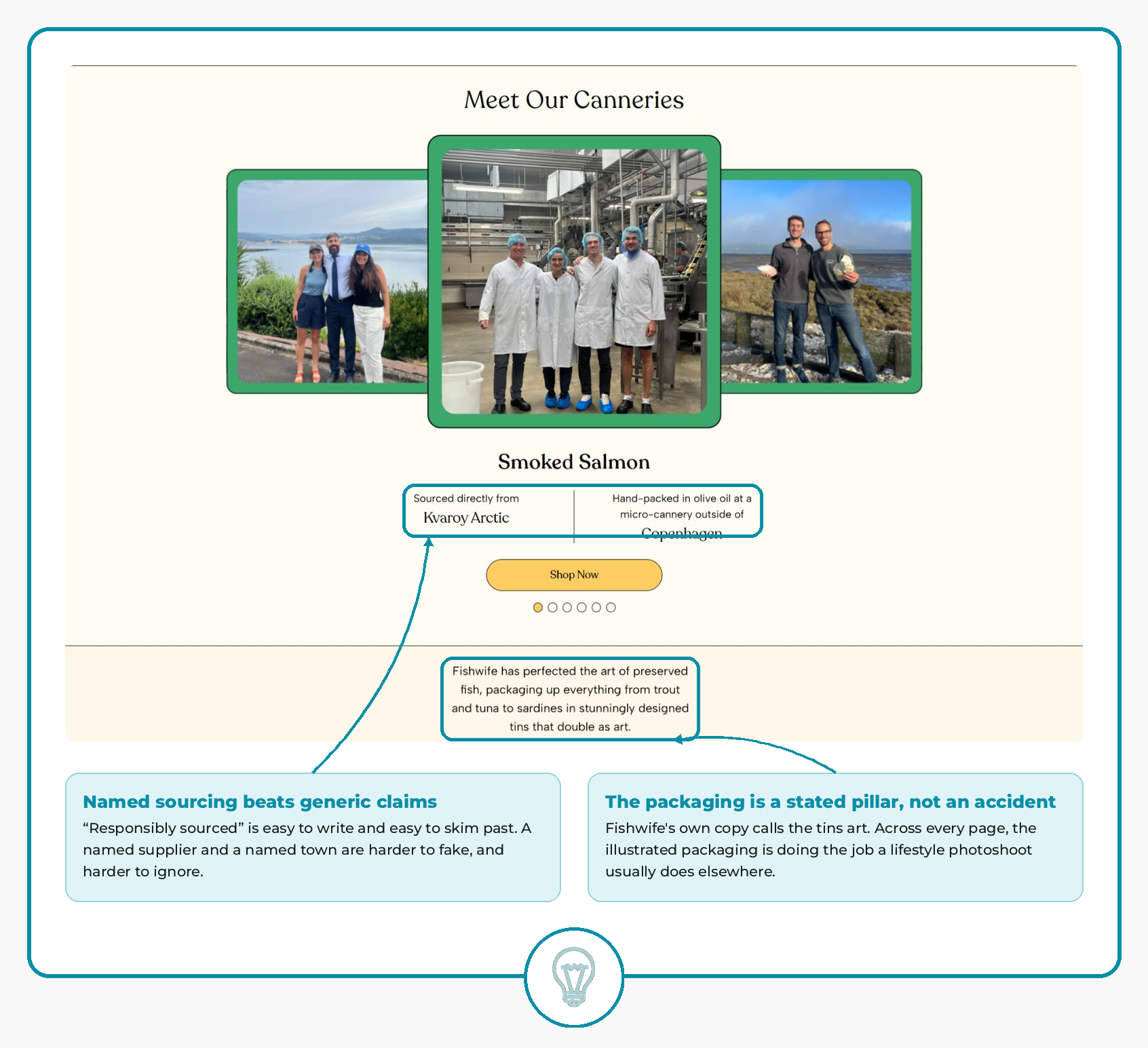
"Meet Our Canneries" trades the usual responsibly-sourced badge for something harder to fake: named suppliers. Smoked salmon is sourced directly from Kvaroy Arctic and hand-packed at a micro-cannery outside Copenhagen, shown with photos of the actual team in hairnets on a factory floor rather than stock imagery of a fishing boat at sunset.
Sitting just below it is a line worth noticing on its own: Fishwife's own copy describes its tins as art. That's not incidental. Every section on this list leans on the same illustrated packaging to do the job a lifestyle photoshoot usually does elsewhere, on the homepage hero, in the bundle grid, framing the popup. The design isn't sitting on top of the product. It's functioning as the site's primary content.

The buy box offers One-Time Purchase or Subscribe, and the subscription option leads with three bullets before it gets to the number: Subscribe & Save 10%, gifts on the 2nd and 3rd order, pause or cancel anytime. Ten percent alone rarely moves someone to commit to a recurring charge. Free gifts and an easy exit do more of that work than the discount does.
Below it, a "Buying Multiple Gifts?" banner sits inside the buy box itself rather than buried in a help article, catching multi-address gifting intent at the exact moment a shopper is deciding how many tins to order. It's a narrow use case, but it's answered right where the question would actually occur to someone, which is most of what good conversion rate optimization comes down to.

An AI-written summary sits above the star breakdown, distilling 34 reviews into flavor, texture, and versatility before a shopper reads a single one. It's a small addition, but it means the page's social proof gets consumed in seconds instead of requiring a scroll through individual reviews to find the pattern.
One of those reviews does something the summary can't. A five-star review titled "The very best" describes hoarding the last three tins because they weren't in stock, and worrying about having to go without. That's an actual customer independently confirming the exact anxiety the homepage headline is selling against. Restock urgency isn't just copy on this site, it's something customers lived through and wrote about unprompted.
.png)
Fishwife's Build Your Own Bundle tool offers three sizes, 9, 12, or 15 tins, and the 12-tin option arrives pre-selected, badged with its own 10% off tag next to 15% off on the largest size. Nine tins is the cheap option. Fifteen is the deal. The default sits exactly where average order value wants it to.
Underneath the size picker, three empty dashed slots and a 0-to-12 counter turn filling the bundle into something closer to a checklist than a cart. Every "Add to Bundle" click on the product grid fills a slot and moves the counter, giving a shopper a visual sense of progress toward a number they've already committed to, rather than just watching a total climb.
The mechanic isn't unique to Fishwife. Wild leans on the same pairing of bundles and subscriptions to lift average order value, which is worth a look if you're deciding where to set your own default tier.
Every section here is solving a different problem. The popup sorts a stranger before it asks for their email. The homepage turns a stockout into urgency and lets its own copy make the case for its packaging. The product page borrows AI to skim reviews and lets a customer's own words do the reassuring. The bundle builder nudges toward the middle tier without ever admitting that's what it's doing.
None of it depends on the tins looking as good as they do, a brand can borrow the mechanics here without borrowing the illustration budget. What's harder to copy is the discipline behind it: building every one of these moments around a specific point of hesitation, rather than bolting on generic best practice and hoping it sticks. That discipline is a better explanation for 180% growth in a category that grew 1% than the packaging ever will be on its own.
If you're looking at your own product pages wondering which of these gaps is costing you conversions, that's exactly the kind of audit we run for ecommerce brands.
