
Momentous has grown revenue by more than 1,200% since merging with human performance company Amp Human in 2021, enough to land it on the Inc. 5000 list for three consecutive years. That kind of growth in supplements doesn't happen on product alone. The category is full of brands making similar claims about purity and performance, and Momentous's website is built to make its version of that claim harder to doubt than everyone else's.
In this breakdown, we're looking at six moments across Momentous's homepage, popup and product pages where the site turns a quality claim into something closer to proof, and what other ecommerce brands running conversion rate optimisation (CRO) alongside paid media can take from it.
In this article
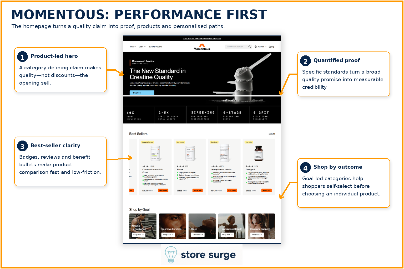
Most supplement brands open with a discount. Momentous opens with a claim: "The New Standard in Creatine Quality." It's a bold line to lead with, and on its own it would be easy to scroll past. What makes it work is what sits directly underneath it.
A row of five hard numbers, 10x fewer impurities, 2 to 5x stricter heavy metal limits, screening for PFAS and microplastics, 6-stage testing and certification, turns a vague quality claim into something that reads like a spec sheet. Visitors don't have to take Momentous's word for it. They're handed a scoreboard instead.
Scroll further and the Best Sellers row does the same job at the product level. Star ratings, review counts and benefit bullets sit directly on each card, so a shopper can compare four products without clicking into a single one. Below that, a Shop by Goal row (Athletic Performance, Cognitive Function, Sleep, Foundational Health, Hormone Support) lets visitors self-select by outcome before they've committed to a specific SKU, which matters for a brand with a wide catalogue: it narrows the decision before it starts.
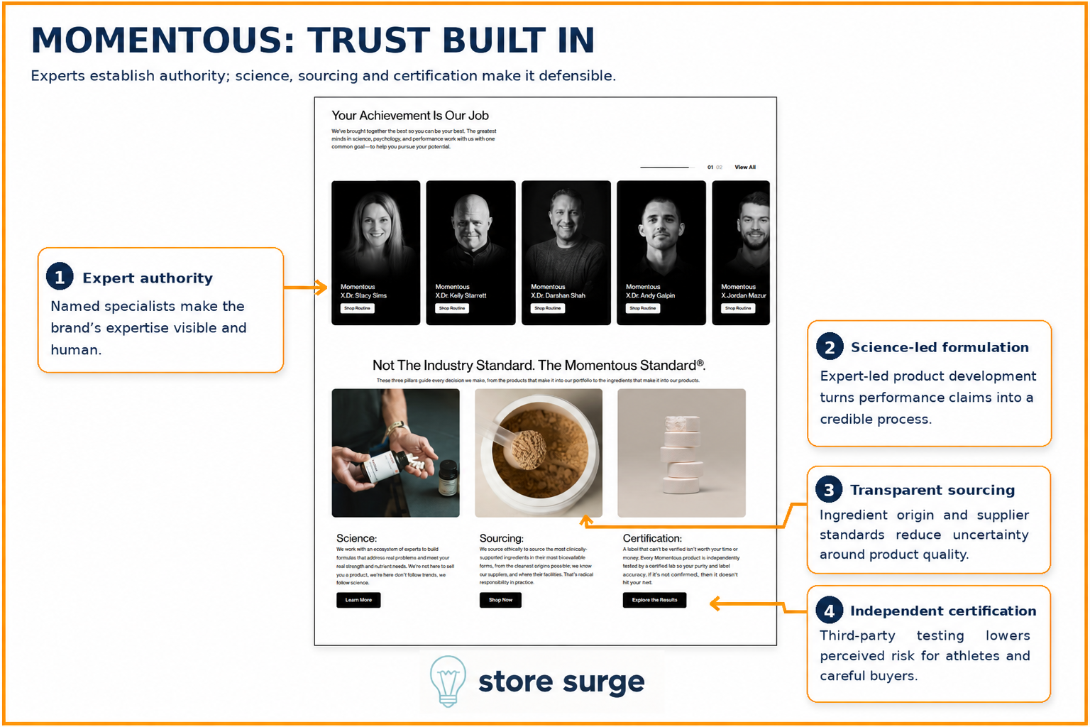
Further down the homepage, Momentous puts faces to its expertise. A row of named specialists, Dr. Stacy Sims, Dr. Kelly Starrett, Dr. Darshan Shah and others, sits under the line "Your Achievement Is Our Job." It's a small design choice with a real effect: a supplement brand claiming scientific backing is a lot more convincing when the scientists are visible and named, rather than referenced as an anonymous "team of experts."
Below the specialists, three pillars, Science, Sourcing and Certification, break the trust claim into parts a skeptical buyer can actually evaluate. Sourcing addresses where ingredients come from. Certification addresses whether a label can be verified. Each pillar links out to more detail rather than asking visitors to take a single paragraph on faith.
This is the section doing the most defensive work on the site. Athletes and health-conscious buyers are exactly the audience most likely to ask "prove it," and Momentous answers that question before it gets asked.
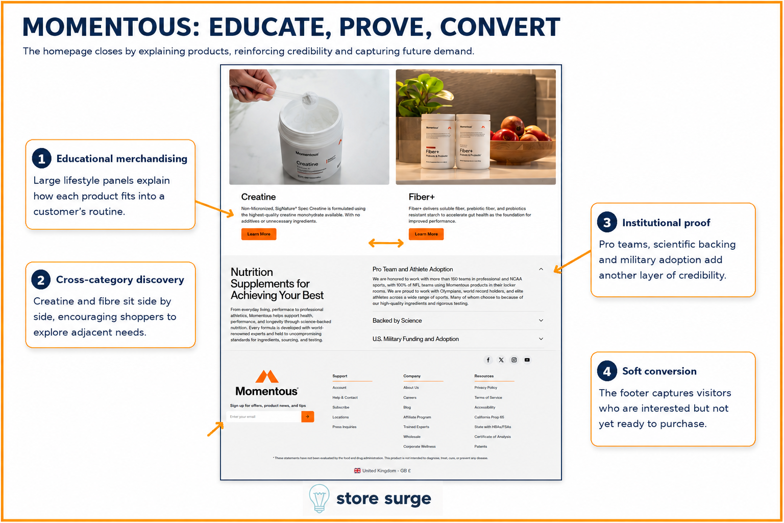
The homepage doesn't end with a hard sell. It ends by teaching. Large lifestyle panels for Creatine and Fiber+ explain what each product does and how it fits into a daily routine, sitting side by side so a visitor who came for one product notices there's a reasonable case for the other too.
Underneath, an accordion titled "Nutrition Supplements for Achieving Your Best" stacks three more layers of proof: adoption by more than 150 professional and NCAA teams, including 100% of NFL teams, a "Backed by Science" section, and a "US Military Funding and Adoption" section. None of these claims are new information at this point in the page, but repetition of specific, named proof points (not just "trusted by athletes") keeps reinforcing the same argument from a different angle each time.
Finally, the footer catches anyone who scrolled the whole page and still isn't ready to buy. A simple email signup field gives Momentous a second chance to capture that visitor as a subscriber rather than losing them entirely, a low-friction net at the exact point most brands stop trying.
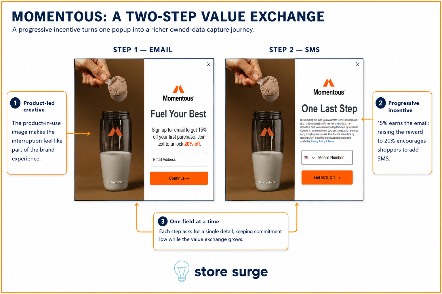
Momentous's popup asks for one thing at a time. Step one offers 15% off for an email address, framed under "Fuel Your Best" with a product-in-use photo that makes the interruption feel like part of the brand rather than a bolted-on discount box. Step two, shown only after email is submitted, raises the offer to 20% off in exchange for a mobile number.
The sequencing is the interesting part. Asking for email and phone number in the same form would have been one bigger ask with one bigger drop-off point. Splitting it into two single-field steps, each with its own reward, keeps the commitment small at every stage while still growing the total value exchanged. Someone who only wanted the email discount can stop at step one with zero friction. Someone willing to go further gets rewarded for it.
Once that email and number are captured, the real return comes from what happens next: welcome flows, replenishment reminders and back-in-stock alerts through email marketing and SMS, which is where a single popup interaction turns into a repeatable revenue channel.
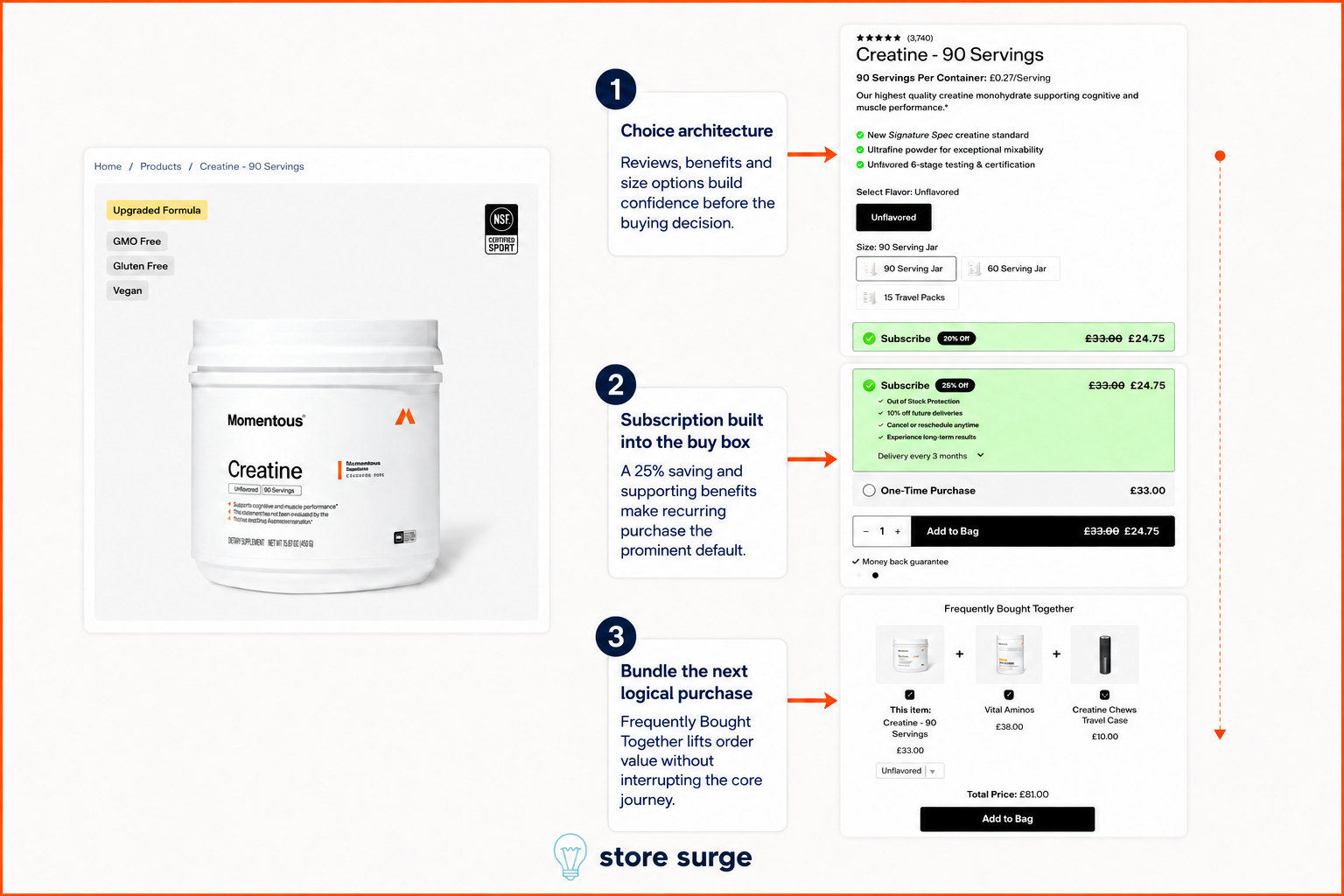
The Creatine product page stacks its confidence-building elements before it ever asks for a decision. A 4.9-star rating with review count, a clear benefit list and straightforward size options (90 Serving Jar, 60 Serving Jar, 15 Travel Packs) all sit above the buy box, so by the time a visitor reaches the purchase decision, most of the thinking has already been done for them.
The buy box itself has a clear default. Subscribe is pre-selected and highlighted in green, showing a 25% saving alongside supporting benefits: out-of-stock protection, 10% off future deliveries, and cancel or reschedule anytime. One-Time Purchase is still available, but it's the secondary, unstyled option underneath. Momentous isn't hiding the one-time option, it's just making the higher-LTV choice the path of least resistance.
Below the buy box, a Frequently Bought Together module bundles the same Creatine with Vital Aminos and a Creatine Chews travel case, each with its own checkbox and a running total. It's a low-effort way to lift average order value without interrupting the primary purchase decision above it.
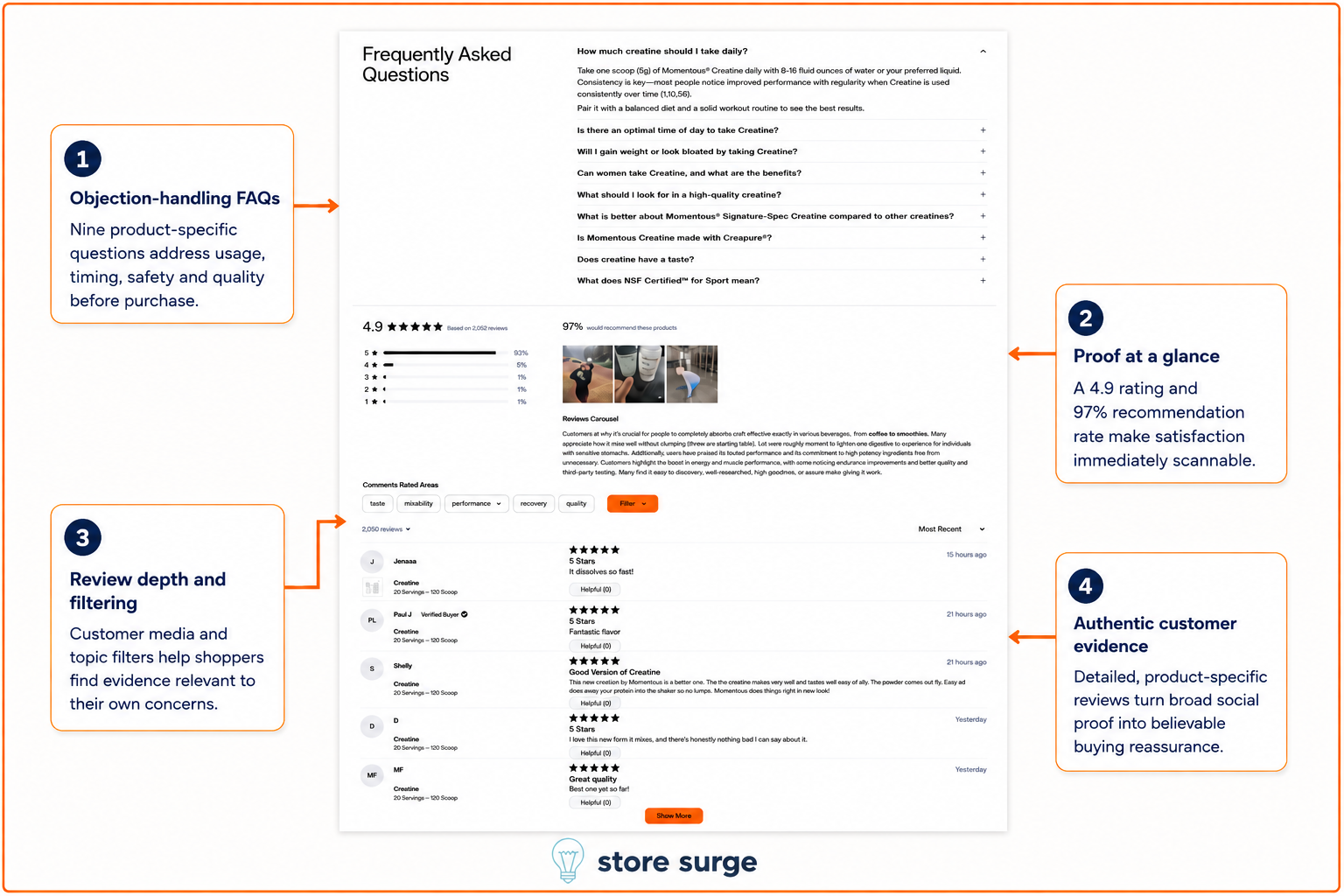
Further down the same product page, a nine-question FAQ handles the objections a buy box can't: dosing, timing, side effects, and how Momentous's Signature Spec Creatine compares to competitors. Answering these questions on the product page itself, rather than pushing shoppers to a separate help centre, keeps hesitant buyers from leaving the page to go find the answer elsewhere.
Directly below the FAQ, a 4.9 rating from over 2,000 reviews and a 97% recommendation rate give visitors an instant, scannable read on satisfaction before they scroll further. Filters for taste, mixability, performance, recovery and quality let shoppers jump straight to the specific concern they came in with, rather than scrolling through reviews that aren't relevant to them.
The reviews themselves are detailed and specific rather than generic five-star noise, which matters more than the star rating alone. A handful of short, credible, product-specific reviews do more to close a hesitant buyer than a large number of vague ones.
The thread running through all six of these moments is the same: Momentous rarely asks a visitor to simply trust a claim. Every quality statement gets a number attached to it, every popup ask gets broken into a smaller step, and every purchase decision gets a pre-selected default that's already been justified above it.
None of these are complicated changes to build. What makes them effective is that they're applied consistently, from the first stat under the hero through to the last review filter on the product page, so trust keeps compounding rather than resetting at every new section.
If you're looking to apply similar thinking to your own Shopify or WooCommerce store, get in touch. We help ecommerce brands build this kind of full-funnel CRO system, from popups and homepage proof through to product page and checkout.
