
The athleisure market has become one of the most competitive sectors in ecommerce. With established names like Gymshark, Lululemon and Alo Yoga competing for attention, simply offering high-quality products is no longer enough. Brands also need to create a shopping experience that reduces hesitation and makes purchasing feel effortless.
TALA has grown rapidly by combining premium activewear with a clean, modern digital experience. Rather than overwhelming visitors with aggressive sales tactics, the brand focuses on subtle conversion rate optimisation (CRO) techniques that build confidence at every stage of the customer journey.
From its email capture strategy and homepage design to its product pages, cart and checkout, each touchpoint has been carefully considered to remove friction and encourage purchases.
In this breakdown, we'll analyse five areas of TALA's ecommerce store and highlight practical CRO ideas that other Shopify brands can apply to increase conversions, improve average order value and create a smoother buying experience.
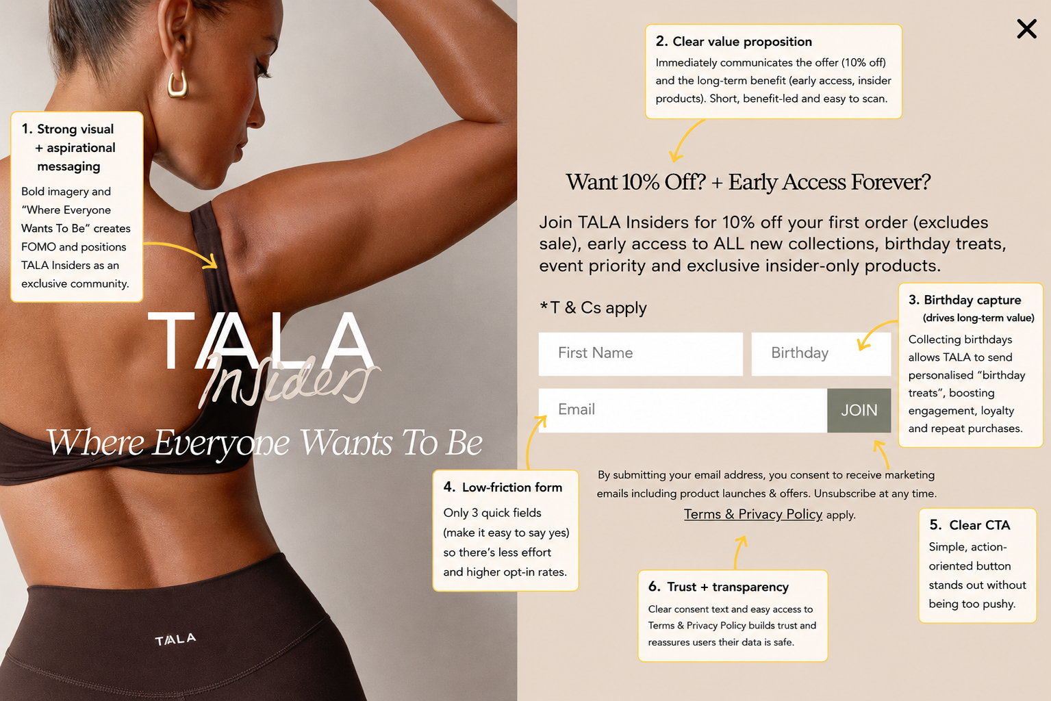
Before visitors have even started browsing, TALA presents a well-balanced email popup designed to grow its marketing list without feeling overly intrusive. Rather than offering a simple percentage discount, the popup combines an immediate incentive with longer-term value, giving shoppers multiple reasons to sign up.
The headline immediately communicates the offer: 10% off the first order, followed by early access to new collections, exclusive products and event priority. This shifts the focus away from a one-time discount and positions TALA Insiders as an exclusive community that shoppers will continue to benefit from long after their first purchase.
One particularly interesting addition is the birthday field. While it adds a small amount of friction to the form, it gives TALA valuable first-party data that can be used to trigger personalised birthday email campaigns and exclusive offers.
These automated touchpoints typically achieve significantly higher engagement than standard promotional emails and help strengthen customer loyalty over time.
The form itself remains simple, asking for just a first name, birthday and email address, while the prominent Join button makes the next step obvious. Clear consent messaging and links to the privacy policy also provide reassurance that customer data will be handled responsibly.
This is where email marketing platforms such as Klaviyo become especially powerful. Capturing an email address is only the beginning; the real value comes from the automated welcome series, abandoned cart reminders, birthday campaigns and product launch emails that follow. When implemented well, these flows consistently rank among the highest-return marketing channels for ecommerce brands.
Key takeaway: TALA's popup doesn't simply collect email addresses. It builds a valuable first-party audience that can be nurtured through personalised email marketing, turning first-time visitors into repeat customers over the long term.
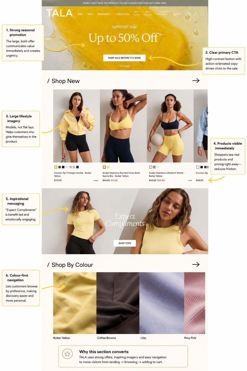
A homepage has one primary job: move visitors from curiosity to product discovery as quickly as possible. Rather than overwhelming shoppers with lengthy brand messaging or dozens of competing promotions, TALA keeps the experience focused on helping visitors start browsing almost immediately.
The first thing visitors see is a bold seasonal promotion with a clear call-to-action. The "Up to 50% Off" message instantly communicates value, while the "Shop Sale Before It's Gone" button gives shoppers a simple next step. This combination of a compelling offer and a prominent CTA reduces hesitation and encourages users to begin exploring the catalogue without unnecessary friction.
Below the hero banner, TALA immediately showcases products instead of making customers search for them. Large lifestyle photography allows shoppers to visualise how the clothing looks when worn, while pricing and colour options are visible without requiring another click. This removes friction from the discovery process and helps visitors compare products much faster.
Another subtle but effective conversion tactic is the use of aspirational messaging. Rather than focusing solely on product specifications, copy such as "Expect Compliments" sells the outcome rather than the garment itself. It's a small detail, but messaging that taps into emotion often resonates more strongly than simply listing features.
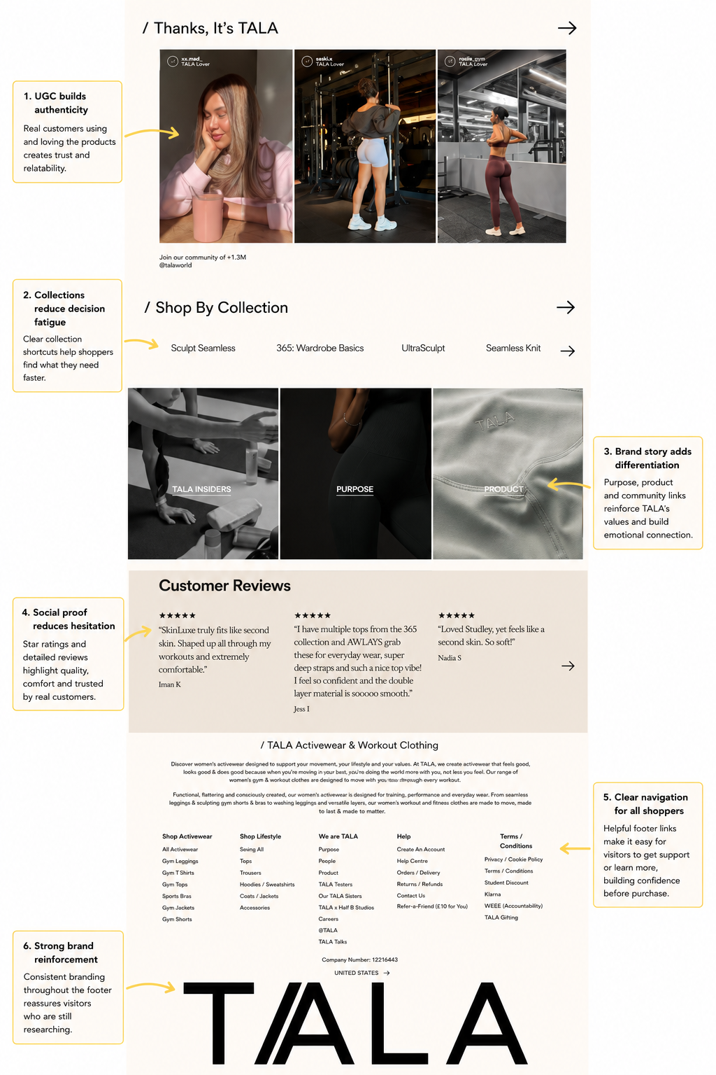
TALA also introduces an interesting browsing shortcut through its Shop By Colour section. Instead of asking customers to navigate through multiple collections or filters, shoppers can begin with the colour palette they're already interested in. For fashion retailers, this creates a more intuitive browsing experience and helps visitors discover products that match their preferences with fewer clicks.
Further down the homepage, the focus shifts from product discovery to building trust. User-generated content is prominently featured through the TALA Insiders section, showing real customers wearing the products in everyday settings. This provides authentic social proof while reinforcing the sense of community surrounding the brand.
The homepage also uses curated collections to reduce decision fatigue. Rather than presenting hundreds of products, visitors are guided into clearly defined ranges such as Sculpt Seamless, 365 Wardrobe Basics, and UltraSculpt. For first-time shoppers especially, this makes navigating the catalogue feel much more manageable.
Finally, customer reviews, purpose-driven content and clear footer navigation provide reassurance for visitors who aren't yet ready to purchase. Instead of relying on aggressive sales messaging, TALA steadily builds confidence by demonstrating product quality, reinforcing its brand values and making it easy for shoppers to continue exploring the site.
Key takeaway: TALA's homepage doesn't try to sell immediately. It first helps visitors discover relevant products, then gradually reinforces trust through social proof, brand storytelling and intuitive navigation. It's a measured approach that reduces friction and naturally guides shoppers towards the next step in the buying journey.
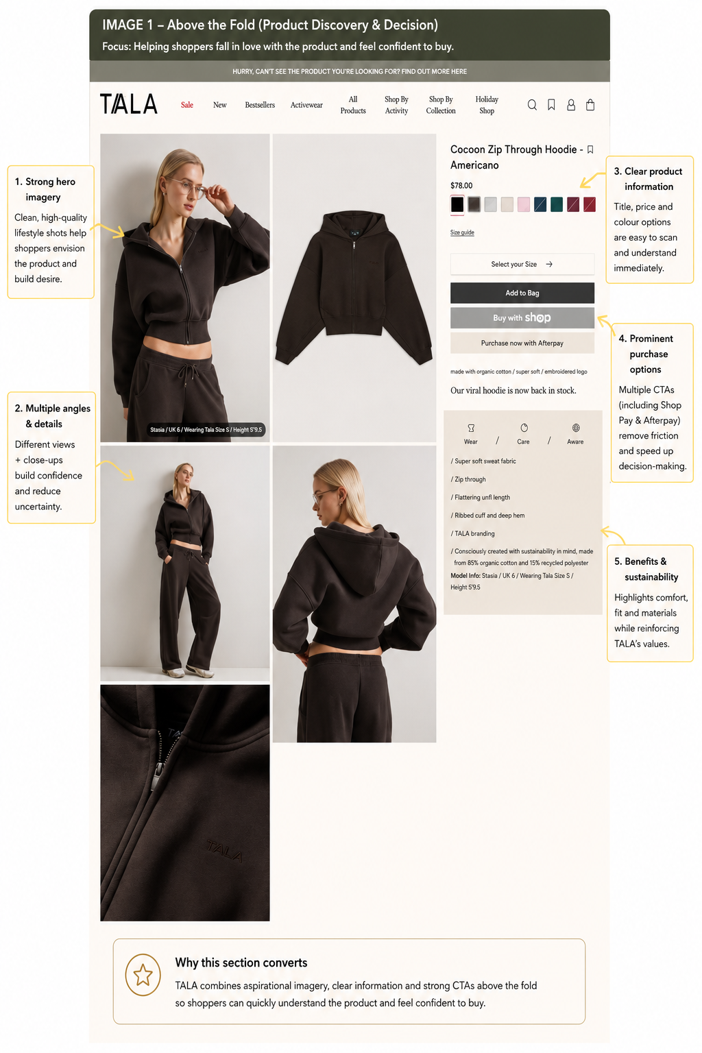
Once a visitor lands on a product page, the goal shifts from generating interest to building confidence. Every element should answer a potential objection before the customer has a chance to leave. TALA's product pages are designed with this in mind, combining high-quality visuals, concise product information and subtle reassurance throughout the buying journey.
The first thing that stands out is the photography. Rather than relying on a single product image, TALA showcases the hoodie from multiple angles, including full-body lifestyle shots, close-ups of the fabric and flat-lay imagery. This helps shoppers understand exactly what they're buying while reducing uncertainty around fit, texture and finish. For apparel brands, this is particularly important, as customers can't physically inspect the product before purchasing.
Product information is kept deliberately clean and easy to scan. Essential details such as colour options, price, size selection and key product benefits are positioned beside the imagery, allowing shoppers to make decisions without excessive scrolling. Instead of overwhelming visitors with lengthy descriptions, TALA highlights the most important selling points first, including the fabric, fit and construction, making the page feel approachable rather than intimidating.
The purchasing options are also given significant prominence. Alongside the primary Add to Bag button, customers can choose accelerated payment methods such as Shop Pay and Afterpay. Giving shoppers multiple ways to complete their purchase reduces friction and caters to different buying preferences, particularly on mobile devices where speed often has a direct impact on conversion rate.
TALA also reinforces its brand values without allowing them to dominate the page. Sustainability messaging is integrated naturally within the product information, highlighting recycled materials and responsible manufacturing alongside practical benefits like comfort and fit. This allows environmentally conscious shoppers to feel reassured without distracting from the primary goal of adding the product to their basket.
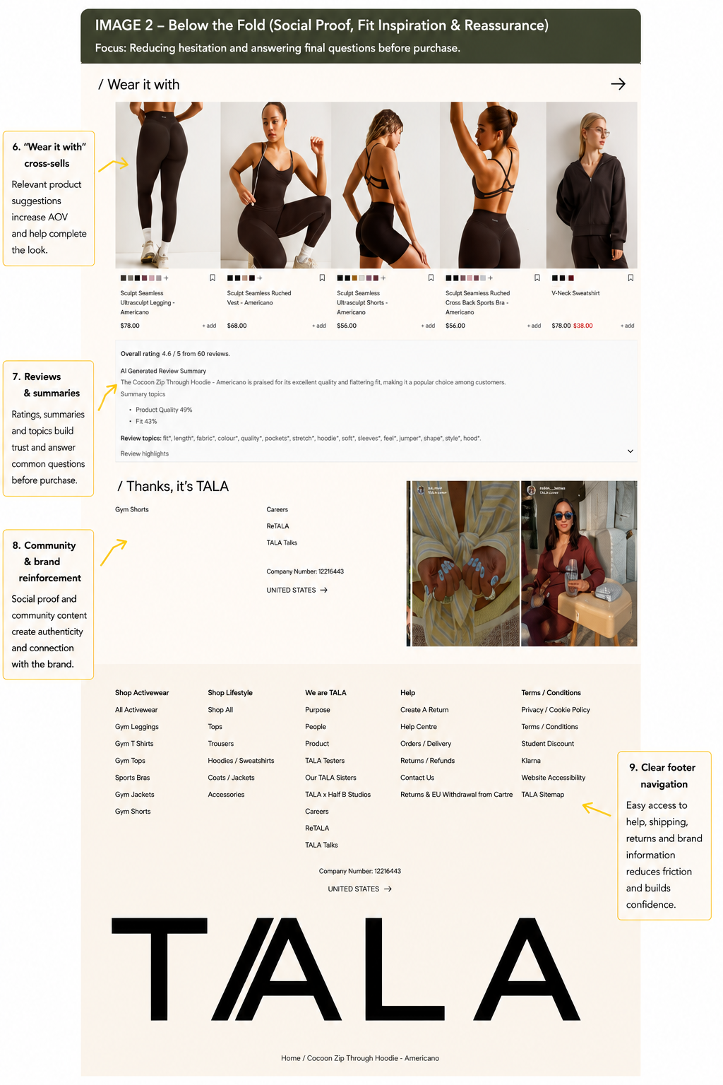
Further down the page, TALA continues removing objections before checkout. A "Wear it with" section introduces complementary products, increasing average order value while helping shoppers complete an outfit rather than purchasing a single item. Rather than feeling like an aggressive upsell, the recommendations remain highly relevant to the product being viewed.
The review section provides another layer of reassurance. Instead of simply displaying a star rating, TALA summarises common customer feedback, highlighting recurring themes such as product quality, fit and comfort. This allows visitors to understand the overall customer sentiment within seconds, without reading dozens of individual reviews.
Finally, community content and user-generated imagery reinforce the authenticity of the brand. Seeing real customers wearing the products after the purchase bridges the gap between polished product photography and real-world use, helping prospective buyers picture themselves owning the item.
Key takeaway: TALA's product pages focus on answering questions before shoppers ask them. Through premium imagery, concise product information, multiple payment options, relevant cross-selling and meaningful social proof, the brand steadily removes friction and builds the confidence needed to convert browsers into customers.
Many ecommerce brands treat the cart as little more than a holding page before payment. TALA takes a different approach by using it to reinforce confidence, create subtle urgency and remove any last-minute uncertainty before checkout.
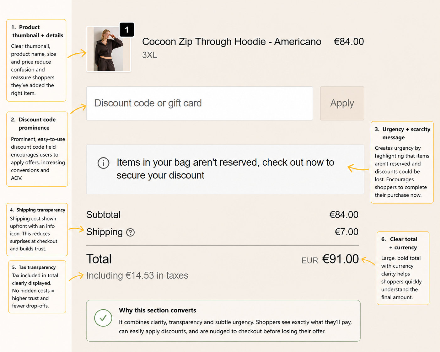
One of the first things shoppers see is a clear summary of the product they've added. The product thumbnail, name, size and price are all displayed prominently, allowing customers to quickly confirm they've selected the correct item. While simple, this reduces the chance of shoppers second-guessing their purchase or returning to the product page unnecessarily.
The discount code field is also given a prominent position. Rather than hiding promotional codes until later in the checkout, TALA makes it easy for customers to redeem offers without interrupting the purchasing journey. For returning shoppers with loyalty rewards or promotional emails, this creates a smoother experience and removes unnecessary friction.
Perhaps the most effective element, however, is the subtle urgency message:
"Items in your bag aren't reserved, check out now to secure your discount."
Unlike aggressive countdown timers or stock warnings, this gently reminds shoppers that delaying their purchase carries some risk. It's a low-pressure way of encouraging immediate action while reinforcing the value of the current offer.
Transparency also plays an important role throughout the cart. Shipping costs are displayed before payment, supported by an information icon for additional clarification. Taxes are also clearly broken out within the total, ensuring shoppers understand exactly what they'll pay before progressing to checkout. Unexpected costs remain one of the biggest causes of cart abandonment, so presenting this information early helps build trust and reduces unpleasant surprises.
Finally, the order total is displayed prominently with the selected currency clearly shown. There is no ambiguity about the final amount due, making it easier for customers to make a confident purchasing decision.
Key takeaway: Rather than relying on aggressive sales tactics, TALA's cart focuses on clarity, transparency and subtle urgency. By confirming product details, surfacing costs early and encouraging timely checkout without overwhelming the shopper, the brand keeps purchase momentum moving towards completion.
TALA's success isn't built on a single clever landing page or a generous discount. Instead, it's the result of dozens of thoughtful CRO decisions working together throughout the customer journey.
The email popup captures valuable first-party data while encouraging long-term engagement. The homepage quickly moves visitors from inspiration to product discovery before reinforcing trust through community content and social proof. Product pages answer common questions with premium imagery, concise information and relevant cross-selling, while the cart and checkout continue to reduce friction through transparency, subtle urgency and clear pricing.
Individually, many of these improvements appear relatively small. Collectively, however, they create a smoother buying experience that helps convert more visitors into customers while increasing customer lifetime value.
For ecommerce brands, that's perhaps the biggest lesson from TALA. Conversion rate optimisation isn't about one dramatic change—it's about continually removing friction at every stage of the shopping journey. From your first email capture through to checkout, every touchpoint presents an opportunity to build confidence and increase revenue.
If you'd like to apply similar CRO strategies to your own Shopify store, get in touch. We help ecommerce brands improve conversion rates through CRO Shopify optimisation, email marketing, Google Ads agency management & Facebook Ads agency management, turning more of your existing traffic into paying customers.
