
Owala's growth over the past two years is one of the standout stories in ecommerce drinkware. Between January and August 2024 alone, the brand's monthly sales volume grew by more than 400%, with revenue up over 200% in the same window. Stanley, the category's long-time leader, saw its share of the market fall from close to 80% to under 45% over that period, and by 2025 Owala had overtaken it in ecommerce sales entirely.
Growth like that isn't just a product story. Owala's website, email flows and merchandising are built around a specific sequence of decisions that reduce friction, manufacture urgency and quietly grow order value at every stage. In this teardown, we're breaking down six of those decisions and what other ecommerce brands, particularly anyone running conversion rate optimisation (CRO) alongside paid media, can take from them.
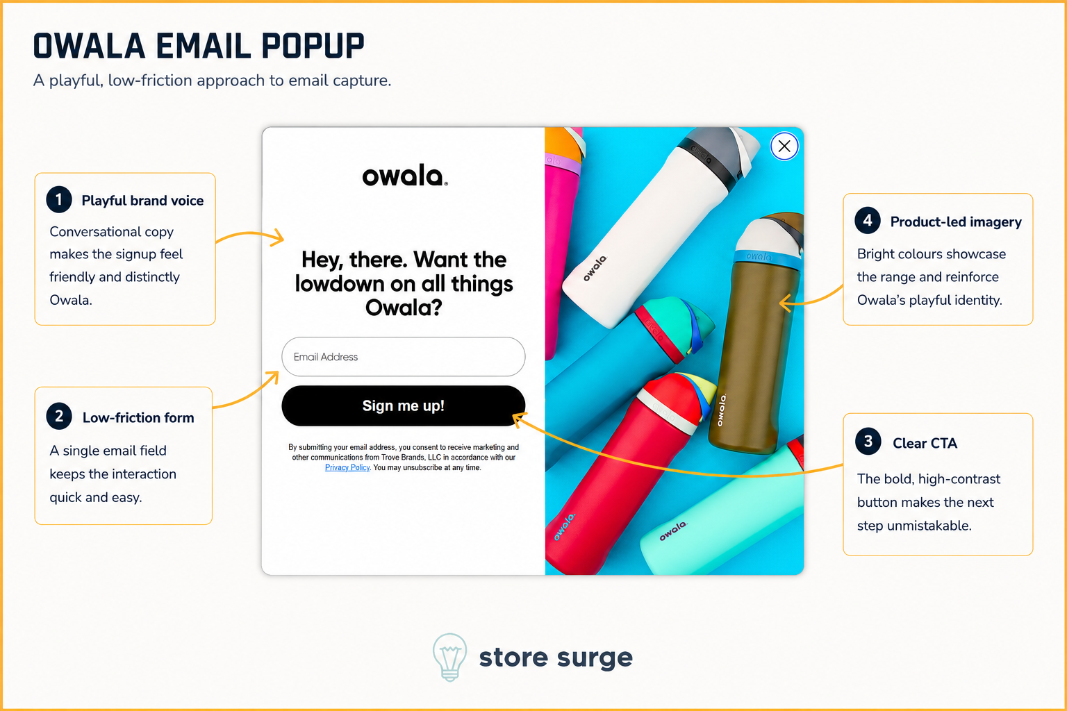
Owala's email popup skips the standard "10% off your first order" formula entirely. Instead, the headline reads like a text from a friend: "Hey, there. Want the lowdown on all things Owala?" It's a small choice, but it sets the tone for a brand that leans on personality rather than discounting to earn a subscriber.
The form itself asks for nothing but an email address, which keeps the interaction quick and removes any reason to hesitate. A single, high-contrast "Sign me up!" button makes the next step obvious, and the surrounding imagery does a lot of the selling on its own: a wall of bottles in bright, distinct colourways, immediately communicating the range and the playful identity the brand is known for.
None of this works without a plan for what happens after signup. Once that email address is captured, it feeds into welcome sequences, colour drop alerts and back-in-stock flows, exactly the kind of automated email marketing that turns a single popup into a recurring revenue channel.
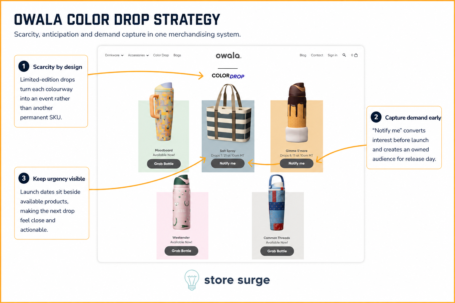
Owala's Color Drop page is where the brand's biggest lever gets pulled: manufactured scarcity. Limited-edition colourways like Moodboard, Salt Spray and Gimme S'more are framed as events rather than permanent additions to the range, each with its own launch date sitting directly beside the product.
The "Notify me" button on unreleased colours is doing more work than it looks like. It converts interest before a single unit is available, and it builds an owned audience for release day that doesn't depend on organic reach or ad spend to activate. By the time a colour actually drops, Owala already knows who wants it.
Keeping launch dates visible next to already-available products is a subtle but effective touch too. It keeps the next drop feeling close and worth checking back for, which is exactly the kind of repeat-visit behaviour a purely evergreen catalogue struggles to generate.
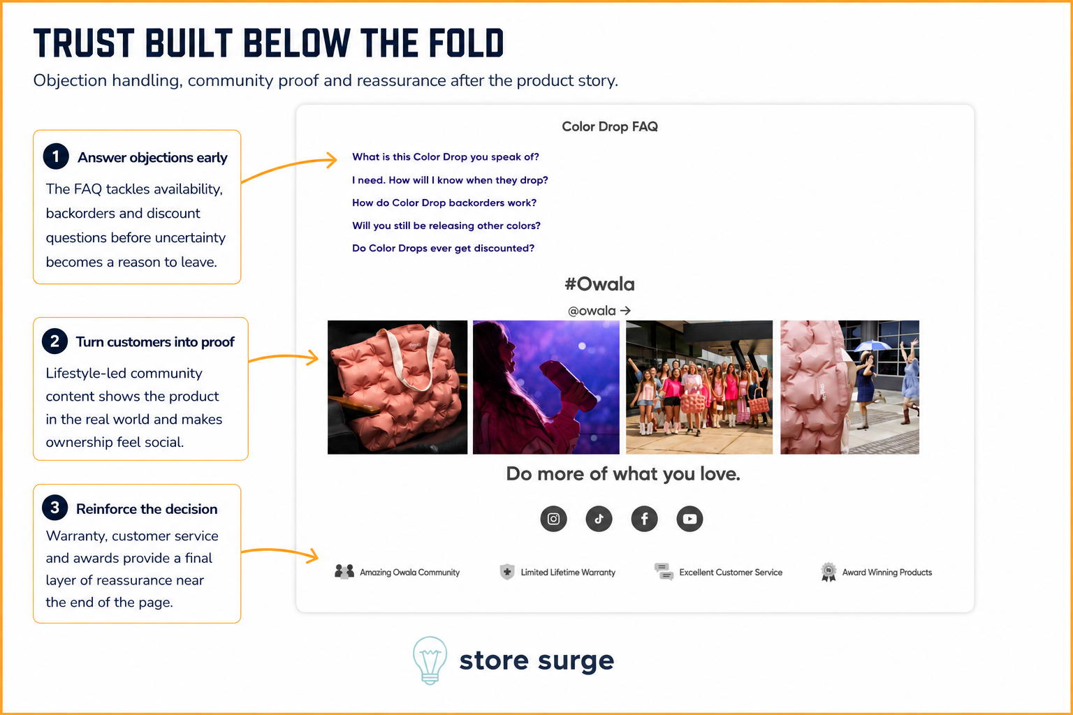
Once the product story has been told, Owala shifts into objection handling. A Color Drop FAQ sits directly beneath the product grid, answering the exact questions a scarcity-driven model raises: how backorders work, whether other colours are still coming, whether drops ever get discounted. Answering these before a shopper has to ask them removes a common reason to leave and look elsewhere.
Right below the FAQ, a wall of lifestyle UGC tagged #Owala turns real customers into proof. Seeing the product carried, worn and used in everyday settings does more for credibility than another product shot could, and it reinforces that buying into Owala means buying into a community, not just a bottle.
The page closes with a short row of reassurance icons: community, limited lifetime warranty, customer service, award-winning products. None of it is flashy, but placed this late in the page it acts as a final layer of confidence for anyone still on the fence.
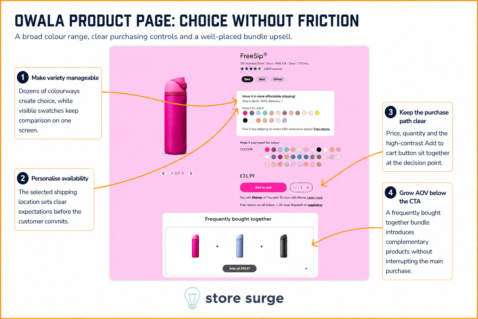
With dozens of colourways across its range, Owala has a genuine choice problem to solve on the product page, and it handles it well. Every available swatch is visible on one screen, so comparing colours never requires extra clicks or a separate page load.
Shipping location is captured early and used to set a specific delivery date, which replaces a vague delivery estimate with something concrete a shopper can plan around. Price, quantity and the high-contrast "Add to cart" button all sit together at the natural decision point, so there's no searching for the next step once a colour is chosen.
Below the fold, a "Frequently bought together" bundle introduces two or three complementary colours with a single "Add all" button. It's an easy way to grow average order value without interrupting the primary purchase, and it works because the recommendation is simply more of a product the shopper has already decided they want.
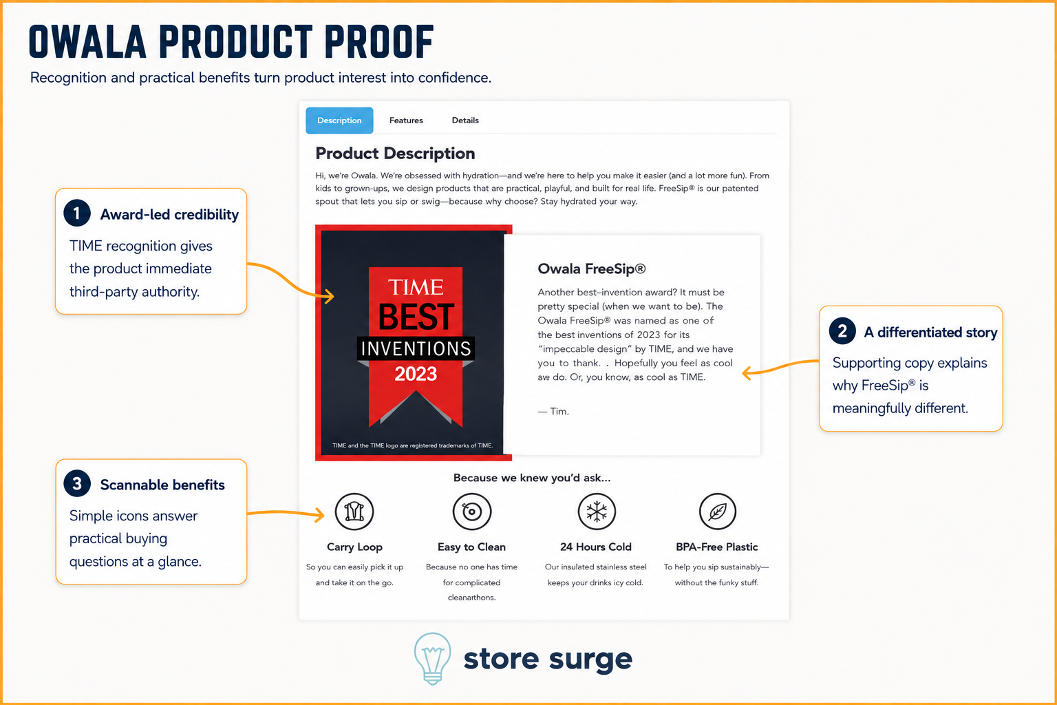
Further down the product page, Owala uses its description tab to do some quiet reassurance work. A TIME Best Inventions 2023 badge sits prominently beside the copy, borrowing third-party credibility that's far more persuasive than anything the brand could claim about itself.
The product story underneath stays in the same playful voice as the rest of the site, explaining what makes the patented FreeSip spout different without reading like a spec sheet. It's brand personality doing double duty as product education.
A row of four benefit icons, Carry Loop, Easy to Clean, 24 Hours Cold, BPA-Free Plastic, closes out the section. Each answers a specific, practical question a shopper might have before buying, in a format that can be scanned in seconds rather than read as a paragraph.
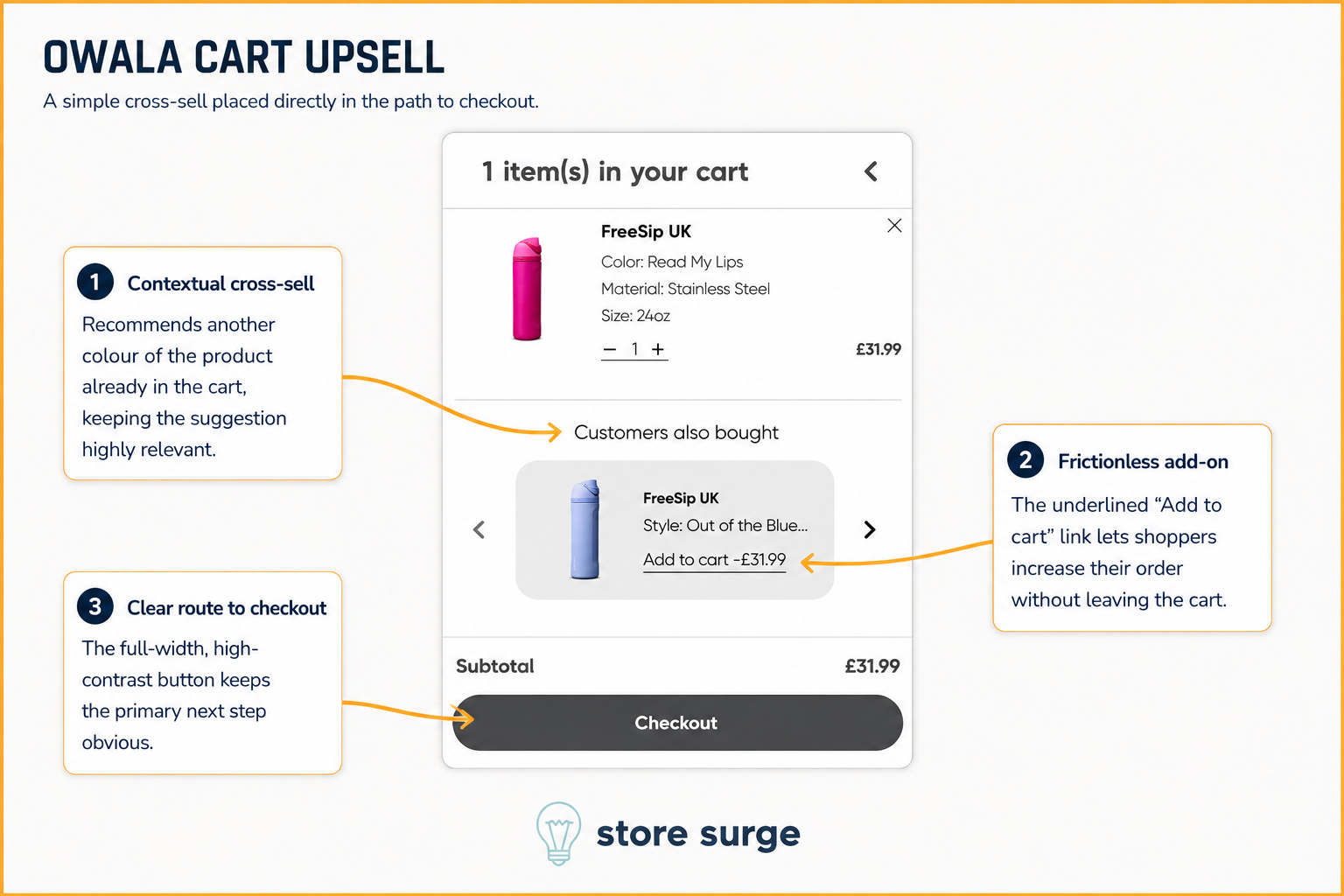
Owala's cart keeps the upsell simple and relevant. Rather than surfacing an unrelated accessory, "Customers also bought" recommends the same FreeSip bottle in a different colourway, the kind of suggestion that requires almost no persuasion because the shopper has already decided they want the product.
The add-on itself is frictionless. An underlined "Add to cart" link sits directly on the recommended product, letting shoppers increase their order without leaving the cart or restarting the checkout flow. It's a small detail, but every extra step at this stage is a chance for a shopper to reconsider.
A full-width, high-contrast "Checkout" button anchors the bottom of the cart, keeping the primary next step obvious even with the cross-sell competing for attention above it.
None of these six moments would move the needle much on their own. What makes Owala's website effective is that each one is doing a specific job: capturing an email, manufacturing urgency, answering an objection, simplifying a choice, borrowing credibility, or growing order value, and none of them get in the way of the others.
That's the pattern behind a lot of the fastest-growing DTC brands right now. Growth isn't one big redesign, it's a series of small, deliberate decisions compounding across the funnel.
If you're looking to apply similar thinking to your own Shopify store, get in touch. We help ecommerce brands build this kind of full-funnel CRO system, from email capture and product page design through to cart and checkout.
