
Stanley didn’t win the tumbler wars with a better bottle. Between 2019 and 2023, revenue went from roughly $73 million to $750 million. A 100 year old brand that spent a century selling flasks to tradesmen suddenly couldn’t keep the Quencher in stock.
The product barely changed. What changed was everything built around it: the popup that captured the email address, the homepage that sold a lifestyle before it sold a bottle, the product page that turned forty colourways into a reason to buy twice.
The virality is the part everyone talks about, and it’s also the part you can’t copy. You can’t manufacture a TikTok moment on demand. The conversion architecture sitting underneath it is a different story.
Strip away the celebrity collabs and the influencer moment that started it all, and what’s left is a site engineered to turn attention into email addresses, email addresses into first orders, and first orders into repeat ones. This is a conversion rate optimization exercise, and it’s one most ecommerce brands can actually run, whether or not they ever go viral.
We pulled apart eight sections of Stanley’s site: the popup, three homepage sections, the collection page, and three product page sections, to see exactly how each one is built to convert. Here’s the breakdown.
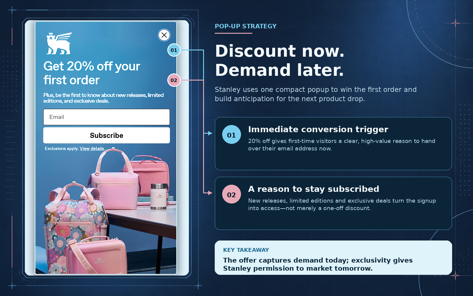
Stanley’s popup does the obvious thing first. Twenty percent off your first order, sitting on top of a stack of pastel bags and a tumbler. That single discount solves the hardest problem on any homepage: giving a stranger a reason to hand over their email before they’ve browsed anything.
The second line matters more than it looks like it should. “Be the first to know about new releases, limited editions, and exclusive deals” sits quietly under the discount, but it’s doing the real retention work. The discount gets the email. The promise of access is what keeps the list warm once the 20% off has already been spent.
This is the logic behind a good welcome flow, not just a popup. The signup form captures intent at the moment it’s highest.
What happens in the inbox after that determines whether the address turns into a customer once, or into someone who opens every drop for the next two years. Stanley’s popup is built for the second outcome. Most ecommerce popups are only built for the first.
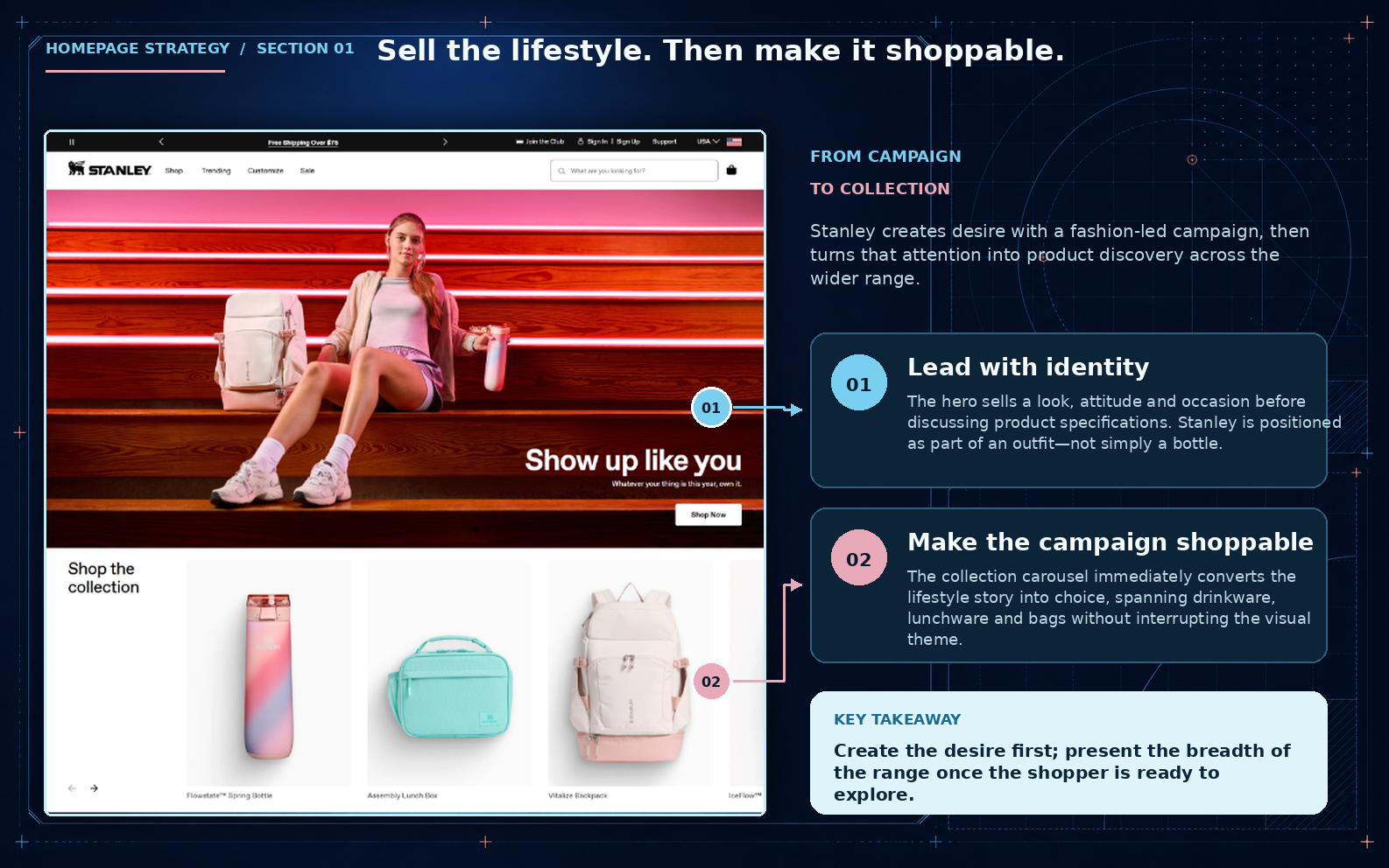
The hero is a girl sitting on neon lit steps in loungewear, tumbler in hand, next to the line “Show up like you.” No price, no spec sheet, no product callout inside the hero itself. Directly below it: a “Shop the collection” carousel spanning drinkware, lunchware, and bags, shot in the same soft, warm aesthetic as the hero.
The homepage sequences function and desire rather than trying to sell both in the same breath. The hero creates the pull, the carousel converts it immediately, before the shopper has to go hunting through a nav menu. It’s the same job a good top of funnel Meta ad campaign is doing: the ad creates the emotional pull, and the landing experience just needs to carry it through instead of resetting to a generic category grid.
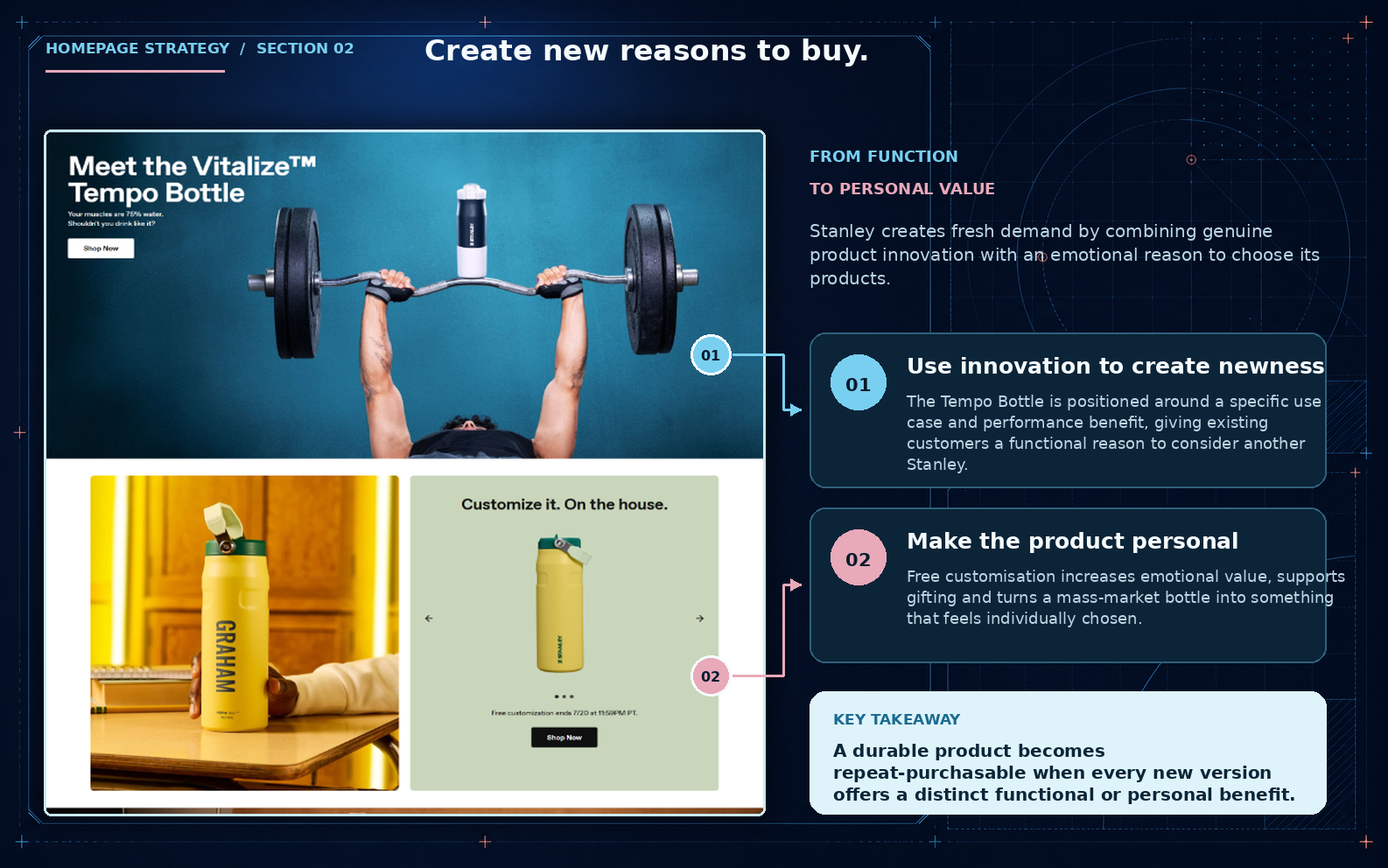
Further down, the Vitalize Tempo Bottle is pitched at a specific occasion: “your muscles are 75% water. shouldn’t you drink like it?” alongside a gym shot. Right after it, a free customisation module lets a shopper put a name on an existing bottle.
Two different plays, both solving the same underlying problem: Stanley sells a durable product with no natural repurchase cycle.
The Tempo Bottle creates a functional reason to buy another one. Free customisation creates a personal one, at close to zero product cost, since it’s a name print rather than a new SKU. Neither needs a discount to work.
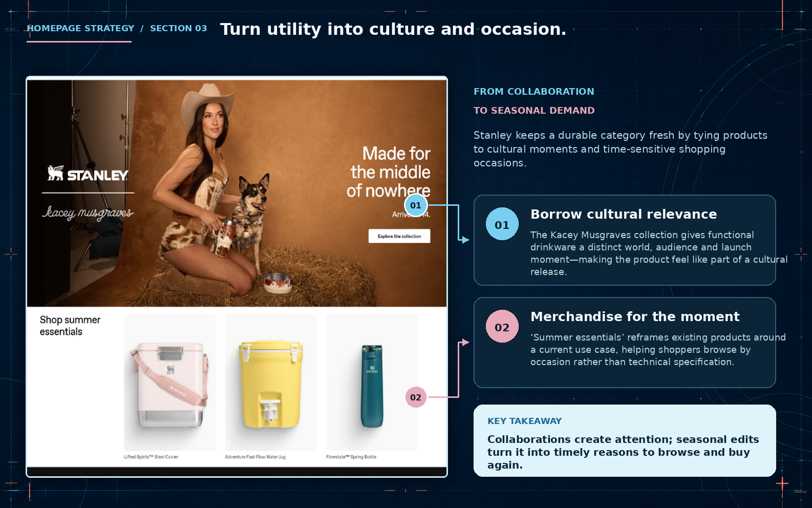
The third section is a Kacey Musgraves collaboration, cowboy hat, dog, hay bale, styled around “Made for the middle of nowhere.” Underneath it: “Shop summer essentials,” pulling existing coolers, jugs, and bottles into a seasonal grouping rather than presenting them as a new drop.
The collaboration borrows an audience Stanley doesn’t have to build itself. The “summer essentials” framing underneath then converts that attention using SKUs that already exist in the catalogue.
No new products, no new photography, just a new reason to look at what’s already there.
Across all three sections, the same product catalogue gets pitched three different ways: as an identity, as an occasion, and as a piece of culture.
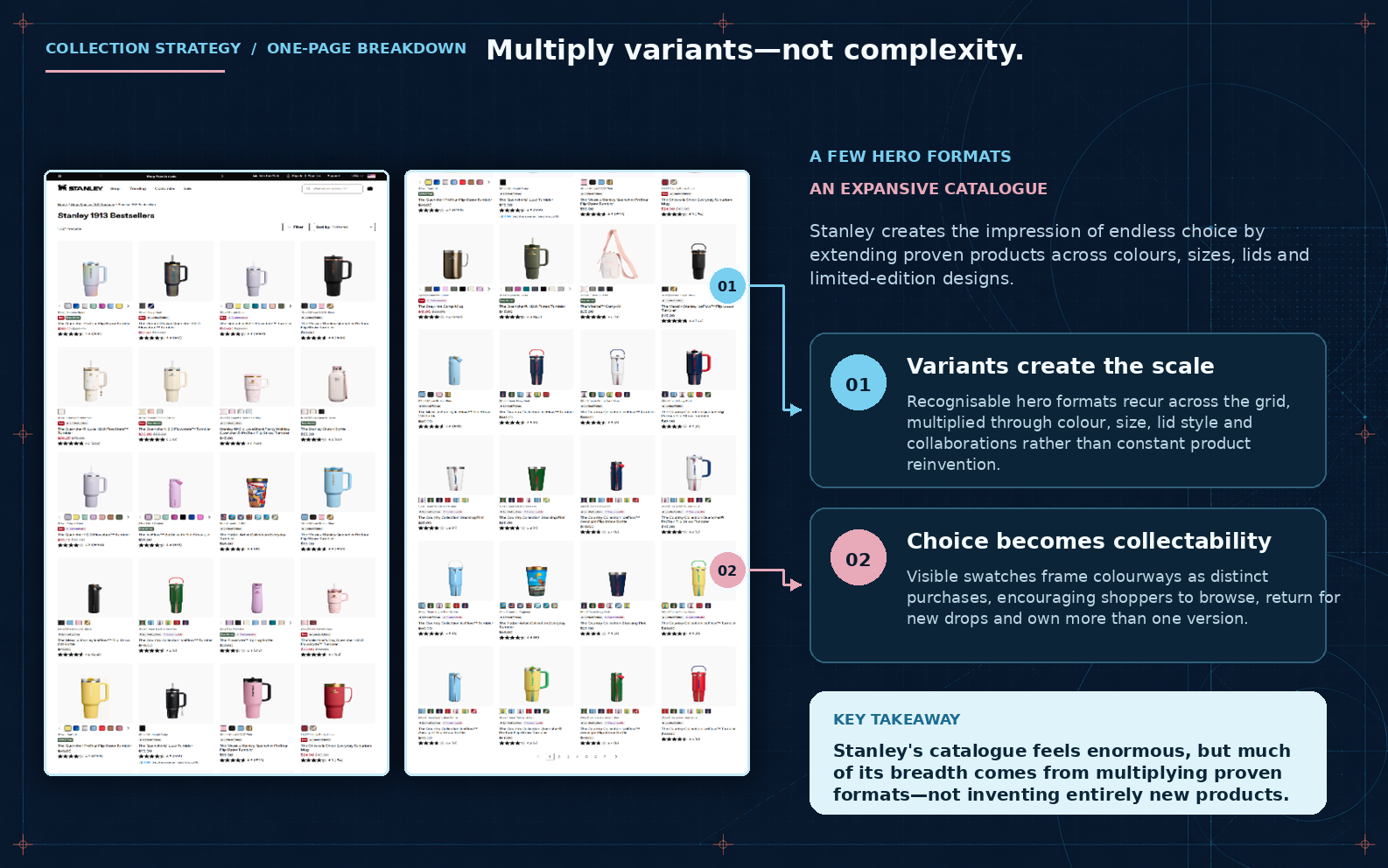
Stanley’s bestseller grid looks enormous. Scroll through it and you’ll see dozens of tumblers, mugs, and jugs in what feels like limitless combinations. Look closer and the trick becomes obvious.
A handful of hero formats (the Quencher, the IceFlow, the Adventure jug) repeat across colour, size, and lid style, with limited edition collaborations mixed in to break up the pattern.
Reinventing a physical product is slow and expensive. Multiplying a proven format across a colourway is nearly free by comparison. Stanley gets the appearance of constant newness without touching tooling, manufacturing, or supply chain, and every new colour drop is really just a variant of something already selling well.
The visible colour swatches on each product tile do more than help with browsing. They turn a single SKU into something that looks collectable. A shopper sees six colours of the same tumbler sitting side by side and starts thinking about which one they don’t own yet, rather than whether they need another tumbler at all.
That’s a category page structure decision, not a merchandising accident. It’s also one of the easier wins to copy if your catalogue already has a few strong hero products sitting underneath a messy or under-organised grid.
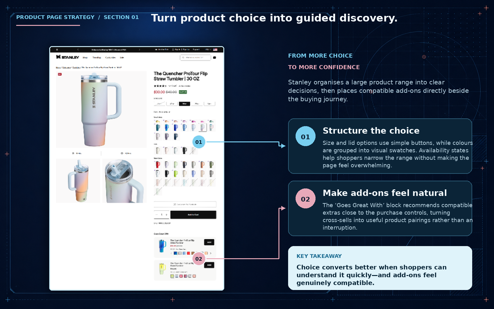
The Quencher’s product page could easily be an overwhelming grid of colours, sizes, and lid styles. Instead, size and lid are simple buttons, colours are grouped into visual swatches, and greyed out states show what’s sold out without needing extra copy to explain it. A shopper can narrow a huge range down to one option in a few taps.
Right below the add to cart button sits a “Goes Great With” block, pairing the tumbler with a straw lid or a matching accessory.
Placing it there, inside the purchase flow rather than as a popup or a separate carousel, is what makes a cross-sell feel like a useful pairing instead of an upsell interruption. That’s the kind of product page structure decision that quietly moves average order value without ever discounting anything.
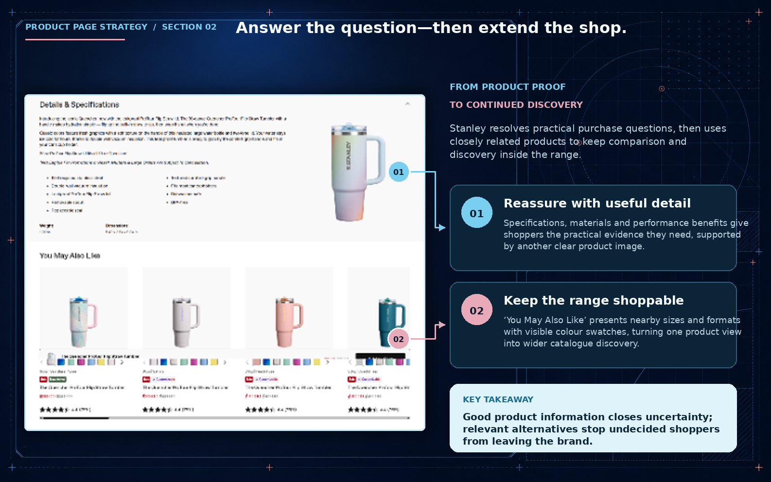
Scroll past the buy box and the page answers the boring but necessary questions: materials, dimensions, care instructions, warranty. This is the part most product pages skip or bury, and it’s exactly the content that removes hesitation for a shopper who’s already decided they like the product but wants to check it holds up.
Right after that comes “You May Also Like,” showing nearby sizes and colourways with their own visible swatches.
A shopper who came in undecided between two sizes doesn’t have to leave the page to compare them. The specs close out doubt, and the related products keep the shopper inside the catalogue instead of opening a new tab to check a competitor.
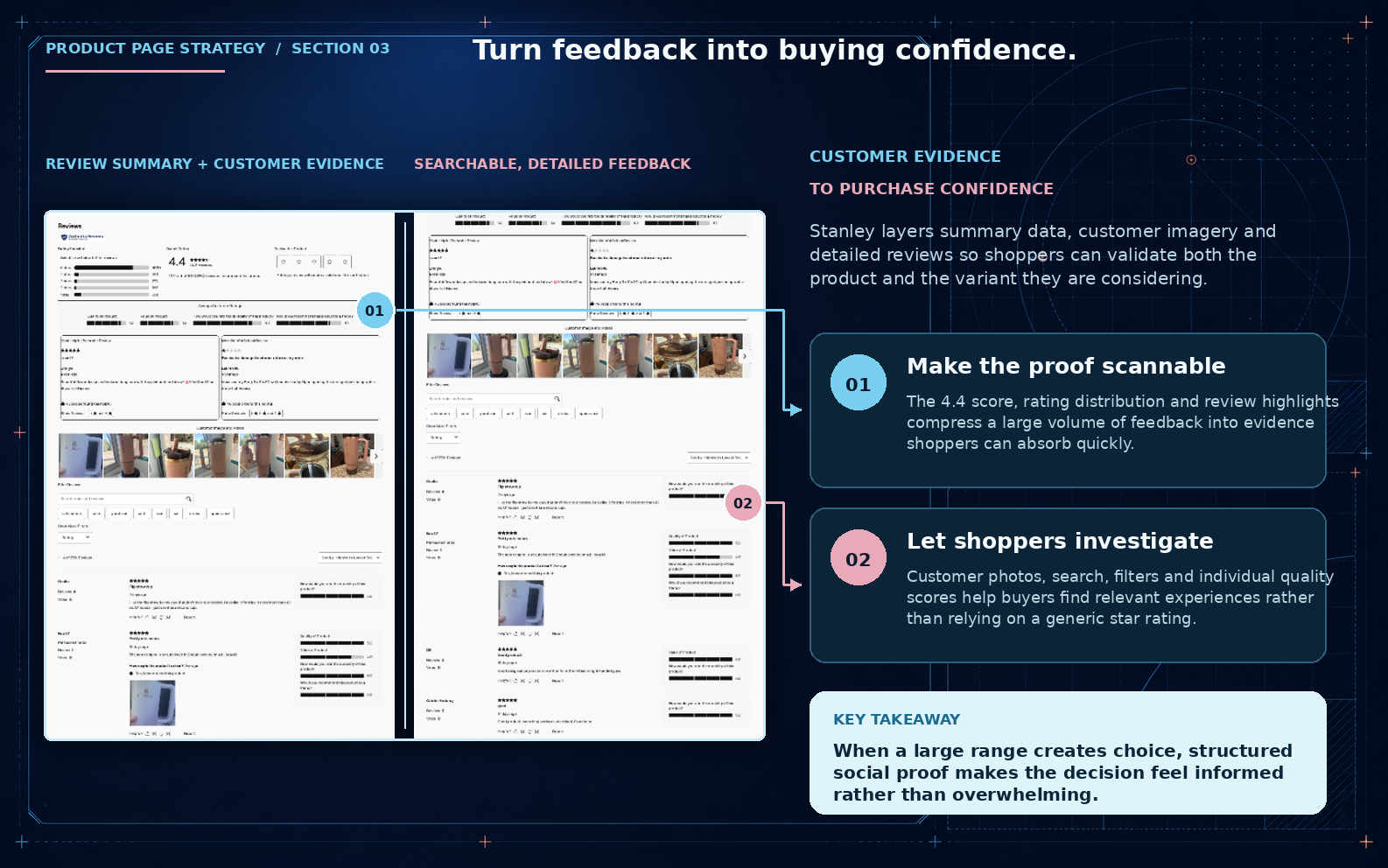
Stanley layers three things on top of each other: a 4.4 score with a rating distribution, a strip of real customer photos, and a searchable, filterable list of full reviews. A shopper can get the headline in two seconds, or dig into reviews from people with a similar use case if they want more convincing.
For a catalogue with this many colours and sizes, generic star ratings aren’t enough on their own. Letting shoppers filter for their exact variant or search for a specific concern is what turns a wall of reviews into something that actually resolves doubt, rather than something to scroll past.
Every section does a version of the same thing. The popup captures an email and gives it a reason to stay subscribed. The homepage sells desire first and makes it shoppable second. The collection page multiplies a handful of proven formats until the catalogue looks endless.
The product page narrows a huge range down to one confident decision, then backs it up with specs and reviews at the exact moment a shopper needs them.
None of this depends on a TikTok moment. The Buy Guide post and the influencer wave got Stanley attention it couldn’t have bought. But attention without conversion architecture just produces a spike that fades. The popup, the homepage, the collection grid, and the product page are the reason that spike turned into $750 million and stuck around afterward.
That’s the part any ecommerce brand can take from this, regardless of catalogue size or budget: the mechanics are copyable even when the virality isn’t. If you’re looking at your own site wondering which of these gaps are costing you conversions, that’s exactly the kind of audit we run for ecommerce brands. Get in touch and we’ll walk your site the same way we walked Stanley’s.
