
DASH Water turned over £17.2m in 2024, up 42.1% on the year before, according to accounts filed at Companies House. In July 2025 alone it sold 4.9 million cans. Co-founder Alex Wright has since put a number on where it goes next: £60m-plus in retail sales across 2026.
Worth separating those figures before going further. The £17.2m is company turnover. The £60m is retail sales value, which counts what shoppers spend at the till rather than what DASH invoices. Both are real, they just measure different things. And the growth has been bought: DASH posted £2.5m of operating losses in 2024.
What interested me is how a brand at that stage keeps its marketing coherent. Roughly 96 ads live in the UK Ad Library, an Instagram account with 97.9k followers, and a site that pushes a subscription before it pushes a flavour. I went through all three. The short version is that DASH says one thing everywhere and changes only the packaging around it.
Open the Ad Library and the repetition is immediate. Nearly every ad leads on one of two hooks. Either "POV: You're done pretending you like sugary drinks" or "Fruit + fizz. That's it." Underneath sits the same proof block every time: real fruit, sparkling water, nothing else, no sugar, no sweeteners, no calories. Then the same code, HEY30.

What changes is the creative. A phone-shot clip of someone holding a multipack sits beside a brand-shot reel that leads with the 4.8 rating, which sits beside a flat pack shot of a single can. Same words, different treatment, so two ads in a row never look alike in the feed.
Two other things stand out. The start dates cluster within days of each other, which reads as a batch of variants launched together to test rather than a slow drip of new work. And the creator ads run from the creator's own handle, posted as "florrietyler with DASH Water" with the AD disclosure, rather than from the brand account. Same funnel, different social signal.
The honest caveat: the Ad Library tells you what is running, not what is working. Long run times are usually a decent proxy for performance, but these ads are all new, so there is nothing to read into yet. What we can say is that the message architecture is deliberate, and that is the part worth copying.
If you are running Meta ads with a different hook on every creative, this is the argument for pinning the claim and varying the frame instead.
The organic account does something the ads cannot. It runs a named series, Meal Deal Reviews, across consecutive tiles, so the grid reads as episodes rather than scattered posts. People recognise the format before they read the caption.

The captions do the heavy lifting. "Help rate Ellie's meal deal below" gives the viewer something to do. That is why the comments fill with actual opinions rather than emoji, and why the replies come from accounts that look like customers.
The story highlights are worth a look too. Pink Lady Apple, Fashion Week, Sustainability, A Glossary, Wonky. Three of those map onto the three motivations the pop-up asks visitors to choose between. The same segmentation logic runs through both.
Worth naming the limit: 84 likes on a post from an account with 97.9k followers is modest. The series earns comments, which matter more than likes for reach, but nobody should look at this account and assume organic is carrying the business. It is doing a specific job, which is making the product look normal in ordinary settings.
The homepage runs the same claim as the ads, in the same sequence, with more room to breathe. The hero leads on the payoff rather than the ingredient list. "Finally, a drink to feel good about" sits above the three reasons to believe it, no sugar, no sweeteners, no calories, with a Trustpilot score alongside. Promise first, proof underneath.
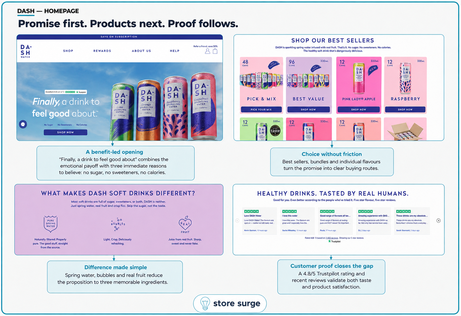
Below that, best sellers do the sorting. Pick and mix, a 96-can bundle and single flavours give three different buying routes off one promise, so the visitor who knows what they want and the visitor who is still deciding both get a door. The difference block then reduces the whole proposition to three things: spring water, bubbles, real fruit. Reviews close it out.
The second half of the page changes register. Having sold the drink, DASH starts selling the reason to feel good about buying it.
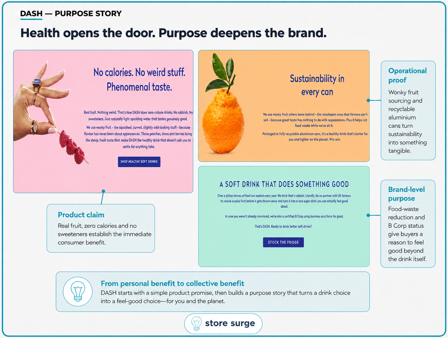
The wonky fruit sourcing and the recyclable cans are operational proof rather than slogans, and the B Corp certification sits behind the food waste claim rather than in front of it. Note the order once more. Personal benefit first, collective benefit second. Nobody is asked to care about food waste before they have been told the drink tastes good.
That ordering is the single most repeatable thing on this site, and it holds from the ad copy through to the bottom of the homepage.
Land on the Pink Lady Apple page and the sequence is tight.

The star rating and review count sit above the price, so the social proof lands before the number does. Then "Choose your plan" opens with Flexible Subscription already selected at £12.79, with the 20% saving, 99p shipping and cancel anytime spelled out underneath. One-time purchase sits below it, greyed out, at £15.99. No strikethrough, no countdown. The saving is visible simply because the two prices sit next to each other, and buying once is the deliberate action rather than the easy one.
The mission content, wonky fruit, B Corp certification, carbon credits, the farmers, all sits well below the fold. That ordering is a choice. Someone who came for a drink gets to buy a drink. Someone who scrolls gets a reason to feel good about it. Neither audience has to sit through the other one's pitch.
Most ecommerce product pages do this backwards, leading with brand story and burying the offer.
The pop-up is the neatest thing on the site. Instead of the usual "get 30% off, enter your email", it asks one question first. What matters most to you? Great taste, zero sugar, or fighting food waste.
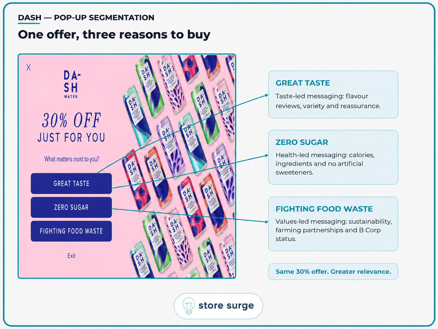
The discount behind all three is identical. What changes is what the visitor has just told them. Someone who picks food waste is a different person from someone who picks taste, and DASH knows which one they are before a single email is sent.
I cannot see what sits behind each button from the outside, so I will not claim it runs three separate flows. What I can say is that the mechanism costs one extra click and collects a preference most brands only infer from behaviour months later.
Small detail worth noting: the way out is a plain "Exit" link rather than a guilt-trip decline. Low friction on the way out tends to mean less irritation for the people who were never going to convert.
Pin the claim, vary the frame. DASH runs one proof block across every ad and changes only the creative. That is what lets them launch a batch of variants without the feed feeling repetitive.
Give the audience a job. A caption that asks for a rating gets comments. A caption that describes the product gets scrolled past.
Let the offer do the persuading. Subscription pre-selected, one-time price visible beside it, no fake urgency. The saving is obvious without a single manipulative device.
Ask before you assume. One question in a pop-up turns an anonymous discount into a segmented one, for the price of a click.
Put the mission where it belongs. Values content below the buying decision serves the people who care without taxing the people who do not.
One caution before copying any of it. DASH has a genuinely differentiated product and a short, checkable claim to make. If your product does not have one of those at the centre of it, this playbook will not save you. The consistency works because the thing being repeated is worth repeating.
If you want a look at how your own paid, organic and on-site messaging line up, get in touch and I will walk through it with you.
