
Vuori started in a garage in Encinitas in 2015, one founder trying to fix men's athletic wear because he couldn't find anything he wanted to train in and then go get coffee in afterward. Ten years later it's valued at $5.5 billion, backed by more than $1.2 billion from SoftBank and General Atlantic, and openly positioned as the brand taking share directly from Lululemon.
The catalogue grew from one guy's shorts into a full men's and women's range. What didn't change is the discipline underneath the site: every stage of the funnel is built to move a shopper to the next one, all the way through checkout.
That's the part worth pulling apart properly. Running nearly 700 ads at once proves Vuori knows how to buy attention, but attention doesn't explain a $5.5 billion valuation on its own. We tore apart eight stages of Vuori's funnel, the popup, the homepage, the collection page, the product page, the cart, checkout, and the ad account feeding all of it, to see exactly how each one is built to convert. Here's the breakdown.
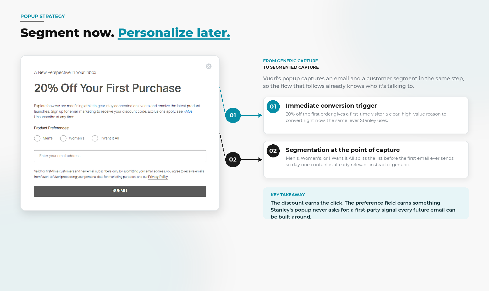
Vuori's popup does the same job as most: 20% off the first order, in exchange for an email address. But under the discount sits a second, easy to miss decision. Before the email field, the popup asks the shopper to pick Men's, Women's, or I Want It All.
That single radio button splits the list before the first welcome email ever sends. A brand new subscriber doesn't get a generic "welcome to Vuori" blast. They get content matched to a category they've already told the brand they care about. The discount earns the click. The preference field earns something most popups never ask for: a first-party signal every future email can be built around.
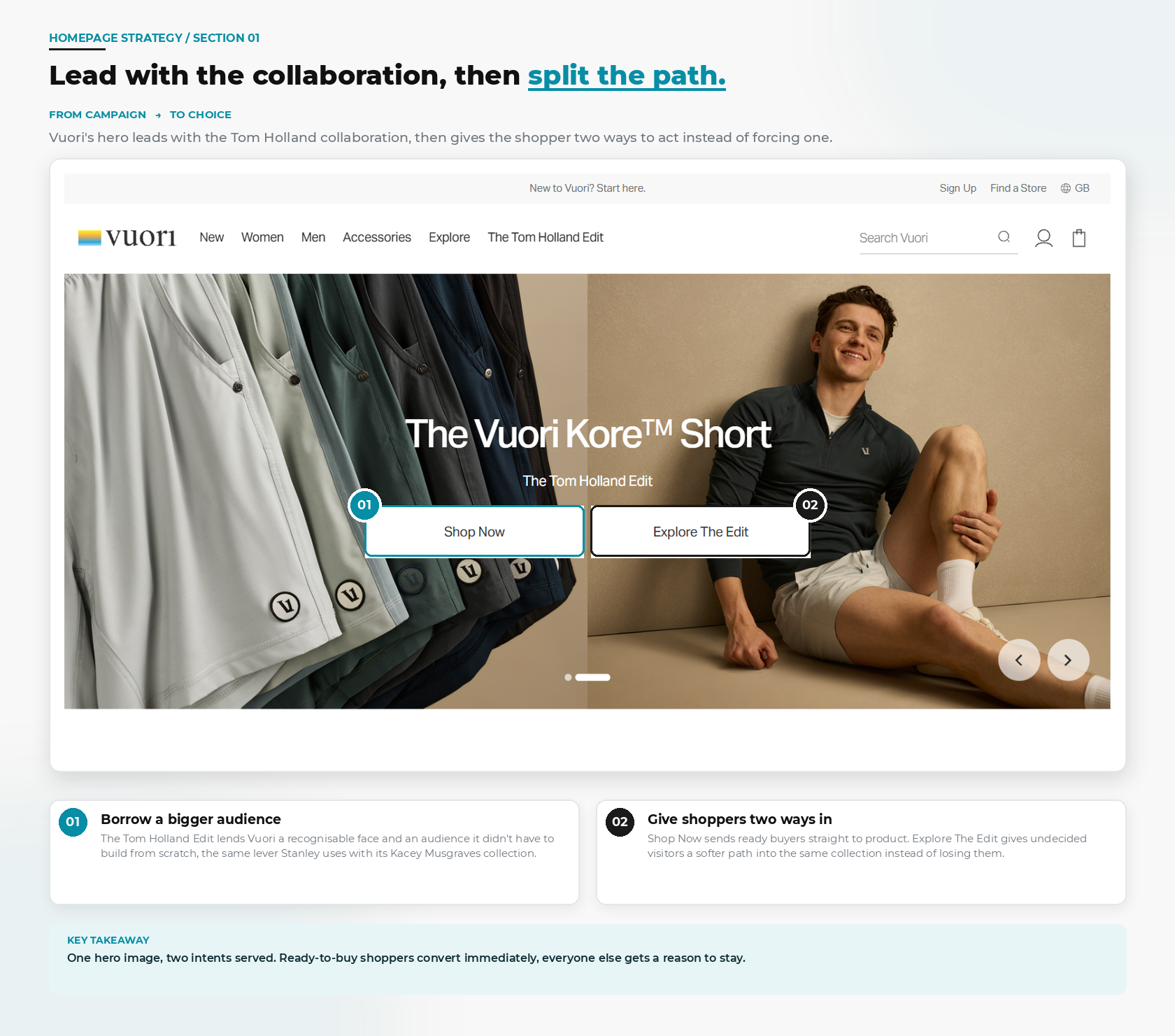
The hero doesn't sell a product first. It sells the Tom Holland Edit, a recognisable face and a fresh product edit, with two buttons sitting side by side underneath it: Shop Now and Explore The Edit. A shopper who already knows what they want can buy immediately. Everyone else gets a softer path into the same collection instead of a single forced choice.
Borrowing an actor's audience is the easy part. The harder, more copyable part is the two-button structure underneath it: giving a ready buyer and an undecided browser two different doors into the same collection, instead of gambling everything on one call to action.
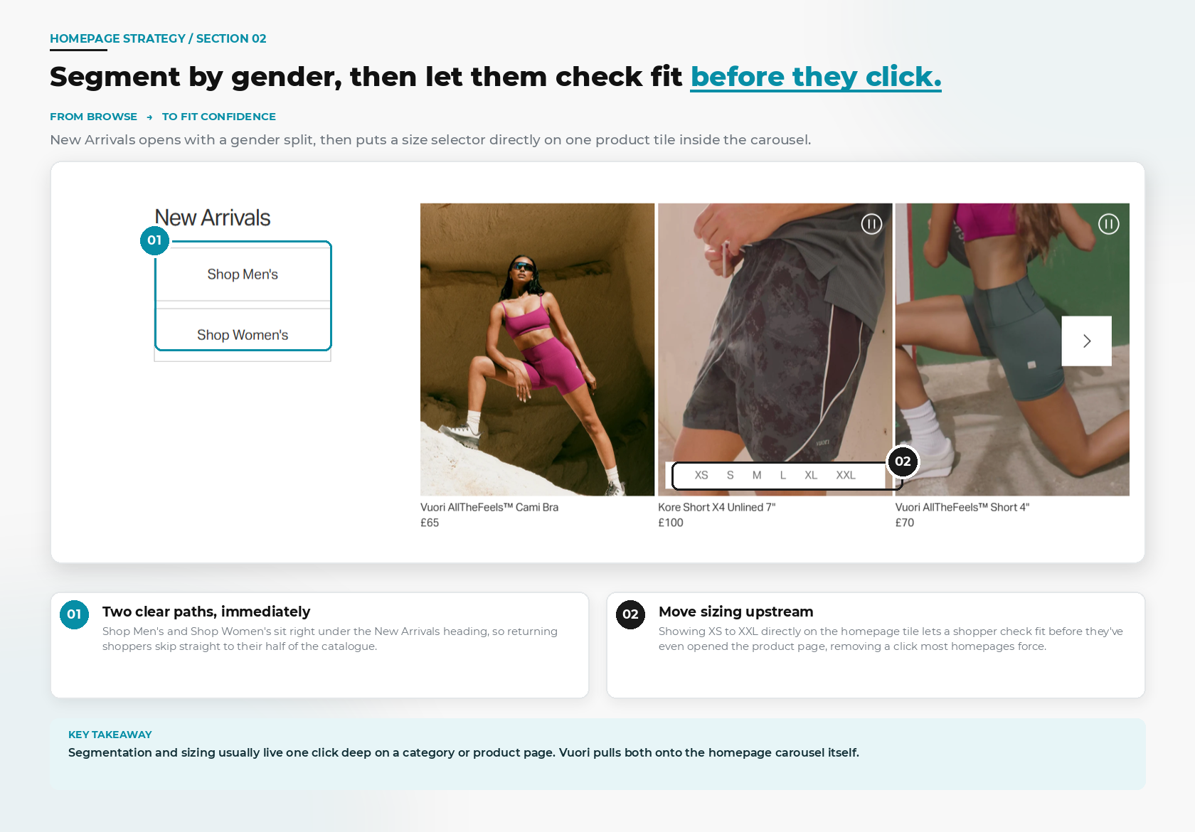
New Arrivals repeats the popup's gender split at the point of browsing, Shop Men's and Shop Women's sitting right under the section heading, then goes one step further. One product tile in the carousel shows its full size run, XS through XXL, directly on the homepage.
Most sites make a shopper open a product page just to learn whether their size is in stock. Vuori answers that question before the click happens at all, on the same tile that's selling the product in the first place.
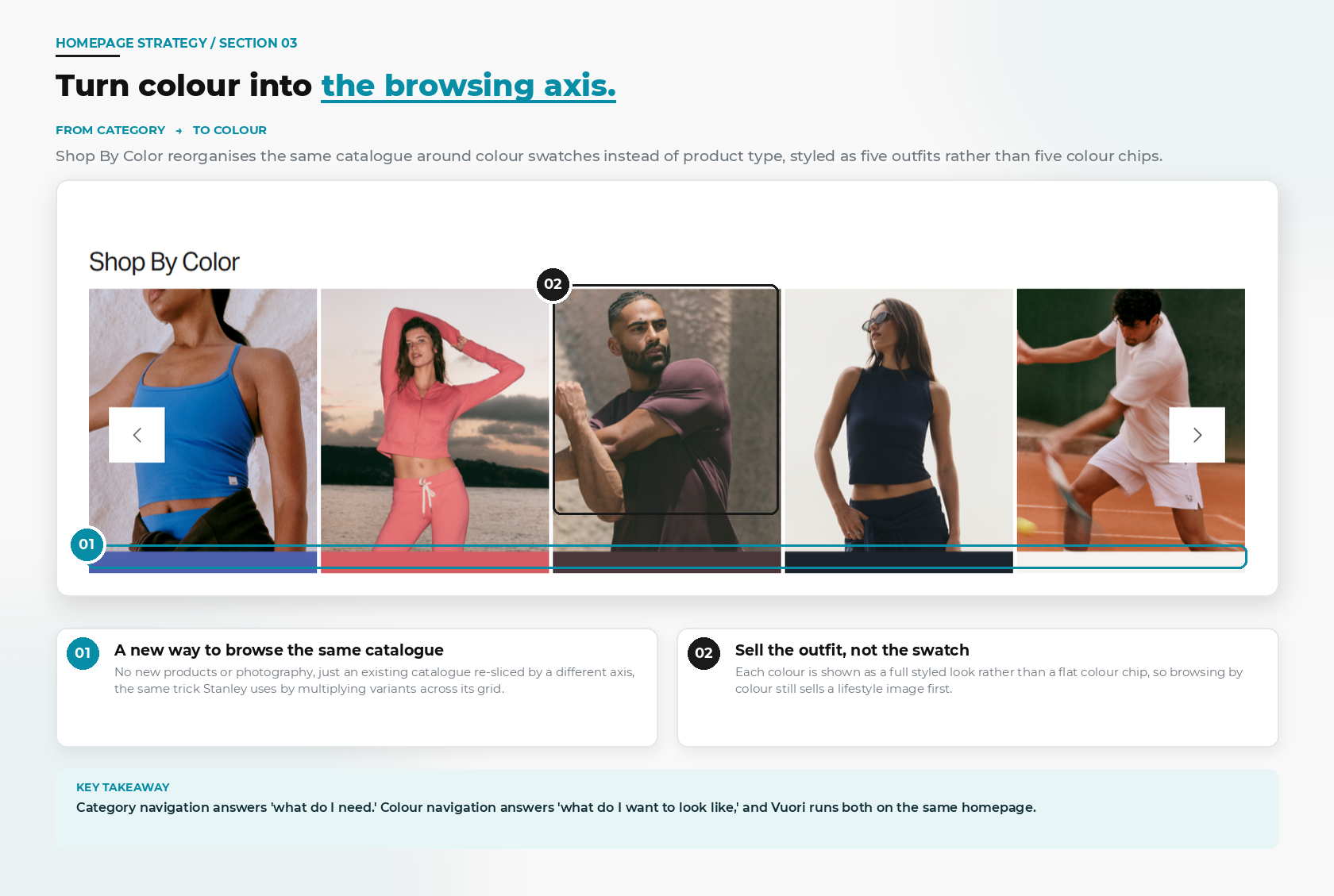
Further down, Shop By Color reorganises the identical catalogue by colour swatch instead of product category, styled as five full outfits rather than five colour chips. No new products, no new photography. Just an existing catalogue re-sliced by a different axis, the same trick Stanley uses by multiplying variants across its grid.
Category navigation answers "what do I need." Colour navigation answers "what do I want to look like," and Vuori runs both from the same homepage.
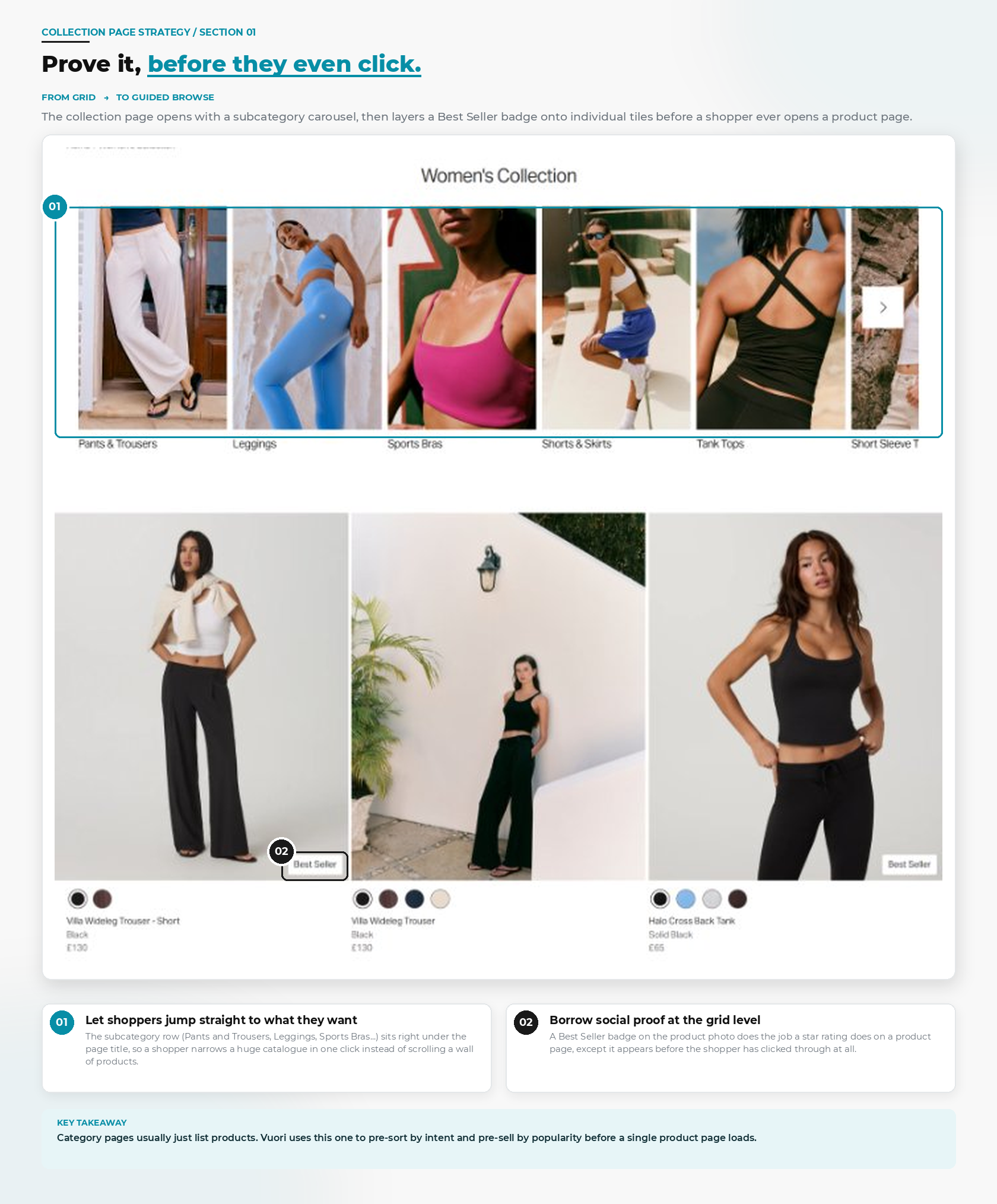
The Women's Collection page opens with a subcategory carousel (Pants & Trousers, Leggings, Sports Bras...) so a shopper narrows a huge catalogue in one tap. Individual tiles carry a Best Seller badge, doing the job a star rating usually does on a product page, except it shows up before the shopper has clicked through to see one.
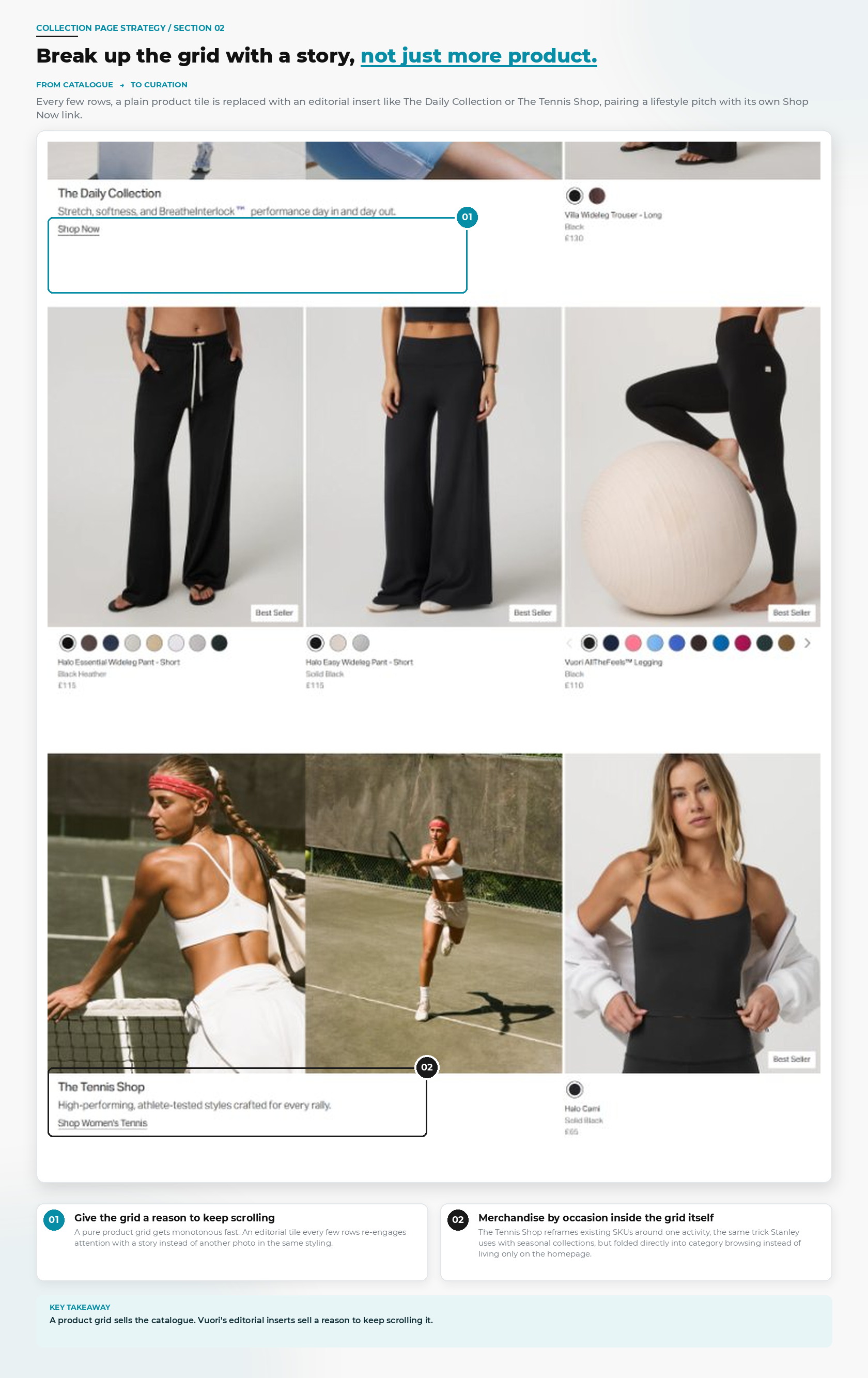
Every few rows, a plain product tile gets replaced with something else entirely: The Daily Collection, The Tennis Shop, an editorial insert pairing a lifestyle photo with its own Shop Now link. The Tennis Shop in particular reframes existing SKUs around one activity, folding a seasonal-collection trick directly into category browsing instead of saving it for the homepage.
A product grid sells the catalogue. Vuori's editorial inserts sell a reason to keep scrolling it, which matters more than it sounds like it should on a page whose entire job is to hold attention long enough to reach a product page.
.png)
The buy box for the Everyday Cotton Stretch Tank stacks a full size run, a Find My Size quiz, a Size Chart link, Klarna instalments, and "all duties and taxes already included, no hidden fees" messaging, all before the Select Size button. Most sites treat fit and cost as checkout problems. Vuori resolves both here, before hesitation gets the chance to start.
A "Goes Great With" style block isn't enough for Vuori. Shop The Look and More From The Collection both carry a quick-add "+" directly on the photo, so a shopper who likes the whole outfit, or wants to compare a colourway, never has to open a second product page to act on it.
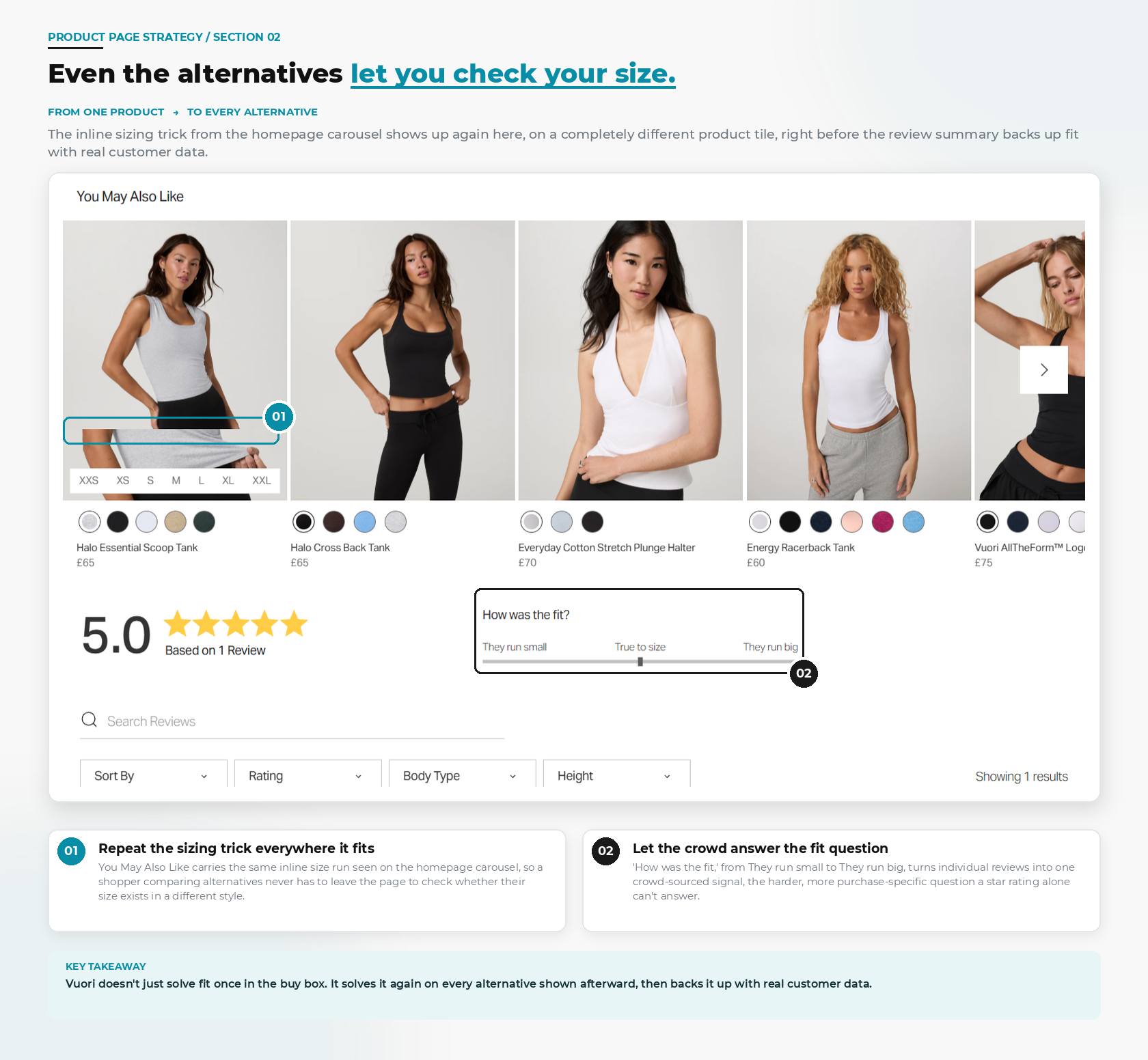
Below the specs, the review summary opens with a standard star score, 5.0, Based on 1 Review, then adds something a tumbler brand never needs: a crowd-sourced "How was the fit?" slider running from They run small to True to size to They run big. A star rating proves a product is good. The fit slider proves it will fit, which is the harder, more purchase-specific question for apparel.
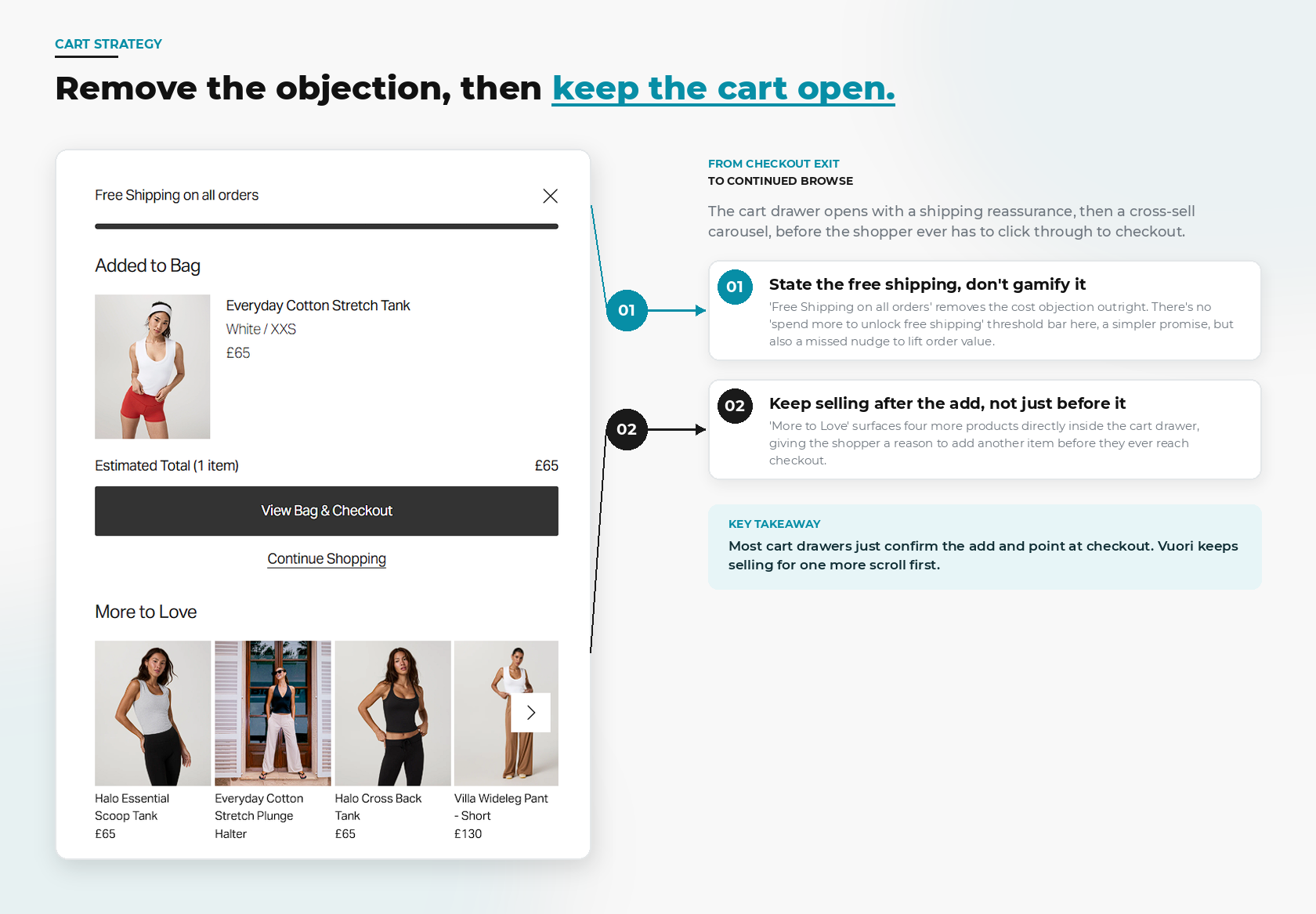
Add an item and the cart drawer opens with "Free Shipping on all orders," stated flatly rather than gamified into a spend-more-to-unlock progress bar. Simpler promise, but also a missed nudge on average order value. Straight after it: More to Love, a cross-sell carousel sitting inside the drawer itself, giving the shopper a reason to add a second item before they've even reached the cart page.
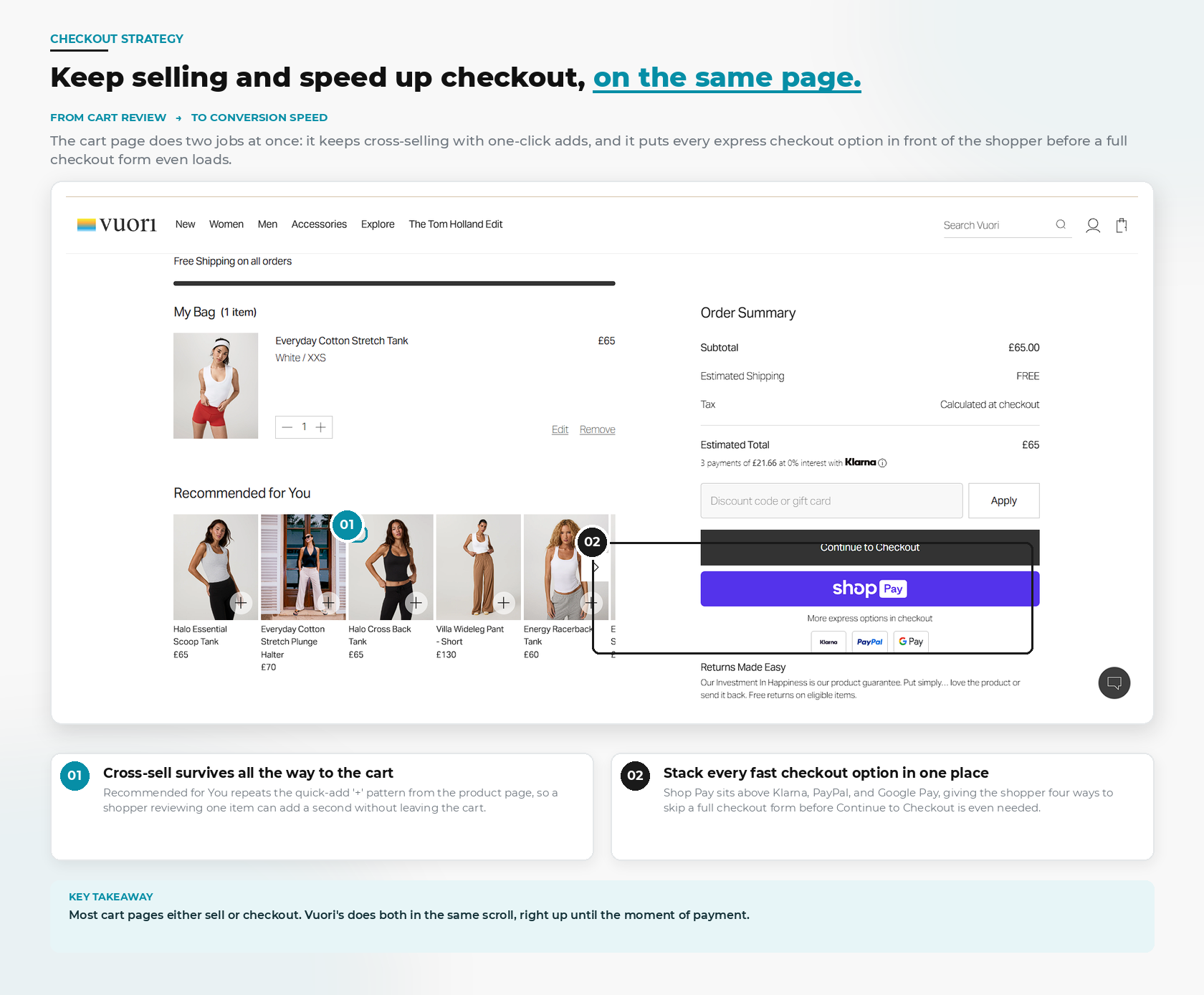
The full cart page does two jobs in the same scroll. Recommended for You repeats the product page's quick-add pattern, so cross-sell survives the entire way to checkout. Right below it, Shop Pay, Klarna, PayPal, and Google Pay are all stacked above the standard Continue to Checkout button, giving four different ways to skip a full checkout form. Most cart pages either sell or speed up checkout. Vuori's does both, right up until the moment of payment.
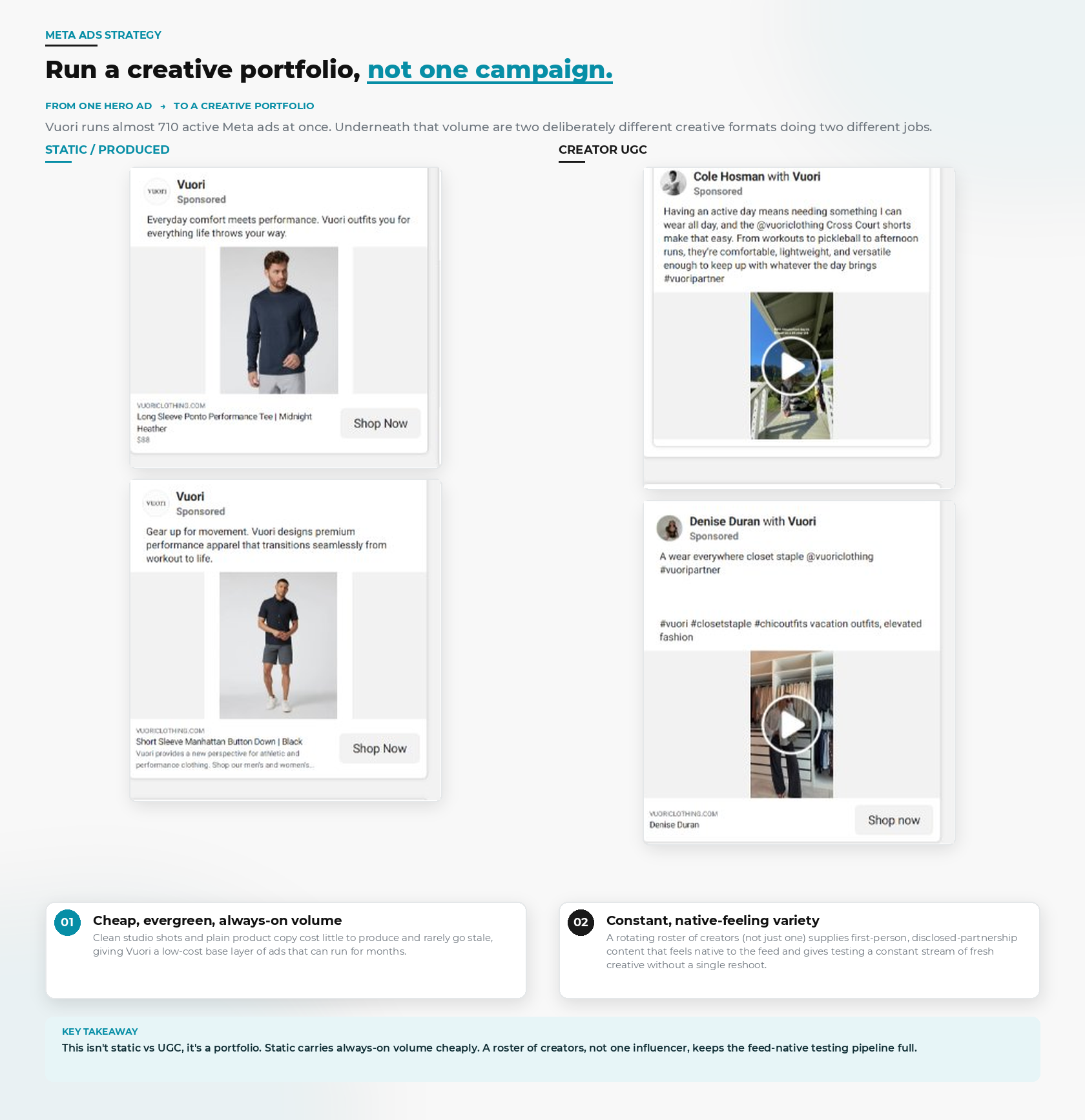
Vuori runs close to 700 active ads at once in the Meta Ad Library, and the volume itself isn't the interesting part. Underneath it are two deliberately different creative formats doing two different jobs. Clean studio shots and plain product copy, "Everyday comfort meets performance," "Gear up for movement," cost little to produce and rarely go stale, giving Vuori a cheap, always-on base layer that can run for months untouched.
Sitting alongside that static layer is a rotating roster of creators, not one influencer but several running in parallel, posting disclosed, first-person content that reads like a normal feed post rather than an ad. That roster supplies a constant stream of native-feeling creative for testing, without a single reshoot required from the brand itself.
Static carries always-on volume cheaply. A roster of creators keeps the feed-native testing pipeline full. Together, that's a creative portfolio, not a single hero campaign, and it's the same logic behind almost every fast-growing DTC ad account right now.
None of these eight stages depend on each other to work, and that's the point. The popup segments before it ever needs to personalise anything. The homepage sells desire, function, and identity from the same catalogue. The collection page pre-sorts and pre-sells before a product page even loads. The product page kills fit, cost, and cross-sell objections in one scroll. The cart states the good news early and keeps selling until the last possible moment. The ad account behind all of it runs two creative formats instead of betting on one.
Vuori didn't get to a $5.5 billion valuation by fixing one part of the funnel well. It got there by not leaving a single stage of it to chance, which is the part any ecommerce brand can actually copy, regardless of catalogue size or ad budget. If you're looking at your own funnel wondering which stage is quietly costing you conversions, that's exactly the kind of audit we run for ecommerce brands.
