
Most ecommerce brands assume growth means more products. Add a second line, then a third, then accessories, then a bundle to tie it all together. The catalogue grows, the merchandising gets harder, and the marketing budget gets split across things that do not all deserve it.
Hears has taken the opposite route. The Amsterdam brand sells a reusable filtered earplug. There are two versions, one for everyday noise and one for sleep, and beyond that the range is colours, a carry case and a cleaning kit. The site claims a 4.9 rating from more than 200,000 customers, and the Meta Ad Library shows roughly 360 live ads. All of it points at the same thing to buy.
That constraint turns out to be an advantage. Here is how the site and the ad account are built around it.
The entry pop-up does not lead with a discount. It leads with a scratch panel and the line Try your luck, so the visitor has something to do and the reward stays hidden until they do it.

Two things are working here. The reward is undisclosed, so nobody is anchored to a fixed percentage before they have seen a product. And the photo sells the sleep use case in context rather than showing the earplug on a white background. It is a small piece of email capture doing more work than a standard ten percent bar.
The hero is given over to a Pacha collaboration for the 2026 season. Not the core earplug, not a spec, a limited edition drop. At a brand with a real range this slot would be a new product launch. Here the drop performs the same function.

Underneath it, the bestsellers row runs five tiles across two products at thirty five and thirty two pounds. Jet Black, Purple Moon, Brass Blue, Midnight Black, Milk and Honey. The row looks like a range and behaves like a colour picker.
Further down, the page stops organising by product entirely and starts organising by occasion.

Music events, sleeping, motorsports. Three doors, one earplug, each with its own photography. Then a single exploded render carries the whole engineering story. With one product, spending properly on one hero asset is affordable in a way a full catalogue never is.
The credibility layer works the same way.
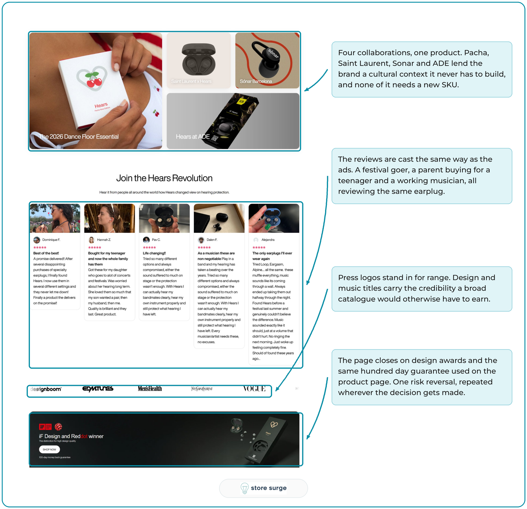
Pacha, Saint Laurent, Sonar and ADE all appear as collaborations, and none of them required a new product to exist. The reviews are cast by use case rather than by item, the press logos borrow authority the catalogue cannot supply, and the page closes on design awards and the same hundred day guarantee that appears at the point of purchase.
This is where the strategy is most visible. The filters at the top are Hears, Hears Sleep, Music and events, Focus and Moto. Five entry points into what is really two earplugs.
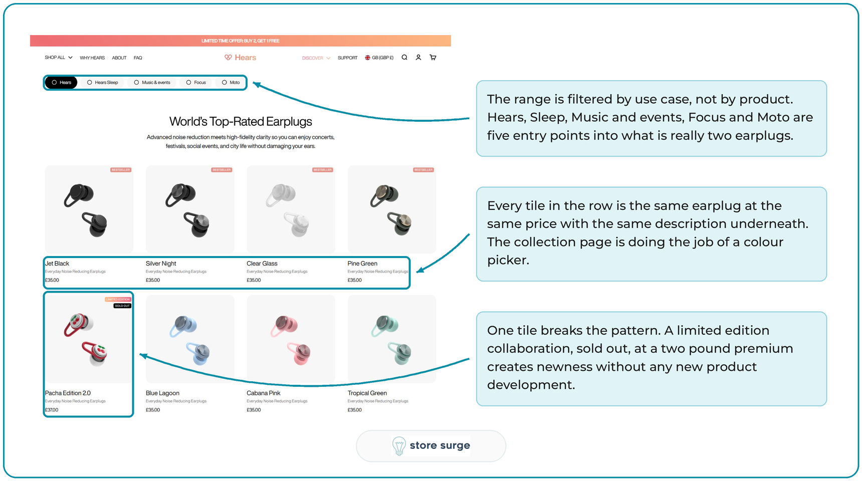
Every tile in the first row is the same product at the same price with the same description underneath. One tile breaks the pattern: a limited edition collaboration, sold out, at a two pound premium. That is newness manufactured without any new product development, and it costs a fraction of what a genuine line extension would.
Choice on the Hears Sleep page amounts to four colourways. The decision is which black, not which model, so nobody stalls comparing specifications.

The volume offer does the work a cross sell would do elsewhere. Buy 2, Get 1 Free, priced per set, flagged as most popular, with a free carry pouch attached. There is no second product to attach, so order value has to come from quantity. Underneath it sits the risk reversal: a hundred night trial and a hundred day money back guarantee, which answers the obvious objection to buying something that goes in your ear. This is conversion work built around a constraint rather than in spite of it.
The segmentation happens further down the page, in the copy.

Four sleeper types, one product. The Snoring Hostage, the Light Sleeper, the Sleep Optimiser, the Shift Worker. Each carries its own percentage, and it is worth saying plainly that these are user claims stated on the page rather than clinical results. They still do the job of turning a vague comfort promise into something specific per situation.
The comparison table is the tell. It compares Hears to foam plugs and to unnamed rivals, never to another Hears model, because there is no other model. The frame of reference stays outside the brand.
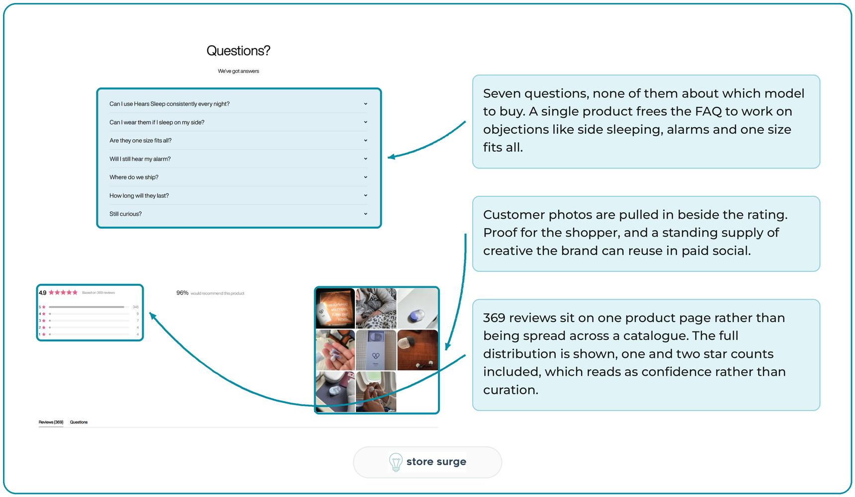
The same logic runs through the proof. Seven FAQ questions, none of them about which version to buy, all of them about side sleeping, alarms and fit. And 369 reviews concentrated on one page with the full star distribution visible, one and two star counts included. A brand with forty products would spread the same review volume forty ways.
The Meta Ad Library shows what the constraint buys in paid social.

Ads that started running in March are still live in August, which in the Ad Library is the closest thing to a public performance signal. Each concept is running as three to seven near identical variants, so the account scales by iterating on copy and creative rather than by adding products. The angles change constantly, from festivals to a snoring partner to shift work to two hundred thousand ravers, but the offer underneath never does. Buy 2, Get 1 Free appears on the ads, the site banner and the product page. That consistency is much easier to hold when there is one thing to sell, and it is why paid social for single product brands often outperforms its budget.
The lesson is not that you should cut your catalogue. It is that Hears has moved the variety from the product to the context. The range is a set of occasions, the choice is colour, the newness is a collaboration, and the proof is concentrated instead of scattered.
If you sell a narrow range, the questions are worth borrowing. What occasions could your existing product be sold into. Where does order value come from when there is nothing to cross sell. What are you comparing yourself to when there is nothing internal to compare. Most brands answer those by launching something new. This one answered them with merchandising.
