
In March 2026, Eight Sleep raised $50m led by Tether Investments at a $1.5bn valuation, having been valued at around $1bn seven months earlier. The detail worth more than the valuation is buried in the announcement: the company said it reached free cash flow positivity in 2025.
That is rare in consumer hardware. Manufacturing, inventory and logistics usually eat the margin for years. So the interesting question is not how Eight Sleep raises money. It is how a mattress company makes it.
The answer is visible in the way the funnel is built. Eight Sleep does not sell a mattress cover. It sells a system, names the parts of that system, and then lets a shopper complete it. Adding a base, a duvet and pillow covers stops feeling like upselling once you have been shown that they belong together.
We walked the whole thing, from the Meta Ad Library through to the payment page. Six screens, annotated.
In this article
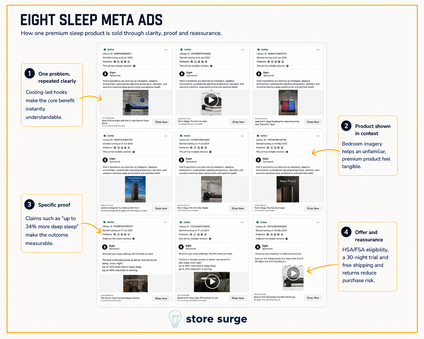
Six of the nine ads in this capture carry identical body copy, word for word. Pod 5 transforms any bed into an intelligent, adaptive environment, automatically adjusting temperature, elevation and sound.
That repetition is the strategy. Eight Sleep is selling something most people have never seen, so the account is not testing what the product is. It is testing which picture makes that sentence land. Bedroom scenes, product stills, video demonstrations and flat text cards all sit underneath the same words.
The headlines are where the variation lives. Some lead with the offer, saving $100 with a Cool-to-Touch cover. Some lead with rank, describing the Pod as first in its class. Some lead with the product itself. One message, several doors into it.
The bottom row does something different and better. It drops the descriptive copy and leads with numbers: up to 34% more time in deep sleep, up to 45% reduction in snoring, framed as clinically proven. Those are the brand's own claims and we have not verified the studies behind them, but as advertising they do a job no adjective can. A shopper cannot picture an adaptive sleep environment. They can picture 45% less snoring.
Reassurance appears in almost every ad. A 30-night home trial, free shipping and returns, HSA and FSA eligibility. On a product costing thousands, the trial is not a nice extra. It is the thing that makes the click possible.
The start dates are worth noting too. They run from May 2025 to December 2025, so several of these have been live for a long time. Long run times are usually a reasonable proxy for performance, though the Ad Library only shows what is running, never what is working.
If your Meta ads change the message every time you change the creative, this account is the argument for the opposite approach.
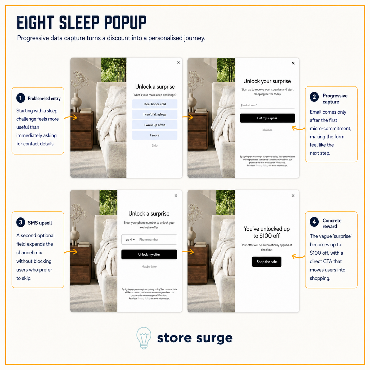
Four steps, and the order of them is the whole point.
Step one asks what your main sleep challenge is. Hot or cold, cannot fall asleep, waking often, snoring. No email field anywhere on the screen. The visitor answers a question about themselves before being asked for anything, and Eight Sleep learns which of its four core benefits to lead with in every message afterwards.
Step two asks for the email. Step three asks for a phone number, with the privacy note explaining contact may come by text message or WhatsApp. Step four reveals the reward: up to $100 off, applied automatically at checkout, with a button straight into the sale.
Two things make this work. The reward stays vague until the end, described only as a surprise, which is what carries someone through three screens. And every exit is soft. Skip, Not now, Maybe later. Nobody is shamed into continuing, and each step can be abandoned without losing what was already given.
Worth naming the contrast, because we have now torn down three premium health brands in a row. WHOOP offers no discount in its popup. Oura offers no discount either. Eight Sleep offers up to $100 off and gets three data points for it. All three are defensible. The difference is that Eight Sleep is selling a considered purchase in the thousands, where a hundred dollars reads as a gesture rather than a devaluation.
The segmentation is the real prize here, not the email. Knowing that someone snores is worth more to an email marketing programme than knowing their first name.

The banner above the navigation promises a 365-night trial with free US shipping and returns. Before the product is seen, the risk has been addressed.
The hero does not show a mattress. It shows the app, mid-use, with a temperature dial reading 75 and cooling to 68, a sleep fitness score of 85, time asleep at 7:45. The outcome is visualised before the object is. For a product that is essentially invisible once it is on the bed, that is the right call.
The buying interface then reduces a complicated purchase to two numbered choices. Select a Pod, either Ultra at $2,695 marked best for most, or Essential at $2,095. Select a size. That is it. A line underneath confirms the price includes the Pod, the Pod Cover and all accessories, which pre-empts the obvious question about what else will be needed.
Reassurance sits directly beneath, in a row of four: 4.6 stars from 8,417 reviews, the 365-night trial, a seven-year limited warranty, made in the USA. Nobody has to leave the page to find any of it.
Then education follows configuration, not the other way round. The See how the Pod works video sits below the buying interface. Someone ready to buy is never made to sit through an explanation first.

The temperature range is minus five to plus 110 degrees on each side, which means nothing on its own. The page says it is like having 20 beds in one, which means something immediately.
Eight tiles follow, and every one is framed as a problem rather than a feature. Fall asleep faster, up to 31% faster. Wake up refreshed, in your REM window. Powerful yet incredibly quiet, at 25dB. Better for everyone, naming hot sleepers and night sweats specifically. The specification is present in each one, but it arrives after the outcome rather than instead of it.
The dual-zone control deserves separate mention, because it turns a limitation into a selling point. Two people in one bed disagreeing about temperature is a compromise in every other mattress. Here it is the reason to buy.
Then named customers with video. Mike says he falls asleep 40% faster and sleeps an hour and a half more. Pat describes it as eight different beds in one frame. Juliet and Ira found their happy temperature for the first time. Named people with specific numbers attached carry more weight than a wall of anonymous stars, and the couple in that list is doing deliberate work directly beneath the dual-zone claim.
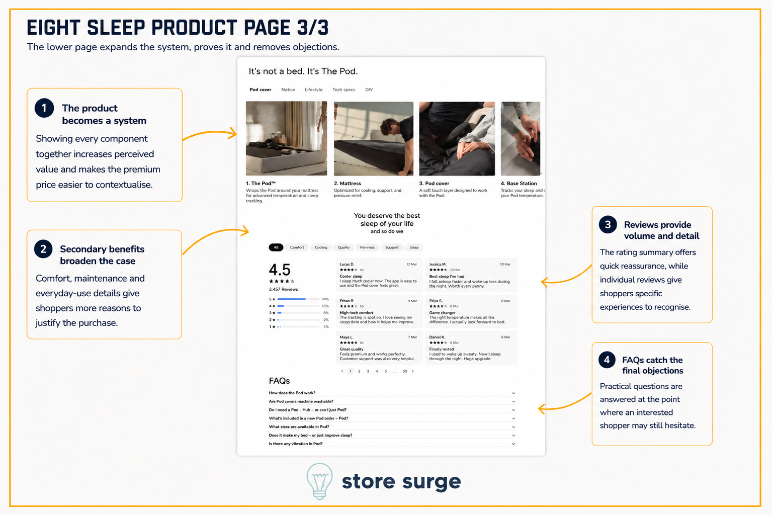
Lower down, the page stops selling a cover and starts assembling a system. It's not a bed, it's The Pod. Four components are laid out and named: the Pod itself, the mattress, the Pod cover, the Base Station.
This is the most commercially important section on the page. Once a shopper understands the product as a set of parts that work together, adding a base, a duvet, a blanket and pillow covers stops feeling like upselling and starts feeling like completing the thing they came for. The naming does the work. Nobody argues about whether a system needs its own base station.
The review block underneath is unusually well built. A 4.5 average across 2,457 reviews, a full star distribution, and filters by comfort, cooling, quality, firmness, support and sleep. A shopper worried about firmness can read only about firmness. That is a genuinely useful feature, and most stores with the same volume of reviews never build it.
The FAQs close on the practical questions people actually hesitate over. Whether covers are machine washable. Whether a Hub is required. What arrives in the box. Whether there is any vibration. None of that is glamorous, and all of it is the last thing standing between interest and a card number.
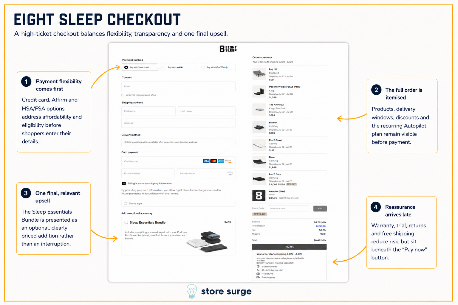
One caveat before anything else. We deliberately loaded this basket with accessories to see how the checkout copes with a long order. The total on screen is not what a typical customer would see, so read the structure here rather than the number.
The first thing on the page is not the contact form. It is the payment choice: credit card, Affirm, or HSA and FSA. Affordability and eligibility are settled before a single personal detail is typed. On a high-ticket order, that ordering is deliberate.
The order summary is fully itemised, and every figure reconciles. Each line carries its own delivery window rather than one date for the whole order, with a note that items may ship separately. On an order made of several physical products arriving from different places, telling people that up front prevents a support ticket later.
Look at where the subscription sits. Autopilot, at $34 a month billed annually, is the last line in the list. Against several thousand dollars of hardware above it, $399 a year barely registers.
That is the third framing we have seen in three teardowns. WHOOP folds the hardware into the membership and lists the device at Free. Oura sells the ring and adds the membership as a visible second line at the cart. Eight Sleep places the subscription at the bottom of an itemised hardware order, where the contrast in size does the work. Same commercial goal, three completely different ways of deciding which number the buyer anchors on.
One more upsell appears before payment, the Sleep Essentials Bundle at $435, priced clearly and presented as an optional accessory rather than an interruption. It is well matched: sheets, a protector and pillows are exactly what someone buying a Pod still needs.
The reassurance stack is the one thing we would move. Five-year warranty, 30-night risk-free trial, free returns and free shipping all sit underneath the Pay now button, below the fold on most screens. That is the last hesitation point in the entire funnel, and the answers to it are placed after the action they are meant to support. It is a small change with an obvious direction, and reordering blocks like this is most of what conversion rate optimisation actually involves.
Three of these are inconsistencies rather than opinions, which makes them the easiest kind of fix to argue for.
The trial length changes depending on where you look. The product page promises 365 nights, twice. The ads say up to 30 nights. The checkout says 30 nights, with an asterisk. There may well be a good reason, since different items in an order may carry different terms, but a shopper who reads 365 on the product page and 30 at the payment screen has been given a reason to pause at the worst possible moment.
The warranty does the same thing. Seven years on the product page, five years at checkout. Same likely explanation, same problem.
The review figures do not match. The top of the product page shows 4.6 from 8,417 reviews. The review block further down shows 4.5 from 2,457. Probably two widgets counting different things, but a sceptical shopper will read it as one of them being chosen for effect.
The reassurance sits below the pay button. Warranty, trial, returns and shipping are the four things that resolve final doubt, and all four are placed after the button they exist to support.
Most brands reading this are not selling a $2,000 mattress cover. The mechanics still transfer.
The through line is that Eight Sleep never asks anyone to buy a mattress cover. It sells an outcome in the ads, segments on the problem in the popup, reduces the decision to two choices on the product page, then names the components so that completing the set feels like the natural end of the process rather than a series of upsells.
If you sell something expensive and suspect the order value could be higher, the answer is usually structural rather than promotional. Our growth calculator will give you a rough sense of the scale before you commit to anything.
We run teardowns like this one on client funnels every week. If you want a look at yours, get in touch and we will walk through it with you.
