
YETI has built one of the strongest premium brands in ecommerce. From cool boxes and drinkware to bags and outdoor equipment, its products command premium prices, yet continue to attract an exceptionally loyal customer base. While product quality plays a major role, YETI's website is also engineered to reinforce that premium positioning and purchasing feel effortless.
Rather than relying on aggressive discounts or promotional messaging, YETI uses subtle conversion rate optimisation (CRO) techniques to build confidence throughout the customer journey. The site focuses on showcasing products in real-world environments, answering objections before they arise and introducing complementary products naturally to increase average order value.
In this breakdown, we'll analyse three key areas of YETI's ecommerce store and highlight practical CRO techniques that other ecommerce brands can apply to increase conversions, improve average order value and create a shopping experience that feels as premium as the products themselves.
In this article
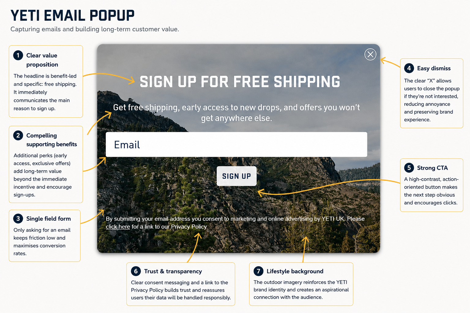
Before visitors begin browsing YETI's product catalogue, they're presented with a clean, well-designed email popup that focuses on long-term customer value rather than simply chasing an email address.
Instead of leading with a discount, YETI offers free shipping alongside early access to new product drops and exclusive offers. This is an effective value proposition because it combines an immediate benefit with ongoing reasons to remain subscribed. Rather than encouraging a single purchase, the popup positions the email list as a way to stay connected with the brand over time.
The form itself keeps friction to a minimum by asking for just an email address. Every additional field can reduce signup rates, so YETI removes unnecessary barriers and makes opting in as quick as possible. The bold Sign Up button stands out clearly against the background, making the next step obvious without feeling overly aggressive.
Trust is also built into the experience. Consent wording and a clearly accessible Privacy Policy reassure visitors that their information will be handled responsibly, while the prominent close button ensures users can dismiss the popup easily if they're not interested. Although it may seem like a small detail, giving visitors control helps create a more positive brand experience and reduces frustration.
Perhaps the strongest element, however, is the imagery itself. Rather than using a plain background or product shot, YETI reinforces its outdoor positioning with a striking mountain landscape. It immediately reminds visitors that they're buying into an adventurous lifestyle, not just insulated drinkware or cool boxes. This consistency between the popup and the wider brand identity makes the signup experience feel like a natural extension of the website rather than an interruption.
Once that email address is captured, the real work begins. Platforms such as Klaviyo allow brands to trigger welcome sequences, product launch announcements, browse abandonment emails and personalised campaigns that continue nurturing customers long after they leave the website. For many ecommerce businesses, these automated email flows generate some of the highest returns of any marketing channel.
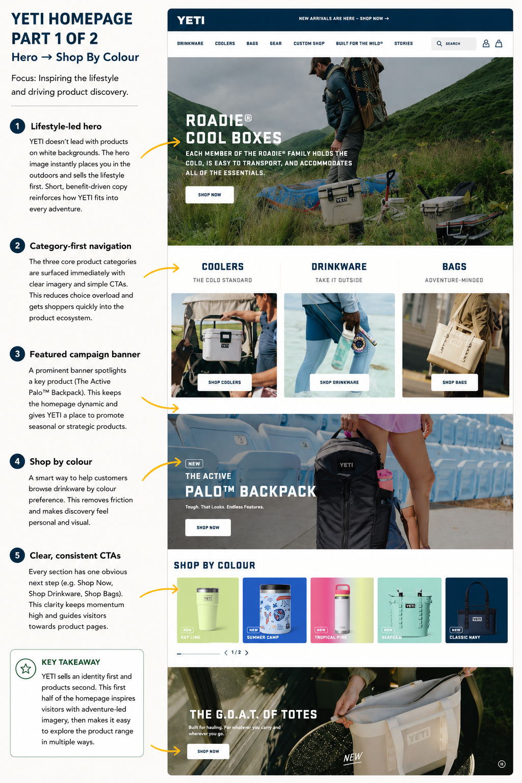
YETI's homepage is a great example of how premium brands use conversion rate optimisation without relying on constant discounts. Rather than pushing products immediately, the page first sells a lifestyle. Large outdoor imagery, concise benefit-led messaging and simple calls to action establish what the brand stands for before introducing visitors to the product range.
Navigation is intentionally straightforward. Visitors can browse by major categories such as Coolers, Drinkware and Bags, explore products by colour, discover new arrivals or shop by category further down the page. These multiple browsing paths accommodate different shopping behaviours while keeping the experience intuitive and reducing decision fatigue.
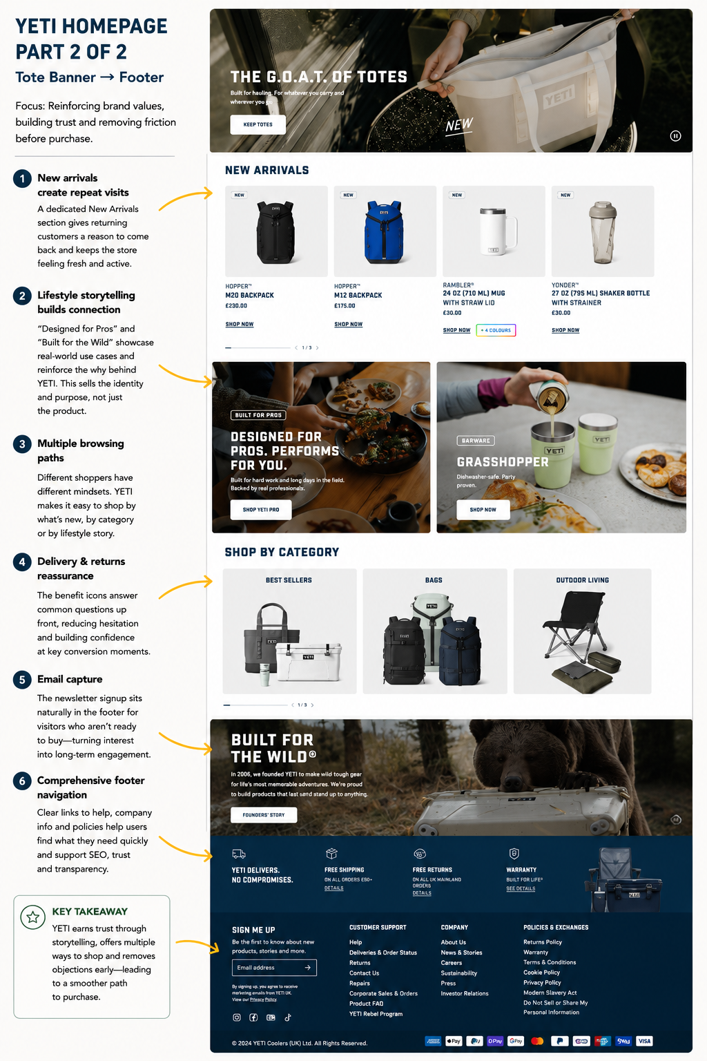
The homepage also keeps the site feeling fresh with campaign banners, featured products and regularly updated new arrivals. Instead of looking like a static catalogue, it feels like an active brand with new products and seasonal stories worth exploring. Throughout the page, YETI continues reinforcing its identity with lifestyle-led content such as "Designed for Pros" and "Built for the Wild," helping customers picture the products in real-world situations rather than simply reading feature lists.
Towards the bottom of the homepage, YETI shifts its attention to reassurance. Free shipping, free returns, warranty information and customer support links answer common questions before shoppers even reach a product page, while the email signup captures visitors who aren't yet ready to purchase. Rather than treating the footer as an afterthought, YETI uses it to build trust, encourage repeat visits and turn today's browsers into tomorrow's customers.
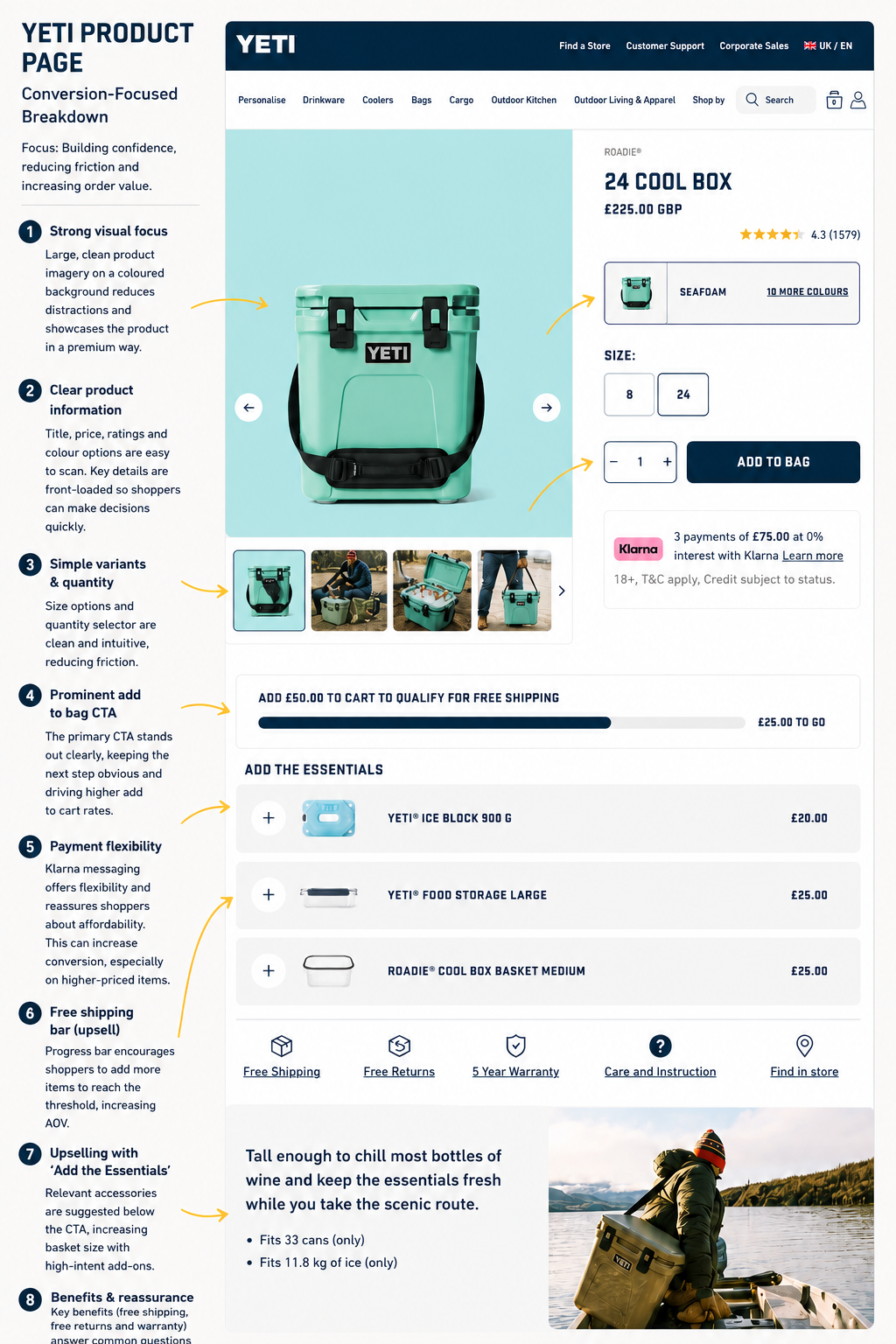
YETI's product page is built around a simple objective: remove friction, build confidence and maximise average order value without making the experience feel overly sales-driven.
Everything important is positioned above the fold. Large product photography immediately communicates quality, while the product name, price, review rating, colour options and size selector are all easy to scan. The primary Add to Bag button dominates the purchase area, making the next step obvious, while Klarna messaging lowers the perceived cost of a higher-ticket purchase by highlighting interest-free instalments.
One of the strongest CRO elements is the free shipping progress bar. Rather than simply stating a delivery threshold, YETI shows shoppers exactly how much more they need to spend to qualify. This small piece of visual feedback encourages customers to increase their basket value instead of checking out immediately.
That strategy continues with the "Add the Essentials" section. Instead of recommending unrelated products, YETI suggests accessories that naturally complement the cooler, such as ice blocks, storage containers and baskets. These are logical additions that genuinely improve the ownership experience while increasing average order value.
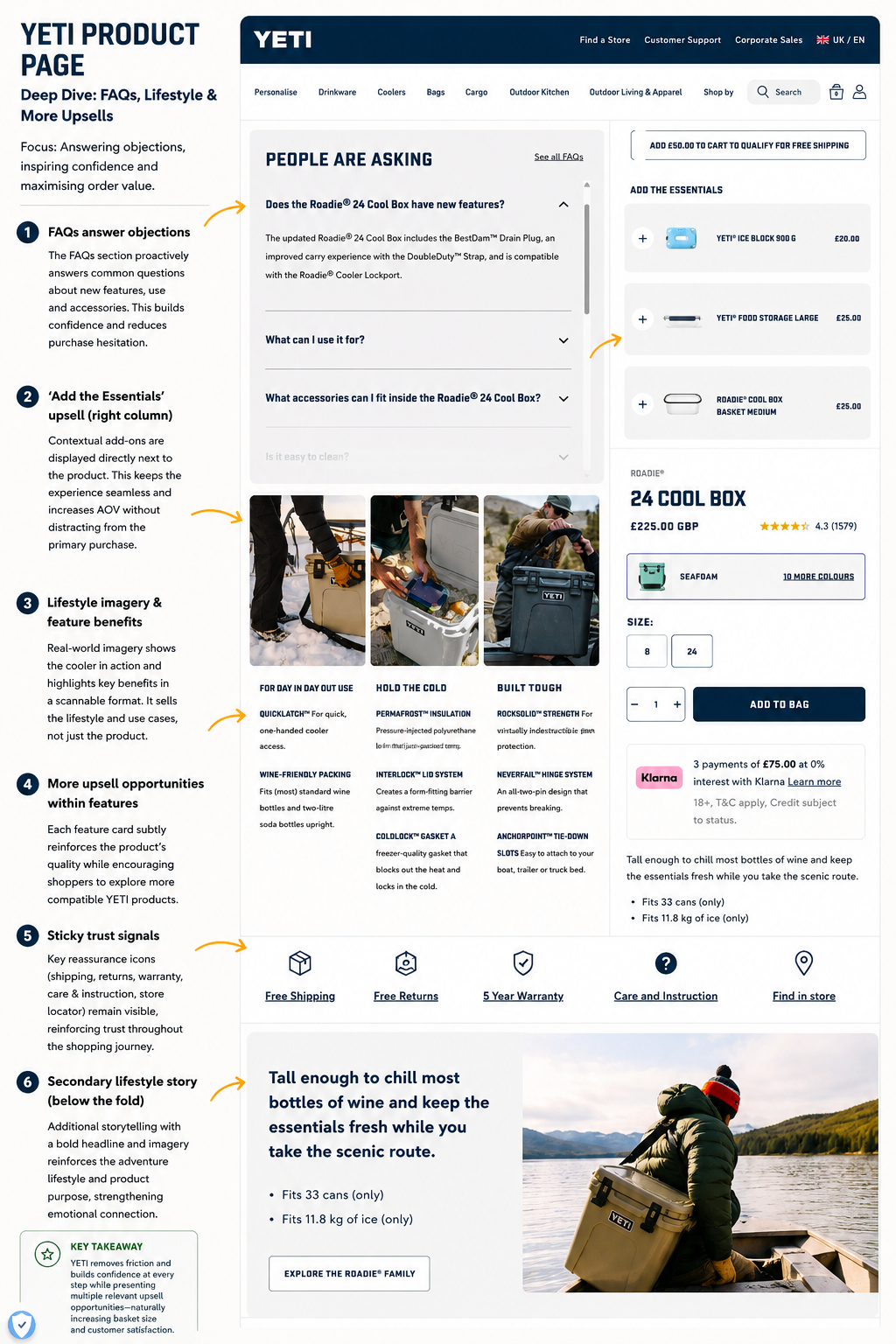
Further down the page, YETI addresses the final objections that often prevent a purchase. The FAQ section answers practical questions before shoppers need to contact support, while feature cards combine real-world photography with concise benefit-led copy to explain why the product performs so well. Rather than presenting technical specifications in isolation, YETI shows the cooler being used in authentic outdoor environments, helping visitors picture themselves owning it.
Trust is reinforced throughout the journey with prominent reassurance icons highlighting free shipping, free returns, a five-year warranty, care instructions and a store locator. These persistent trust signals reduce perceived risk and support premium pricing by reminding customers that they're investing in a long-lasting product backed by strong customer service.
YETI's success isn't built on one standout landing page or a single clever feature. Instead, every stage of the customer journey has been designed to reinforce the brand, reduce friction and steadily increase purchase confidence. The email popup captures long-term value, the homepage inspires visitors through lifestyle storytelling, and the product page removes objections while encouraging relevant upsells that increase average order value.
For ecommerce brands, the biggest lesson is that conversion optimisation isn't just about changing button colours or adding countdown timers. The highest-performing websites create a seamless experience where every section has a purpose, every interaction builds trust and every page naturally guides customers towards the next step.
If you're looking to improve your own Shopify store, these are exactly the types of CRO opportunities we help identify and implement—from homepage optimisation and product page improvements to email marketing, Klaviyo flows and ongoing conversion testing. Small improvements across the customer journey often compound into significant increases in revenue over time.
