
On 21 May 2026, Oura confidentially filed a draft registration statement with the SEC for a proposed IPO. Behind that filing sits roughly $1bn of revenue in 2025, up from about $500m the year before, a $900m Series E at an $11bn valuation, and 5.5 million rings sold since 2015.
Those are the numbers everyone quotes. The one that actually explains the website is different. Oura reported it was on pace to pass five million paid members in the second quarter of 2026.
That is the business. The ring is hardware sold once. The membership is revenue that arrives every year afterwards, and it is the number a public market will price. So the entire funnel has one job underneath the obvious one: sell the ring, then attach the subscription.
We walked the whole thing, from the Meta Ad Library to the cart. Seven screens, annotated.
In this article
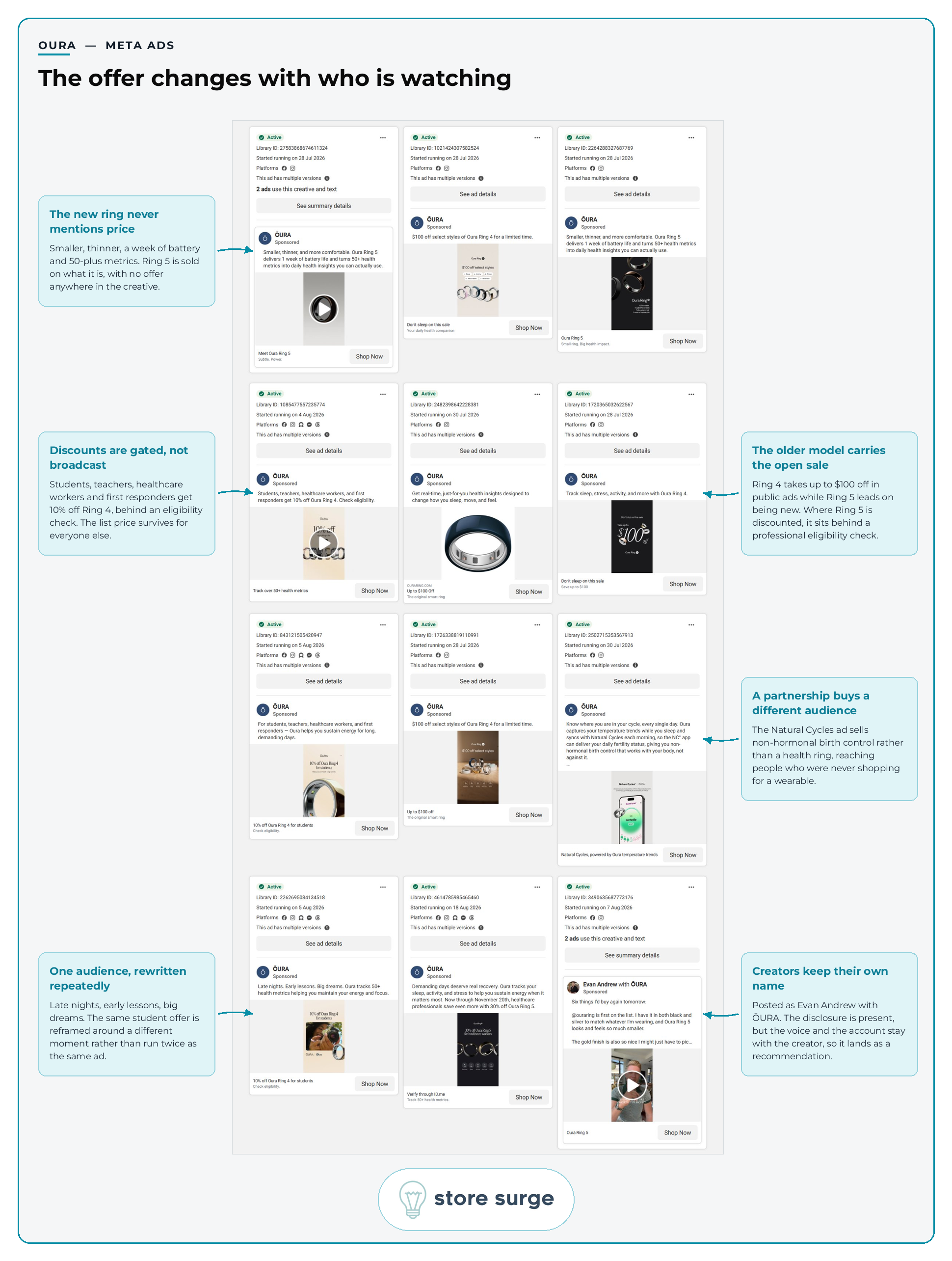
One note before the numbers. The Ad Library here is filtered to the United States, so the offers in this section are in dollars. Everything from the product page onwards is the UK store, in pounds.
Roughly 76 ads were live in that library, and the top four rows show the shape of the account clearly.
Two products run at once, doing different jobs. Ring 5 sells on being new: smaller, thinner, a week of battery, more than 50 health metrics. No offer appears anywhere in that creative. Ring 4 sells on price, at up to $100 off, described as a limited time sale. A launch and a clear-out share one account without ever competing on the same terms.
Where Ring 5 is discounted, it is gated. Healthcare professionals get 30% off, verified through ID.me, with a stated deadline. Students, teachers, healthcare workers and first responders get 10% off Ring 4, again behind an eligibility check. Every discount in this library is attached to a group that has to prove it belongs. The list price survives for everybody else.
The formats vary inside a fixed message. Video demonstrations, still product shots and flat typographic offer cards sit side by side. Several ads carry identical body copy with different creative, which is a brand testing the picture rather than the argument.
Two ads do something more interesting. One sells Natural Cycles, an FDA cleared non-hormonal birth control app powered by Oura temperature data, which reaches people who were never shopping for a wearable at all. Another is posted as "Evan Andrew with ŌURA", carrying the partnership disclosure but keeping the creator's own voice and account.
If your Meta ads discount to everybody by default, this is the argument for gating instead. Oura protects a £499 price by making the saving conditional rather than universal.
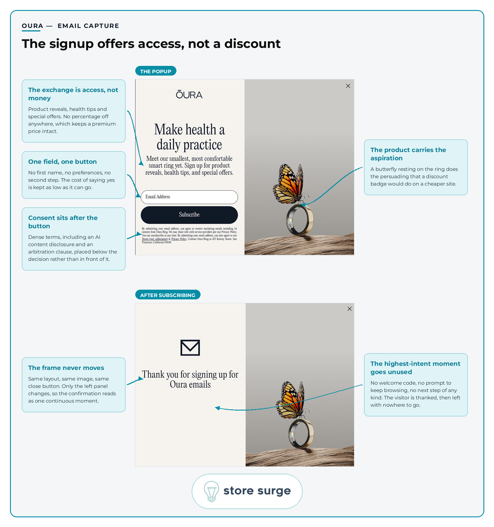
Land on the site and the email capture appears. What it offers is product reveals, health tips and special offers. What it does not offer is money off.
That restraint is consistent with the ad account. A brand that discounts its way onto an email list has told every new subscriber what the product is really worth, and Oura has decided the list is not worth that.
The ask is as small as it can be. One field, one button, no first name and no preferences. The consent copy is dense, covering an AI content disclosure and an arbitration clause, but it sits below the button rather than between the field and the button, so it does not add reading friction at the moment of commitment.
Then the confirmation state, which is the weakest thing we found on the site. The frame does not move. Same layout, same image, same close button, so the moment feels continuous. But nothing follows. No welcome code, no prompt to keep browsing, no next step of any kind. Someone has just raised their hand at the highest point of intent they will reach today, and the page thanks them and stops.
That is a free win sitting on the floor. Sending a new subscriber to the Free Sizing Kit, or to the sizing explainer, would cost nothing and would put them on the exact path the product page depends on. Most email marketing problems are further down the flow than this. This one is on the first screen.
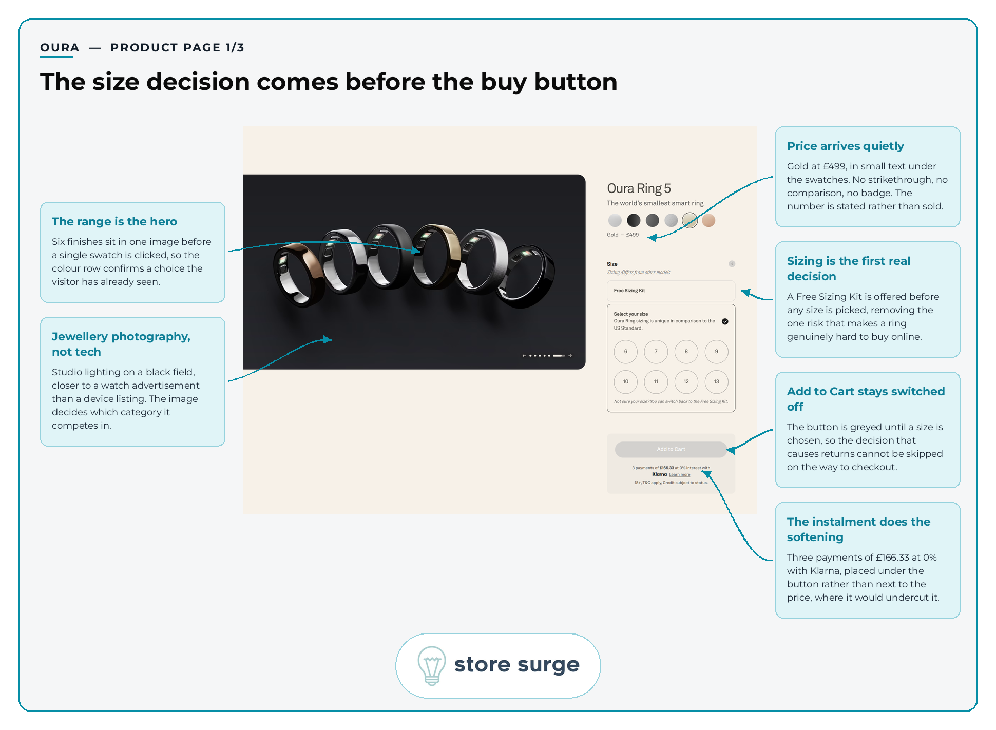
The product page opens with six finishes in a single image, so the swatch row confirms a choice the visitor has already seen rather than introducing one. The photography is studio lighting on a black field, closer to a watch advertisement than a device listing, which quietly sets the category being competed in.
Price arrives without ceremony. Gold at £499, in small text beneath the swatches. No strikethrough, no comparison, no badge. The number is stated rather than sold.
Then the mechanic that matters. A ring cannot be returned as easily as a t-shirt, and getting the size wrong is the single thing most likely to stop someone buying one online. Oura offers a Free Sizing Kit before any size is chosen, and leaves Add to Cart greyed out until a size is selected. The decision that causes returns cannot be skipped on the way to checkout.
Underneath the button, three payments of £166.33 at 0% with Klarna. Placed there rather than next to the price, where it would undercut it.
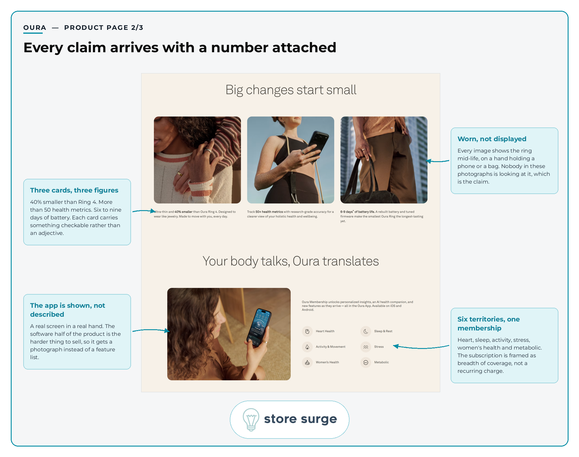
Three cards carry three checkable figures: 40% smaller than Ring 4, more than 50 health metrics, six to nine days of battery. Each one is something a sceptic could verify. None of them lean on an adjective to do the work.
The photography is making an argument too. Every image shows the ring mid-life, on a hand holding a phone or carrying a bag. Nobody in these pictures is looking at it, which is precisely the claim being made about a wearable you are supposed to forget.
Then the membership appears for the first time, framed as breadth rather than cost. Heart health, sleep and rest, activity and movement, stress, women's health, metabolic. Six territories, one subscription, and no price attached at this stage. The app is shown as a real screen in a real hand rather than described in a feature list, which is the right call, because the software half of this product is the harder half to sell.

The FAQ opens with one question already expanded, and it is the right one. Accuracy is the biggest doubt anyone has about a health wearable, and the answer is on screen before the visitor clicks anything. Five further questions stay collapsed, covering waterproofing, charging, data and sizing, so the section answers a lot without becoming a wall of text.
The technical specifications block then does something most brands skip. Sensor types, 6.09mm width, 2.28mm thickness, from two grams, water resistance to 100m, IP68, language support, integration with more than 100 apps. Almost nobody reads that in full. Almost everybody is glad it is there, because its presence is the argument rather than its content.
The small card in the corner is worth copying outright. What's Included: ring, size-specific charger, USB-C cable. Three lines that stop a £499 buyer wondering what else they will have to buy.
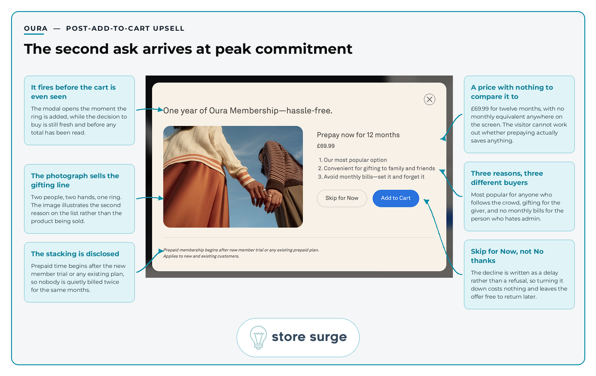
This is the screen that explains the business model, and it is easy to miss because it only appears for a moment.
Add the ring to the basket and a modal opens immediately, before the cart has been seen and before any total has been read. It offers one year of Oura Membership, prepaid, at £69.99. The timing is the whole trick. The visitor has just decided to spend £499 and has not yet seen what that decision totals.
The three reasons underneath are aimed at three different people. Most popular, for anyone who follows the crowd. Convenient for gifting, for the person buying it for someone else. Avoid monthly bills, for the person who hates admin. One list, three motivations.
The decline is written as "Skip for Now" rather than "No thanks". That is a deferral, not a refusal, which costs the visitor nothing and leaves the offer free to return later.
One honest gap. The screen shows £69.99 for twelve months with no monthly equivalent anywhere on it, so the visitor cannot work out whether prepaying saves them anything. Convenience is doing the selling, not arithmetic. Whether that is deliberate or an oversight, we cannot tell from the outside, but showing both numbers is the obvious test.
The fine print is fair, and worth saying so. Prepaid time begins after the new member trial or any existing plan, so nobody is quietly billed twice for the same months.
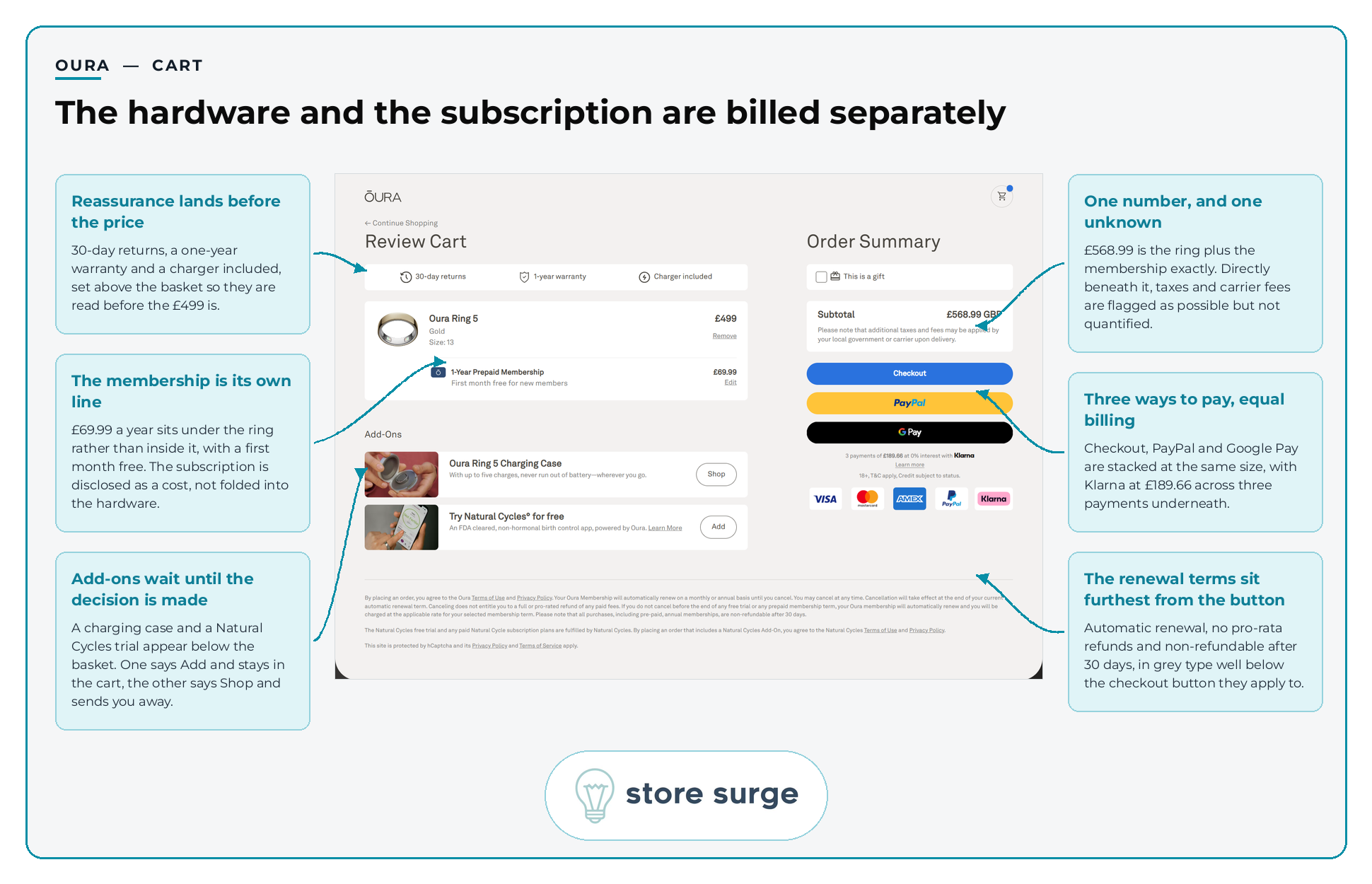
Reassurance is set above the basket, so 30-day returns, a one-year warranty and a charger included are read before the £499 is.
Then the line that makes this teardown worth writing. Oura Ring 5 at £499. Underneath it, as its own line, 1-Year Prepaid Membership at £69.99, with a first month free for new members. Subtotal £568.99, which is the two figures added together exactly. Three payments of £189.66 at 0% with Klarna.
Compare that with WHOOP, which we pulled apart recently. WHOOP sells a membership and lists the hardware, the charger, the band and the warranty at Free beneath it, so a £289 charge reads as a bundle. Oura does the opposite. It sells hardware and then adds the subscription as a visible second cost.
Two premium wearables at similar money, framing the same transaction in opposite directions. Neither is dishonest. Both are choices about which number the buyer should anchor on, and it is worth asking which one your own pricing page is closer to.
Add-ons wait until the main decision has settled, which is right, though the two of them behave differently. The Natural Cycles trial says Add and stays in the cart. The charging case says Shop and sends the visitor away from checkout. That inconsistency is the sort of thing that survives for years because nobody owns it.
Payment gets three routes at equal weight, Checkout, PayPal and Google Pay, with the card and Klarna logos underneath. And below all of it, in grey type, the renewal terms: automatic renewal, no pro-rata refunds, non-refundable after 30 days. All disclosed, all accurate, and all sitting as far from the checkout button as it is possible to be while remaining on the same page. Most conversion rate optimisation arguments about cart design come down to this exact trade-off between friction and clarity.
No teardown is worth reading if everything gets a tick. Four things we would put in front of a test.
The email confirmation goes nowhere. The highest-intent moment on the site ends in a thank you and a close button. Sending that person to the Free Sizing Kit is close to free and points them at the exact decision the product page depends on.
The upsell shows one price and no comparison. £69.99 prepaid, with no monthly figure beside it. Showing both would either prove the saving or reveal there is not one, and either answer is useful.
Two add-ons, two behaviours. One adds in the cart, the other sends the visitor to a different page mid-checkout. Making both work the same way is a small build with an obvious direction.
Taxes and fees are flagged but not quantified. The cart says local taxes and carrier fees may apply without saying how much. An unknown cost sitting immediately before the payment page is a known abandonment driver.
Most brands reading this are not filing an S-1. The mechanics still transfer.
The thread running through all of it is that Oura is not really selling a ring. It is selling a membership, and using a ring to open the relationship. Once you see the funnel that way, the separate cart line, the modal at Add to Cart and the six health territories on the product page all stop looking like separate decisions.
If you sell something once and would rather sell it repeatedly, the attach point is the thing to get right, and it is almost never where brands put it. Our growth calculator will give you a rough sense of what a better attach rate is worth before you commit to anything.
We run teardowns like this one on client funnels every week. If you want a look at yours, get in touch and we will walk through it with you.
