
In March 2026, WHOOP raised $575 million at a $10.1 billion valuation, in a round led by Collaborative Fund with Cristiano Ronaldo, LeBron James and Rory McIlroy among the investors. By July its member base had passed three million.
Those numbers are interesting on their own. What makes WHOOP worth pulling apart is what sits underneath them.
WHOOP does not sell a wearable. It sells a membership, and the hardware arrives as part of it. That single decision changes every conversion mechanic on the site. There is no discount code anywhere. There is no sale banner. There is no urgency timer. The entire funnel has to make a £289 two-year commitment feel small without ever cutting the price.
We walked the whole thing, from the homepage to the payment screen, and captured every step. Nine screens, annotated.
In this article

The first line of text on the page is not the brand name. It is a strip above the navigation reading “Try WHOOP for FREE today”, with a Join now link beside it.
That placement is deliberate. Before a visitor reads the hero, sees the product, or forms any opinion about price, they have been told there is a way in that costs nothing.
The hero itself leads with a benefit rather than a spec. “The wearable designed for lasting progress.” No sensor counts, no battery figures, no comparison to a competitor. What it does not carry is a button of its own. Every click available above the fold has to come from the navigation bar or that announcement strip.
Scroll once and the persuasion turns numerical. Daily WHOOP wear is linked to 91 more minutes of weekly activity, 2.3 more hours of sleep per week, and over 10% higher HRV, with an asterisk pointing to cited medical footnotes at the foot of the page.
Most ecommerce sites put their features here. WHOOP puts outcomes with numbers attached, then makes them checkable.
The feature carousel below continues the pattern. The cards are titled “Quantify how your body is feeling”, “Extend your prime for years to come” and “Optimize your sleep”. Every one of them describes a result. None of them describes a sensor.
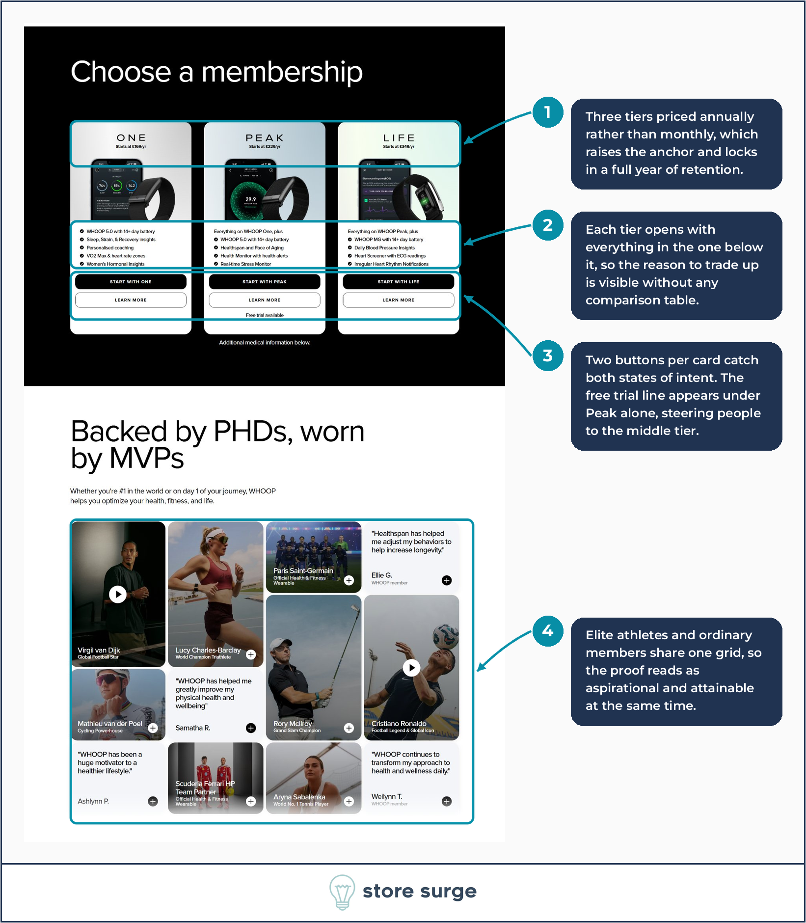
There is no separate pricing page. The three membership tiers sit on the homepage in a black section, roughly a third of the way down.
ONE starts at £169 a year, PEAK at £229, LIFE at £349. All annual. The monthly figure is not shown at this stage, which raises the anchor and quietly commits the buyer to a full year before they have thought about it in monthly terms.
The feature stacking is the part worth copying. ONE lists five capabilities. PEAK opens with “Everything on WHOOP One, plus” and lists four more. LIFE opens with “Everything on WHOOP Peak, plus” and does the same again. There is no comparison table anywhere on the page, and none is needed. The reason to trade up is visible in the first line of each card.
Each card carries two buttons. A filled “Start with One” and an outlined “Learn more”. One captures the visitor who has decided, the other captures the visitor who has not. Neither forces the choice.
Under the middle card, and only the middle card, sits a small line reading “Free trial available”. That is a nudge toward PEAK doing quiet work in six words.
Below the tiers, “Backed by PHDs, worn by MVPs” runs a proof grid that mixes two very different kinds of evidence. Virgil van Dijk, Rory McIlroy, Cristiano Ronaldo, Aryna Sabalenka, Paris Saint-Germain and Scuderia Ferrari HP sit in the same grid as members identified only as Ellie G., Samatha R. and Ashlynn P.
The athletes make the product aspirational. The members make it attainable. Separating those into two sections would have weakened both.
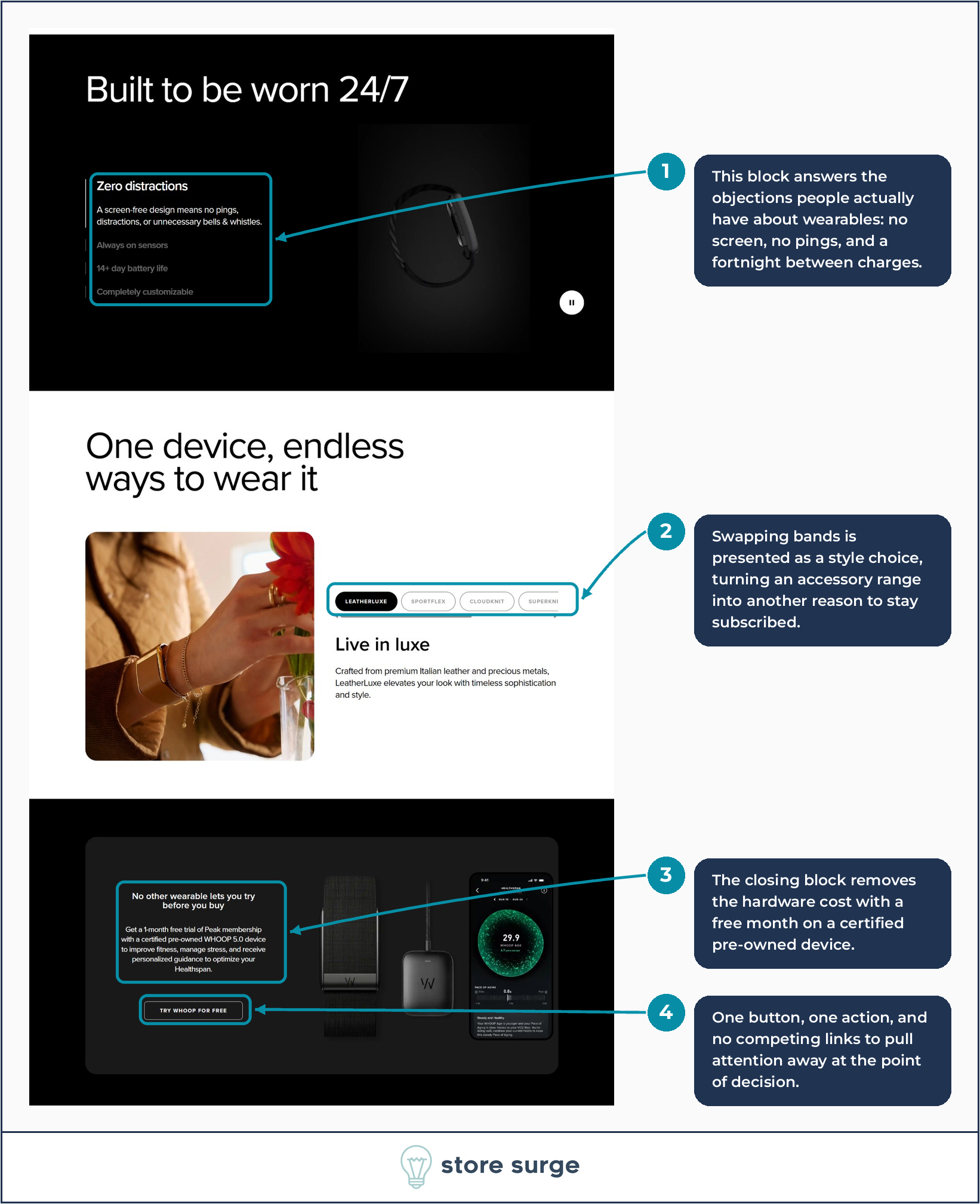
The final third of the homepage is built almost entirely around objection handling, and the objections chosen are the real ones people have about wearables.
“Built to be worn 24/7” leads with “Zero distractions” and a line explaining that a screen-free design means no pings or unnecessary bells and whistles. Then “Always on sensors”, “14+ day battery life” and “Completely customizable”.
Screen fatigue and nightly charging are the two reasons people abandon wearables. Both are addressed before the close, not in an FAQ underneath it.
“One device, endless ways to wear it” then reframes the accessory range. LeatherLuxe, SportFlex, CloudKnit and SuperKnit are presented as a style story rather than a parts list, with copy about premium Italian leather and precious metals. An accessory catalogue becomes a reason to stay subscribed.
The close is a single black block: “No other wearable lets you try before you buy.” A one-month free trial of Peak membership, with a certified pre-owned WHOOP 5.0 device. One button. No competing links.
That pre-owned detail is doing more work than it appears to. It removes the hardware cost entirely while giving WHOOP a use for returned units.
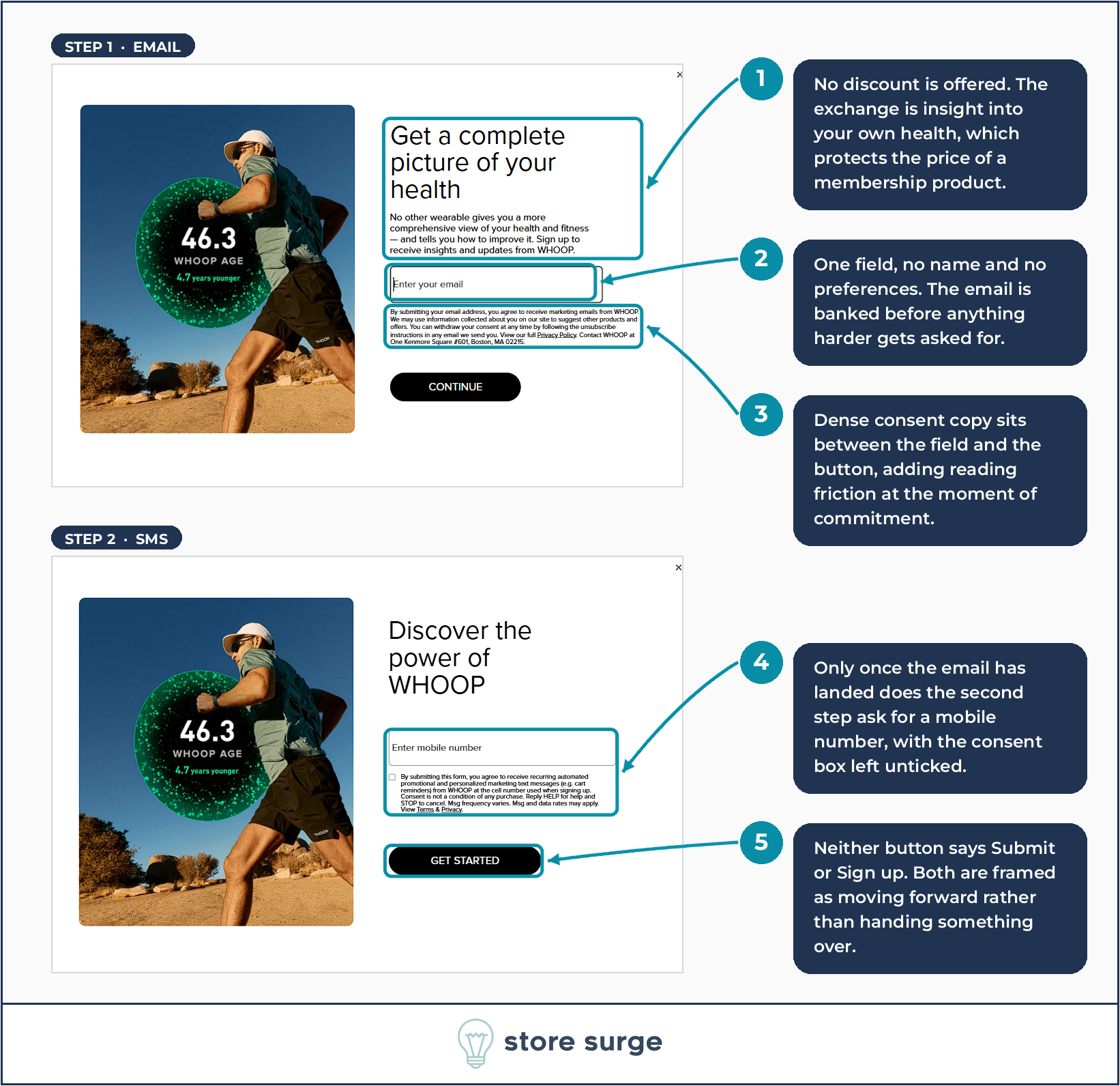
The email popup is where most ecommerce brands offer 10% off. WHOOP offers nothing of the sort.
The headline is “Get a complete picture of your health”, and the exchange on offer is insights and updates. For a subscription business, that restraint protects the price. A brand that discounts its way into an email list has told every new subscriber what the product is really worth.
The capture is progressive. Step one asks for an email address and nothing else. No first name, no preferences, no birthday. The email is banked before anything harder is asked for.
Step two then appears with a new headline, “Discover the power of WHOOP”, and asks for a mobile number. The consent checkbox is left unticked, and the copy states plainly that consent is not a condition of any purchase.
Both buttons avoid the obvious verbs. Not “Submit”, not “Sign up”, but “Continue” and “Get started”. Both are framed as moving forward rather than handing something over.
Notice also what is missing. There is no decline link, no “no thanks, I don’t want to be healthy” pattern. Just a close X in the corner. Manipulating people into a list tends to produce a list that does not convert. If you are building capture flows of your own, this is the pattern worth studying before you touch the email marketing side of it.
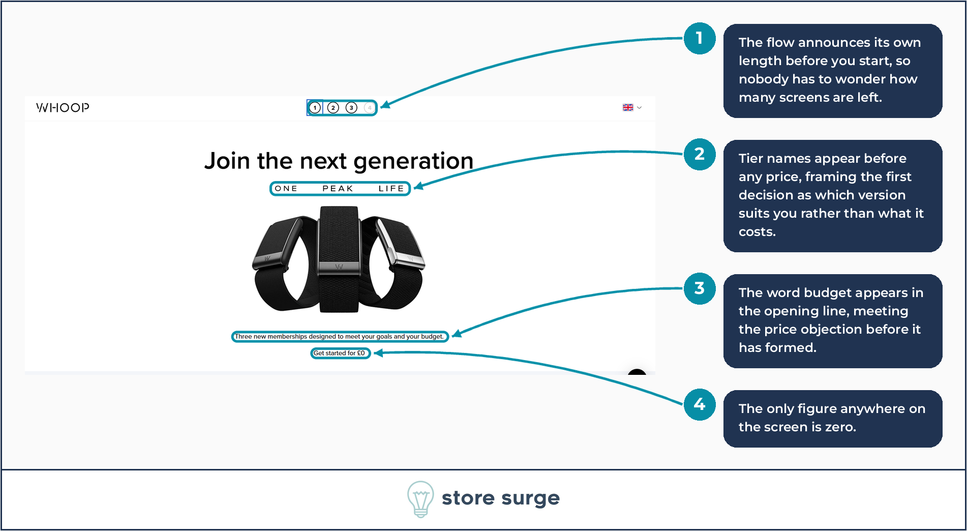
Click through to join and the funnel announces its own length immediately. Four numbered dots sit in the header, with the first highlighted. Nobody has to wonder how many screens are left, which is one of the quiet reasons people abandon multi-step flows.
Step one shows three tier names, ONE PEAK LIFE, above a product image. No prices. The first decision is framed as which version suits you rather than what it costs.
The subheading reads “Three new memberships designed to meet your goals and your budget.” The word budget appears in the opening line of the funnel, meeting the price objection before it has had a chance to form.
Below it, the only figure on the entire screen: “Get started for £0.”
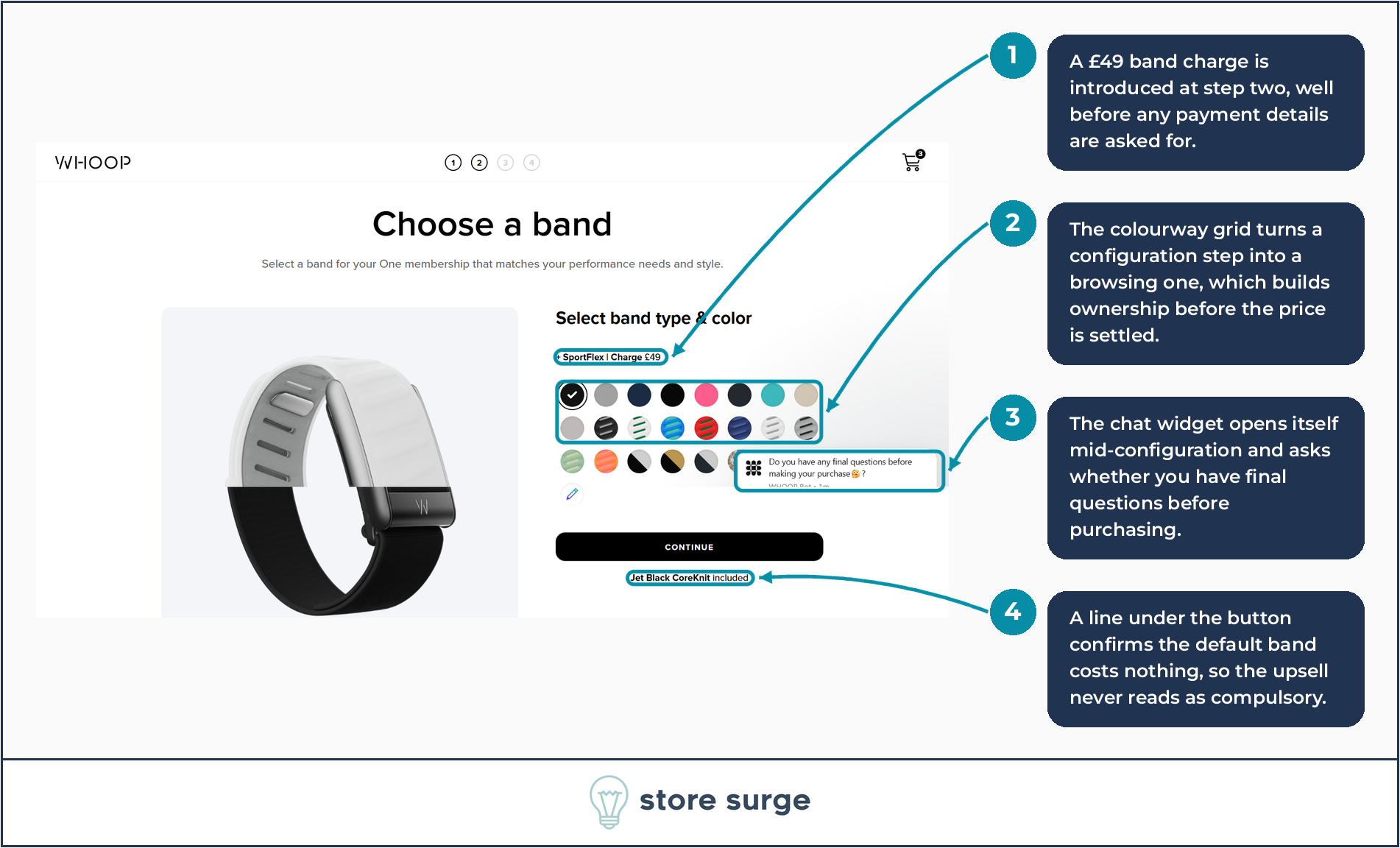
Step two is “Choose a band”, and it introduces a paid upsell before any payment information has been requested.
The label reads “+ SportFlex | Charge £49”. A grid of colourways sits below it, and the effect of that grid is worth naming. Picking a colour is a small act of ownership. By the time a buyer has chosen one, the device has started to feel like theirs, and that happens before the plan price is settled.
Under the Continue button, a line reads “Jet Black CoreKnit included”. The default costs nothing. The upsell never reads as compulsory, which is the difference between an upsell that lifts average order value and one that adds friction.
One thing we captured here that WHOOP presumably did not intend: the chat widget opens itself mid-configuration and asks whether you have any final questions before making your purchase. Proactive chat at a decision point is a reasonable tactic. Firing it over the very grid the user is trying to click is less reasonable.
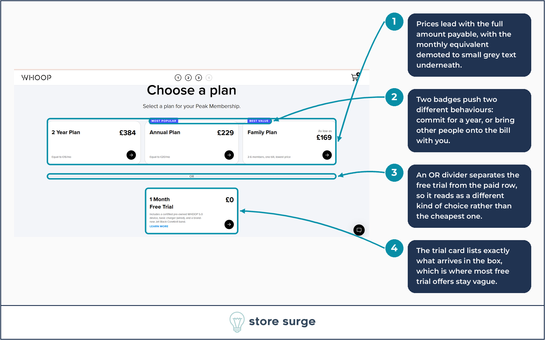
Step three is where the money conversation finally happens, and it is the most interesting screen in the funnel.
On the Peak membership, three plans sit in a row. 2 Year Plan at £384, Annual Plan at £229 carrying a MOST POPULAR badge, and Family Plan from £169 carrying BEST VALUE. Each shows the full amount payable in large type, with the monthly equivalent demoted to small grey text underneath. “Equal to £16/mo.”
The two badges push two different behaviours. MOST POPULAR pushes commitment length. BEST VALUE, sitting on the Family Plan, pushes account expansion. Same screen, two growth levers.
Below the row sits an OR divider, and beneath that, alone, the 1 Month Free Trial at £0. Separating it matters. Inside the row it would read as the cheapest item on a price list. Outside the row it reads as a different kind of choice.
The trial card also lists exactly what turns up: a certified pre-owned WHOOP 5.0 device, a basic charger, and a brand-new Jet Black CoreKnit band. This is where most free trial offers stay vague, and vagueness at the point of commitment costs conversions.
Worth naming the wider point. Whether to lead with the total or the monthly equivalent is one of the highest-leverage tests available to any subscription brand, and the answer is rarely obvious without running it. Structural decisions like that are most of what conversion rate optimisation work actually consists of.
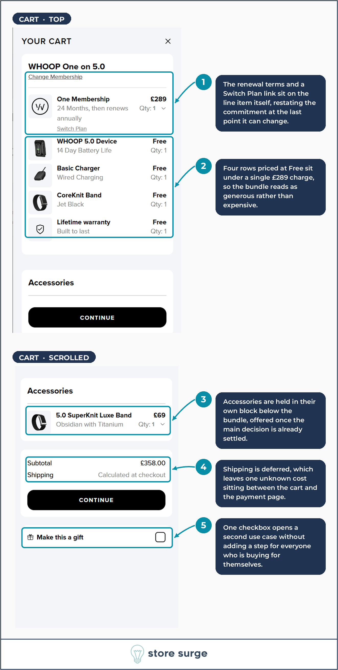
The cart drawer is a masterclass in framing.
Five line items are listed. One Membership at £289. WHOOP 5.0 Device, Free. Basic Charger, Free. CoreKnit Band, Free. Lifetime warranty, Free.
The word Free appears four times against a single real charge. Nothing about that is misleading, since the hardware genuinely is included, but the decision to itemise it rather than fold it into one line is a choice. Itemised, the bundle reads as generous. Folded together, £289 would read as expensive.
The line item itself carries “24 Months, then renews annually” and a Switch Plan link, with Change Membership sitting above it. The commitment is restated at the last point it can still be changed, and both escape routes keep the user inside the cart rather than sending them back up the funnel.
Accessories are held in a separate block below the bundle. The 5.0 SuperKnit Luxe Band at £69, taking the subtotal to £358. Offering that after the main decision has settled, rather than alongside it, is why it does not derail the purchase.
At the bottom, a single checkbox: “Make this a gift”. One line of interface opening an entire second use case, without adding a step for everyone buying for themselves.
The one thing we would question is shipping, marked “Calculated at checkout”. That leaves an unknown cost sitting immediately before the payment page.
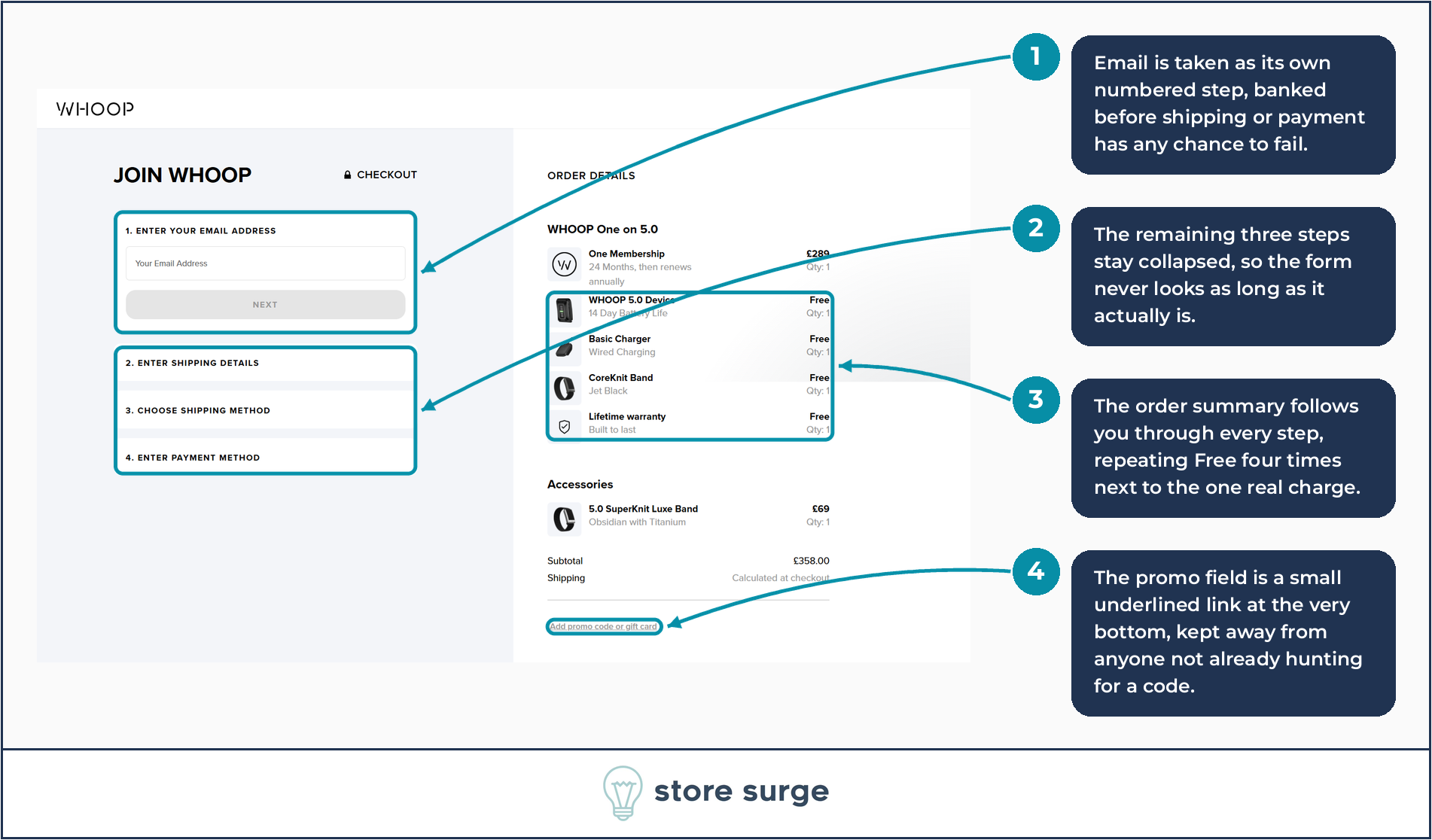
The checkout is four steps, and only one of them is visible.
Step one asks for an email address and nothing else, with the Next button greyed out until it is filled. Email is banked before shipping or payment has any chance to fail. If the purchase dies at step three, WHOOP still has an address to recover it with.
Steps two, three and four stay collapsed. Enter shipping details, choose shipping method, enter payment method. The form never looks as long as it actually is, which matters, because perceived length drives checkout abandonment as much as real length does.
The order summary sits on the right through every step, repeating those four Free lines next to the one real charge. A padlock icon and the word CHECKOUT sit next to the JOIN WHOOP heading.
At the very bottom of the summary, in small underlined grey text, sits “Add promo code or gift card”. Prominent promo fields send people off to hunt for a code they may never find, and a decent share of them never come back. Burying it protects the conversion without hiding it from anyone who genuinely has one.
No teardown is worth reading if everything gets a tick. Four things we would put in front of a test.
The hero has no CTA of its own. Every click above the fold has to come from the navigation or the announcement strip. Adding a button in the hero is close to the cheapest test available on that page.
Shipping is deferred to checkout. An unknown cost sitting between the cart and the payment page is a known abandonment driver. Showing a flat rate or a free threshold in the cart would remove it.
The consent copy sits between the popup field and its button. Four lines of dense legal text stand between typing an email and clicking Continue. Moving it below the button, which is standard practice and still compliant, removes reading friction at the moment of commitment.
The chat widget covers the swatch grid. Proactive chat is fine. Proactive chat that lands on top of the element the user is currently trying to click is a bug wearing a feature costume.
Most brands reading this do not have a $10bn valuation or Cristiano Ronaldo on the cap table. The mechanics still transfer.
The thread running through all of it is that WHOOP never competes on price, so every mechanic has to earn its conversion some other way. That is a harder constraint than most brands work under, and it produces better decisions.
If you are looking at your own funnel and suspecting there is money sitting in it, that is usually because there is. Our growth calculator will give you a rough sense of the scale before you commit to anything.
We run teardowns like this one on client sites every week, and the fixes are rarely as dramatic as the results. Have a look at how we approach conversion rate optimisation for ecommerce brands, or get in touch and we will take a look at yours.
