
Caraway has become one of the fastest-growing cookware brands in the United States, but its success isn't down to great products alone. Behind the scenes, the brand has built a highly optimised ecommerce experience that's designed to attract visitors, increase trust and maximise conversions at every stage of the customer journey.
In this teardown, we'll analyse Caraway's marketing strategy across Meta Ads, TikTok, Google Ads, product pages, email marketing, SMS, checkout optimisation and the Shopify apps powering the website. Along the way, we'll highlight practical conversion rate optimisation (CRO) techniques that any Shopify brand can learn from and implement.
Whether you're looking to increase conversion rates, improve customer retention or simply understand how leading ecommerce brands approach digital marketing, there are plenty of valuable lessons to take away from Caraway's strategy.
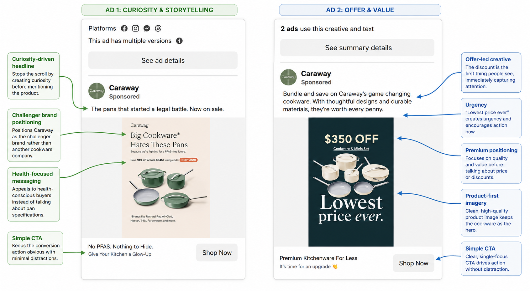
After reviewing Caraway's active Meta Ad Library, one thing becomes immediately obvious: they rarely advertise cookware itself. Instead, each advert is built around a different customer pain point.
Some of the messaging currently being tested includes:
Rather than relying on a single winning advert, Caraway appears to be testing multiple angles simultaneously. This allows Meta's algorithm to identify which messaging resonates best with different audience segments.
Interestingly, price isn't always the primary selling point. Many of the creatives first establish why the product is different before introducing discounts or promotional offers. This helps reinforce Caraway's premium positioning while still appealing to deal-seeking shoppers.
Several creatives also lean heavily on social proof, highlighting over 155,000 five-star reviews, while others feature creators such as Bethenny Frankel and Jessie James Decker. These creator-led videos feel much closer to native social content than traditional advertisements, helping them blend naturally into users' feeds.
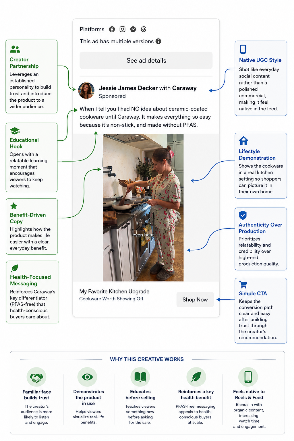
Visually, the adverts remain remarkably consistent. Neutral colours, clean layouts and minimal copy ensure the products remain the focus while strengthening overall brand recognition.
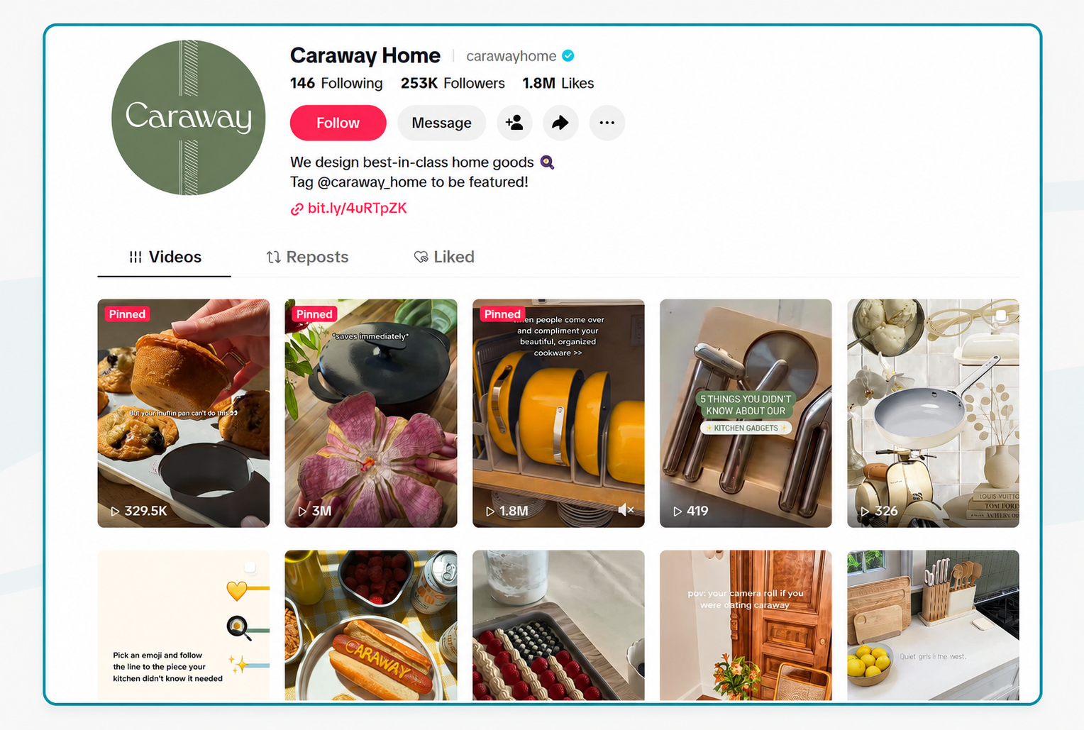
Caraway has built an impressive presence on TikTok, with more than 253,000 followers and 1.8 million likes. But unlike many ecommerce brands, its account doesn't feel like one long advert. Instead, it's packed with content that people would genuinely choose to watch, whether they're looking for kitchen inspiration, organisation ideas or simple cooking tips.
One thing that immediately stands out is how little attention is given to technical product features. Instead of talking about ceramic coatings or pan construction, Caraway shows its products solving everyday problems.
Videos demonstrating cupboard organisation, stackable cookware and clever storage solutions have attracted hundreds of thousands, and in some cases, millions of views.
It's a good reminder that people are often buying a better kitchen experience, not just another frying pan.
Another noticeable theme is the use of strong opening hooks. Videos begin with lines such as "5 Things You Didn't Know..." or "When people come over...", creating curiosity and encouraging users to watch for longer. It's a simple technique, but one that's consistently used across some of the brand's most popular content.
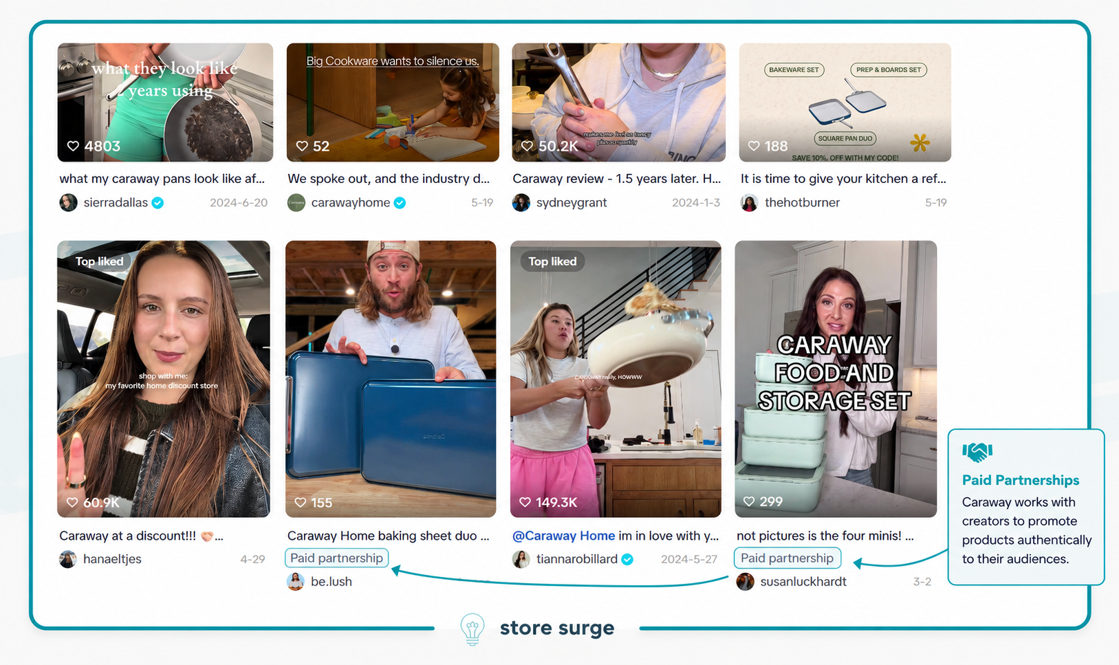
Caraway also leans heavily into creator marketing. Alongside its own content, the brand works with influencers and paid partners who demonstrate the products in their own homes. These videos feel much more like genuine recommendations than traditional adverts, which helps them blend naturally into users' feeds and build trust with new audiences.
Caraway appears to have a well-rounded Google Ads strategy, using both Shopping Ads and Search Ads to capture customers at different stages of the buying journey. While Shopping Ads focus on showcasing products visually, the accompanying Search Ad reinforces the brand's core messaging and directs shoppers to relevant collections.
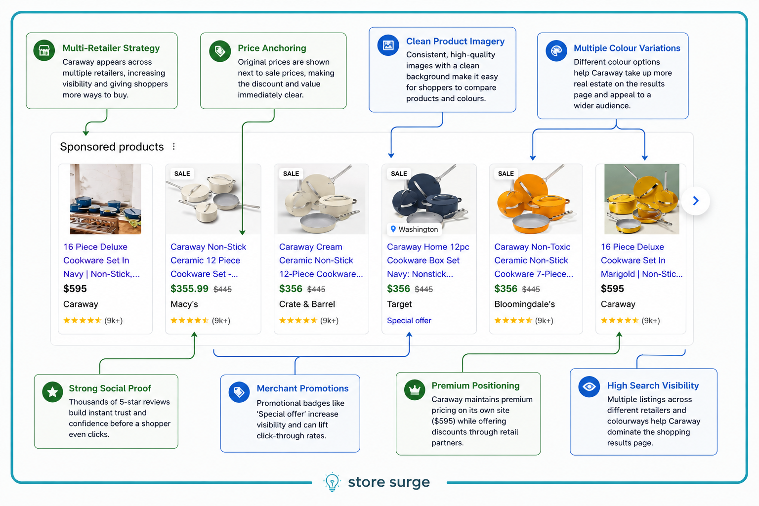
One of the first things that stands out in the Shopping results is Caraway's broad retail presence. Alongside its own website, products are also listed by retailers including Macy's, Crate & Barrel, Target and Bloomingdale's. This gives shoppers multiple purchase options while increasing the brand's visibility across the results page.
The Shopping listings themselves are consistent, with clean product imagery, prominent review ratings, sale pricing and clear discounts. Rather than relying on a single product, Caraway promotes multiple colour variations and cookware sets, helping it occupy more space within the Shopping carousel.
The Search Ad complements this strategy by focusing less on individual products and more on the brand's value proposition.
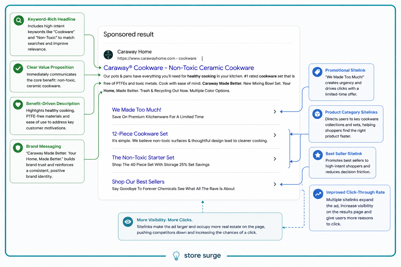
Instead of leading with discounts, the headline immediately reinforces Caraway's positioning around non-toxic ceramic cookware. The description continues this theme by referencing healthy cooking, PTFE-free materials and thoughtful design before introducing newer product ranges.
Caraway also makes good use of sitelinks, directing users to promotions, best sellers and key product collections. This reduces friction by helping shoppers land on the most relevant page rather than starting every journey on the homepage.
Getting traffic to your website is only half the battle. The product page is where that traffic either converts into customers or leaves without buying. Caraway has clearly invested heavily in this stage of the customer journey, creating a product page that's designed to answer questions, build trust and remove friction at every step.
1. The Above-the-Fold Experience Is Built for Fast Decision Making
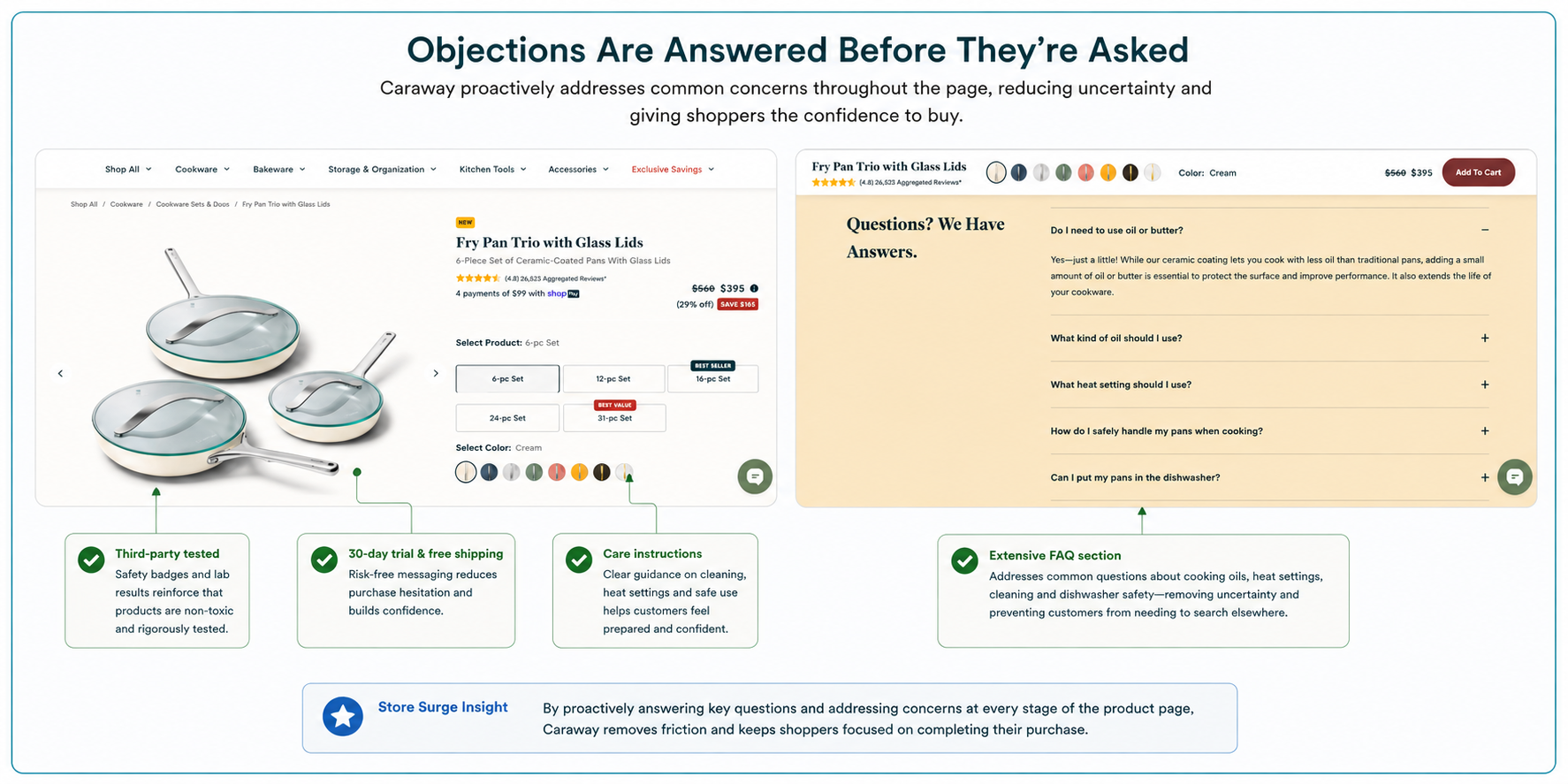
Caraway understands that many visitors decide whether to keep browsing within just a few seconds, so the top of the product page answers almost every important buying question immediately.
The product title, star rating, review count, pricing, discount and payment options are all visible without scrolling. Customers can instantly choose their preferred set size and colour, while labels such as "Best Seller" and "Best Value" subtly guide shoppers towards higher-value options without feeling overly sales-driven.
What's particularly effective is that there are very few distractions. The photography is clean, premium and consistent, allowing the cookware to become the hero of the page while the purchase options remain clear and easy to scan.
Rather than forcing visitors to hunt for information, Caraway presents everything needed to make an informed buying decision within the first screen—reducing friction and encouraging shoppers to continue through the purchase journey.
2. Upsells Feel Helpful Rather Than Salesy
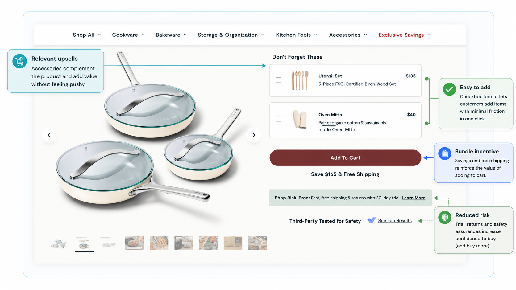
Many ecommerce stores wait until the checkout to suggest additional products. Caraway does it earlier, while the customer is still evaluating their purchase, and does so in a way that feels genuinely useful.
Instead of recommending random products, the page suggests complementary items that naturally fit the cookware being purchased, such as matching utensils and oven mitts. Each recommendation includes a product image, a short description and a simple checkbox, allowing shoppers to add accessories without leaving the page or interrupting their buying journey.
The upsell sits immediately above the Add to Cart button, ensuring customers see it at the exact moment they're making a purchase decision. Just below, Caraway reinforces the value of buying today with free shipping, a 30-day risk-free trial, and third-party safety testing, giving shoppers even more confidence before clicking the button.
It's a good example of increasing average order value without creating friction. The recommendations feel like completing a kitchen set rather than being pushed into spending more, making them far more likely to convert.
3. Detailed Information Is Available Exactly When It's Needed
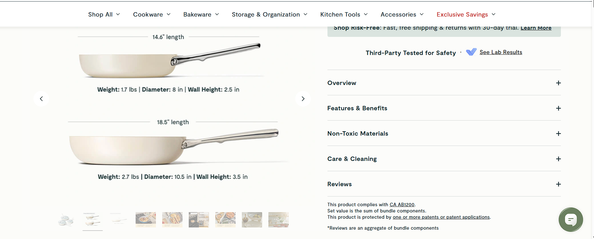
As customers scroll further down the page, Caraway continues to remove potential buying barriers by providing detailed product information in a structured, easy-to-digest format.
One feature that stands out is the visual size guide, which shows the dimensions, weight and depth of each pan. Rather than asking customers to interpret a list of measurements, the page presents the information visually, making it much easier to understand exactly what they're buying. For higher-value purchases, this helps reduce uncertainty and can minimise returns caused by incorrect expectations.
Alongside this, the product information is organised into expandable sections covering features, non-toxic materials, care instructions and reviews. Instead of overwhelming visitors with large blocks of text, shoppers can quickly open the sections most relevant to them.
The result is a page that feels informative without becoming cluttered. Customers can answer their own questions, compare specifications and build confidence in the product—all without ever leaving the page.
4. Lifestyle Photography Helps Customers Imagine Ownership
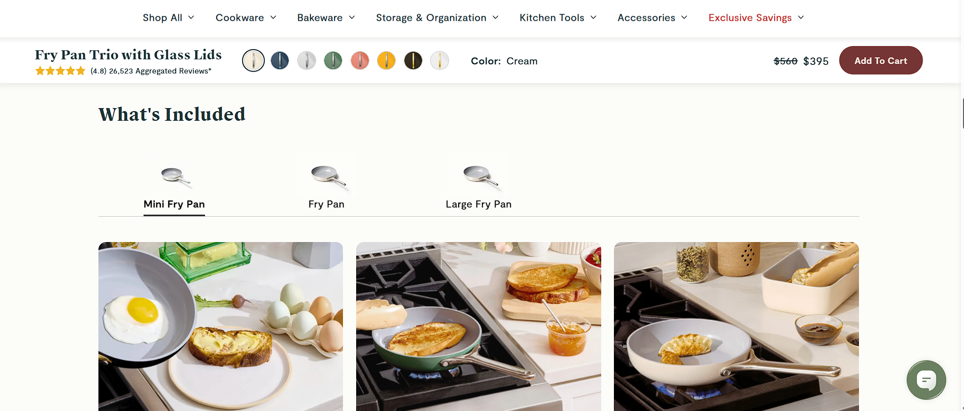
Caraway doesn't rely solely on polished studio product photography. As shoppers move down the page, the cookware is shown in real kitchens, cooking real food and being used in everyday situations.
This might seem like a small detail, but it's a powerful conversion tool. Instead of asking customers to imagine how the product will fit into their lives, the photography does the work for them. Whether it's cooking breakfast, making toast or preparing a quick meal, each image helps shoppers picture themselves using the pans in their own kitchen.
The section is also interactive, allowing visitors to switch between the different pans included in the set. This gives customers a much clearer understanding of exactly what they're buying while demonstrating practical use cases for each piece.
It's an effective combination of product education and lifestyle marketing. By moving beyond "cold" product images and showing the cookware in context, Caraway makes the product feel more aspirational, more relatable and ultimately easier to justify purchasing.
5. They Don't Just Sell the Product — They Sell Why It's Better
One of the strongest conversion techniques on the page is the interactive comparison section. Rather than simply listing product features, Caraway directly compares its cookware against traditional alternatives, helping shoppers justify why the premium price is worth paying.
The comparison focuses on the benefits customers actually care about—non-toxic materials, ease of use, durability and everyday performance. By framing the decision as Caraway versus traditional cookware, the brand shifts the conversation away from price and towards value.
This is particularly effective because many shoppers are already comparing products in their own minds. Instead of leaving them to research competitors elsewhere, Caraway keeps that comparison on its own website and presents the argument in its favour.
It's a subtle but powerful piece of persuasion. Rather than telling customers their cookware is better, the page allows shoppers to compare the differences for themselves, building confidence and reducing the need to leave the site before purchasing.
6. Great Product Pages Continue Selling After the Purchase Decision
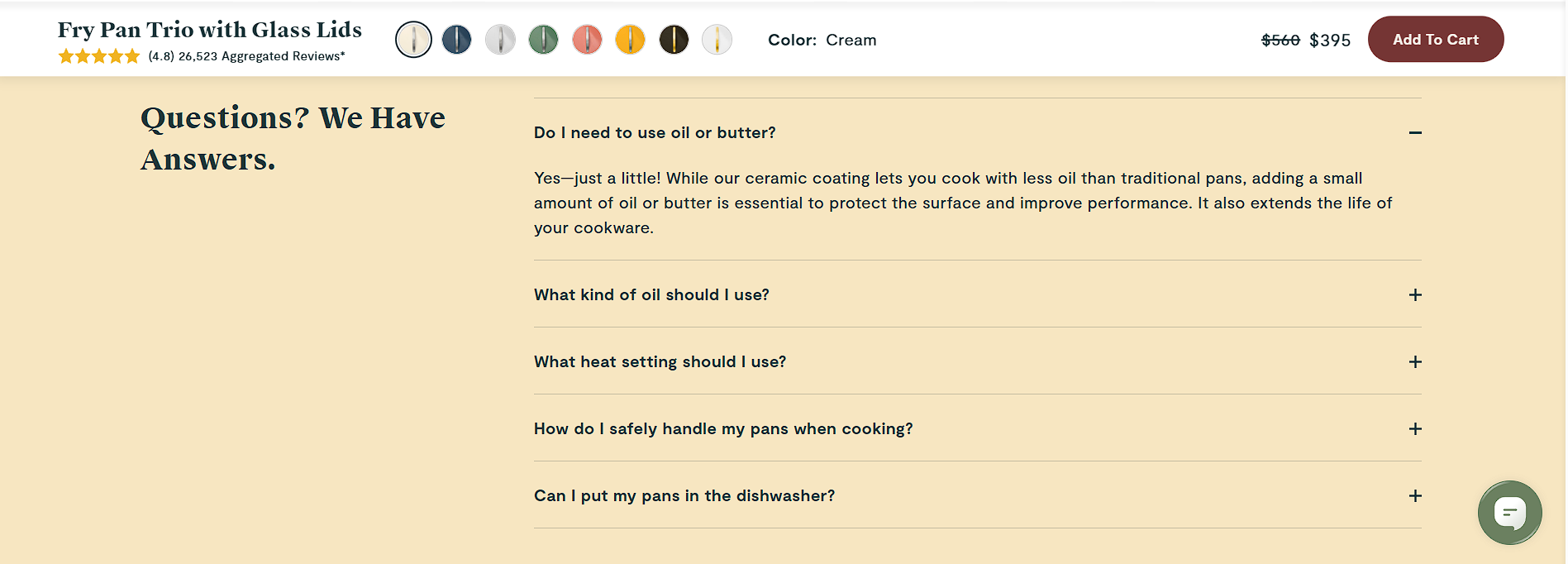
By the time a customer reaches the FAQ section, they've often decided they like the product. The remaining challenge is removing any final hesitation before they buy.
Caraway uses this section to answer the practical questions that commonly prevent customers from checking out. Rather than hiding this information in a help centre, it covers topics such as cooking oils, heat settings, handling and cleaning directly on the product page.
The answers are written in a reassuring, conversational tone, helping customers feel supported rather than sold to. Instead of simply saying "dishwasher safe" or "use low heat", the brand explains why certain recommendations exist, reinforcing its expertise and building credibility.
It's another example of friction reduction. Every question answered on the page is one less reason for a shopper to leave the site, search elsewhere or delay their purchase. Combined with the trust signals shown earlier on the page, the FAQ acts as a final confidence boost before customers click Add to Cart.
7. Social Proof Is Everywhere—And The Buy Button Never Disappears
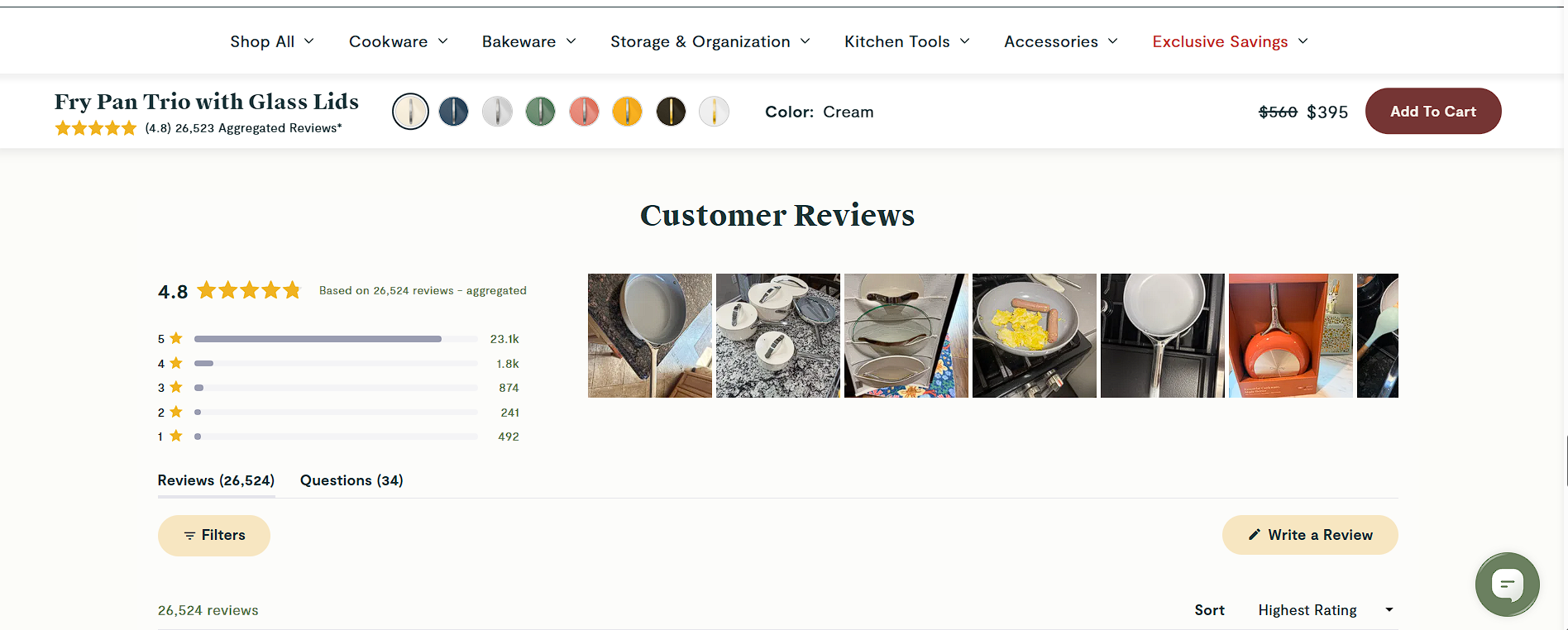
Many ecommerce stores treat reviews as something customers can browse after they've decided to buy. Caraway does the opposite. Reviews become part of the sales process.
With more than 26,000 customer reviews, a 4.8-star average, a clear ratings breakdown and hundreds of customer-submitted photos, shoppers can quickly see that real people are using and enjoying the product. The user-generated images are particularly powerful because they show the cookware in real kitchens rather than polished studio environments, making the product feel more authentic and trustworthy.
At the same time, Caraway ensures that customers never have to hunt for the purchase button. As visitors scroll through reviews, product information and FAQs, a sticky Add to Cart bar remains fixed at the top of the page, continuously displaying the product name, star rating, selected colour, discounted price and purchase button.
This is a subtle but highly effective conversion technique. Customers can continue building confidence through reviews and social proof without ever losing the opportunity to purchase. By combining reassurance with constant purchase visibility, Caraway shortens the path from consideration to checkout.
Caraway's popup is designed to do much more than collect an email address. Rather than offering a discount on the current purchase, it incentivises customers with $50 off their second order, encouraging repeat business and increasing customer lifetime value.
The signup flow is equally well thought out. Visitors are first asked for their email address before being prompted for their mobile number, reducing friction and improving completion rates. They're also asked what they're shopping for, allowing Caraway to segment customers by product interest from the very beginning.
By combining email capture, SMS signup and customer segmentation into a single, low-friction experience, Caraway creates a marketing funnel that's optimised not just for today's sale, but for future purchases as well.
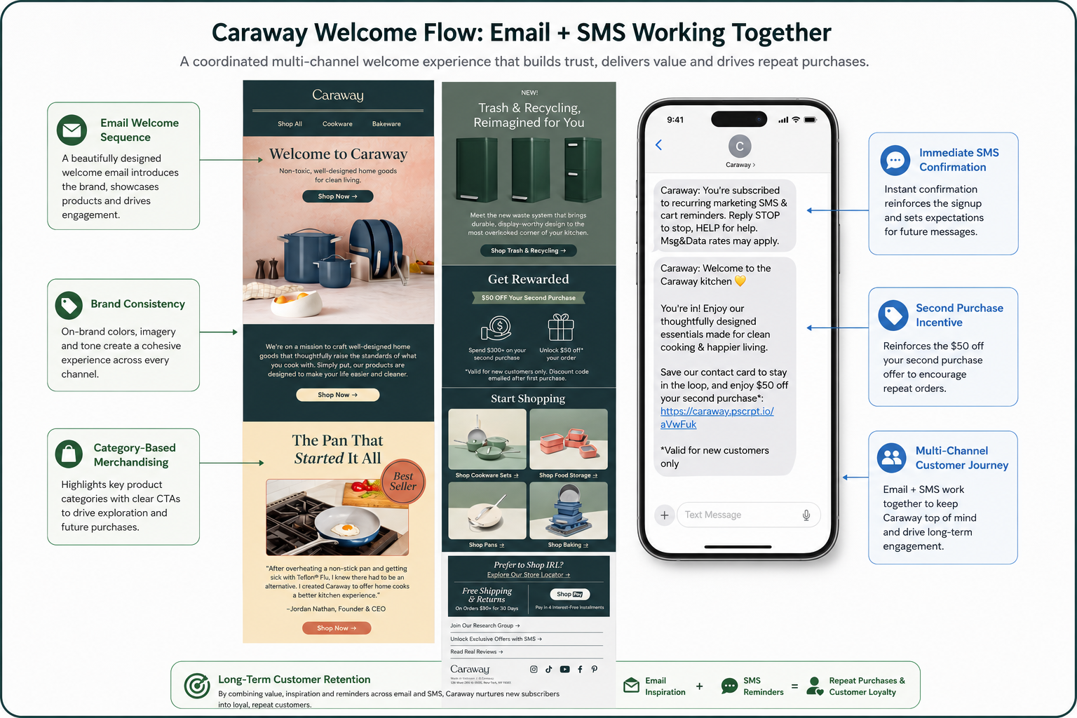
The moment a customer signs up, Caraway begins building the relationship across both SMS and email. The welcome text is short and immediate, confirming the subscription while reinforcing the second purchase incentive with a direct link back to the website.
The accompanying welcome email expands on this with beautiful product imagery, clear calls-to-action and a simple introduction to the brand. Rather than focusing solely on discounts, it highlights Caraway's product categories, tells the brand story, promotes new launches and reminds customers of the reward waiting on their second order.
Together, the SMS and email work seamlessly to keep Caraway front of mind. By combining immediate engagement with long-term nurturing, the brand gives itself multiple opportunities to convert subscribers into repeat customers while strengthening customer lifetime value.
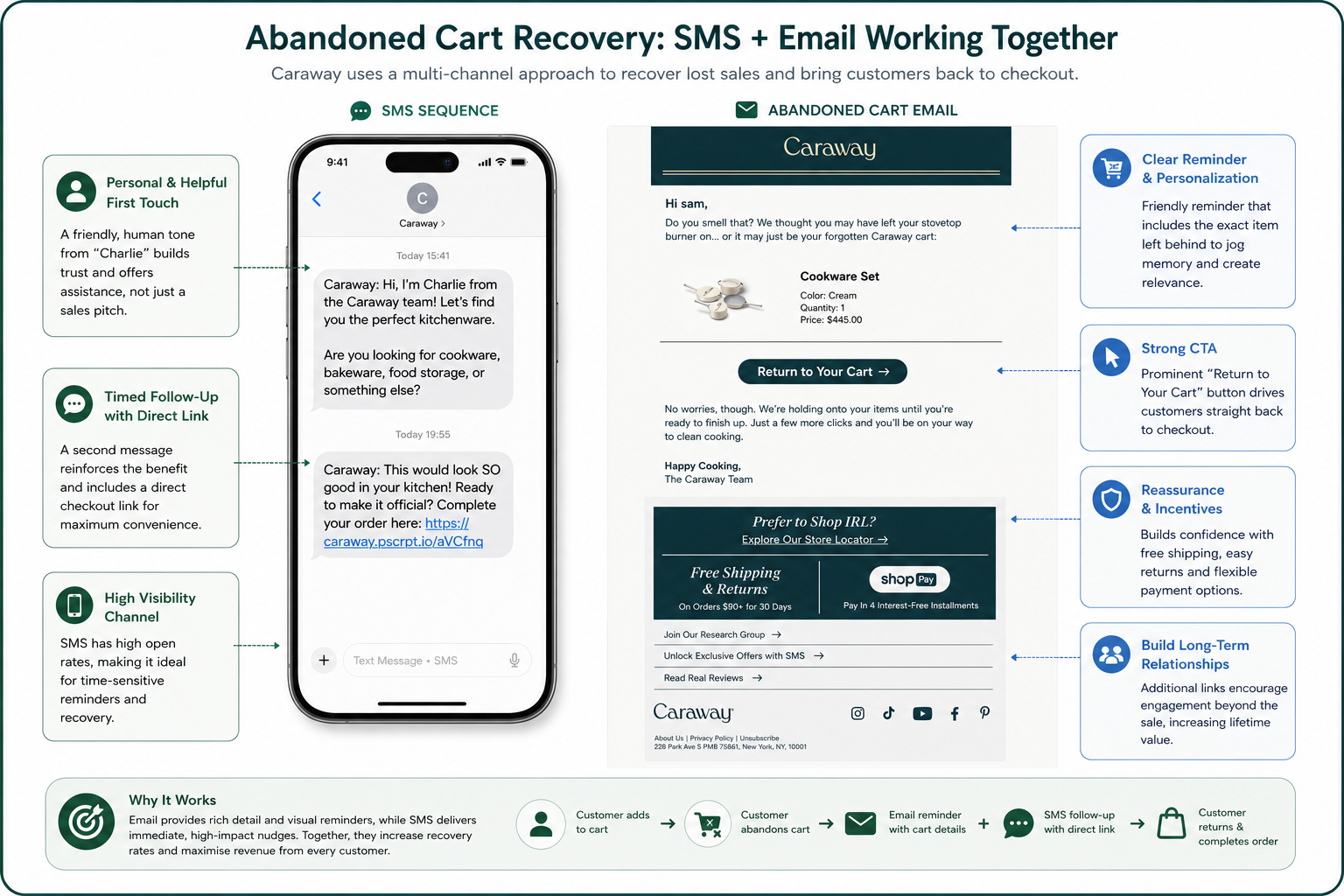
Caraway doesn't rely on a single abandoned cart reminder. Instead, it uses both email and SMS to re-engage shoppers who leave without completing their purchase.
The email reminds customers exactly what they've left behind, includes a personalised product summary and makes returning to checkout effortless with a prominent "Return to Your Cart" call-to-action. Meanwhile, the SMS sequence takes a more conversational approach, first offering assistance with product selection before later prompting the customer to complete their order with a direct checkout link.
Using both channels increases the chances of recovering lost sales while allowing each to play a different role. Email provides richer product information and branding, while SMS delivers timely, high-visibility reminders that are difficult to ignore. Together, they form a well-executed abandoned cart strategy that helps turn hesitant shoppers back into paying customers.
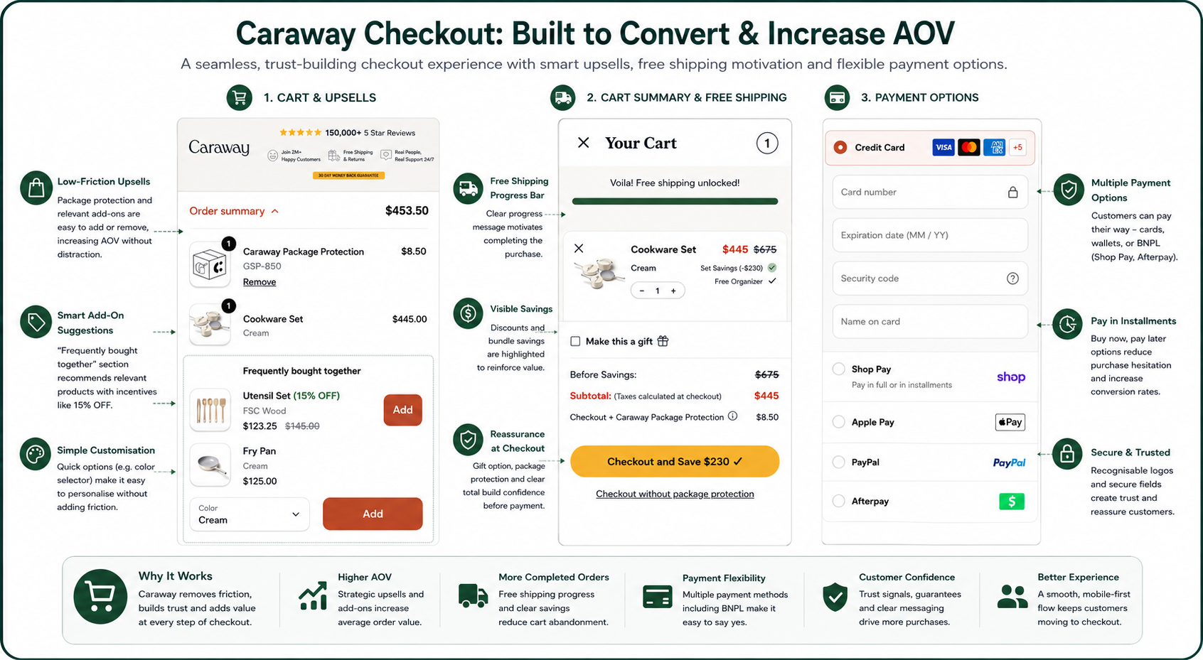
Caraway's optimisation doesn't stop at the product page. The checkout continues to increase conversion rates while actively growing average order value through a combination of smart upsells, reassurance and friction reduction.
The cart immediately reinforces value by highlighting the customer's savings, free shipping and bundle discounts before they reach the payment stage. Rather than presenting a static basket, it suggests complementary products through a "Frequently Bought Together" section, allowing customers to add accessories with a single tap. Package protection is also included as a low-friction upsell, increasing order value while providing additional peace of mind.
The checkout itself removes barriers by offering multiple payment methods including Shop Pay Installments, Apple Pay, PayPal, Afterpay and standard credit card payments, giving shoppers the flexibility to pay in full or spread the cost. Combined with prominent trust signals, visible savings and a streamlined mobile-first design, the entire checkout experience is engineered to reduce abandonment while encouraging customers to spend more before completing their purchase.
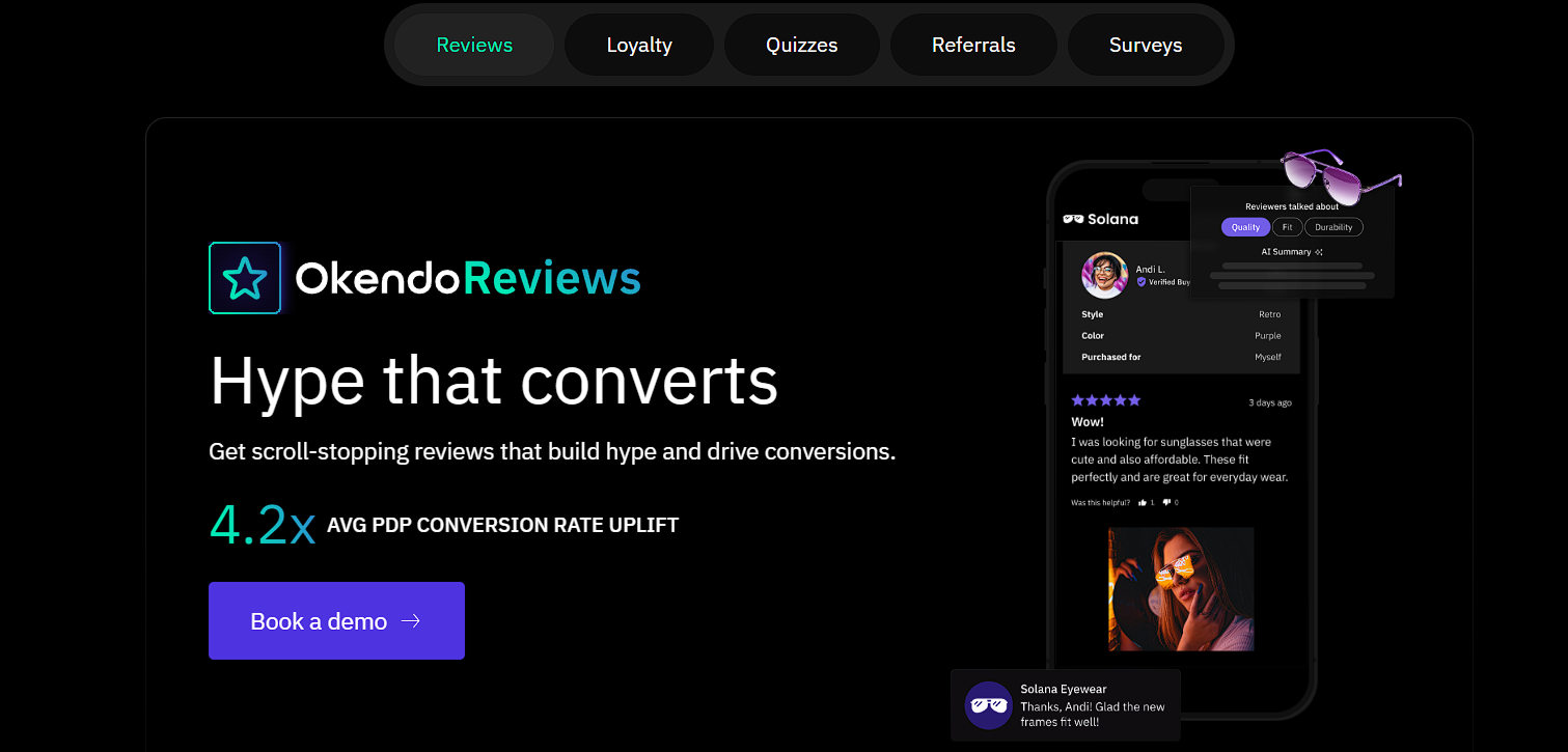
One of the standout apps powering Caraway's ecommerce experience is Okendo, which goes far beyond collecting customer reviews. The platform helps Caraway build trust through verified reviews, customer photos and star ratings while also encouraging repeat purchases through referrals and loyalty features.
By combining social proof with customer advocacy, Okendo turns existing buyers into a marketing channel. Happy customers can share referral links with friends, earn rewards and generate new sales at a much lower acquisition cost than paid advertising. At the same time, the large volume of authentic reviews and user-generated content strengthens product pages, giving new visitors greater confidence to purchase.
For Shopify brands looking to improve both conversion rates and customer retention, Okendo demonstrates how a single platform can support the entire post-purchase journey—not just collect reviews, but help create a loyal customer base that continues to drive future growth.
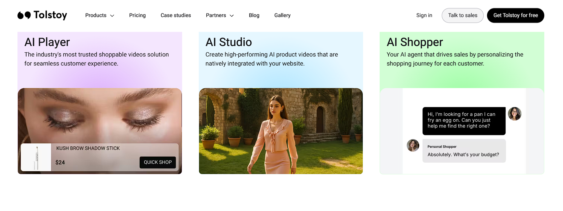
Another app helping to power Caraway's customer experience is Tolstoy, an interactive video platform designed to make online shopping feel more engaging and personal. Rather than relying solely on static images, Tolstoy allows brands to embed shoppable videos, product demonstrations, tutorials and customer stories directly throughout the buying journey.
For Caraway, this means shoppers can see products in use, understand key features more quickly and gain confidence before making a purchase. Interactive video is particularly effective for premium products because it answers questions visually, reduces uncertainty and keeps visitors engaged for longer.
Tolstoy also integrates with Shopify and Klaviyo, allowing brands to personalise video experiences, collect customer data and measure how video influences conversions. It's a strong example of how modern ecommerce brands are moving beyond traditional product photography to create richer, more immersive shopping experiences that help increase conversion rates.
Caraway's website isn't built around a single "magic" feature. Instead, it's the result of dozens of small optimisations working together to remove friction, build trust and maximise customer lifetime value.
From the moment a visitor lands on the product page they're guided towards a purchase through clear social proof, compelling product imagery, thoughtful FAQs, comparison tables and strategic upsells.
Once they leave the page, sophisticated email and SMS automations continue the conversation with personalised welcome flows and abandoned cart reminders designed to bring shoppers back. Even the checkout has been optimised to increase average order value through complementary product recommendations, package protection, flexible payment options and reassuring trust signals.
Perhaps the biggest lesson isn't to copy Caraway feature for feature. It's to understand that high-converting ecommerce brands think about the entire customer journey, not just the product page. Every interaction is an opportunity to reduce hesitation, reinforce trust or increase customer value.
If you're running a Shopify store, ask yourself a simple question:
How many of these strategies are you currently using—and which one could make the biggest impact on your conversion rate?
At Store Surge, this is exactly the type of ecommerce audit we carry out. By analysing every stage of the customer journey, from product pages and merchandising to Klaviyo flows, SMS marketing and checkout optimisation, we identify practical opportunities to increase conversions, boost average order value and drive more long-term revenue.
If your store is attracting traffic but not converting as efficiently as it should, our ecommerce conversion rate optimisation services (CRO) identify the friction, missed revenue opportunities and practical improvements across the full customer journey.
