
Most ecommerce brands ask customers to choose a product first and answer questions later.
Butternut Box does the opposite.
Before showing a single price or asking customers to commit to a subscription, it guides them through a carefully designed questionnaire that feels more like a conversation than a form. By the time visitors reach their personalised meal plan, they've already invested several minutes into the process, shared valuable information, and built confidence that the recommendations have been created specifically for their dog.
This approach isn't just about collecting data. It's a masterclass in conversion rate optimisation (CRO). Every interaction reduces friction, builds trust and makes the eventual subscription feel like the logical next step rather than a sales pitch.
Here's how the first stage of the journey works.
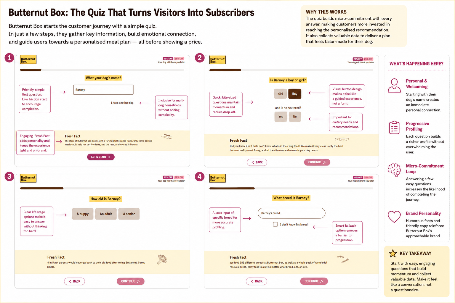
The first few screens set the tone for the entire experience.
Rather than overwhelming visitors with lengthy forms or product choices, Butternut Box starts with simple, highly personal questions: your dog's name, gender, age and breed.
These questions are intentionally effortless to answer. Each requires only a few seconds of thought, creating a series of small "yes" moments that psychologists often refer to as micro-commitments. Once someone has answered several questions, they're naturally more inclined to continue the journey they've already invested time in.
The design reinforces this feeling throughout.
The progress bar provides reassurance that the process won't take long, while the large buttons make each decision feel quick and intuitive. Instead of presenting dropdown menus or complex forms, the interface encourages users to simply click and move forward.
Perhaps the cleverest touch is the personality woven into every step. Between questions, Butternut Box includes light-hearted "Fresh Facts" about dog nutrition and the brand's story. These small moments break up what could otherwise feel like a data collection exercise, making the experience feel enjoyable rather than transactional.
There are also subtle friction reducers throughout. If a visitor doesn't know their dog's exact breed, there's an immediate fallback option rather than forcing them to abandon the quiz. Multi-dog households are catered for from the very first screen, preventing unnecessary barriers before the journey has even begun.
By the end of these opening questions, Butternut Box has already gathered valuable first-party data while simultaneously making the visitor feel understood.
The customer hasn't browsed products.
They haven't compared prices.
They haven't even seen a subscription yet.
Instead, they're already thinking about their dog, and that's precisely where Butternut Box wants their attention.
The result is an onboarding experience that feels less like filling in a questionnaire and more like having a personalised consultation. It's a subtle shift, but one that lays the foundations for everything that follows.
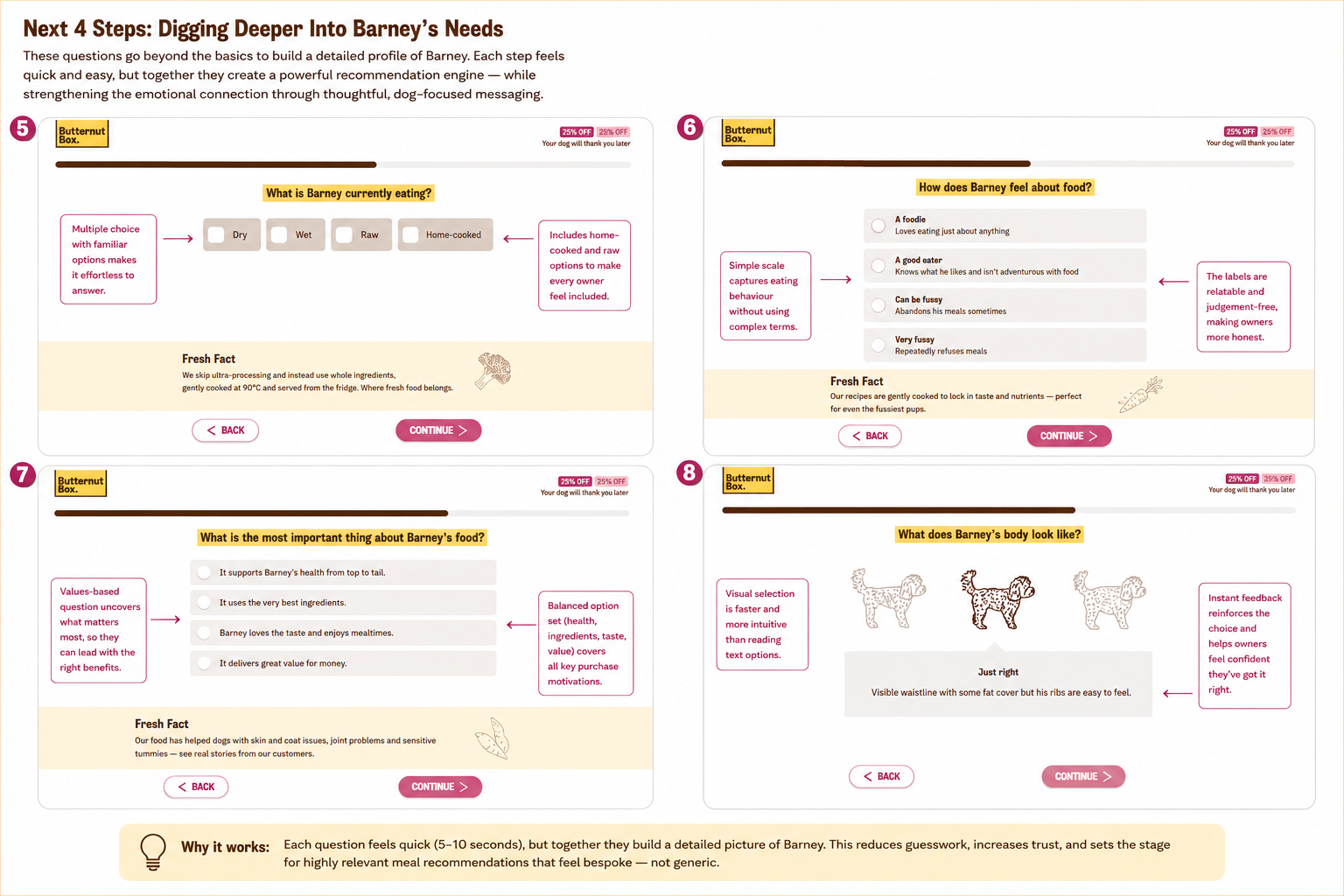
Once the initial questions are complete, Butternut Box starts collecting the information that transforms a generic recommendation into something that feels genuinely tailored.
Rather than jumping straight into products, the quiz digs deeper into Barney's daily routine. It asks what he's currently eating, how enthusiastic he is about food, what matters most to his owner, and even lets them visually assess his body condition.
Each question is still incredibly quick to answer, but together they create a surprisingly rich customer profile.
One of the strengths of this section is that every question uses language that feels natural. Instead of asking about "feeding compliance" or "palatability", owners simply choose whether their dog is "A foodie", "A good eater" or "Very fussy". These descriptions are instantly understandable and avoid making owners feel judged, encouraging more honest responses.
The same principle appears throughout the experience. When asking about Barney's current diet, familiar options like dry, wet, raw and home-cooked mean virtually every owner can identify their situation immediately. There's no need to interpret technical terminology or overthink the answer.
Butternut Box also uncovers buying motivations before recommending a product. Asking what matters most about Barney's food—whether it's overall health, premium ingredients, taste or value—reveals which benefits should be emphasised later in the journey. Instead of showing every possible selling point, the brand can lead with the messages most likely to resonate with that individual customer.
Perhaps the smartest interaction is the body condition selector. Rather than asking owners to describe their dog's weight, they're shown a series of illustrations with instant feedback explaining each option. Visual selection is significantly faster than reading long descriptions, reduces uncertainty and gives owners confidence that they've made the right choice.
Throughout this entire stage, the quiz continues to reinforce trust with short "Fresh Facts" about nutrition and dog wellbeing. These small educational moments subtly justify the questions being asked while reinforcing Butternut Box's expertise.
The overall effect is that the customer never feels like they're filling out a lengthy questionnaire. Every interaction takes only a few seconds, but collectively they build an incredibly detailed picture of Barney. That richer profile allows Butternut Box to present recommendations that feel bespoke rather than generic—making the final subscription far easier to justify.
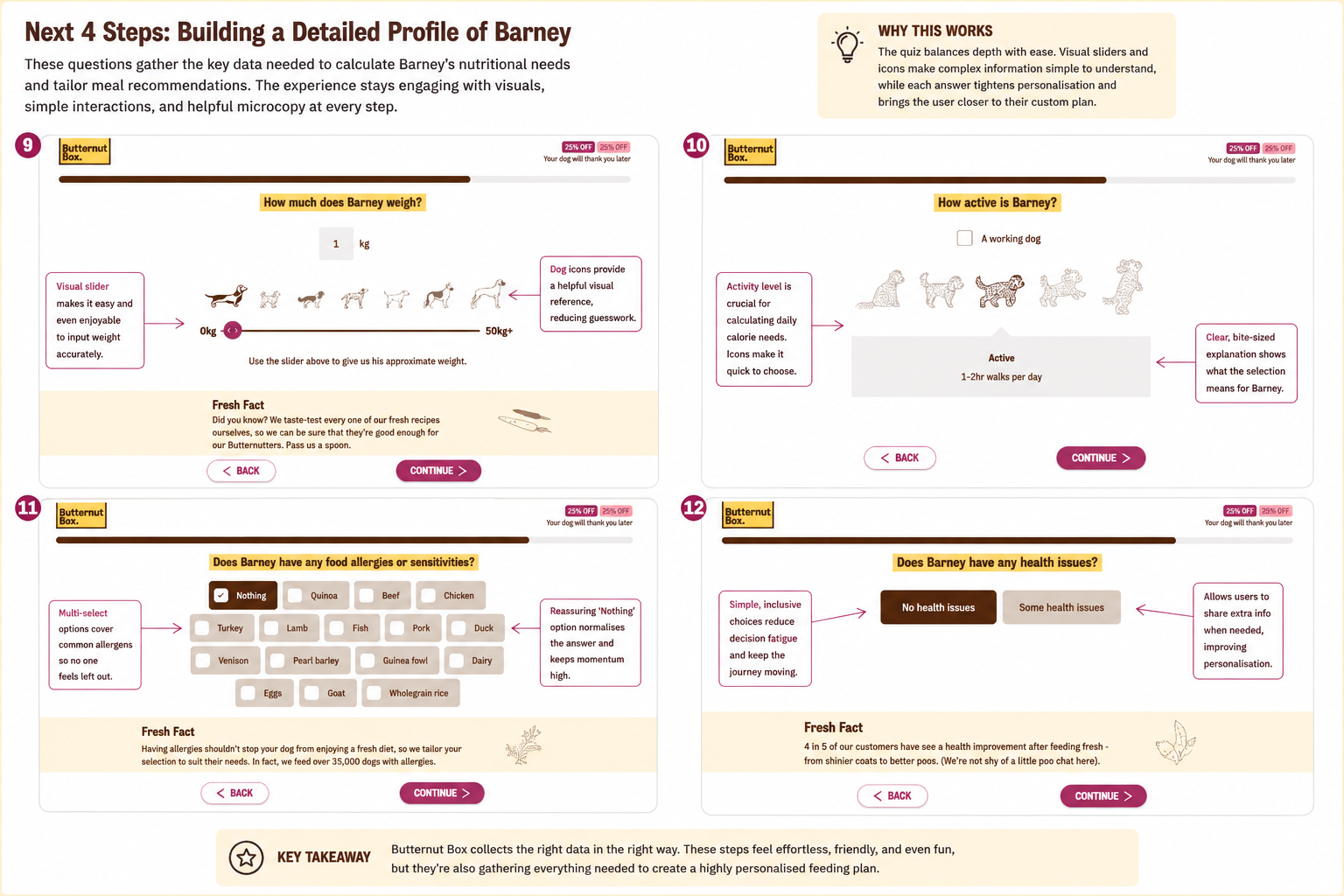
By this point in the quiz, Butternut Box has already built an emotional connection with the customer. The next stage focuses on gathering the practical information needed to create a genuinely personalised feeding plan.
Instead of presenting these as long forms, each question uses highly visual interactions that make potentially complicated information feel effortless to provide.
Weight is a perfect example. Rather than asking owners to type a number into a text field, Butternut Box uses a simple slider accompanied by dog illustrations that provide an instant visual reference. Even if an owner doesn't know their dog's exact weight, they can make a confident estimate in seconds.
The activity question follows the same principle. Instead of describing exercise levels with paragraphs of text, owners simply choose from a series of illustrations showing increasingly active dogs. Once selected, the interface immediately explains what that activity level means in practical terms, reinforcing confidence that they've made the correct choice.
The quiz also captures important dietary requirements without creating friction. Food allergies are presented as familiar multi-select buttons, while a prominent "Nothing" option allows most owners to answer with a single click. Small design decisions like this reduce decision fatigue and keep the journey moving.
Health conditions are handled equally well. Rather than overwhelming users with a lengthy medical questionnaire, Butternut Box begins with a simple choice between "No health issues" and "Some health issues". Only customers who actually need additional personalisation are asked to provide more information, while everyone else progresses immediately.
Throughout this stage, the experience remains remarkably consistent. Helpful illustrations, concise explanations and reassuring "Fresh Facts" continue to educate without interrupting the flow. Each answer feels quick and satisfying, even though the business is collecting highly valuable data behind the scenes.
This is a good example of effective conversion optimisation. Customers feel like they're having a simple conversation about their dog, while Butternut Box is quietly gathering everything needed to calculate calorie requirements, tailor ingredient recommendations and personalise future marketing. The user experiences almost no friction, yet the brand ends up with an exceptionally rich customer profile that makes the final recommendation feel credible rather than algorithmic.
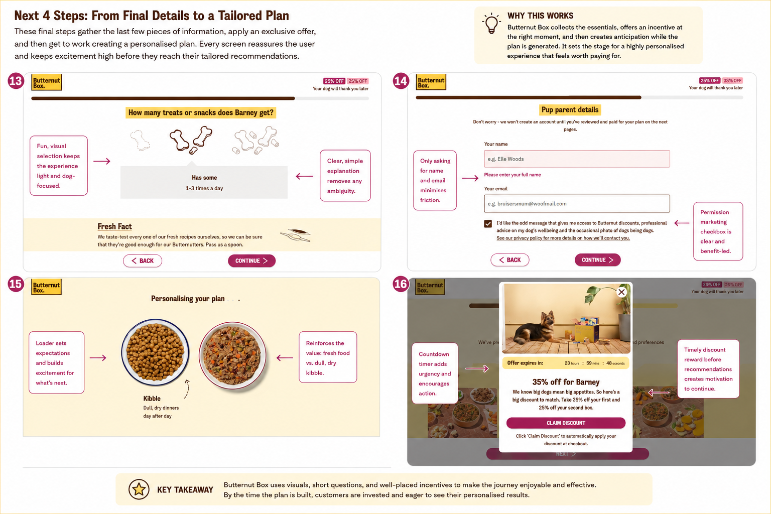
The final stage of the journey doesn't simply collect the last few pieces of information—it carefully transitions the customer from answering questions to becoming emotionally invested in the personalised recommendation they're about to receive.
The remaining questions stay true to the experience that Butternut Box has built from the very beginning: quick, visual and easy to complete.
Even something as simple as asking how many treats Barney receives each day is handled with playful illustrations rather than a traditional dropdown. The interaction feels light-hearted and on-brand, while still gathering another useful data point for calorie calculations.
Only once the customer has invested time completing the quiz does Butternut Box ask for their contact details. This timing is important. By now, visitors have already answered more than a dozen questions, making the request for a name and email feel like the natural next step rather than an obstacle. The form itself asks for only the essentials, and the optional marketing checkbox is framed around the benefits the customer will receive, rather than simply requesting permission.
As the recommendation is generated, the brand cleverly uses a short loading screen to build anticipation rather than leaving customers staring at a blank spinner. Comparing dry kibble with fresh food subtly reinforces the product's core value proposition while reassuring users that their answers are being transformed into a genuinely personalised plan.
One particularly smart conversion tactic appears just before the recommendations are revealed. Rather than waiting until checkout, Butternut Box presents a time-limited discount alongside a countdown timer. After investing several minutes completing the quiz, customers are already psychologically committed to seeing the result. Introducing an exclusive offer at this exact moment increases the perceived value of continuing without feeling overly aggressive.
It's a good example of incentive timing. The discount isn't used to persuade someone to start the quiz—it rewards the effort they've already invested.
By the end of this section, Butternut Box has achieved something many ecommerce brands struggle with. Customers have willingly provided detailed information about their dog, shared their contact details, accepted a promotional offer and become genuinely excited to see their personalised recommendation.
Instead of feeling like a lengthy onboarding form, the experience feels more like a guided consultation. Every small interaction builds trust, reduces friction and increases commitment, making the transition into the product recommendations feel completely natural rather than like a sales pitch.
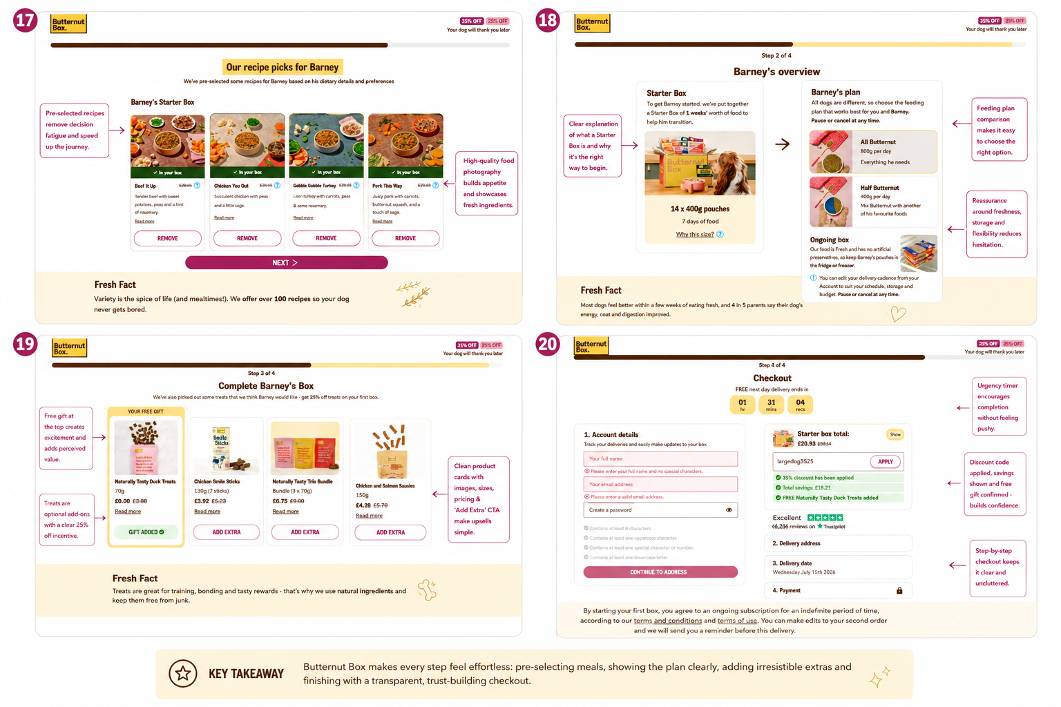
After spending several minutes learning about Barney, Butternut Box finally delivers the personalised recommendation. Crucially, this isn't presented as a generic product catalogue. Everything feels like the natural outcome of the conversation that came before it.
The recommended recipes are already selected, removing decision fatigue while still giving customers the freedom to swap meals if they prefer. Large food photography immediately communicates freshness and quality, making the products feel far more appetising than traditional dry dog food. Rather than asking customers to build a box from scratch, Butternut Box presents a solution that's already been tailored to their dog's needs.
The next screen reinforces exactly what the customer is buying. The Starter Box is clearly explained as a week's worth of food to help dogs transition onto the new diet, while the ongoing subscription options are presented side by side. Instead of simply showing prices, the page explains who each plan is suitable for, how the food should be stored and, importantly, reminds customers that they can pause or cancel at any time. These small reassurance points reduce the hesitation that often surrounds subscription purchases.
Once the core purchase has been established, Butternut Box introduces carefully timed post-purchase upsells. Rather than pushing expensive add-ons, customers receive a free gift first, immediately increasing the perceived value of the order. Additional treats are then presented as optional extras with discounted pricing and simple "Add Extra" buttons. Because the primary purchase has already been mentally accepted, these complementary products feel helpful rather than intrusive.
Finally, the checkout itself remains clean and confidence-inspiring. The process is broken into clear, manageable steps, making it obvious how much remains. A free next-day delivery countdown adds gentle urgency without overwhelming the customer, while the order summary highlights every saving that's been applied—including the personalised discount, total savings and free gift. Instead of forcing customers to calculate the value themselves, Butternut Box repeatedly reminds them that they're getting an excellent deal.
The overall experience demonstrates one of the strongest ecommerce principles: each stage prepares the customer for the next. The quiz builds trust, the personalised recommendations reduce decision-making, the plan overview removes uncertainty, the optional extras increase average order value, and the checkout reinforces value rather than creating friction.
Many brands focus almost exclusively on optimising their product pages. Butternut Box shows that some of the biggest conversion gains come from engineering the entire customer journey.
By the time visitors reach the payment page, they've already invested time, received personalised recommendations, claimed an exclusive offer and built confidence in the subscription. Completing the purchase feels like the logical conclusion to the experience—not the moment the selling begins.
