
Blue Tees Golf sells nine devices ranging from a $199 GPS speaker to a $599.99 portable launch monitor. They do it in a category owned by Bushnell and Garmin, two brands most golfers can name without thinking.
Their answer is not a discount. Across thirteen active ads in the US Meta library, there is not a single price cut. Every ad carries the same promise instead, and that promise survives the click.
We pulled their full active ad set, their homepage, and three product pages to work out how the account is actually built.
Thirteen active ads. Every one of them carries "100 Day Returns + Free Shipping" in the description line. Most carry "Back In Stock" in the link text above it.
There is no discount ad. No bundle-versus-single test. No seasonal angle. The commercial argument in every placement is that you can send it back.
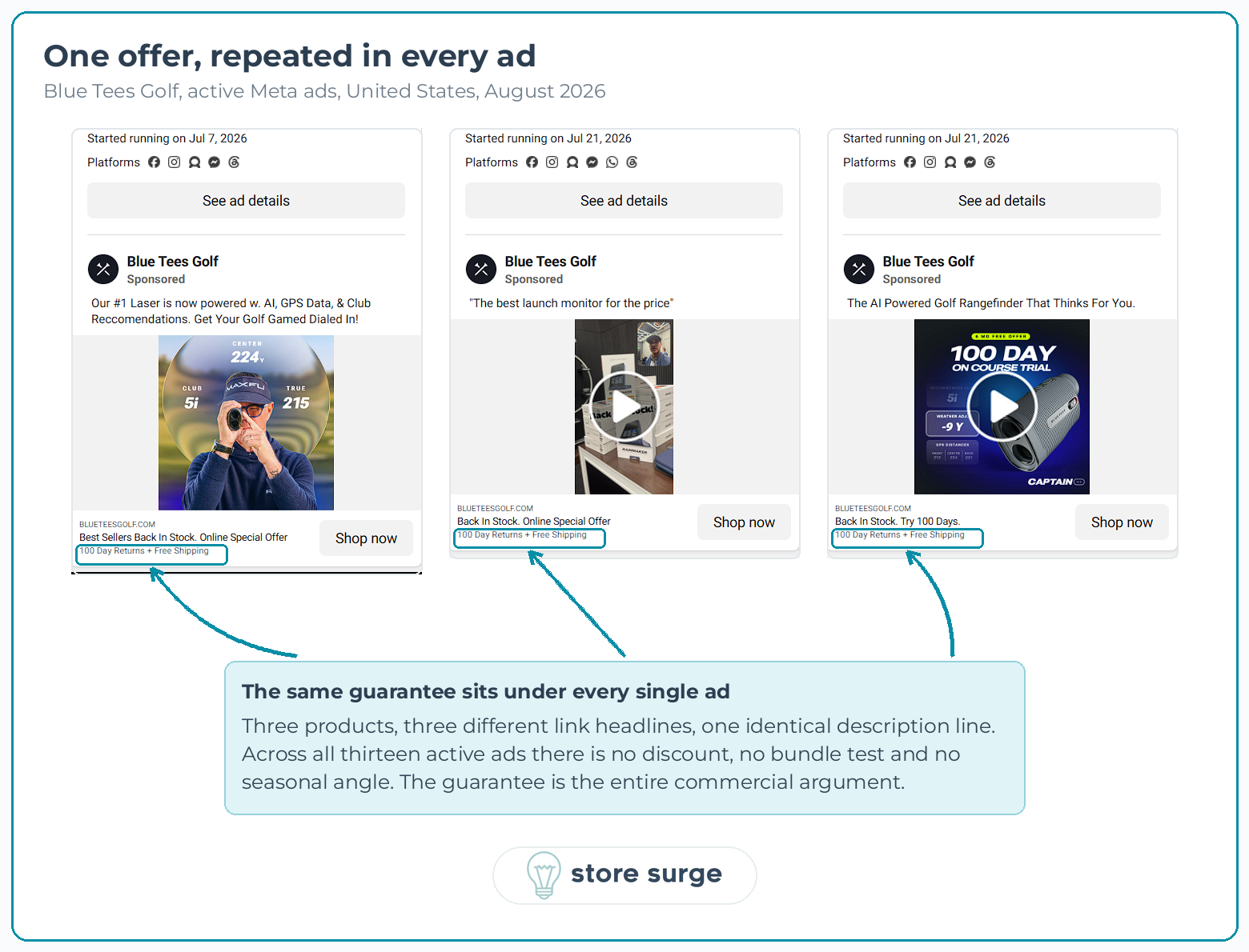
What makes this worth studying is that the promise does not weaken after the click. The site-wide banner at the top of every page reads "100 DAY RETURNS & FREE SHIPPING". The homepage repeats it as "Every purchase includes free shipping, an extended two-year warranty, and a 100-day risk-free guarantee". Every product page we checked carries two badges directly beneath the buy button: "100 DAY MONEY BACK GUARANTEE" and "FAST, FREE SHIPPING".
Most accounts we audit lose the offer somewhere between the ad and the page. The ad promises something specific, the landing page talks about features, and the visitor has to go hunting for the thing that got them to click. Blue Tees put the same sentence in all three places.
That consistency is doing real work at their price points, and it is worth more than a clever creative angle.
Five of the thirteen ads point at Rainmaker, the $599.99 launch monitor. We confirmed this by clicking through rather than guessing from the creative.
Rainmaker is also the homepage hero. It sits above the fold with its own headline and a tab strip that lists it first, ahead of Player Pro, Captain Pro and Captain Air.
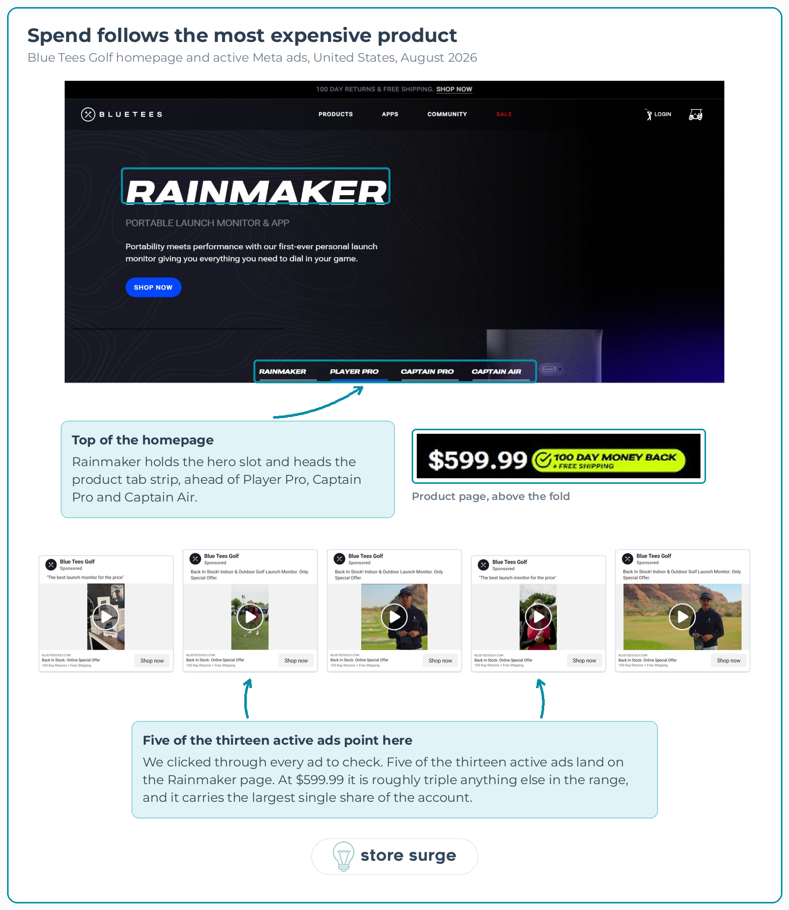
So the product with the deepest paid support is also the product the site leads with, and it is roughly triple the price of anything else in the range.
That alignment sounds obvious. In practice it is rare. We regularly find accounts where the paid budget sits behind a cheap entry product for cost-per-purchase reasons while the site pushes something else entirely, and nobody has reconciled the two.
The remaining eight ads split across the rangefinders and the GPS speaker. We can infer the split from copy and creative, though we did not verify each destination individually, so treat the exact breakdown as approximate. What is verified is that the $600 product carries the largest single share.
There are thirteen ads and only about six distinct primary text lines between them.
"Get Your Golf Gamed Dialed In!" appears on three. "Back In Stock! Indoor & Outdoor Golf Launch Monitor. Only Special Offer." appears on three, though one of those three drops the word Golf. "The AI Powered Golf Rangefinder That Thinks For You." appears on two. "The best launch monitor for the price" appears on two. "Our #1 Golf GPS Speaker Just Got Better." appears on two.
Underneath those repeated lines, the creative changes completely. Static product renders, on-course video, a piece of unboxing footage shot indoors, a studio graphic built around the 100-day trial.
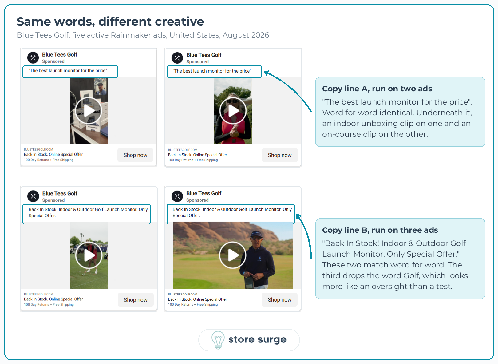
This is a creative test with copy as the control. It tells you which visual gets the click when the words are identical, which is a cleaner read than changing both at once and guessing which one moved the number.
Three of the entries also show "This ad has multiple versions", so the visible count understates how many variants are actually live. Thirteen library entries is the floor, not the total.
If you are running the same creative against six different headlines and wondering why the data never resolves, this is the pattern to copy. Fix one variable.
The Rainmaker page is built differently from the $199 and $299 pages, and the differences are instructive.
Above the fold it carries a bonus bundle rather than a discount. The line reads "INCLUDES 1YR BONUS | GAME AI + LAUNCH App Package", with "Shot Tracking, AI Caddie & More" underneath and the $79.99 price struck through and marked FREE. Perceived value is added on top rather than taken off the hardware price, which protects the margin and the brand position at the same time.
Afterpay sits directly underneath, noted as available for orders up to $4,000. Payment splitting appears here in a way it does not need to at $199.
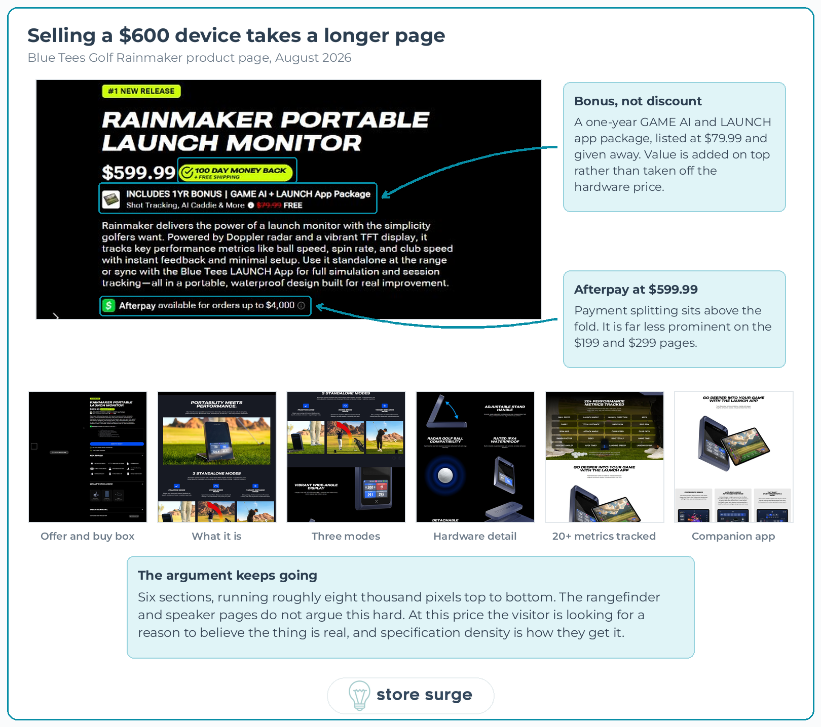
Then the page argues specification depth, at length. Three standalone modes. A 4.3 inch display with a stated contrast ratio. IPX4 waterproof rating. A detachable magnetic remote. A grid listing 20+ tracked performance metrics, laid out so you can count them. A full section on the companion app covering dispersion maps and bag customisation.
The rangefinder pages do not work this hard. They do not need to. At $600 the visitor is looking for a reason to believe the thing is real, and specification density is how you give it to them.
Blue Tees sell nine devices on the homepage grid, and a golfer could plausibly want three of them. That is a self-cannibalisation problem. Every minute a visitor spends deciding between your own products is a minute they are not buying.
Their fix sits on the Captain Pro page: a comparison table headed "WHICH RANGEFINDER IS RIGHT FOR YOU?", running Series 3 Max+, Captain Air and Captain Pro across eight rows.
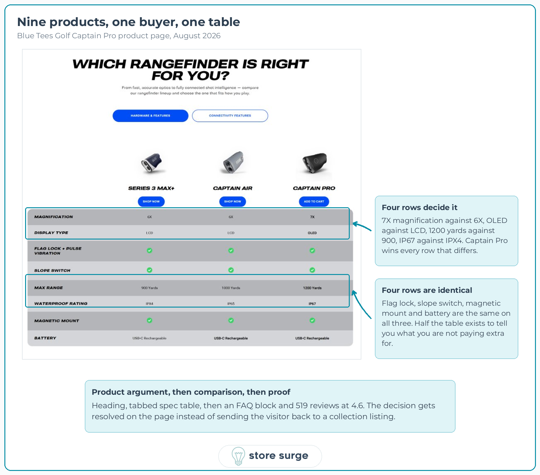
Four of those eight rows are identical on all three products. Flag lock, slope switch, magnetic mount and battery do not change. Only magnification, display type, max range and waterproof rating differ, and Captain Pro wins all four.
So half the table exists to tell you what you are not paying extra for. That is the part worth stealing, and it is the kind of change that shows up in conversion rate work faster than most redesigns do. Most comparison tables pile in every specification they can find and leave the visitor to spot the differences. This one makes the upgrade path readable in about five seconds, and it ladders upward to the most expensive of the three.
Two smaller details. The table is tabbed, with a second set of rows under "Connectivity Features". And the Captain Pro column button reads "Add to cart" while the other two read "Shop now", so the product whose page you are already on gets the direct action and the others get a navigation step.
Underneath sits an FAQ block and 519 reviews at a 4.6 average. The sequence runs product argument, then comparison, then objection handling, then proof. That order is deliberate.
Three things, and none of them are fatal.
The primary text on the longest-running ad reads "Our #1 Laser is now powered w. AI, GPS Data, & Club Reccomendations. Get Your Golf Gamed Dialed In!" That is two errors. "Reccomendations" is misspelled, and "Golf Gamed" should presumably read "Golf Game". The second error has been copied into three further live ads.
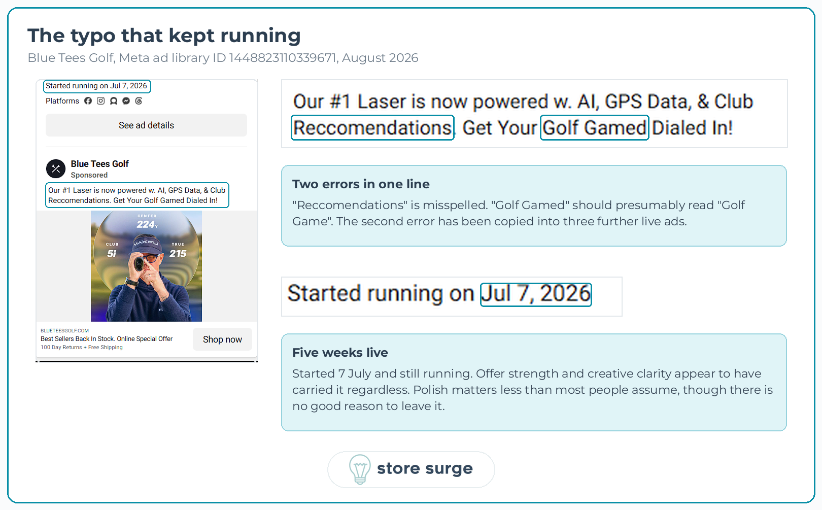
The interesting part is that this ad started running on 7 July and is still live, which makes it one of the longest-running in the account. Offer strength and creative clarity appear to have carried it regardless. Polish matters less than most people assume, though there is no good reason to leave it.
Second, "Back In Stock" appears on nearly every ad and has done for at least three weeks. Restock urgency stops working when it is permanent. It reads as a template rather than news.
Third, and this is the one we would fix first. The Rainmaker ads lead with "Back In Stock! Indoor & Outdoor Golf Launch Monitor" and "The best launch monitor for the price". The page they land on leads with a free one-year app bundle worth $79.99. The strongest argument on the page never appears in the ad that drives traffic to it.
The offer category matches. The specific hook does not. That gap is usually worth testing before anything else in the account, and it is the kind of thing a structured Meta ads audit surfaces in an afternoon.
Blue Tees are doing the hard part well. One offer, stated identically in every placement, holding all the way from ad to buy button. Spend concentrated behind the product with the most value in it. Creative tested against fixed copy so the results mean something.
The gaps are smaller and easier to close. A hook that matches the page, and an urgency line that has run out of road.
If your ads and your product pages are telling slightly different stories, that is usually worth more attention than the next creative refresh.
