
Michael Shewmake started Atlas Coffee Club in 2015 with $5,000 and a corner of his parents' basement. He did not drink coffee at the time. The business now runs at around $22M in annual recurring revenue, built on one idea: a new single origin coffee from a new country, delivered every month.
Numbers like that do not come from the product alone. They come from a site that takes a considered, recurring purchase and breaks it into decisions small enough to say yes to. We went through three pages on Atlas Coffee Club and annotated what each one is actually doing.
In this article
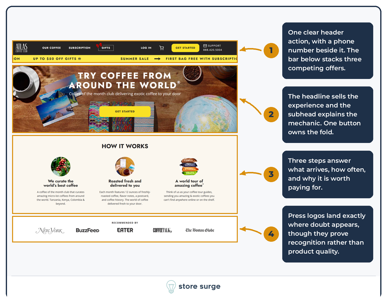
The headline names the experience and the subhead explains the mechanic in plain words. Coffee of the month club, delivered to your door. Anyone who has never bought a subscription coffee understands the product in two lines.
One button owns the fold. No competing links, no secondary offer. What is missing is a price or a review count, which is a real trade for a subscription product where the first question is usually what it costs.
Then the order of the page does the work. How It Works answers what arrives, how often, and why it is worth paying for, with named origins to make the promise concrete. Press logos land immediately afterwards, at exactly the point doubt appears. The row proves recognition rather than quality, since no quote or claim is attached to any of the logos.
That sequencing is the part worth stealing. Most of the CRO work we do for ecommerce brands starts here, with the order in which a page answers questions rather than the design of any single block.
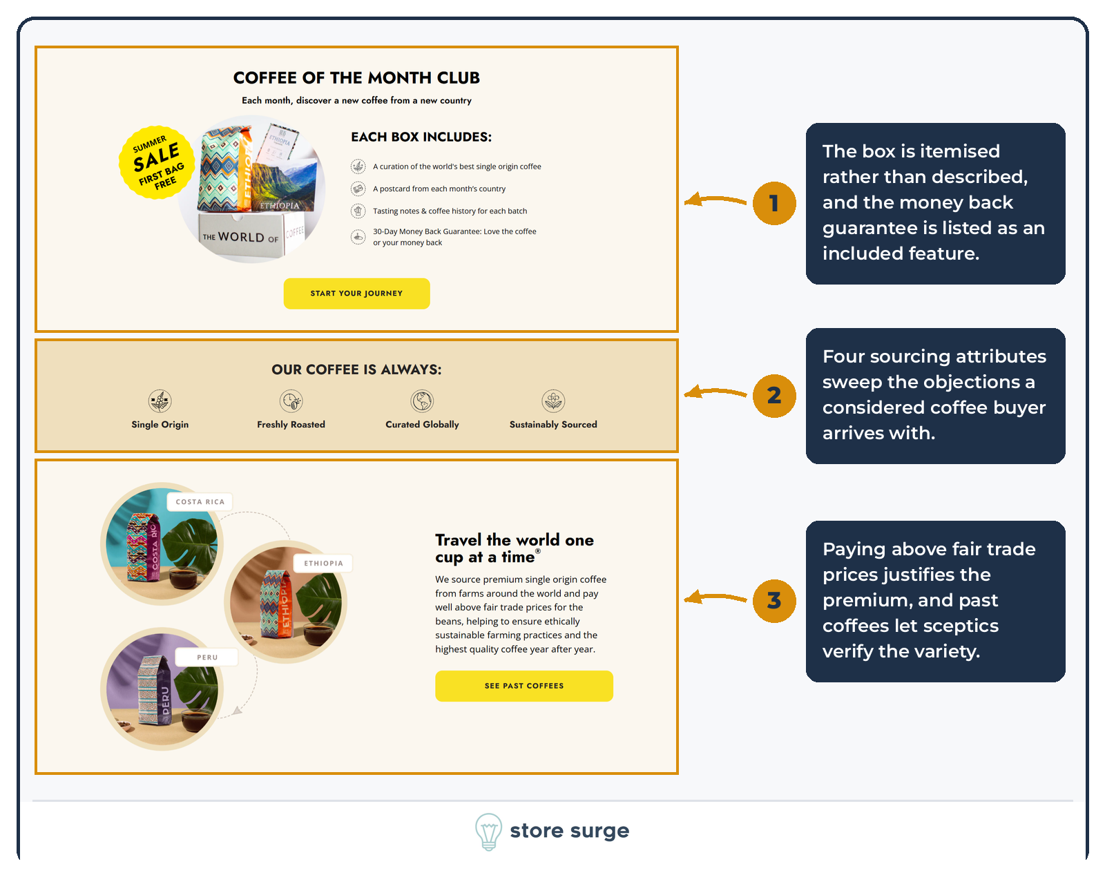
The Coffee of the Month Club block itemises what is inside the box rather than describing it. Coffee, postcard, tasting notes, guarantee. The 30-day money back guarantee is listed as a feature of the box, not buried as a policy link, which quietly removes the largest reason to hesitate.
Below that, four sourcing attributes sweep the objections a considered coffee buyer arrives with: single origin, freshly roasted, curated globally, sustainably sourced.
The sourcing story then justifies the price. Atlas states it pays farmers above fair trade prices, which gives an ethically minded buyer a reason to accept a premium. A link to past coffees lets sceptics verify the variety before committing to anything.
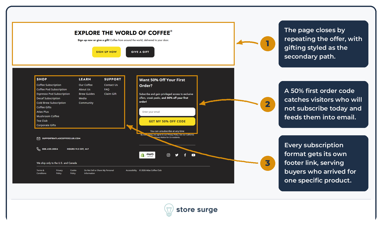
The page closes by repeating the offer with two paths, subscribe or gift, with the gift option styled as the secondary choice.
The email capture is the part most brands under-build. A 50% first order code catches visitors who will not subscribe today and moves them into a flow instead of losing the session. For a subscription business with a long consideration window, that capture is doing as much work as the hero. It is the same logic behind most of the email marketing programmes we run, where the job of the site is to feed the list and the job of the list is to close the sale later.
The footer link architecture is also deliberate. Decaf, cold brew, espresso pods and coffee pods each get their own link, which builds internal links to category pages and serves visitors who arrived for one specific format.
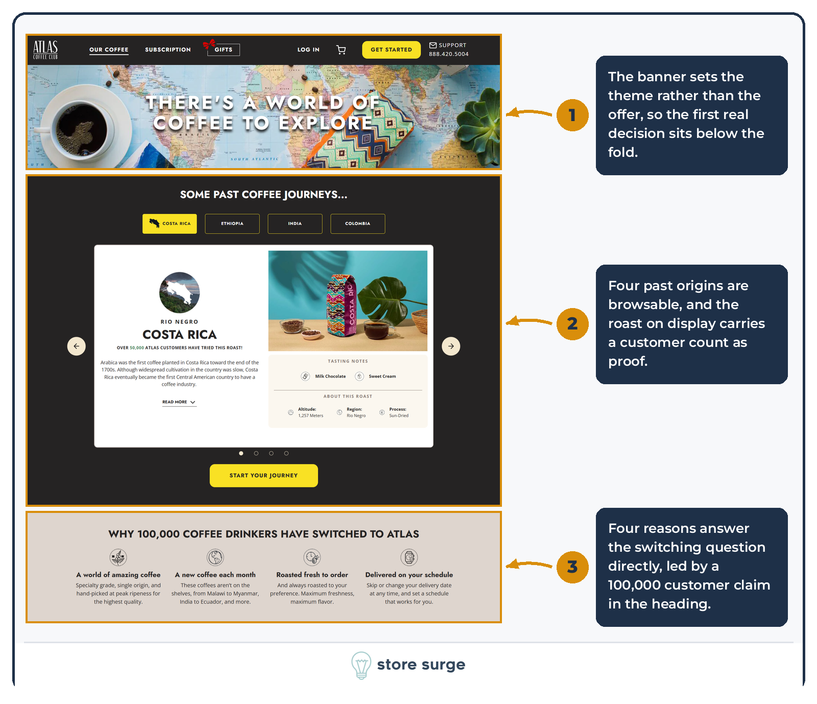
The Build Your Plan page could have opened with the form. Instead it opens with a banner, a browsable carousel of past origins, and a reasons-to-switch block.
The carousel is the strongest piece. Four past countries can be clicked through, and the roast on display carries a customer count as proof, which turns a product gallery into evidence that other people have already bought this.
The reasons block answers the switching question directly, headed by a 100,000 customer claim. By the time the visitor reaches the configurator, the decision has moved from whether to buy to how to configure.
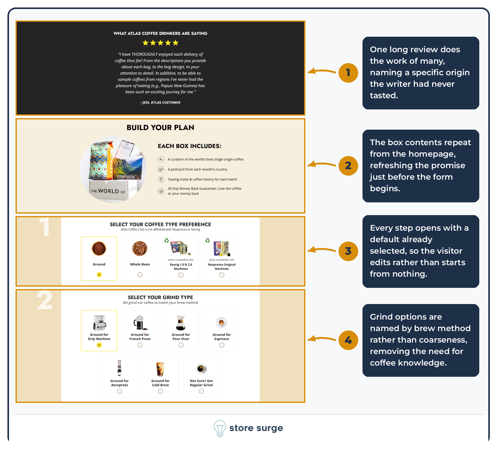
A long testimonial and a restatement of what the box contains sit between the pre-sell and the form.
Then the configurator starts, and the important detail is that every step opens with a default already selected. The visitor edits rather than starting from nothing, which lowers the effort of each step to almost zero and means an abandoned configuration still has a valid state.
Grind options are named by brew method rather than by coarseness. Ground for drip machine, ground for French press, ground for cold brew. That removes the need for any coffee knowledge, which matters when the buyer is a beginner and the entire brand promise is discovery.
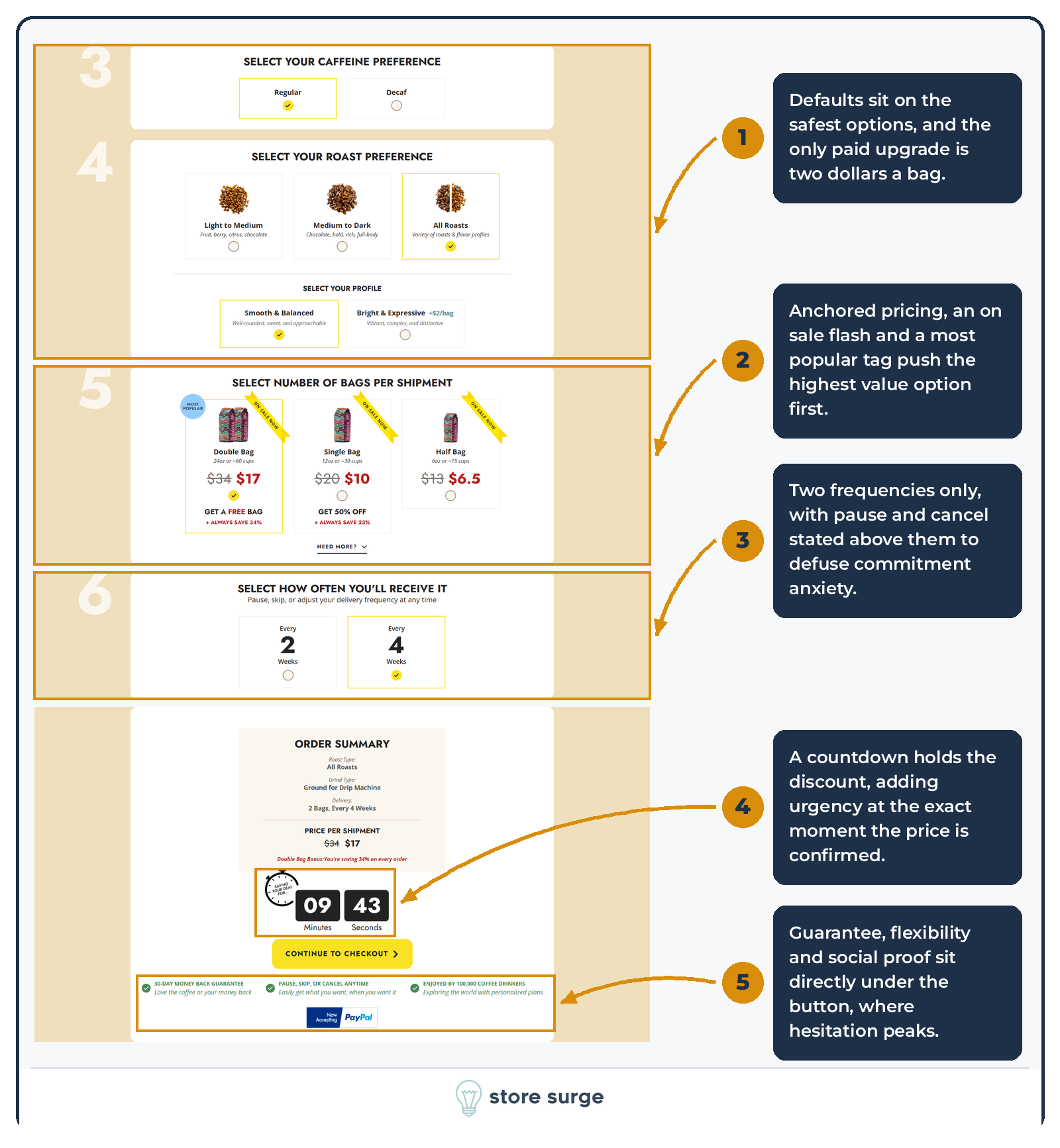
Defaults continue to sit on the safest options, and the only paid upgrade in the whole flow is two dollars a bag for a brighter flavour profile.
The bags step is where the persuasion concentrates. Struck-through anchors, an on sale flash on every card, a most popular tag on the double bag, a free bag incentive, and a stated always save percentage. Two frequency options follow, with pause and cancel stated above them to defuse commitment anxiety.
The order summary then adds a countdown that holds the discount at the exact moment the price is confirmed, with guarantee, flexibility and social proof sitting directly under the button where hesitation peaks.
That is five separate pressure mechanics attached to one decision. For cold paid traffic it very likely lifts conversion rate, and it is the kind of page we want landing behind Meta and Facebook ad campaigns where the visitor has no prior relationship with the brand. The open question is what it costs in trust with a considered buyer who has arrived through search or referral, and that is a test worth running rather than an assumption worth holding.
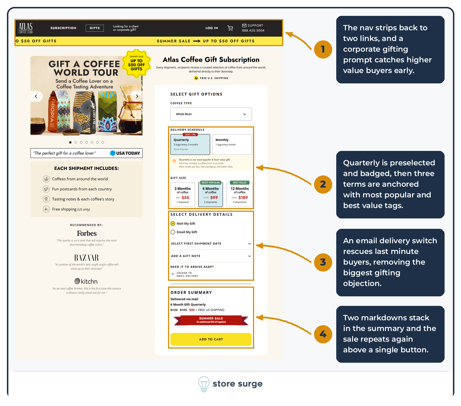
The gift page is not the homepage with a different headline. The nav strips back to two links and adds a corporate gifting prompt to catch higher value buyers early.
Inside the buy box, quarterly is preselected, badged save 14%, labelled most popular, and reinforced by a note underneath explaining why it is better value. Three gift terms follow with struck-through anchors, the six month option badged most popular and the twelve month badged best value.
The single best mechanic on the page is further down. Need it to arrive ASAP prompts a switch to email delivery, which removes the biggest reason a gift buyer abandons. The order summary then stacks two markdowns and repeats the sale above one button.
Gift subscription demand is seasonal and searched with high intent, which makes this page a natural destination for Google Ads and Shopping campaigns in the run-up to a gifting peak.
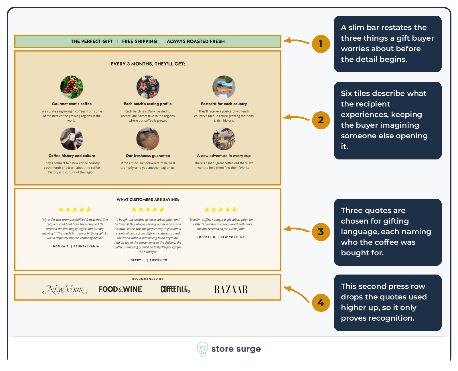
A slim reassurance bar restates the three things a gift buyer worries about before any detail begins.
Six tiles then describe what the recipient experiences rather than what the buyer receives, which keeps the buyer imagining someone else opening the box. The testimonials underneath are chosen for gifting language, each naming who the coffee was bought for.
One weak spot. A second press row appears with four titles and no quotes, unlike the row higher up the page where each logo carries a pull quote. Repeating logos without the quotes adds recognition the visitor already had.
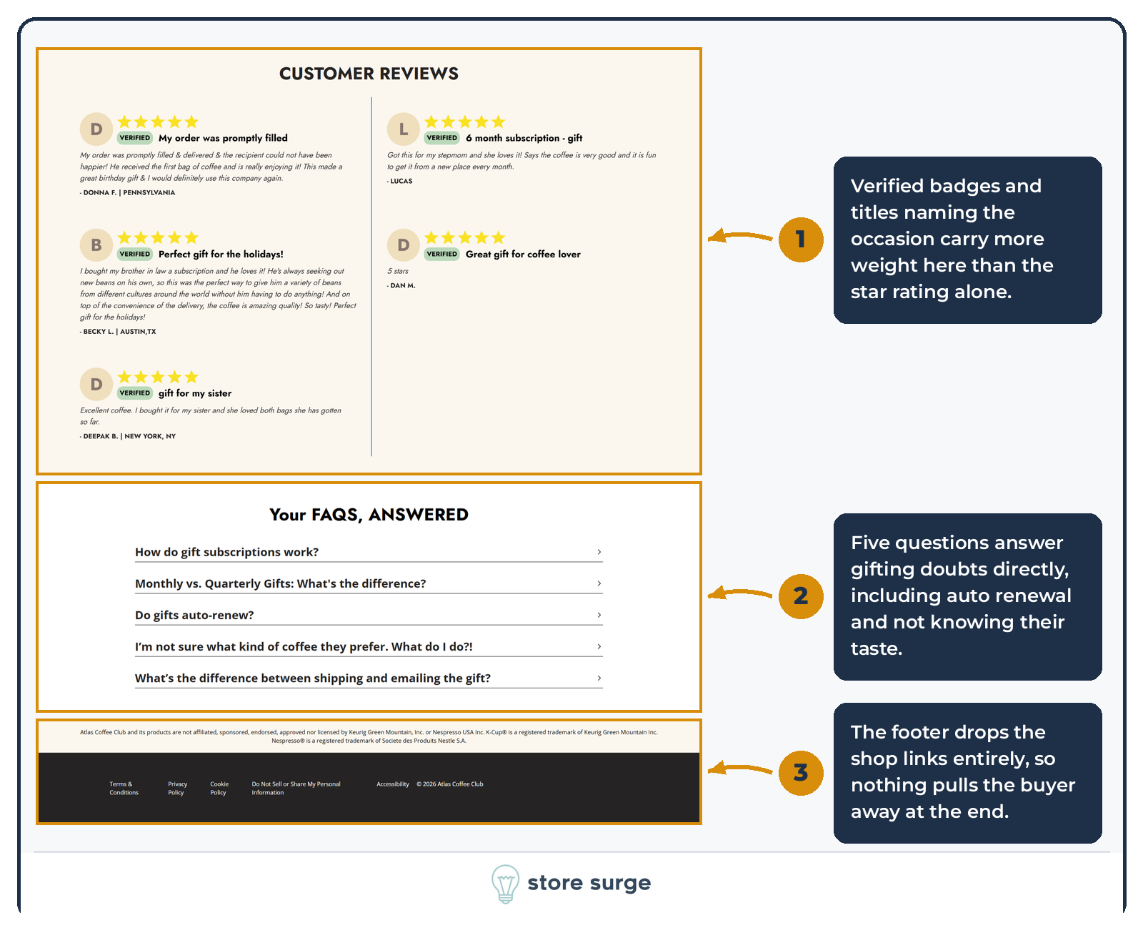
Customer reviews carry verified badges and titles naming the occasion, which does more here than the star rating alone. A review titled gift for my sister answers a question the star count cannot.
The FAQ then handles gifting doubts directly. How gift subscriptions work, monthly versus quarterly, whether gifts auto-renew, what to do if you do not know their taste, and the difference between shipping and emailing.
Finally, the footer drops the shop link columns entirely. On the homepage those links are useful discovery. Here, nothing pulls the buyer away at the end of the page.
If you want the same treatment applied to your store, we run this teardown as part of every engagement, screenshot by screenshot, with the fixes prioritised by revenue impact. Get in touch and we will show you what we would change first.
