
Ruggable turned over roughly $316m through ruggable.com in 2025, with around 93% of that coming from the United States. Third-party estimates put the average order value somewhere between $225 and $250.
That is a considered purchase. Nobody buys a rug on impulse, and nobody spends $250 on one without checking the reviews, the returns policy and whether it will survive the dog. So the interesting question isn't how Ruggable gets attention. It's how the brand carries one promise all the way from a Meta ad to a checkout button without losing anyone on the way.
We pulled seven screenshots across the full funnel: the Meta Ad Library, Google Shopping, the Google store profile, three sections of a product page, and the cart. Here's what each one is doing, and what it suggests for anyone selling something people have to think about first.
In this article
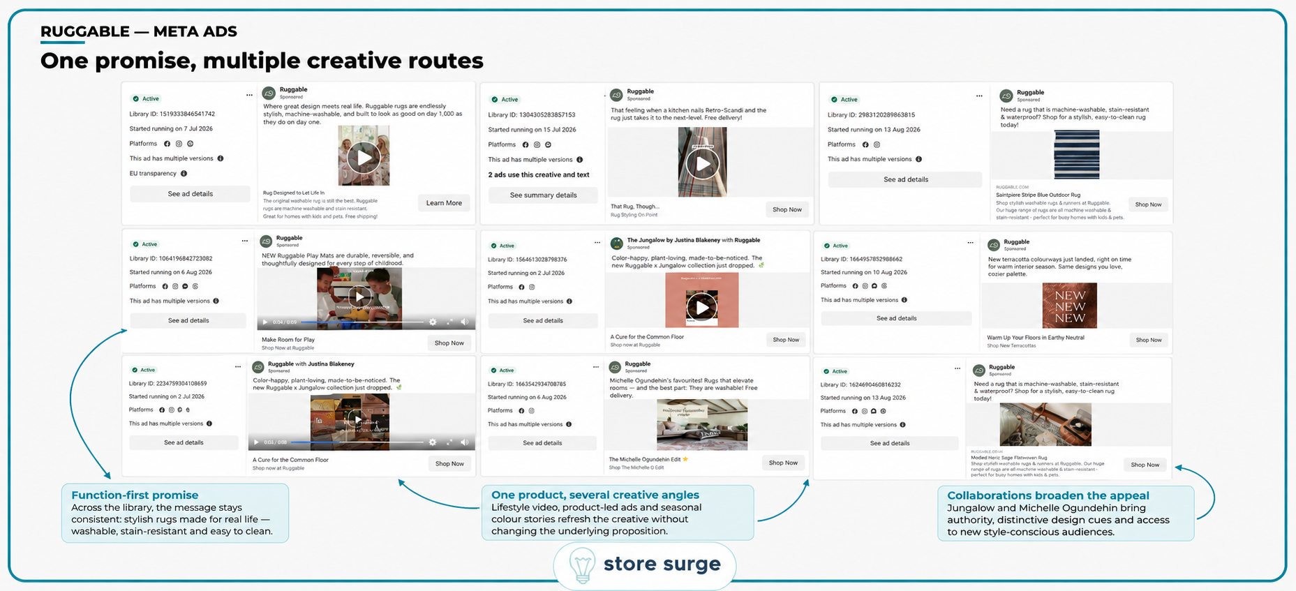
Ruggable's Meta library is large, but it isn't scattered. Across the nine active ads captured here, the underlying proposition barely moves. Rugs that look good and go in the washing machine. Stain resistant. Fine with kids and pets. Free delivery.
What changes is the route in. There are lifestyle videos showing rugs in situ, flat product ads against a plain background, and a seasonal angle built around a terracotta colourway timed to the shift into warmer interior palettes. There's a line extension, with play mats positioned as durable and reversible rather than as a new category to explain. And there are two named collaborations doing separate jobs: Jungalow by Justina Blakeney bringing colour-led design credibility, and Michelle Ogundehin bringing an editorial, interiors-authority signal.
The dates matter. Most of these started running between early July and mid-August 2026, so this is a live rotation rather than an archive. Several are marked as having multiple versions, and one creative is noted as running across two separate ads. That's a brand testing variants inside a fixed proposition, not testing the proposition itself.
This is the part worth copying. Most accounts we look at have the opposite problem: five different promises across five ads, none of which get enough spend behind them to prove anything. Ruggable has settled its message and spends its creative budget on angles instead. If your Meta ads are still arguing with each other about what the product is for, that's the thing to fix before touching targeting.
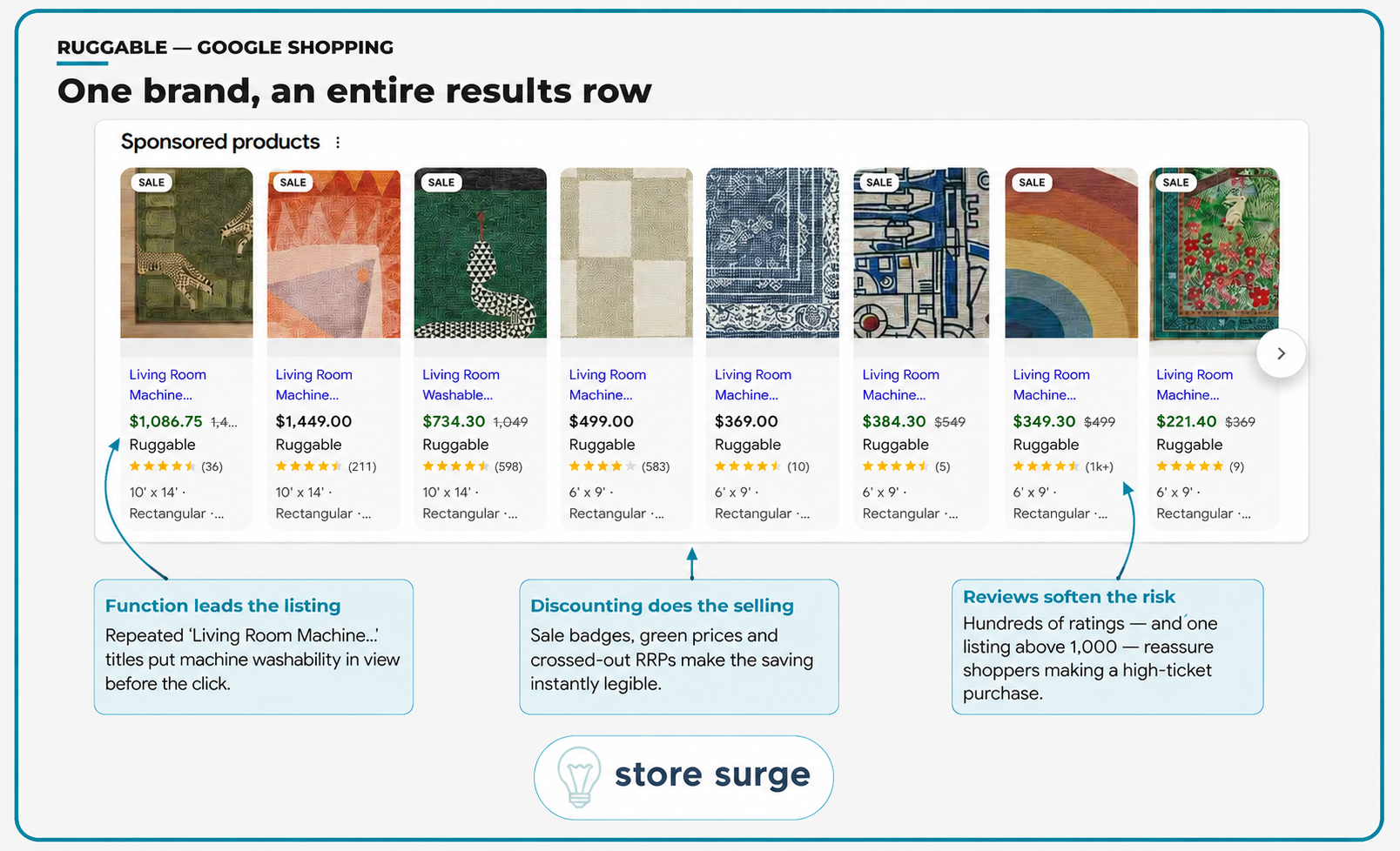
The sponsored products row here is eight listings deep, and every one of them is Ruggable. That isn't an accident of the screenshot. That's a brand owning a shopping surface for its category term.
Three things are doing the work.
The titles lead with function. Nearly every one opens with a variation on "Living Room Machine...", which puts machine washability in view before anyone clicks. The single most persuasive fact about the product sits in the first three words, where it survives truncation.
The discounting is legible at a glance. Sale badges, prices in green, crossed-out RRPs. The depth is consistent rather than random: $1,049 down to $734.30, $549 down to $384.30, $499 down to $349.30. All 30%. One listing sits at 40%. A shopper scanning the row reads "everything here is on offer" without doing any arithmetic.
The review counts soften an uncomfortable price. This row spans $221 to $1,449. At the top end that's a serious purchase to make from a search result, and the ratings, including one listing above 1,000 reviews, are what makes it survivable.
Worth being honest about the limitation: a review count on a Shopping listing tells you a product has been bought, not that it was good. It works because it's there at the moment of hesitation, not because it's rigorous. That's usually enough. Getting review data flowing into the feed properly is one of the higher-leverage jobs in Google Ads for considered purchases, and it's routinely left half-finished.
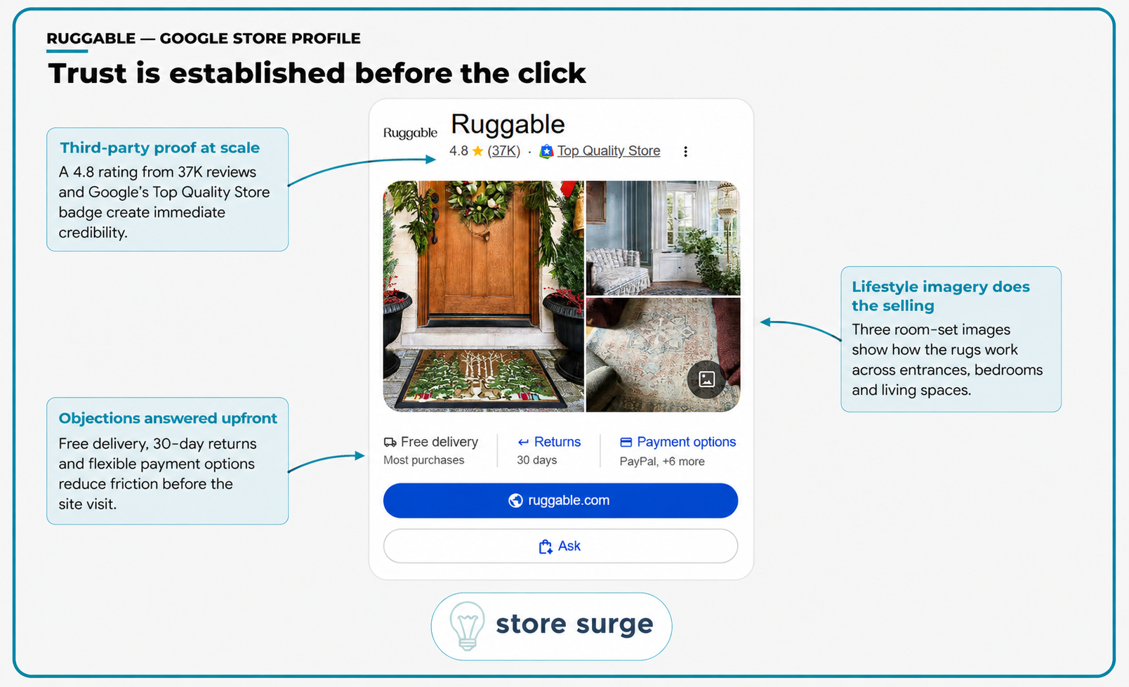
The Google store profile is a surface most brands never look at, and Ruggable has clearly worked on it.
The rating sits at 4.8 across 37,000 reviews, alongside Google's Top Quality Store badge. That combination does something a brand can't do for itself. It's a third party vouching, at a volume that's difficult to wave away.
Underneath, three room-set images show the rugs at an entrance, in a bedroom and in a living space. No product shots on white. The imagery is answering "will this look right in my house" rather than "what does this product look like".
Then the objections, listed flatly: free delivery on most purchases, 30-day returns, PayPal plus six more payment options. Those are the three things that stop a first-time buyer from a brand they haven't heard of, and they're all answered before the visitor has even arrived on the site.
None of this is glamorous work. It's feed hygiene and merchant account configuration. But it means a cold shopper lands on the product page having already cleared the trust hurdle, which changes what that page has to do.
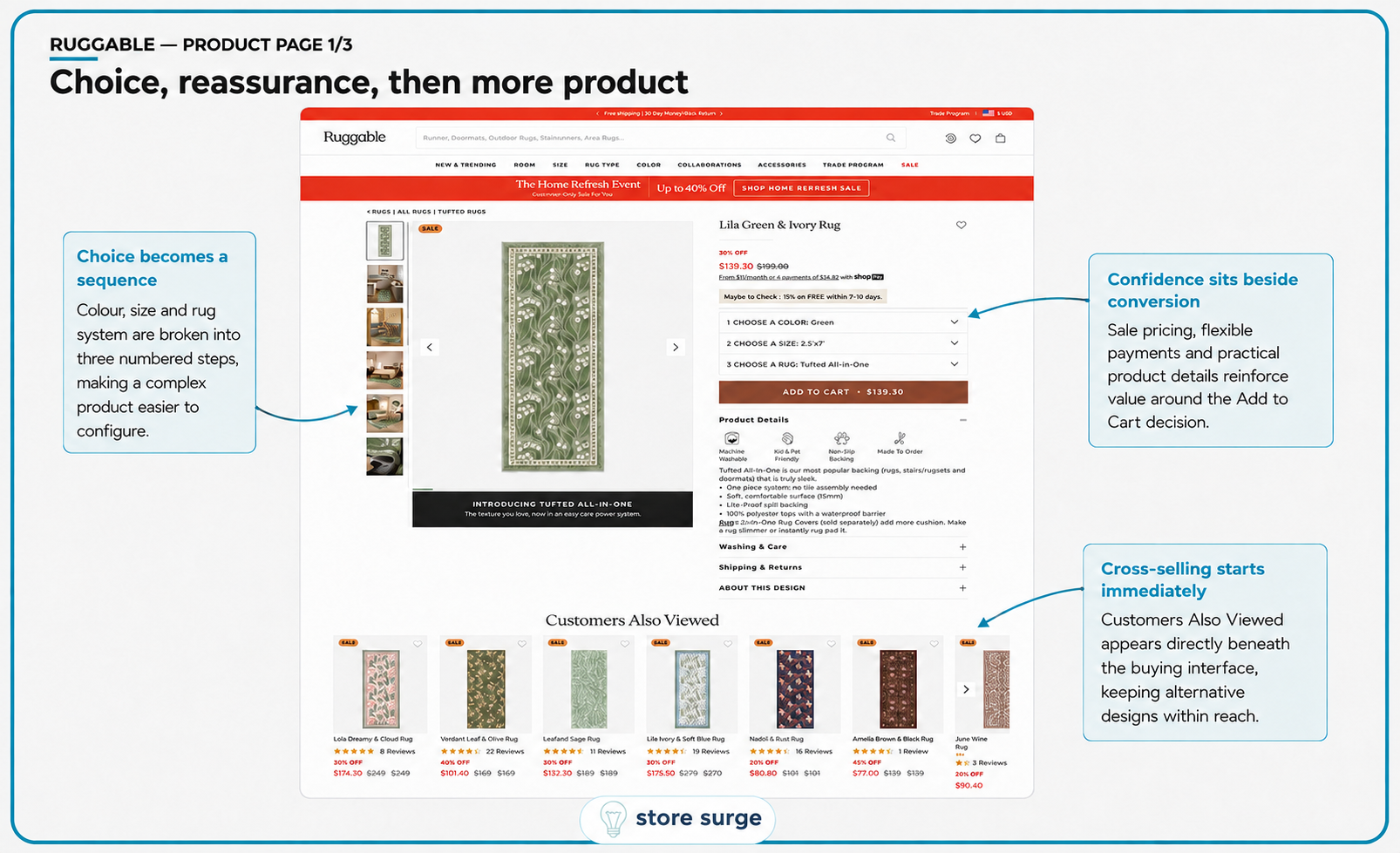
Ruggable sells a configurable product. Colour, size and rug system, with the system choice affecting both the price and the experience. That's a lot to hold in your head at once.
The page handles it by numbering the decisions. Choose a colour. Choose a size. Choose a rug. Three collapsed dropdowns, in order, sitting directly above Add to Cart. A complicated product presented as three small decisions rather than one large one.
The reassurance sits inside that block rather than beside it: the 30% discount, the reduced price against a crossed-out original, Shop Pay instalments at $34.82, and four practical icons covering machine washable, kid and pet friendly, non-slip backing, made to order. The buyer is never asked to scroll away from the buying decision to find out whether the product suits them.
One detail we'd push back on if this were a client account. "Customers Also Viewed" appears immediately below the buying interface, before the page has finished making the case for the product currently in front of you. It keeps alternatives within reach, which is defensible in a category where design preference drives the choice. It's also an early invitation to leave. Whether that nets out positive is an A/B test, not a principle, and we'd want to see the data before assuming Ruggable has it right.

Further down, a Best Sellers carousel provides a second route into the range. This is a different mechanism from the recommendation strip above it. Recommendations show you things like the rug you're looking at. Best sellers show you what other people actually bought. For a design-led product where taste does the choosing, having both makes sense.
Then the page stops selling and starts explaining. Three lifestyle images carry three benefits: No Assembly, Spot & Machine Washable, Soft but Durable. Each one is demonstrated rather than claimed. Someone laying a rug flat. Someone loading a rug into a washing machine. A child playing on one.
Below that, close-up texture samples separate Flatwoven, Tufted and Plush, each with a one-line description. Smooth and low-pile. Softly textured with cushioning. Cosy and plush yarn.
This is the part most stores skip. Texture is the hardest thing to communicate online and one of the most common reasons a homeware return happens. Showing it at close range, before the technical comparison, means the shopper reaches the spec table already knowing what the words mean.

The comparison table maps the three constructions against five criteria: rug system, whether a pad is needed, feel, washability and what each is suited to. Flatwoven is a two-piece system that needs a pad. Tufted and Plush are one-piece with a pad optional. Washability is stated with limits rather than as a blanket claim: all sizes fit home washers for Flatwoven, up to 8x10 feet for Tufted, up to 5x7 feet for Plush.
That specificity is the interesting choice. Ruggable could have written "machine washable" three times. Instead it gives the buyer the size ceiling, which is exactly the detail that would otherwise turn into a bad review.
The "Perfect For" row does the same job with icons rather than adjectives. Entryways, high traffic, kitchen. Runners, living and dining, kids room. Bedroom, living room, kids room. Nobody has to work out which one suits them.
Then the closer. A laundry image and a three-step sequence: scrunch, wash, unroll. The brand's defining claim is the one thing a sceptical buyer won't take on trust, so it gets a visual demonstration at the bottom of the page rather than another line of copy at the top.
The principle underneath all three product page sections is straightforward. Repetition doesn't build belief, proof does. Most of the conversion rate optimisation work we do on product pages is some version of this: finding the claim the buyer doesn't believe, and replacing the adjective with evidence.
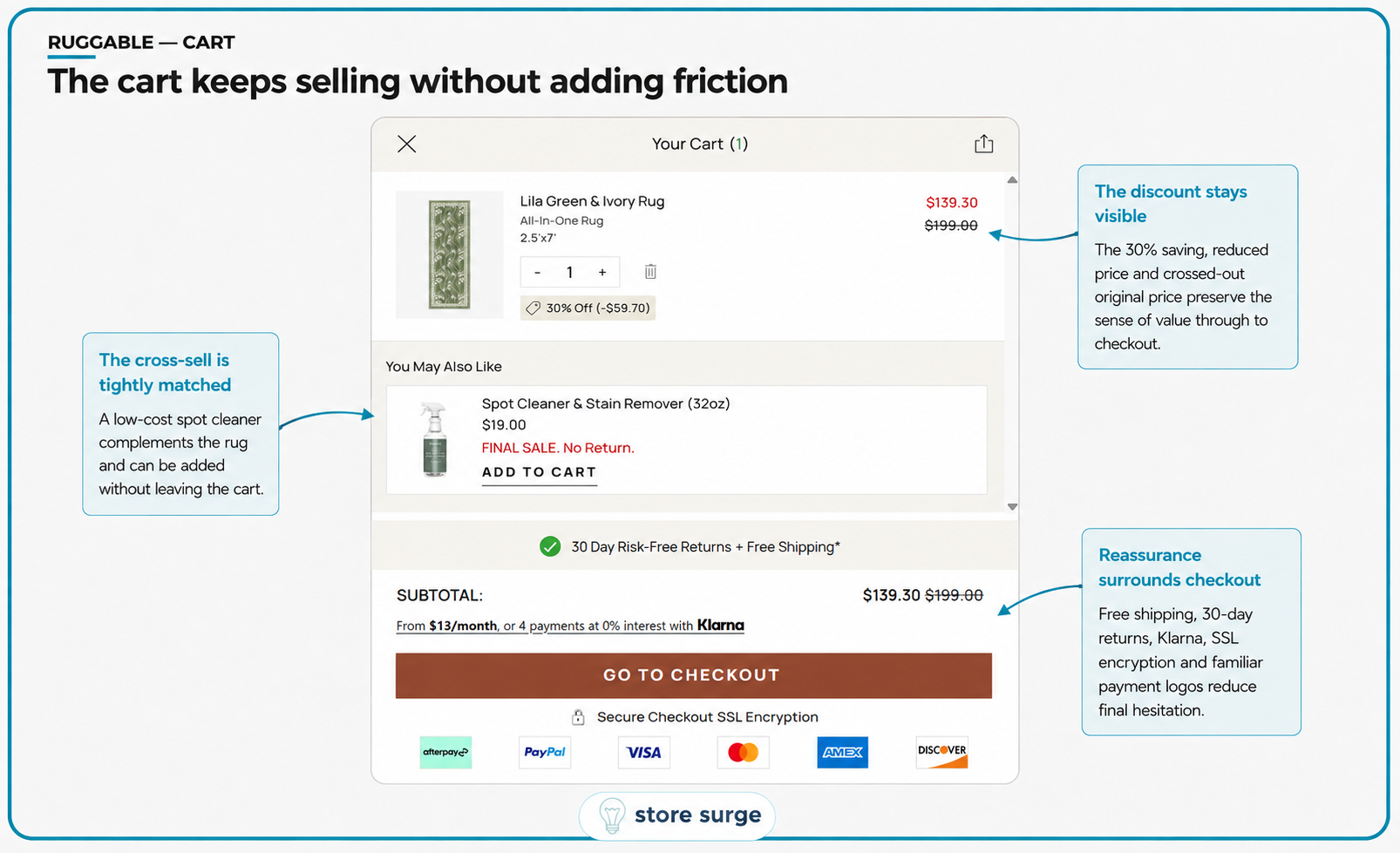
The cart is where a lot of good work gets undone. This one holds its nerve.
The discount stays visible. The line item shows $139.30 against a struck-through $199.00, with a tag reading 30% off and the saving spelled out at $59.70. The subtotal repeats it. The buyer never has to trust that the discount survived to checkout, because they can see it twice.
The cross-sell is a $19 spot cleaner and stain remover, addable without leaving the cart. It's well chosen. It complements the rug rather than competing with it, and at that price it's a low-friction add rather than a second decision. It's marked final sale and non-returnable, which is honest, but it sits slightly oddly next to a 30-day risk-free returns promise a few lines below. We'd test moving or softening that disclosure, because it introduces a small note of caution at exactly the wrong moment.
The reassurance stack around the checkout button is dense. Thirty-day risk-free returns and free shipping on one line. Klarna from $13 a month or four interest-free payments. SSL encryption. Six payment logos including Afterpay, PayPal and the major cards. On a $139 order that's a lot of reassurance, but the AOV here sits between $225 and $250 and the RRP was $199. This cart is built for the version of the order that costs real money.
Four things carry across, more or less regardless of category.
Settle the promise before testing the creative. Ruggable runs a lot of ads and one message. The variation lives in format, season and collaborator, not in what the product is for.
Put the persuasive fact where truncation can't reach it. Machine washable appears in the first words of the Shopping title, in the ad copy, in the product icons and in the comparison table. Same fact, four surfaces.
Answer objections before the click, not after. Delivery, returns and payment options are all resolved on the store profile. The product page is then free to sell rather than reassure.
Replace adjectives with demonstrations. The washing machine imagery, the texture close-ups and the size limits in the comparison table all do work that "premium quality" never could.
One honest caveat. A teardown shows what a brand chose to do, not what that choice earned. Ruggable's revenue was roughly flat year on year in 2025 on the estimates above, so this isn't a story about a brand that has solved everything. Treat these as hypotheses worth testing on your own store rather than settled answers.
If you'd like a version of this run over your own funnel, with the same annotated breakdown across your ads, your product pages and your checkout, get in touch and we'll put one together.
