
Acquiring new customers has never been more expensive. Rising advertising costs across Meta, Google and TikTok mean ecommerce brands can no longer rely on simply increasing ad spend to grow revenue. Instead, the brands seeing the strongest long-term performance are those that maximise Customer Lifetime Value (LTV) by turning first-time buyers into loyal, repeat customers.
From its paid social campaigns through to its homepage, product pages, shopping cart and checkout, RYZE consistently reinforces value while removing the hesitation that often prevents customers from completing a purchase.
In this breakdown, we'll analyse the key stages of RYZE's subscription funnel, highlighting the ecommerce strategies that help drive recurring revenue. Whether you're investing in a dedicated Facebook Ads agency for ecommerce brands, looking to improve your Google Ads performance, or optimising your website's conversion rate, there are practical lessons throughout this funnel that almost any subscription business can apply.
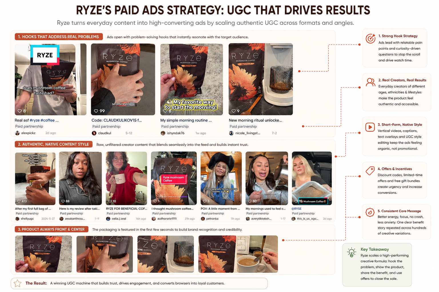
Before a visitor ever lands on the RYZE website, the brand has already done much of the hard work. Rather than relying on highly polished studio adverts, RYZE fills TikTok with creator-led content that feels almost indistinguishable from the videos users already consume every day.
A consistent pattern quickly emerges across their paid partnerships. The creators are deliberately varied in age, appearance and lifestyle, helping the brand appeal to a much broader audience while making the product feel authentic and accessible. Instead of celebrity endorsements, viewers see ordinary people preparing their morning coffee, sharing their routines and talking about their personal experiences.
Most videos also lead with a strong hook. Questions such as "Does mushroom coffee taste bad?" or statements around improved focus, sustained energy and avoiding the afternoon crash immediately address common objections and encourage users to keep watching. The product itself is rarely hidden either – the RYZE packaging is usually visible within the first few seconds, helping build brand recognition even if someone doesn't watch the entire video.
Despite the variety of creators, the messaging remains remarkably consistent. Better mornings, improved focus, healthier coffee and simple daily habits are repeated across hundreds of creative variations, allowing Meta and TikTok to continually test new content while reinforcing the same core value proposition.
The lesson for ecommerce brands? Don't obsess over producing cinematic adverts. Build a repeatable creative formula, then scale it across dozens or even hundreds of authentic creators.
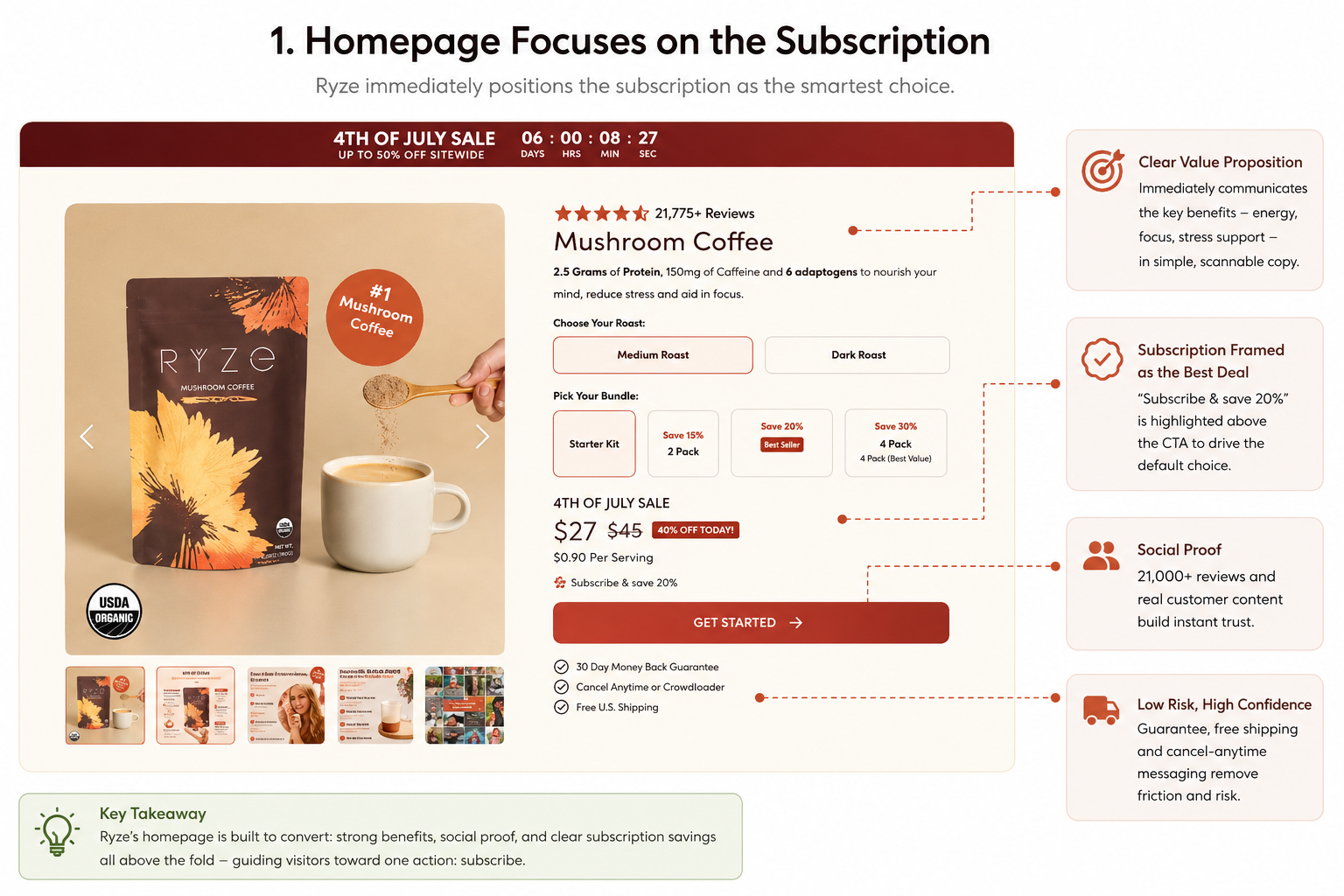
The moment someone lands on the RYZE homepage, they're given a clear answer to two questions: what is this product, and why should I buy it? Within seconds, visitors are introduced to the core benefits, thousands of customer reviews and a prominent call-to-action, eliminating much of the uncertainty that causes users to leave a website.
Rather than overwhelming visitors with dozens of products or categories, RYZE keeps the experience focused. The homepage centres around its flagship Mushroom Coffee before introducing progressively larger bundles, making it easy for shoppers to compare options while naturally encouraging higher-value purchases.
Trust is reinforced throughout the page. Customer review counts are displayed prominently, subscription savings are clearly highlighted, and reassuring messages such as the 30-day money-back guarantee, free U.S. shipping and flexible cancellation policy appear before customers even reach the checkout. These seemingly small details reduce perceived risk and make subscribing feel like the safer option.
The layout itself is equally deliberate. Instead of unnecessary navigation or competing promotions, almost every section pushes visitors towards the same objective: selecting a bundle and starting a subscription. Each scroll reinforces the value proposition rather than introducing distractions.
For ecommerce brands, this is an important lesson in conversion optimisation. A homepage shouldn't simply introduce your business—it should guide visitors towards a single, high-value action as quickly and confidently as possible.
In essence, RYZE's homepage is designed to move someone from curiosity to purchase in under 30 seconds.
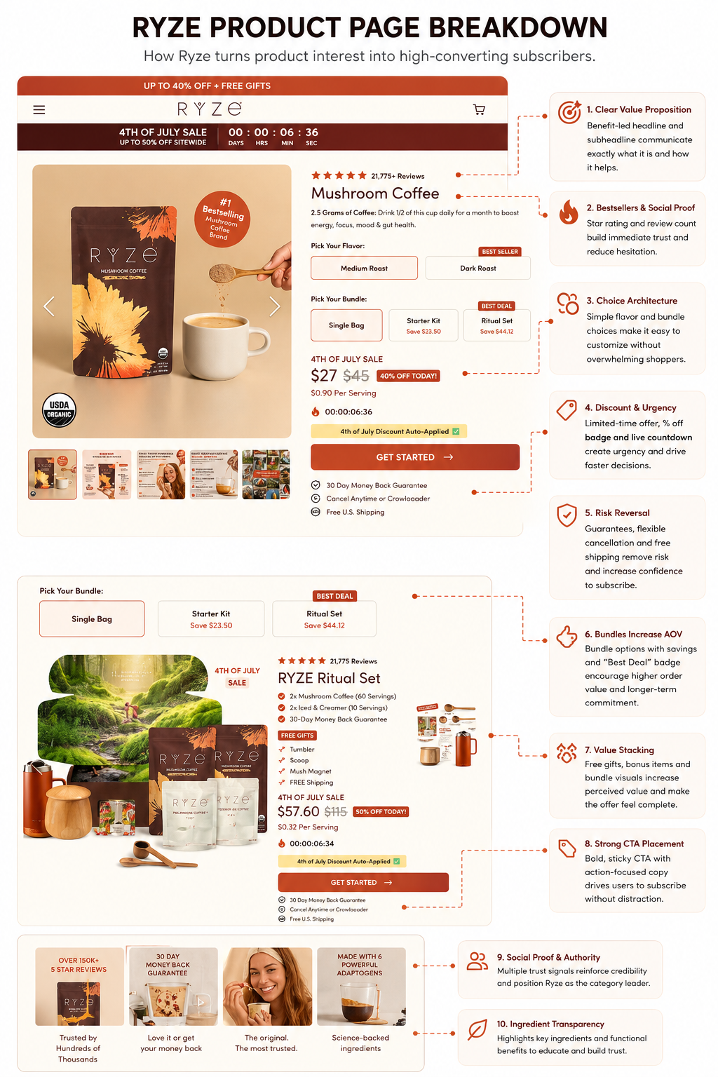
If the homepage generates interest, the product page is where RYZE converts that interest into a subscription. Every element has been designed to reduce hesitation and reinforce the idea that subscribing offers the best overall value.
One of the first things you'll notice is the bundle architecture. Rather than simply offering a single bag of coffee, RYZE presents multiple purchase options, from individual bags through to larger bundles, with clear "Best Seller" and "Best Deal" labels helping shoppers make a decision. This removes the mental effort of comparing products while subtly steering customers towards higher-value purchases.
Savings are impossible to miss. Original prices are struck through, percentage discounts are displayed prominently, and the cost per serving is shown alongside the overall price. Combined with a countdown timer and limited-time promotional messaging, the page creates a genuine sense of urgency without feeling overly aggressive.
The primary call-to-action is equally effective. Large, high-contrast "Get Started" buttons appear throughout the page, ensuring visitors never need to search for the next step. Around these buttons, RYZE surrounds customers with reassurance: a 30-day money-back guarantee, free shipping, flexible subscription messaging and cancellation options all reduce the perceived risk of committing to a recurring purchase.
The value proposition doesn't stop there. Premium bundles include free gifts such as tumblers, scoops and magnets, helping increase perceived value without relying solely on heavier discounts. Instead of competing on price, RYZE makes the overall offer feel more complete.
Perhaps the biggest lesson from this page is that every component works together. Reviews establish credibility, bundle labels simplify decision-making, savings reinforce value, urgency encourages action and guarantees remove doubt. It's a textbook example of conversion rate optimisation, where no single feature does all the work, but the combined experience steadily nudges visitors towards becoming subscribers.
For ecommerce brands looking to improve conversions, this is a reminder that the highest-performing product pages don't simply describe a product—they systematically remove every reason not to buy.
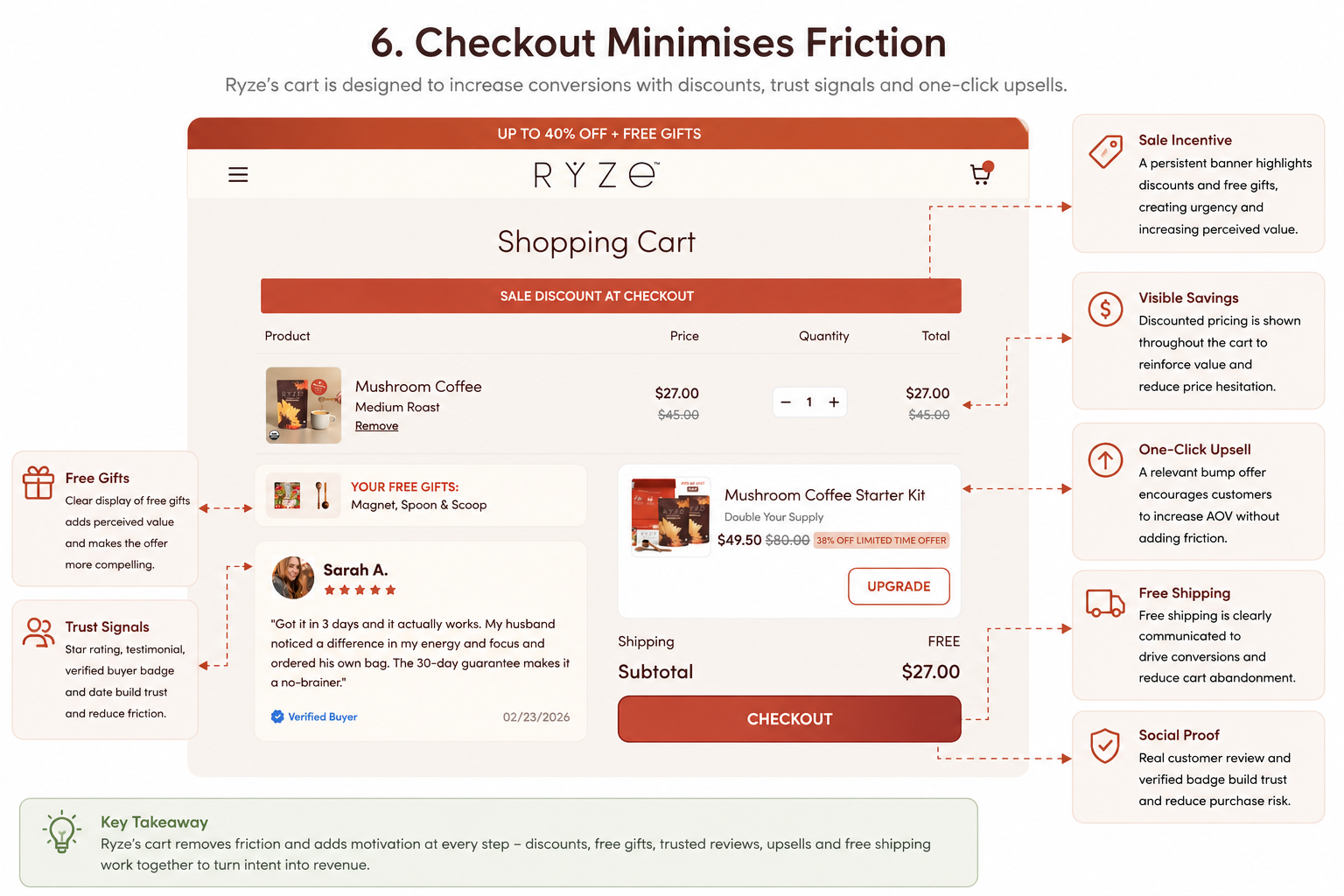
For many ecommerce brands, the shopping cart is simply a holding page before checkout. RYZE takes a very different approach. Rather than assuming the selling process is complete, the cart continues reinforcing value and encouraging customers to spend a little more before they purchase.
One of the first things shoppers see is a relevant upgrade opportunity. Instead of displaying unrelated products, RYZE recommends complementary items that naturally fit with the customer's existing order, increasing Average Order Value (AOV) without feeling intrusive.
The cart also reminds customers of the additional value they're receiving. Free gifts are displayed alongside the order summary, reinforcing the perception that the subscription offers more than just a discounted price. It's a simple tactic, but one that makes customers feel they're getting a genuinely better deal by committing to a subscription.
Another effective feature is the inclusion of customer testimonials directly within the cart. Most brands wait until the product page to showcase reviews, but RYZE understands that hesitation can return at any point in the buying journey. Reinforcing social proof immediately before checkout provides one final layer of reassurance.
The page also continues highlighting key incentives, including discount reminders and free shipping thresholds, ensuring customers don't lose sight of the savings they're about to receive. Finally, a large, high-contrast checkout button keeps the next step obvious, reducing unnecessary friction at one of the most important stages of the funnel.
The key takeaway is simple: most ecommerce carts exist to summarise an order. RYZE uses its cart to continue selling. By combining strategic upsells, social proof and value reinforcement, the brand turns what is often an overlooked page into another opportunity to increase both conversions and average order value.
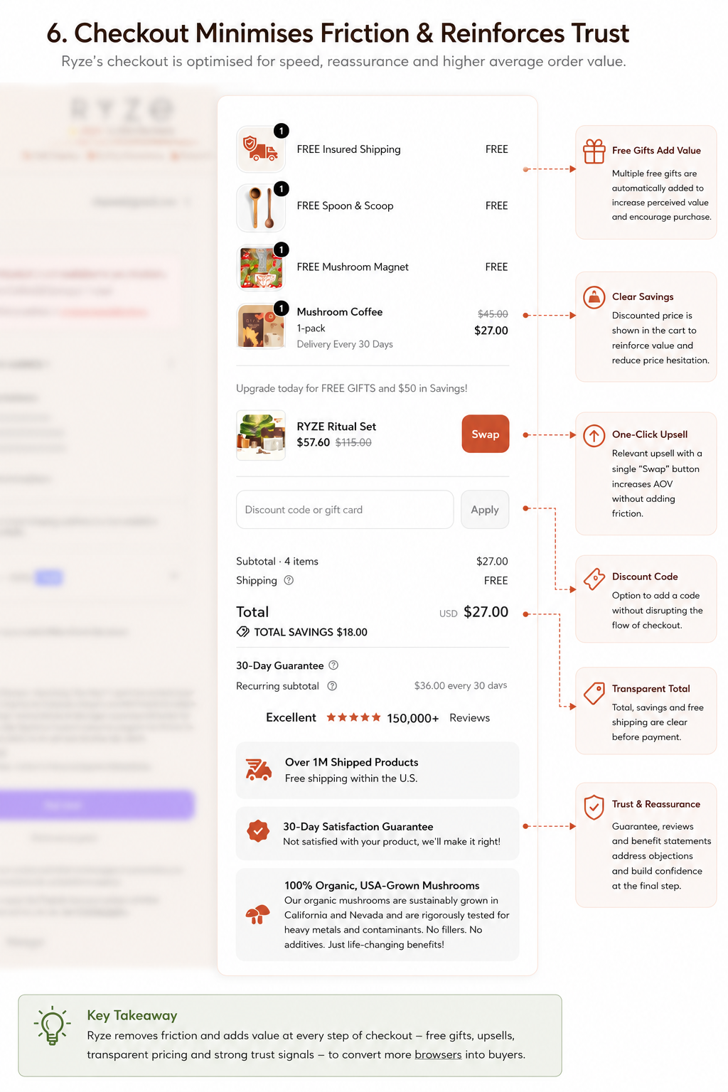
Many ecommerce checkouts unintentionally introduce friction at the point where customers are ready to buy. Unexpected costs, unclear pricing or a lack of reassurance can quickly lead to abandoned carts. RYZE takes the opposite approach by using its checkout to reinforce the value of the purchase and maintain customer confidence right through to payment.
The order summary clearly displays every saving, allowing shoppers to see exactly how much they're receiving through discounts, bundled offers and free gifts. Rather than stripping away promotional messaging, RYZE carries these incentives all the way through the checkout, reminding customers why they're getting a great deal.
The checkout also continues to build trust. 150,000+ customer reviews, satisfaction guarantees and reassuring messaging remain visible, helping reduce any last-minute doubts. By keeping these trust signals present, RYZE avoids one of the most common ecommerce mistakes: assuming customers no longer need reassurance once they've reached the payment stage.
Another subtle but effective tactic is that the upsell opportunity doesn't disappear. Customers are still presented with relevant complementary products, creating one final opportunity to increase Average Order Value without disrupting the checkout experience.
Finally, practical reminders such as free shipping, transparent pricing and a clear breakdown of what's included ensure there are no unpleasant surprises. Every element is designed to make completing the purchase feel like the obvious next step rather than a risky commitment.
The lesson for ecommerce brands is clear: your checkout shouldn't simply collect payment—it should continue reinforcing trust. While many websites become more transactional at the final stage of the funnel, RYZE actually becomes more reassuring, helping reduce hesitation at the point where every abandoned checkout matters most.
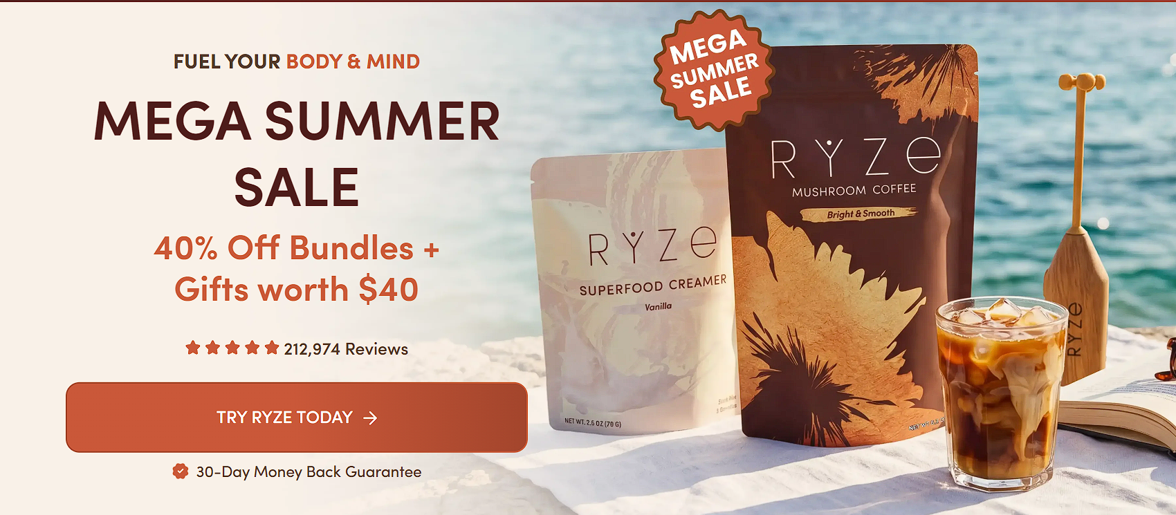
RYZE's success isn't built on one brilliant landing page or a single viral TikTok. It's the result of a customer journey where every stage has been carefully optimised to reduce hesitation, reinforce trust and maximise customer lifetime value.
Their creator-led paid ads generate curiosity without feeling like traditional advertising. The homepage immediately communicates value and steers visitors towards a subscription. Product pages simplify decision-making through bundles, social proof and risk-reducing guarantees, while both the cart and checkout continue strengthening the offer rather than simply processing an order.
Taken individually, many of these tactics are relatively simple. Combined, however, they create a seamless subscription funnel that encourages higher average order values, stronger conversion rates and, ultimately, more recurring revenue.
For ecommerce brands, that's perhaps the biggest takeaway. Optimisation shouldn't stop once a customer clicks "Add to Cart." Some of the highest-impact improvements happen afterwards.
By continuously reinforcing value, removing friction and building confidence throughout the buying journey, brands can turn more first-time customers into long-term subscribers.
If you're looking to implement similar strategies on your own Shopify store, our team specialises in Conversion Rate Optimisation (CRO), Facebook Ads for ecommerce brands and Google Ads management.
The goal isn't simply to generate more traffic, it's to build a customer journey that converts more visitors and increases lifetime value from every acquisition.
