
Cometeer sells pre-measured, precision-brewed coffee capsules. Not quite instant coffee. Not quite a coffee machine. The positioning could fail in seconds if the product feels obscure on landing.
Instead, they've built a system where the ads, product page and cart all conspire to make the format feel obvious once you understand it. The result: repeated creative angles with no message drift, a product page that survives the click intact, and a subscription flow that turns constraints into completion tasks.
In this article
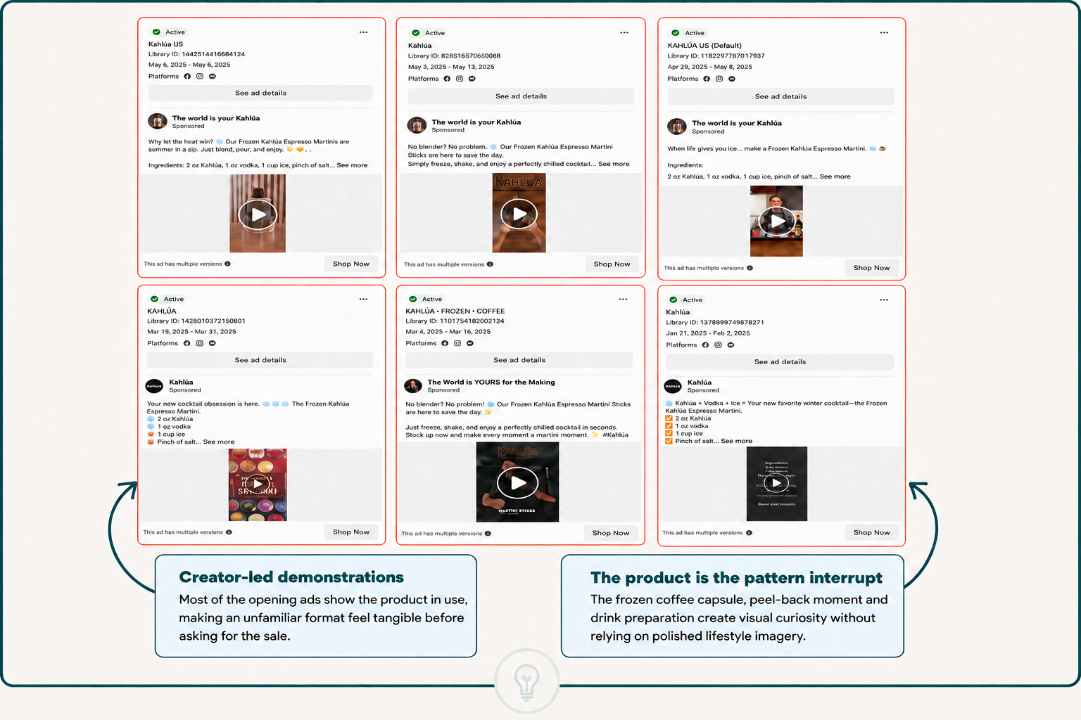
Cometeer's active ad library shows something most brands miss. Their ads don't look the same. Some are testimonials. Some are demonstrations. Some are product-first. Some are benefit-first. The copy changes. The visual treatment rotates.
But the underlying promise doesn't move an inch: cafe-quality coffee in 30 seconds.
Every ad creative, whether it shows the capsule being peeled, melted or poured, starts with that same value proposition. The capsule format is the product, not the side note. Handling the capsule is the hero moment, not the preamble.
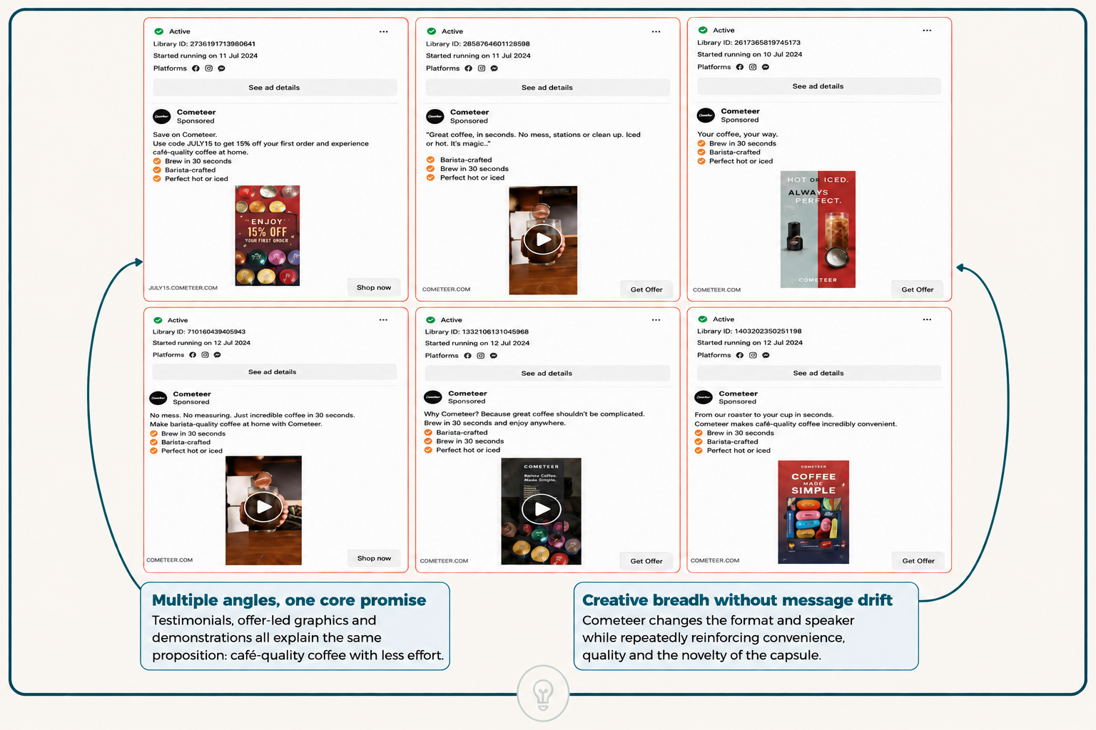
This matters for scaling performance marketing. Most brands treat creative diversity as permission to drift the message. "Let's try different angles" becomes "let's test whether the core message actually works." Cometeer reverses it: proven message, format rotation.
The outcome visible in their ad library is predictable. After months of testing, they're not cycling ads weekly. They're running six to nine evergreen campaigns simultaneously, each with multiple versions, which Cometeer explicitly flags as "This ad has multiple versions". Library start dates span four to eight month windows. That doesn't happen by accident. It means the message-to-format ratio is working.
If your Meta ads strategy still treats creative as a guess-and-check exercise, you're leaving efficiency on the table. The hard work, nailing the core promise, needs to come before the creative exploration.
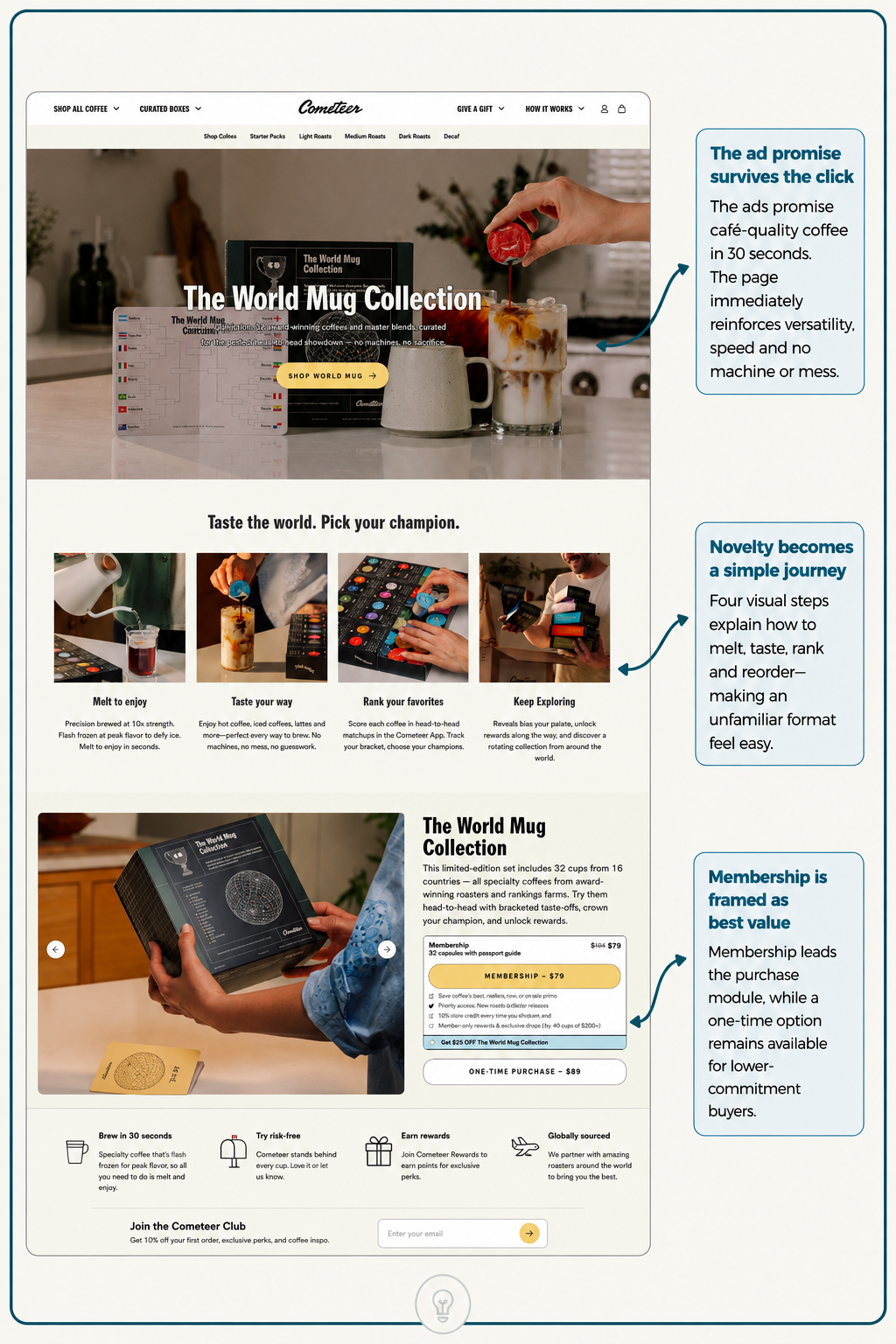
Landing from a Cometeer ad, the first thing a new visitor sees is not a feature list or a value prop restatement. It's a hand holding a red coffee capsule. The visual is identical to what they just saw in the ad.
This is intentional. The promise doesn't reset on landing. It retrieves.
Below the hero image, the copy is surgical. The World Mug Collection is described as a limited-edition set of 32 cups from 16 countries, all speciality coffees from award-winning roasters and ranking farms, to be tried head-to-head in bracketed taste-offs.
Note what's missing: machine talk, brewing mechanics, subscription language. The page leads with a use case, a tasting challenge, rather than a specification. The visitor came for convenience in a format. The page asks them to picture a ritual, ranking coffees and earning status.
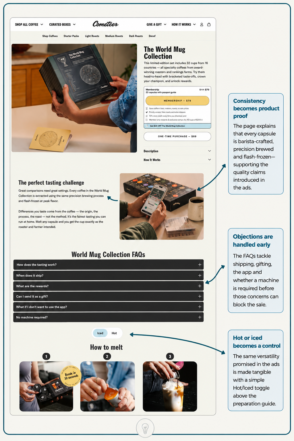
The page handles three objections immediately.
Consistency becomes product proof. The "How to melt" section shows three precise images: grab, peel, pour. The copy promises a 30-second brew, barista-crafted, perfect hot or iced. This isn't reassurance prose. It's proof the system actually works.
Objections get front-loaded. Before checkout, a six-item FAQ section covers how the tasting works, when it ships, what the rewards are, whether it can be sent as a gift, what happens if you don't want to use the app, and whether a machine is required. That last one explicitly tackles the unspoken fear: do I need to buy hardware?
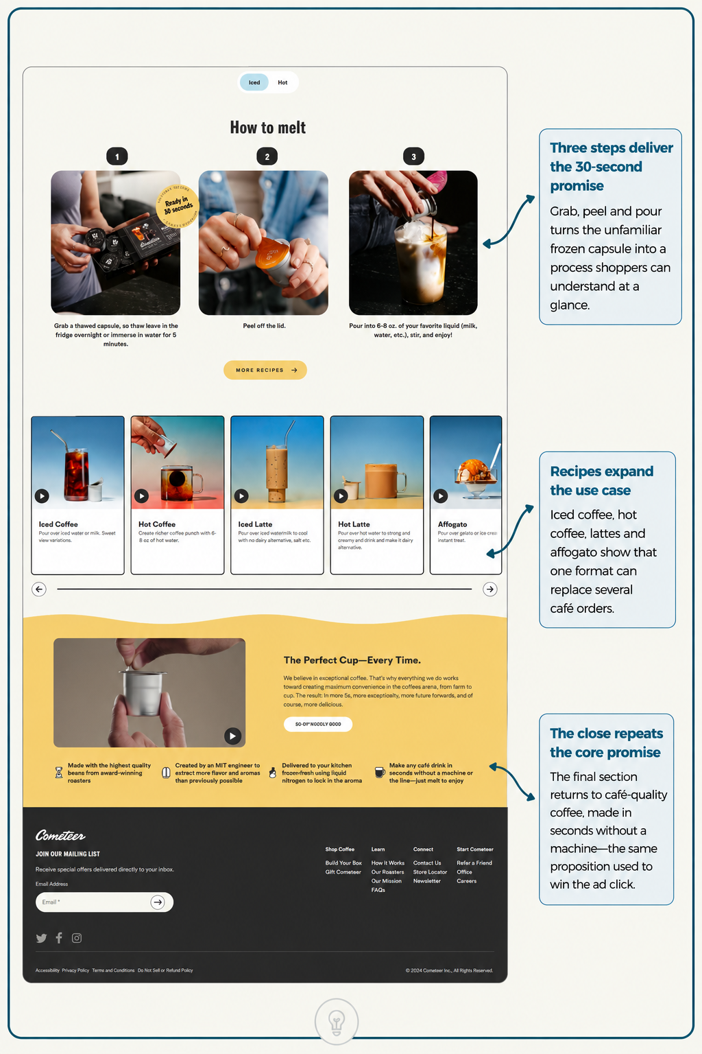
Membership is framed as best value. The page surfaces two purchase paths: membership at $79 for 32 capsules with a passport guide, and one-time at $89. The membership gets a savings callout covering $25 off the first order, priority access, 10% store credit on every checkout, and member-only rewards and offers. The one-time option remains visible for lower-commitment buyers.
This is conversion rate optimisation at the philosophy level. The page doesn't argue for coffee. It sets up a use case where the product becomes the tool to accomplish something the visitor already wants: discovering and ranking coffees.
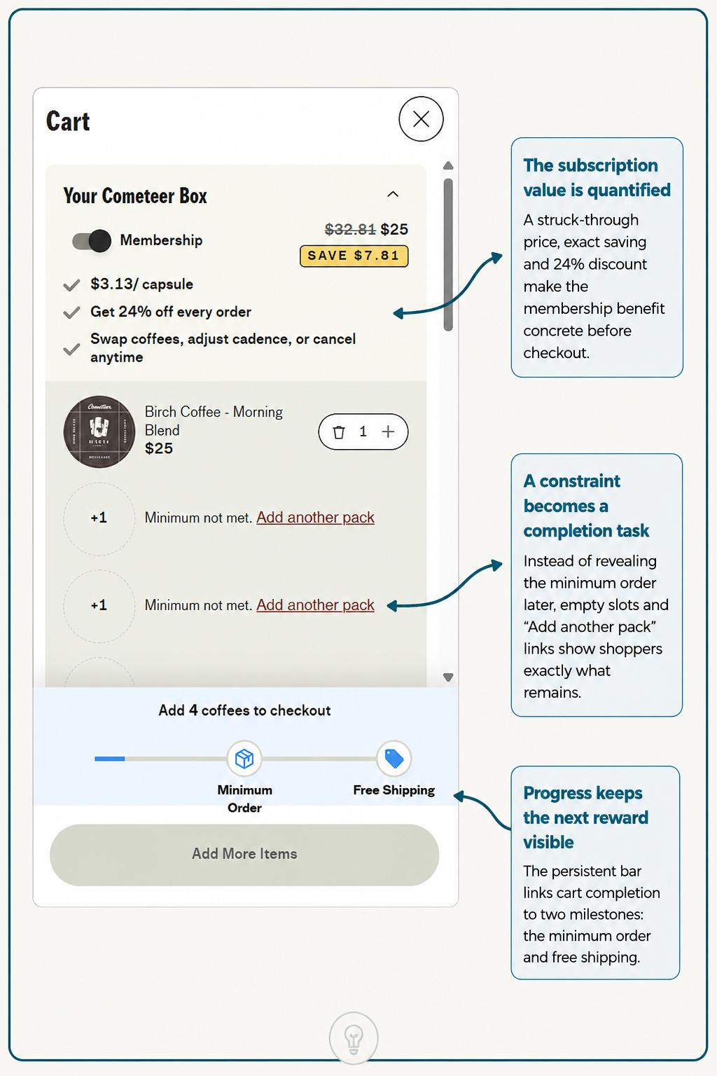
Most ecommerce carts hide their mechanics. Cometeer's cart is transparent about a critical constraint: minimum order.
The page shows exactly what's in the cart, $25 for one Birch Coffee box. It then shows two empty slots with "+1" buttons and the label "Minimum not met. Add another pack." Below the empty slots is a progress bar tracking two milestones: minimum order, and free shipping.
This is deliberate. Instead of revealing the minimum order requirement at checkout, when friction is highest, Cometeer shows it as a solvable puzzle. The visitor isn't blocked. They're guided toward the second milestone.
The subscription value is quantified with precision. $32.81 struck through to $25, a saving of $7.81, with the 24% discount highlighted. That exact-cent figure makes the discount feel concrete rather than aspirational. Paired with three checkmarks covering $3.13 per capsule, 24% off every order, and the freedom to swap coffees, adjust cadence or cancel anytime, the subscription argument is built into the cart context rather than buried in sign-up.
The minimum-order constraint, which could be friction, becomes a completion task. Two more coffees to free shipping. Each addition moves the progress bar visibly. By the time the visitor reaches checkout, they've made three separate micro-commitments: adding items, toggling subscription, and seeing free shipping unlock.
This is the inverse of friction design. Most carts minimise steps. Cometeer's cart makes each step visible and rewarded.
A visitor lands from a Cometeer Meta ad primed for one idea: cafe-quality coffee in 30 seconds. The product page delivers proof of that claim immediately through the visual, then pivots to a use case that makes the format valuable, with the tasting challenge, the ranking and the status. The cart reinforces the subscription's financial advantage and makes hitting free shipping feel like progress rather than a hurdle.
Each piece moves the visitor forward on the same rails. No reset. No new pitch. No hope that a different angle will resonate if the first one didn't.
If your brand's ads, landing pages and cart are optimised independently, as if they're separate conversions, you're fragmenting the customer journey. The lift comes from connecting them.
When you're scaling performance marketing for ecommerce, think of your Meta ad strategy as a belief foundation, your product page as proof of that belief, and your cart as the completion mechanism. Everything else is noise.
If you're running Shopify or WooCommerce and your ads, landing experience and checkout feel disconnected, get in touch and we'll walk through where the throughline breaks.
