
When most ecommerce brands think about conversion rate optimisation, they often focus on tweaking button colours or shortening checkout forms. The Oodie takes a different approach. From the moment you land on the homepage, every section has a clear purpose: reduce friction, build trust and make it incredibly easy for visitors to find something they’ll love.
Rather than overwhelming shoppers with dozens of promotions or lengthy explanations, the homepage is designed around a simple customer journey. It quickly communicates value, showcases social proof and guides visitors towards the most relevant product categories, all while reinforcing the cosy, feel-good lifestyle that has helped turn The Oodie into one of the world's best-known comfort brands.
The result is a homepage that feels effortless to browse, but is carefully engineered to increase engagement and conversions.
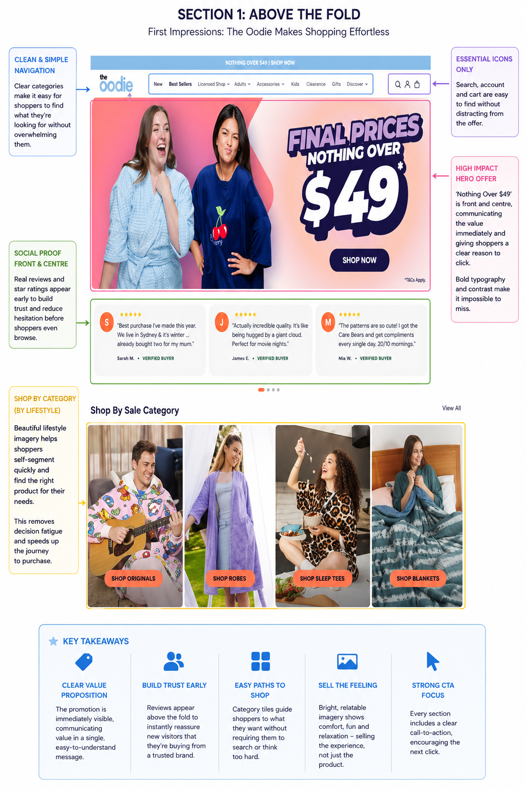
The very first thing visitors see is a bold promotional banner advertising "Nothing Over $49." It's impossible to miss and instantly answers one of the biggest questions every shopper has: Why should I buy today? Rather than relying on a subtle discount badge, The Oodie makes its offer the hero of the page, giving customers an immediate reason to continue browsing.
Just below, customer reviews appear before shoppers have even reached the product catalogue. This is an excellent example of using social proof early in the buying journey. Instead of waiting until the product page to prove credibility, The Oodie reassures first-time visitors that thousands of customers have already purchased and enjoyed their products. Removing uncertainty this early reduces hesitation and increases the likelihood that someone continues exploring the site.
Navigation is equally well considered. The header keeps the menu simple and uncluttered, while search, account and basket icons remain visible without distracting from the main promotion. Shoppers who already know what they're looking for can find it immediately, while new visitors are encouraged to browse.
One of the strongest CRO elements is the "Shop By Sale Category" section. Rather than forcing customers to scroll through hundreds of products, The Oodie allows visitors to self-segment into categories such as Originals, Robes, Sleep Tees and Blankets. This dramatically reduces decision fatigue and shortens the path to a relevant product page.
Finally, almost every image on the homepage focuses on people enjoying the products rather than simply displaying them. This is an important distinction. The Oodie isn't selling oversized hooded blankets or sleepwear—it is selling warmth, relaxation and comfort. By showing people laughing, relaxing and spending time together, the homepage encourages visitors to imagine themselves enjoying the same experience.
Many ecommerce homepages become repetitive after the hero banner, simply presenting rows of products with little context. The Oodie takes a much more deliberate approach. Rather than asking visitors to browse endlessly, it continually introduces new reasons to click, creating an experience that feels fresh, engaging and highly personalised.
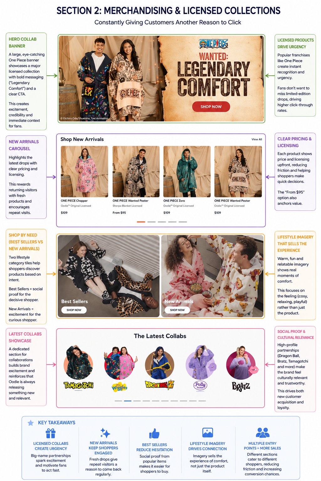
One of the standout strategies is its use of licensed collaborations. Instead of relying solely on its own brand, The Oodie partners with globally recognised franchises including One Piece, Dragon Ball Z, Bratz, Polly Pocket, Tamagotchi and The Wiggles. These collections immediately tap into existing fan communities, giving shoppers an emotional reason to explore products beyond simply needing a new blanket or sleep tee. For many customers, the collaboration itself becomes the purchase trigger.
The homepage reinforces this with large promotional banners dedicated to featured collections. Rather than being hidden within the navigation, collaborations receive premium real estate, complete with strong headlines such as "Legendary Comfort" and prominent calls to action. It's a simple but effective way of turning licensed products into major marketing campaigns rather than just another SKU.
Below this, New Arrivals keeps the homepage feeling dynamic. Returning visitors instantly see what's new, while clear pricing and product imagery make it easy to browse without clicking through multiple pages. Even subtle touches—such as displaying pricing from $95 alongside full-priced products—help establish value and encourage exploration.
The Oodie also recognises that not every customer shops with the same mindset. Some visitors want reassurance that they're buying the most popular product, while others are looking for the latest release. By placing Best Sellers alongside New Arrivals, the homepage caters to both audiences simultaneously. Best Sellers provide social proof for cautious shoppers, while New Arrivals appeal to those looking for something fresh or exclusive.
Perhaps most importantly, the imagery throughout this section continues selling the experience rather than the product. Instead of flat product photography, shoppers see people relaxing together, laughing and enjoying cosy moments. This emotional merchandising helps customers imagine themselves using the product, making the purchase feel less transactional and more aspirational.
Most ecommerce brands treat the bottom of the homepage as little more than a footer. The Oodie uses this space to reinforce its credibility, strengthen its brand identity and encourage visitors to stay connected long after their first visit.
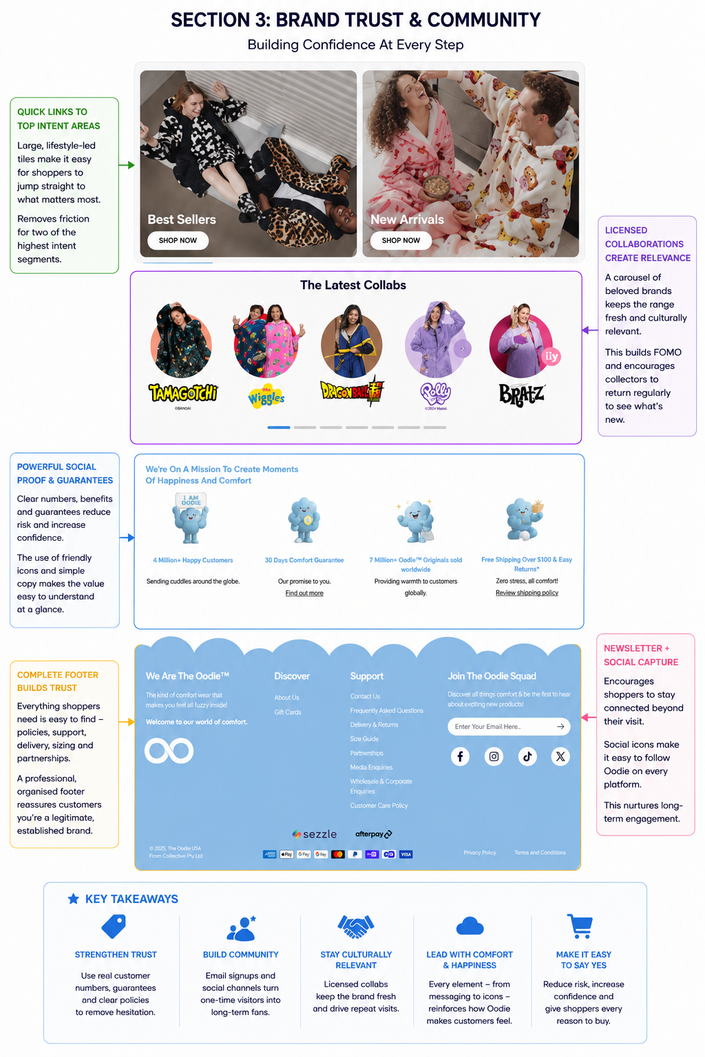
The homepage continues promoting Best Sellers, New Arrivals and its growing catalogue of licensed collaborations, reminding shoppers that there's always something new to discover. Featuring recognisable brands such as Bratz, Dragon Ball Z, Polly Pocket and Tamagotchi helps keep the site culturally relevant while encouraging repeat visits from customers eager to see the latest releases.
Just as importantly, The Oodie reinforces trust with simple but highly effective statistics. Claims such as 4 million+ happy customers, 7 million+ products sold, a 30-day comfort guarantee and free shipping over $100 with easy returns provide immediate reassurance without overwhelming the page. These figures answer many of the questions shoppers naturally have before making a purchase: Can I trust this brand? What happens if I need to return it? Am I buying from an established company?
Even the footer has been designed with purpose. Rather than acting solely as navigation, it makes customer support, delivery information, partnerships and policies easy to find while encouraging visitors to join the email list and follow the brand on social media. Capturing that email address is what turns a one-off purchase into a repeat one, which is where email marketing does most of its work. It's a subtle reminder that The Oodie isn't simply trying to secure a one-off sale—it wants to build an ongoing relationship with its customers.
Once a visitor lands on a product page, The Oodie shifts its focus from attracting attention to removing hesitation. Every element is designed to answer questions, build confidence and make adding an item to the basket feel like the obvious next step.
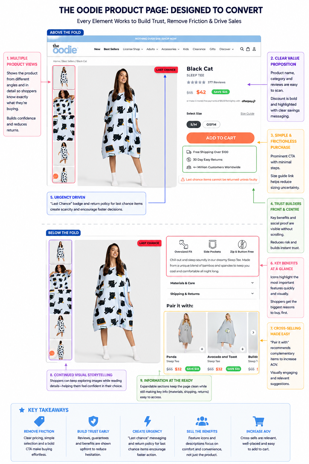
Unlike many apparel brands that rely on a handful of product photos, The Oodie provides a generous gallery of lifestyle and close-up images. Shoppers can quickly view the product from multiple angles, see the fit on a real person and inspect the pattern in greater detail without leaving the page. This is particularly valuable for oversized clothing, where customers often struggle to visualise how the product will look and fit.
Alongside the imagery, the key purchasing information is presented clearly and immediately. The product title, review count, discounted price and savings are all visible above the fold, meaning customers don't need to hunt for the information that influences buying decisions most. The pricing also uses strong visual hierarchy, making the saving stand out far more than the original price.
The purchase process itself is intentionally simple. With just two size options, a large Add to Cart button and a clearly positioned size guide, The Oodie removes unnecessary decision-making. Fewer choices generally lead to faster purchasing decisions, particularly for products where simplicity is part of the appeal.
Just beneath the call-to-action, several trust signals reinforce the purchase decision before shoppers scroll any further. Free shipping thresholds, a 30-day returns policy and the claim of 4+ million customers worldwide reassure visitors that they're buying from a well-established brand. These small additions help answer common concerns without forcing customers to search elsewhere on the page.
The Oodie also uses urgency sparingly but effectively. Rather than filling the page with countdown timers and flashing banners, products nearing the end of their lifecycle receive a simple "Last Chance" badge. Combined with the note explaining that last-chance items cannot be returned unless faulty, this creates genuine scarcity rather than artificial urgency.
Further down the page, the product description focuses on the benefits customers care about most. Simple iconography highlights features such as the oversized fit, side pockets and button-free design, allowing shoppers to understand the product within seconds. Supporting accordions for materials, care instructions and shipping information keep the page clean while ensuring detailed information remains easily accessible when needed.
Finally, The Oodie continues selling even after the customer has effectively made their decision. The "Pair it with" section introduces complementary products that feel genuinely relevant rather than intrusive, creating natural opportunities to increase average order value without interrupting the shopping experience.
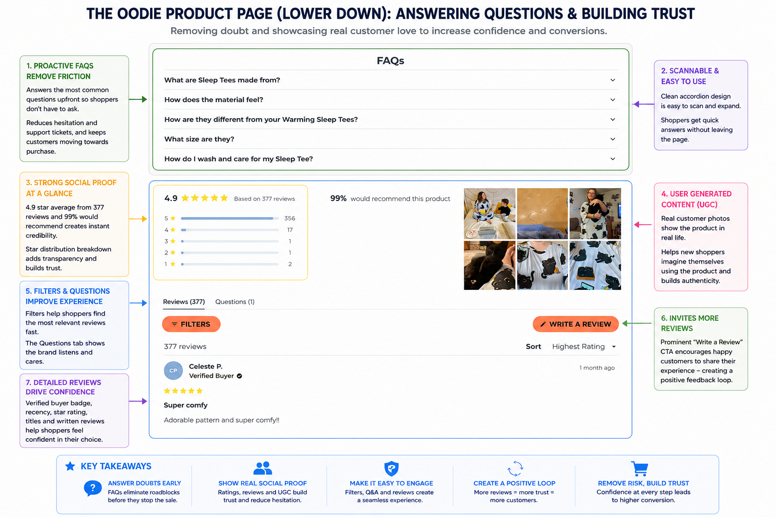
Many ecommerce brands assume the hard work is done once a customer reaches the bottom of a product page. The Oodie treats it differently. Instead of allowing momentum to fade, it uses this space to answer remaining questions, reinforce trust and give shoppers even more reasons to complete their purchase.
The first thing visitors encounter is a well-structured FAQ section. Rather than forcing customers to search elsewhere or contact support, common questions about sizing, materials, comfort and care are answered directly on the page. The accordion layout keeps everything clean and easy to scan, while ensuring detailed information is only a click away. This is a simple but effective way of removing friction before it becomes a reason to abandon the purchase.
Immediately below, The Oodie doubles down on social proof. Rather than displaying a single star rating, it shows an overall 4.9-star average, a detailed rating distribution and the statistic that 99% of customers would recommend the product. These numbers provide transparency and instantly reassure shoppers that they're buying a product with consistently positive feedback.
One of the strongest features is the inclusion of user-generated content (UGC) alongside the reviews. Customers can browse genuine photos showing the product in real homes, on different body types and in everyday situations. This bridges the gap between polished marketing photography and reality, helping prospective buyers visualise themselves using the product while adding an extra layer of authenticity.
The review section itself is also thoughtfully designed. Filters allow shoppers to find the most relevant feedback quickly, while verified buyer badges, review titles and written comments make the content feel credible rather than manufactured. This encourages visitors to spend more time engaging with customer experiences instead of leaving the site to search for third-party opinions.
Finally, The Oodie turns its review platform into a continuous trust-building engine by prominently featuring a "Write a Review" button. Encouraging satisfied customers to contribute fresh reviews keeps the content current, increases the volume of social proof over time and creates a positive feedback loop that benefits future shoppers.
