
Magic Spoon puts its proof right in the hero: 80,000+ five-star reviews, printed above the fold before a single product shot loads. That's not incidental. Since launching in 2019, the brand raised an $85 million Series B backed by investors including Shakira, Nas and Russell Westbrook, and by its own account reached more than a million customers within its first three years, all while charging a premium for cereal in a category most shoppers buy on autopilot. Convincing someone to pay more for a food staple is one of the harder trust problems in ecommerce, and Magic Spoon's site is built almost entirely around solving it.
In this breakdown, we're looking at five moments across Magic Spoon's homepage and its Build Your Own Bundle page where proof and easy choice-making do the heavy lifting, and what other ecommerce brands running conversion rate optimisation (CRO) can take from it.
In this article
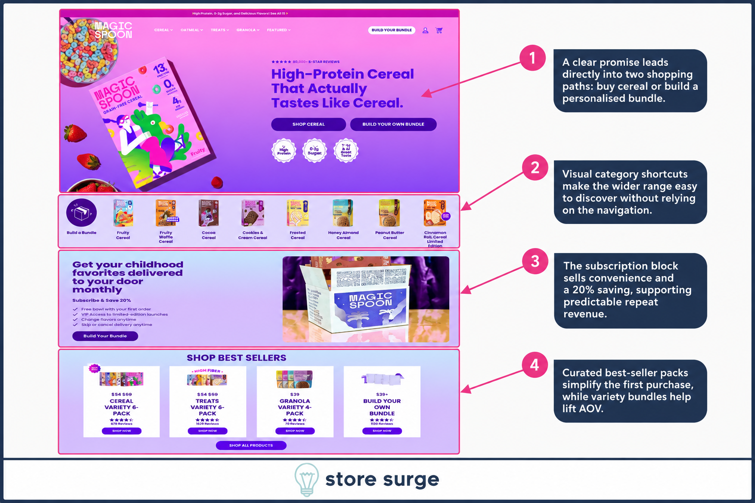
The headline does a lot of work in very few words: "High-Protein Cereal That Actually Tastes Like Cereal." It states the functional benefit and pre-empts the obvious objection, that healthy cereal usually tastes like cardboard, in a single line. Directly under it, the 80,000+ review count and star rating sit before either call to action, so the claim above it doesn't have to be taken on faith.
From there, the page splits into two clear paths: Shop Cereal for someone who already knows what they want, and Build Your Own Bundle for someone who wants variety. Neither path is buried in navigation. Both sit as equal-weight buttons directly under the headline, letting the visitor self-select rather than forcing everyone down one funnel.
Below the fold, a row of visual category shortcuts (Fruity, Cocoa, Cookies & Cream and more) makes the wider range easy to discover without relying on the nav bar, while a subscription callout, Subscribe & Save 20%, gets introduced early with supporting benefits like a free bowl and flexible flavour swaps. By the time a visitor reaches Best Sellers further down, most of the thinking (what to buy, whether to subscribe, how the brand tastes according to other people) has already been done for them.
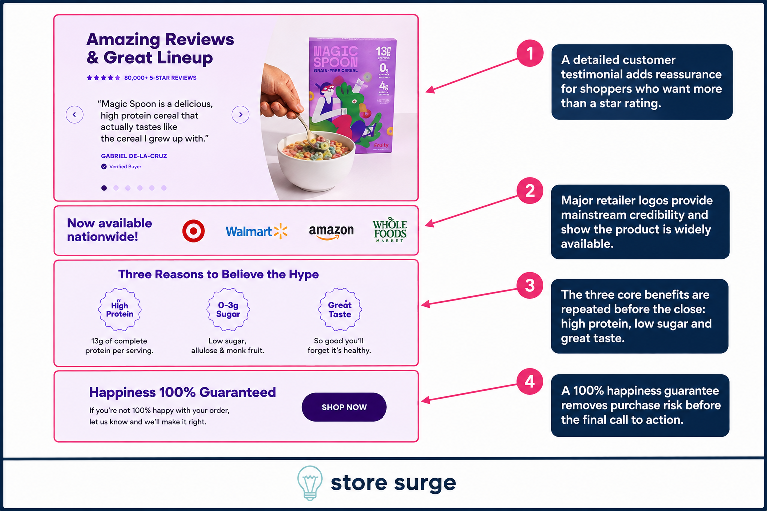
Where the hero leads with a review count, the homepage close leads with a full testimonial. A named, verified customer quote sits next to product photography, giving shoppers who want more than a star rating something more substantial to read before they scroll past.
Directly underneath, "Now available nationwide" sits next to Target, Walmart, Amazon and Whole Foods logos. For a brand that started direct-to-consumer, retail distribution is an unusual trust signal to lean on this heavily, most DTC brands avoid mentioning it in case it undercuts the case for buying direct, but Magic Spoon uses it anyway, betting that mainstream retail availability reads as more convincing than a badge or certification would.
The page closes by repeating its three core benefits, High Protein, 0 to 3g Sugar, Great Taste, one more time immediately before a Happiness 100% Guaranteed box and a final Shop Now button. Removing purchase risk right before the last call to action is a small addition, but it's placed at exactly the point a hesitant buyer is deciding whether to click away or convert.
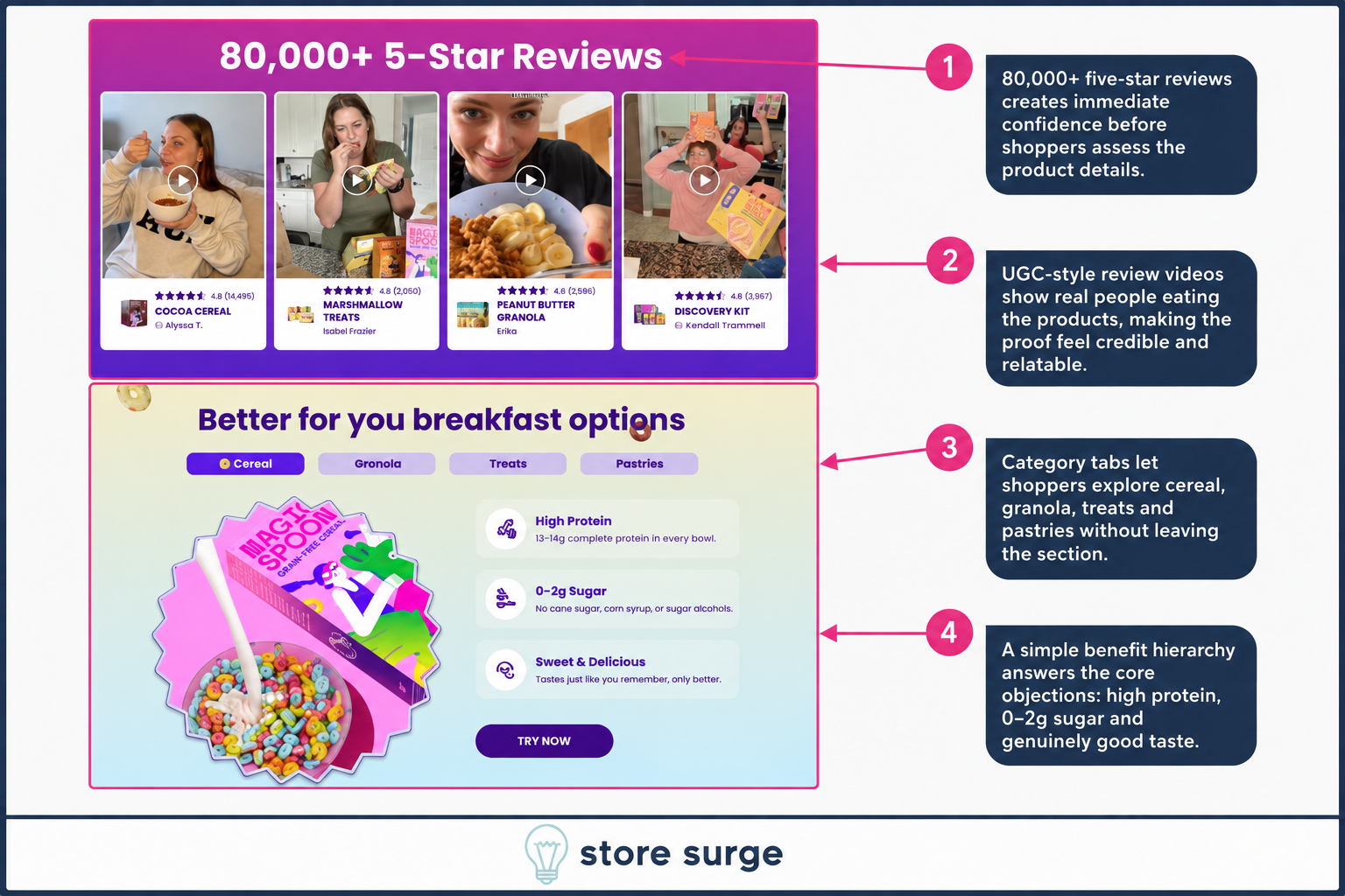
Elsewhere on the site, Magic Spoon repeats its 80,000+ five-star review count, but this time backs it with UGC-style video testimonials, real customers filmed eating the product rather than stock photography. Video reviews are harder to fake convincingly than written ones, and that makes the same headline number feel more credible the second time it appears.
Underneath the reviews, category tabs (Cereal, Granola, Treats, Pastries) let shoppers explore the wider catalogue without leaving the section they're already engaged in, keeping momentum rather than sending visitors back to the main nav.
The section closes with the same benefit hierarchy used elsewhere on the site: High Protein, 0 to 2g Sugar, Sweet & Delicious. Reusing this exact structure across multiple pages isn't repetitive so much as deliberate. A shopper doesn't need to visit every page to get the full pitch; they'll hit the same three-point argument wherever they land.
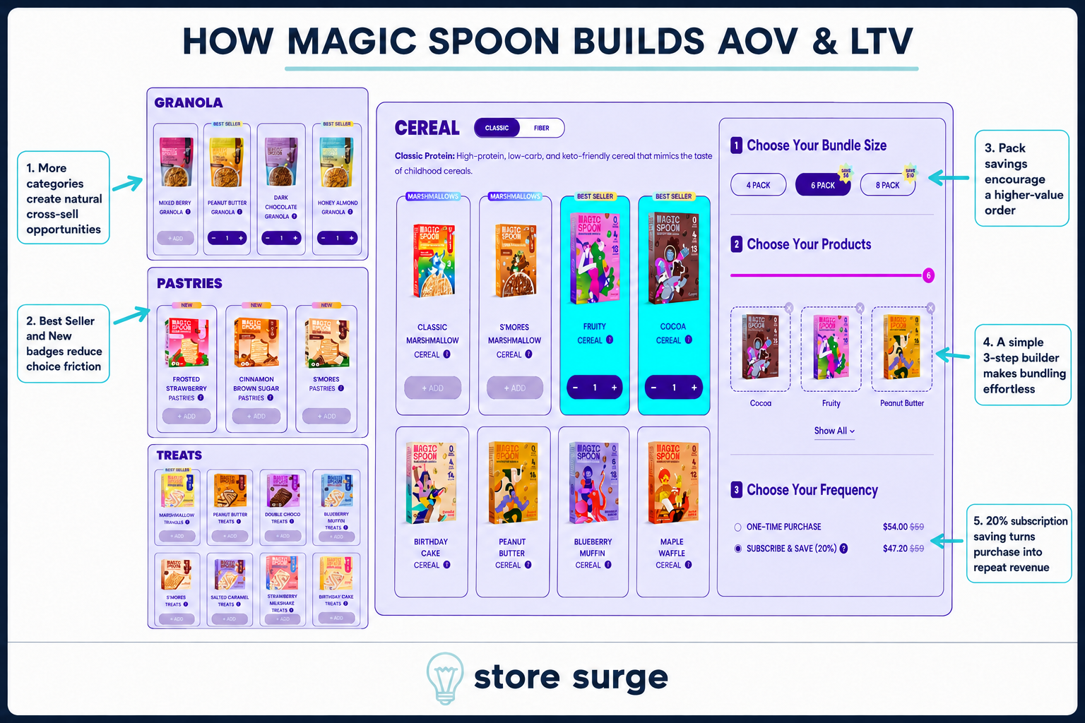
Magic Spoon's Build Your Own Bundle page is where the catalogue's breadth actually pays off. A sidebar breaks products into Granola, Pastries and Treats, each with Best Seller and New badges that reduce the friction of choosing between near-identical options, while the main panel focuses on Cereal with a Classic and Fiber toggle up top.
The builder itself runs in three visible steps: choose a bundle size (4, 6 or 8 pack), pick products up to that count, then choose a frequency. A running counter shows progress through the product-selection step, so a shopper always knows exactly how close they are to a complete bundle rather than guessing.
The frequency choice is where the page earns its revenue. Subscribe & Save (20%) is pre-selected against a crossed-out one-time price, turning what could be a single transaction into a recurring one by default. That single toggle, combined with the natural cross-sell from three separate product categories sitting side by side, is what actually lifts average order value on this page, not any individual product upsell. Once that subscription is locked in, it feeds directly into email marketing flows built around replenishment reminders and flavour recommendations, turning a single bundle order into a much longer customer relationship.
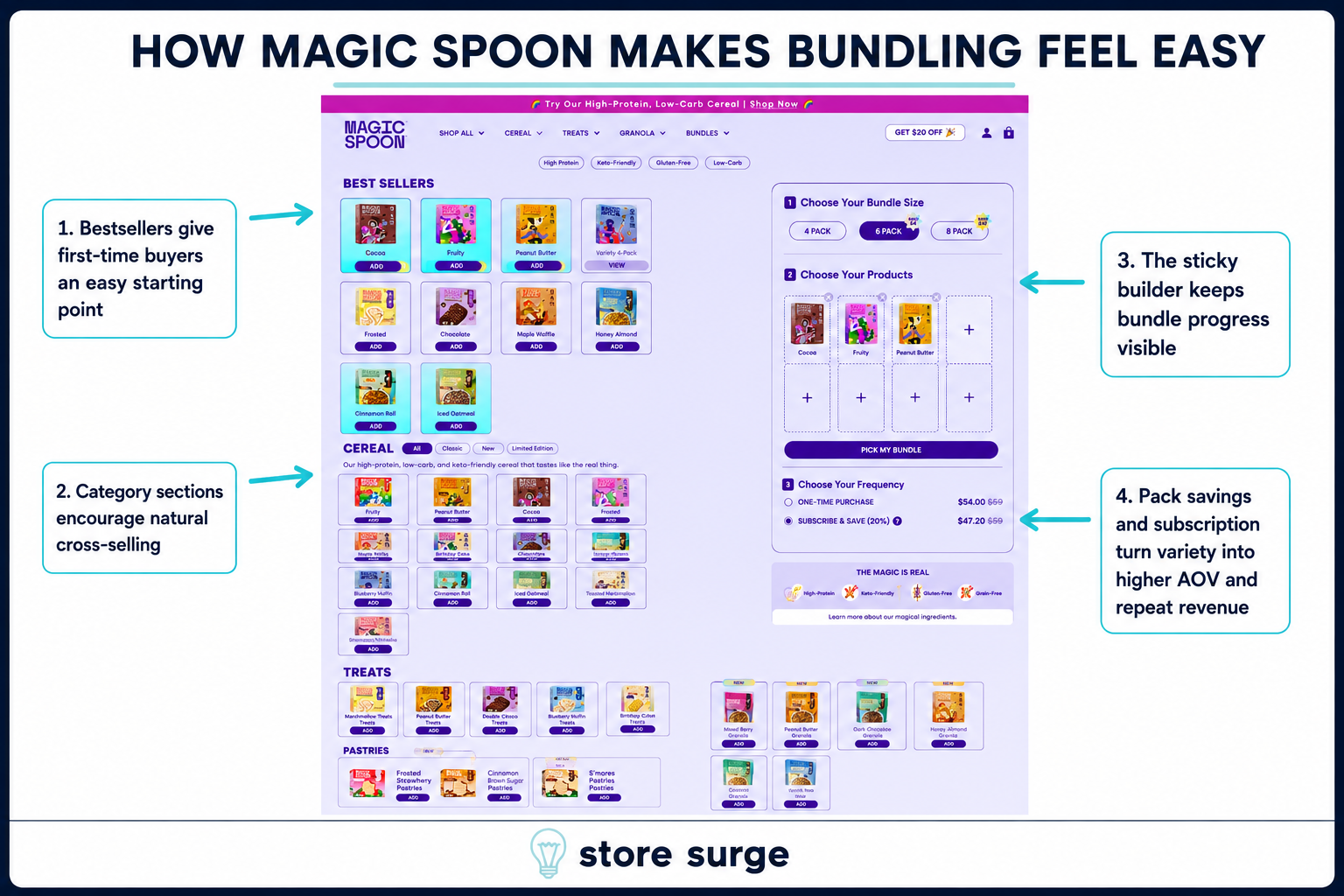
Zooming into the builder mechanics themselves, the page opens with Best Sellers as the default starting point, giving first-time buyers who don't know the flavour range yet an easy, low-risk place to begin rather than a blank grid of unfamiliar products.
Scrolling further, dedicated Cereal category sections encourage natural cross-selling. A shopper who came in for one flavour keeps discovering more of the range simply by scrolling, without ever leaving the builder flow to browse elsewhere.
Throughout the whole process, a sticky bundle panel stays visible on the right-hand side of the page. Every product added updates that panel in real time, so progress toward the chosen pack size is always in view rather than hidden behind a cart icon the shopper has to click to check. Combined with the pack savings and pre-selected subscription discount sitting directly beneath it, the panel turns what could be a tedious multi-step selection process into something that feels closer to a single, continuous decision, and one that quietly defaults toward the higher AOV, higher LTV outcome the whole page is built around.
Magic Spoon's site doesn't rely on one big trust signal. The same 80,000+ review count, the same three-point benefit claim and the same subscription discount show up repeatedly across the homepage, the reviews section and the bundle builder, each time reinforcing the last rather than introducing something new to evaluate.
That repetition is doing real work. A shopper who's seen the same proof three times in three different formats has effectively been convinced three separate times before they ever reach checkout, and the bundle builder's sticky panel and pre-selected subscription make sure that conviction turns into a higher-value order rather than a single box of cereal.
If you're looking to apply similar thinking to your own Shopify or WooCommerce store, get in touch. We help ecommerce brands build this kind of full-funnel CRO system, from homepage proof through to bundling, subscription and repeat revenue.
