
Most ecommerce homepages want you to buy a product. BarkBox's homepage wants you to answer a question. Before a visitor ever sees a price, the brand asks what their dog likes, how big they are, what their name is, and whether they have allergies. Only then does it show them a box.
That sequencing isn't an accident. Subscription boxes live and die on retention, not first-time conversion, and BarkBox's entire funnel is built to make every subscriber feel like their box was assembled specifically for their dog, because in their mind, it was. Well-built quiz funnels consistently outconvert a standard product page on cold traffic, and BarkBox leans on that gap harder than almost any other subscription brand we've reviewed.
In this breakdown, we'll analyse how BarkBox's homepage, its ten-step build-a-box quiz, and its standalone product page work together to turn a first-time visitor into a paying subscriber, and where the experience still has cracks.
In this article
.png)
BarkBox's homepage doesn't lead with one call to action. It leads with two. The hero splits into "Give your dog exactly what they want," pointing at the build-a-box quiz, and "Free Toys for a Year," pointing at a 6 or 12 month plan. Visitors land on two different reasons to subscribe before they've seen a single product, which means the page qualifies the offer for them rather than making them dig for it.
Scroll further and the three box types (Classic BarkBox, Super Chewer, Combo Box) each carry a small "March • Spring Farm" tag under a thumbnail of that month's actual toys. It's a small detail, but it does real work. Instead of asking a visitor to imagine what's inside a box, BarkBox shows them the literal contents of a recent one, built directly into the selector they'll use to start the quiz.
The "What's inside the box" carousel pushes that further, naming past themes like Monster Gnash and Winter Wooferland with the month attached. It reads less like a product spec and more like a preview of a show a visitor hasn't watched yet. For a subscription brand, that's the right pitch to make: not "here is a toy," but "here is twelve months of toys you haven't seen."
Trust signals stack toward the bottom rather than the top. "Trusted by 8+ million dogs" sits above five real customer photos and quotes, rather than a bare number left to carry the weight on its own. Just below it, BARK lists Amazon, Chewy, Target, Walmart, and PetSmart as places the product already sells. That's an unusual trust signal for a direct-to-consumer subscription brand. Most DTC brands avoid mentioning retail availability at all, since it can undercut the case for subscribing directly. BarkBox uses it anyway, betting that "you already trust us at Target" outweighs the risk of reminding someone they could buy elsewhere.
The lesson for ecommerce brands: a homepage doesn't need a single offer and a single path. BarkBox runs two offers, three entry points, and several trust signals in parallel, and lets the visitor self-select rather than forcing everyone down one funnel.
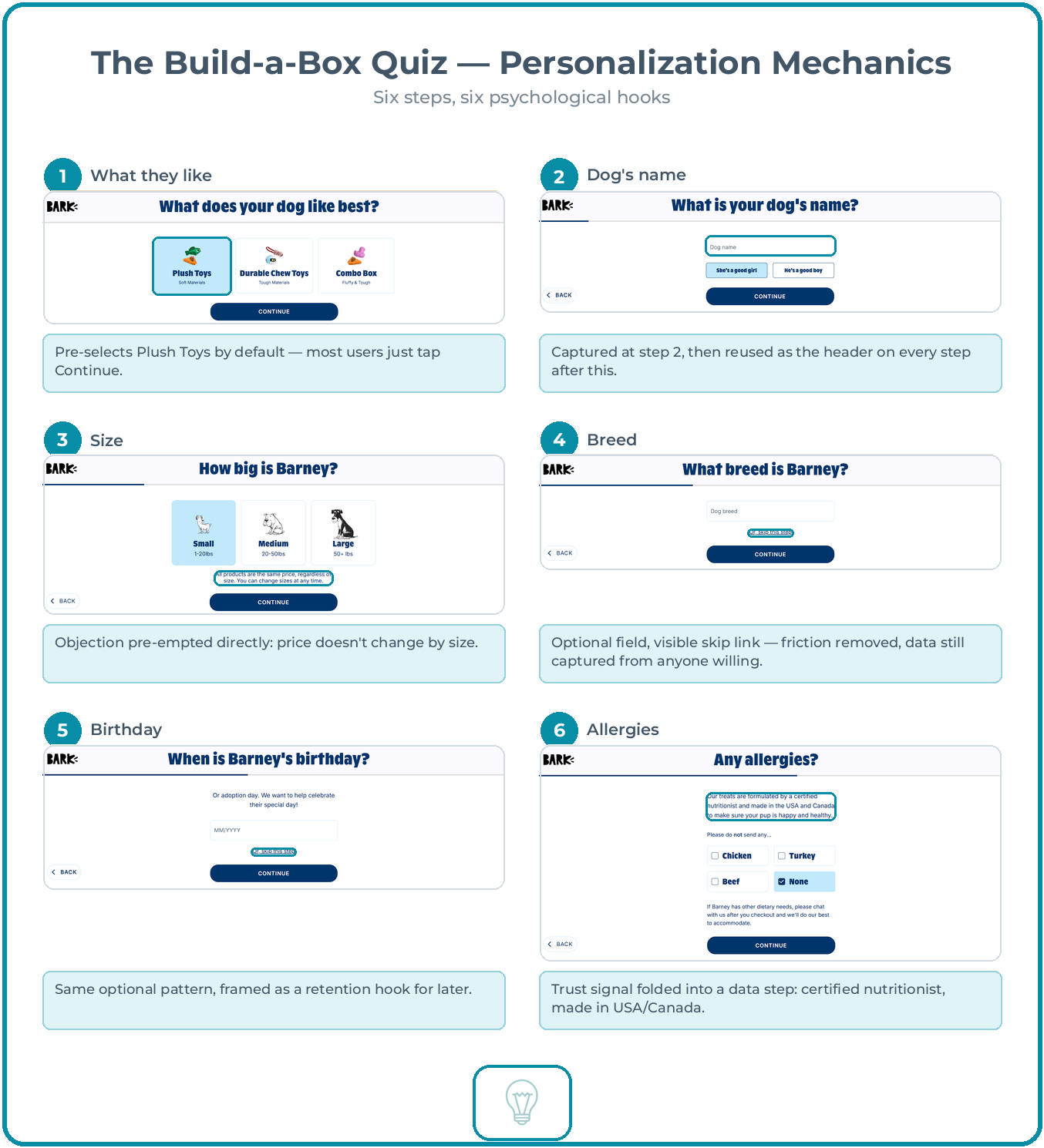
Click through from either homepage CTA and the ten-step build-a-box quiz begins. The first six steps are pure personalisation, and the sequencing is the whole trick.
Step two asks for the dog's name. From that point forward, every header in the quiz uses it: "How big is Barney?", "What breed is Barney?", "When is Barney's birthday?" It costs BarkBox nothing to build, but it changes what the interaction feels like. A form that says "select a size" reads like paperwork. A form that asks "how big is Barney?" reads like a conversation with someone who's about to shop for your dog specifically.
The size step doubles as objection handling. Right under the Small, Medium and Large options sits a line most brands would leave for an FAQ page: "All products are the same price, regardless of size." That single sentence removes a hesitation before it forms. Someone with a large dog doesn't need to wonder whether they're about to pay more.
Breed and birthday are both optional, with a visible "Or, skip this step" link on each. That matters more than it looks. Every question BarkBox asks is a chance to lose someone, so making the non-essential ones skippable keeps the funnel moving for anyone in a hurry, while still capturing that data from everyone willing to give it. It's a low-friction way to build a genuinely rich customer profile without gating progress on it.
The allergy step folds a trust claim into what would otherwise be a purely functional question. Above the Chicken, Turkey and Beef checkboxes, BarkBox notes that its treats are "formulated by a certified nutritionist and made in the USA and Canada." Nobody was asking about manufacturing standards at that exact moment, but it's a natural place to plant the claim, right when a pet owner is thinking about what they will and won't feed their dog.
By the time someone reaches step seven, they've answered five or six personal questions about their dog. That's the entire point. A ten-step quiz sounds like friction on paper, and for a generic ten-question form it probably would be. BarkBox's version works because each step is trivial to answer and personal enough to keep someone invested, so by the time a price appears, walking away means abandoning something that already feels like it belongs to Barney.
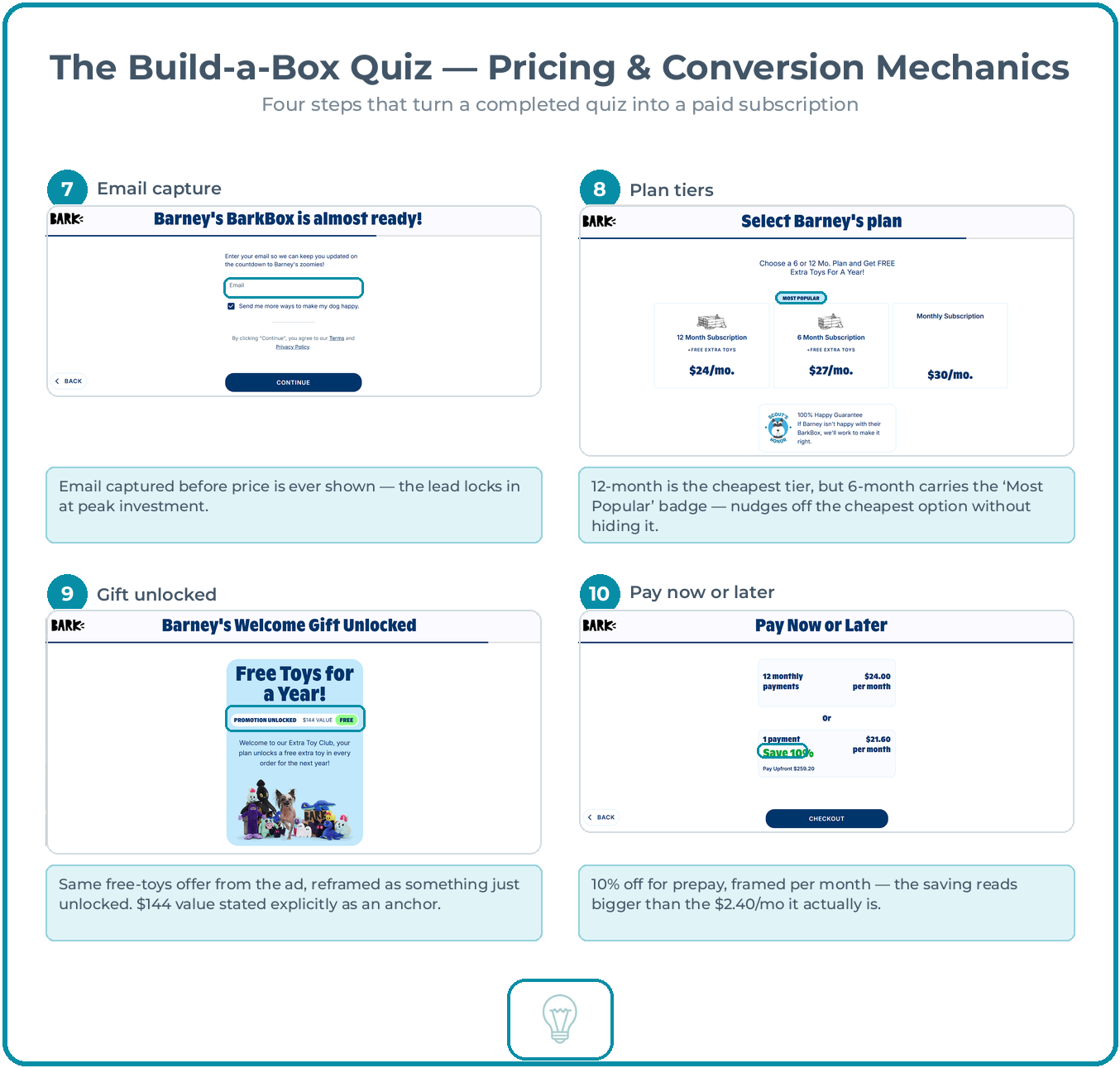
Step seven is where the funnel turns commercial. "Barney's BarkBox is almost ready!" asks for an email address, and it does so before a single price has been shown. That sequencing is deliberate. The lead is captured at the exact point where the visitor has the most invested and the least reason to leave.
The plan selector that follows offers three tiers: 12 month, 6 month, and monthly. The 12 month plan is the cheapest at $24/mo, but the "MOST POPULAR" badge sits over the 6 month tier at $27/mo. BarkBox doesn't hide the cheaper option. It quietly nudges most visitors toward the middle one instead, a classic anchoring move.
Whichever multi-month plan someone picks, the next screen reframes the same free-toys offer from the original ad as something just "unlocked": "Barney's Welcome Gift Unlocked," with a "$144 VALUE" stated explicitly next to a green "FREE" badge. It's the identical incentive from the homepage hero, but framed as a reward earned by finishing the quiz rather than a standing offer, which makes it feel like progress rather than a coupon.
The last step, "Pay Now or Later," offers 10% off for paying upfront, shown as $21.60/mo against $24.00/mo. Framing the saving per month rather than as a lump sum makes a $2.40 difference read as more significant than it is, while the upfront total ($259.20) sits underneath in smaller text for anyone doing the maths.
None of these four steps is a new tactic on its own. Email before price, tier anchoring, reframed incentives, and prepay discounts all show up across ecommerce constantly. What's worth noting is the order. BarkBox spends six steps building investment before it asks for anything, then spends four steps converting that investment into revenue. The personalisation is what makes the pricing work, built in from the first question rather than tacked on at the end.
.png)
Not every BARK purchase runs through the quiz. Licensed items like the Scooby-Dooby-Doo™ Plush Tug Dog Toy sell through a standard product page, and it's worth a look because it shows a different side of the same brand.
The price stays hidden until after size and quantity are chosen, sitting well below the title rather than anchored near it the way most product pages handle price. It's a minor deviation from convention. Most shoppers expect to see a number immediately, and BarkBox asks them to make two small decisions first. The 100% Happy Guarantee badge, by contrast, sits exactly where it should: directly under Add to Cart, right at the moment someone is deciding whether to commit.
Below the fold, an "A Reward For Your Pup!" banner offers a free toy for any order over $25, or a premium one over $50. It's shown to every visitor regardless of what's already in their cart, a simple, low-cost way to nudge order value up without gating the offer behind anything.
The one genuine flaw sits in the reviews section. Right above the actual customer reviews, the page renders a block of raw, unstyled text: "AI Generated Review Summary," "Summary topics," "Review topics: [].", "Review highlights," "Reviews." That's a bug, not a tactic. Whatever summarisation tool BARK has wired into its reviews widget is failing silently and printing its own internal labels, including an empty array, directly onto a live product page. It's a small thing, but it sits right above social proof that's otherwise doing its job well, and it's worth fixing before it costs BARK some of the credibility those reviews are meant to build.
BarkBox's funnel works because it treats personalisation as infrastructure, not decoration. The homepage sells variety and trust. The quiz spends its first half building investment through a dog's name, its size, its allergies, before it ever mentions a price, then spends its second half converting that investment through anchored pricing, reframed incentives, and a prepay discount. Even the standalone product page, built for one-off purchases outside the subscription funnel, carries the same instinct for risk reversal at the point of decision.
The lesson for other subscription and ecommerce brands is less about adding a quiz, and more about the order things get asked for. Collecting an email before showing a price, or a name before asking for money, works because it changes what saying no costs the visitor by the time they reach it.
If you'd like to apply similar strategies to your own Shopify store, get in touch. We help ecommerce brands improve conversion rates through Conversion Rate Optimisation built around the actual customer journey, and Email Marketing that picks up the moment a quiz or signup captures a lead. Small changes to the order of a funnel often move the needle more than any single page redesign.
